SEGAvangelist
Member
And them pushing this real life, anti-anonymous bullshit after getting their security cracked wide open in the past is pretty ridiculous as well.
I imagine you can turn that stuff off right?
And them pushing this real life, anti-anonymous bullshit after getting their security cracked wide open in the past is pretty ridiculous as well.
I imagine you can turn that stuff off right?
I'm not sure why you think a security hack matters here - what difference does it make what Sony pushes when they have your real name on file anyway and a security hack would potentially expose that?And them pushing this real life, anti-anonymous bullshit after getting their security cracked wide open in the past is pretty ridiculous as well.
These are the ones released today:
The rest are old.
Source is Sony PR.
I'm not sure why you think a security hack matters here - what difference does it make what Sony pushes when they have your real name on file anyway and a security hack would potentially expose that?
If anything, the transparency of using your real name gives a hacker one less thing to try and target you for.
That said, Sony has already stated that you will have the option to use a pseudonym still. But they are encouraging real name use, so it's no surprise these mockups embody that position.
Don't use your name.lol
More like it gives them a critical piece of information for which they can use on a ton of websites in order to fish for other pieces of Pii which could in turn be used for identity theft.
There's absolutely no reason for them to be pushing it.
And them pushing this real life, anti-anonymous bullshit after getting their security cracked wide open in the past is pretty ridiculous as well.
Don't use your name.
I won't be, and it's not a big deal in the long run given that it is an option, I just don't agree with Sony pushing it.
Lets get back to the overall UI discussion though before I derail the thread though.
I'm not sure why you think a security hack matters here - what difference does it make what Sony pushes when they have your real name on file anyway and a security hack would potentially expose that?
If anything, the transparency of using your real name gives a hacker one less thing to try and target you for.
That said, Sony has already stated that you will have the option to use a pseudonym still. But they are encouraging real name use, so it's no surprise these mockups embody that position.
Pour some liquor for my homie XMB
You were the best, bro. I'm gonna miss you.
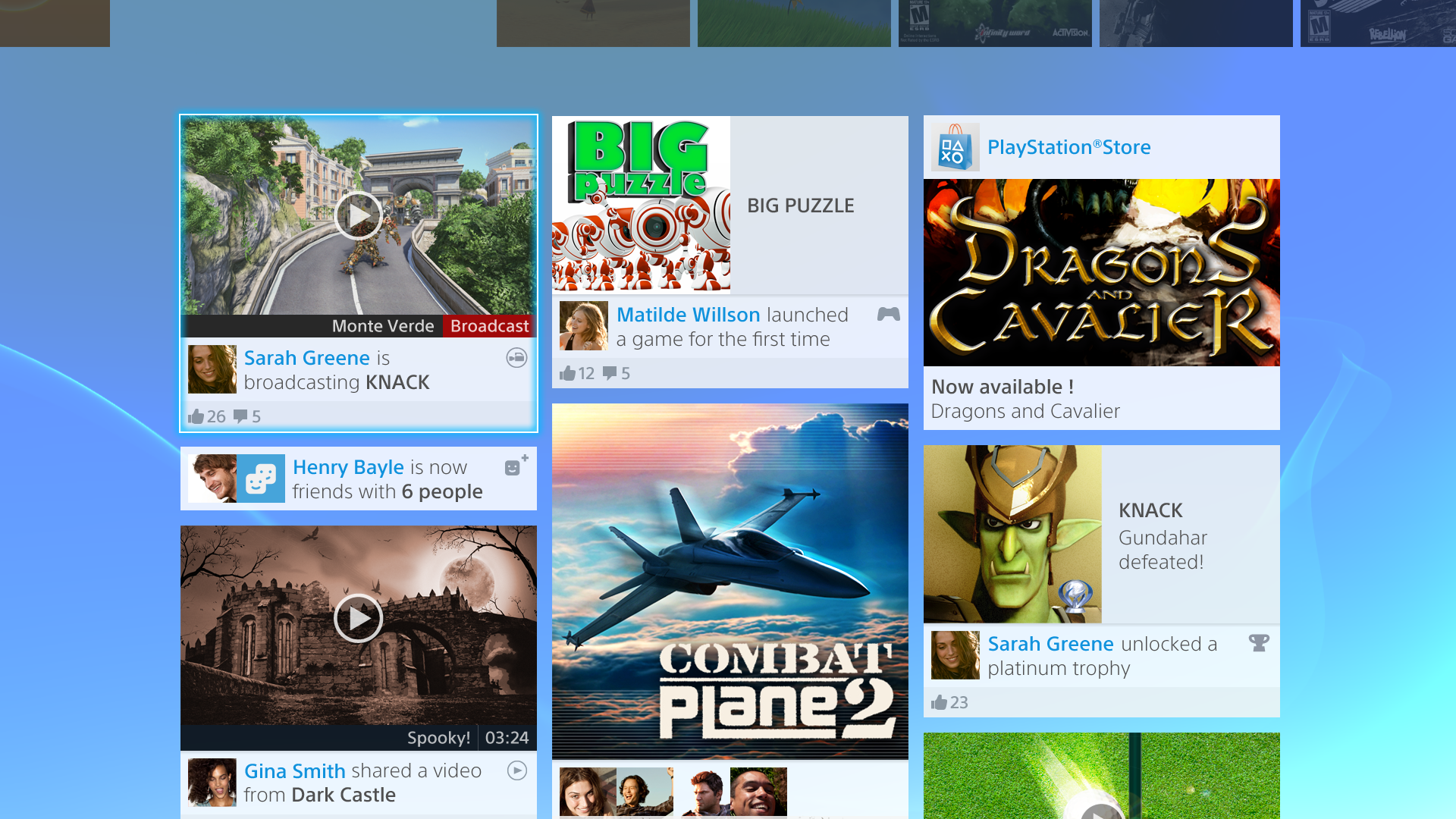
I'm stunned that people like this at all. It's just a mess of shit everywhere, no rhyme or reason to any of it. Just boxes of pictures put, what looks like, haphazardly wherever they feel like it.
It's just awful.
I won't be, and it's not a big deal in the long run given that it is an option, I just don't agree with Sony pushing it.
Lets get back to the overall UI discussion though before I derail the thread though.
It's not random though. Not to be That Guy but do you know anything about layout? If you examine the levels/hierarchy of it, the design is pretty straightforward.
Personally I find it a bit safe but there's nothing really wrong with their approach.
I'm not trying to spin it. It's spin to portray a pseudonym as any kind of valid security measure. It's a placebo.Haha, now that's some spin. "It's already out there, no need to hack!".
Which they're going to get anyway in an actual security hack, much more easily than anything else they might be trying to get since it's probably not protected the same way your password or CC# should be.More like it gives them a critical piece of information for which they can use on a ton of websites in order to fish for other pieces of Pii which could in turn be used for identity theft.
I'm better looking, but honestly is there a type?Does Sony really think gamers look like that?
One thing concerns me. The emphasis on Facebook integration.
I can't be the only one who wants to keep Facebook and PS4 separate, can I? None of my "real life" friends are really into gaming, plus I don't really want to be making my Facebook page and real name public via my PS4 profile.
Surely there must be away to have a vibrant friends list without all the Facebook social integration.
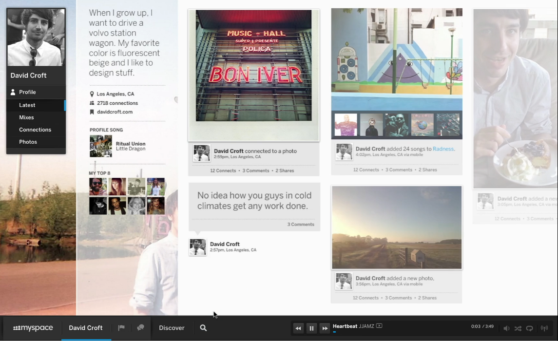
I've not done any "professional" layout study course or anything, but this:
Looks terrible. The levels of each box aren't lined up to each other in any way. At first they kinda look like they might, but they don't. It's sloppy looking. It looks like what Facebook looks like on a PC, and it's awful.
However, those shopped Watchdog parts of the layout do look good. It's not every page, but it's a lot of them.
I really want to smoke whatever some of you people are on.
Interface looks great, there are screenshots with the blue in different shades, so I'd think it could be changed.(even though DAT blue is god tier)
All the social networking stuff looks great, especially the "clusterfuck" of information bits. What's up with all the negativity here?
Would you look at that MySpace doesn't look half bad.
Just at a first glance, the XB UI looks more organised and easy to navigate thanks to the category bar at the top. I'm not sure exactly what part of the PS4 UI that is supposed to be -- is it the home? If so, are they really just going to dump *everything* (I can see a web browser and video player there) in one long line of scrolling icons? Won't that become a pain in the ass once you have a ton of stuff installed/played on your box? The background pattern is questionable but it seems that can be changed. The mobile stuff looks pretty great though.
I wish they made this like how it looks on Myspace. I think the Horizontal layout like such.....
....would look better. I like how the font looks and how the the updates are less intrusive. I think the blue is what really makes it look uglier than it seems. That blue is just ugh...I hate it. Everything looks so cramped in that space. They should stretch it out more and use more of that space that's just sitting there
What the hell are you people on? The only difference between the PS4 interface and the Myspace screens you're quoting is the user profile along the left side.I'm in complete agreement with this.
And them pushing this real life, anti-anonymous bullshit after getting their security cracked wide open in the past is pretty ridiculous as well.
Journey, Flower, Call of Duty 4, Medal of Honor and something else at the top.
I've not done any "professional" layout study course or anything, but this:
Looks terrible. The levels of each box aren't lined up to each other in any way. At first they kinda look like they might, but they don't. It's sloppy looking. It looks like what Facebook looks like on a PC, and it's awful.
However, those shopped Watchdog parts of the layout do look good. It's not every page, but it's a lot of them.
I don't know why but it just looks messy what with all that Facebook and Twitter stuff going on and it doesn't look as laid out as it could be. Dont get me wrong though, it does look nice, it just doesn't look all that simplistic or streamlined as it could be. I honestly think that the X1 layout will beat it, if only for its perceived simplicity and streamlined nature.
