-
Hey, guest user. Hope you're enjoying NeoGAF! Have you considered registering for an account? Come join us and add your take to the daily discourse.
You are using an out of date browser. It may not display this or other websites correctly.
You should upgrade or use an alternative browser.
You should upgrade or use an alternative browser.
Atlus has a new logo: /|TLUS
- Thread starter FluxWaveZ
- Start date
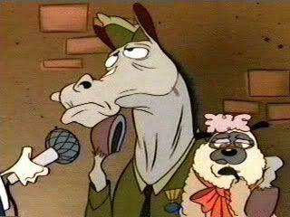
Why.jpg
.
Old Logo is so much better. Please stop with the logo redesigns, guys.

I can't say I like it. :/
dat Franklin Gothic Extra Condensed
The top bar on the T is too short. Very annoying.
Glad I'm not the only one bothered by that.
The top of the "T" is not long enough. It really irks me. Otherwise, decent logo.
that T is messed.
dat Franklin Gothic Extra Condensed
Heh, check out the copyright now under their games (PersonaQ for example):
Neat. Comparison of the copyright on the Persona 5 website from before and after:


Dark Octave
Banned
At first I was like "why not" but looked at the old one again (OP image not working for old logo) and yeah, I like the old one better. The new one has short letters and not as much detail.
I dunno.
I dunno.
Jinfash
needs 2 extra inches
The new type is too compressed while the A remains the same width sans bar. It's kinda distracting.The top bar on the T is too short. Very annoying.
Jimnymebob
Member

Quick and dirty edit to add the cuts into the letters and makes the kerning similar to the old logo.
Ryu Hayabusa
Member
I like it.


Graphics Horse
Member
I can't say I like it. :/
dat Franklin Gothic Extra Condensed
you missed my post.
I thimk it only needs a few more pixels, but having a stand out colour and looking like that doesn't quite work for me.

KojiKnight
Member
Is that improperly kerned? Or is it just me? It seems the spacing is off between the letters and it bothers me greatly.
Graphics Horse
Member
Is that improperly kerned? Or is it just me? It seems the spacing is off between the letters and it bothers me greatly.
Aside from the T, the S has a much bigger gap than the other letters, but I don't know shit about kerning.
Yeah, the problem is that they extended the width of the A, so the T looks strange next to it.I can't say I like it. :/
dat Franklin Gothic Extra Condensed
Can't wait for the day that flat / simple / minimalistic logos go out of fashion and we can get some depth / complexity to our logos again.
See, this is a fucking logo. I could believe that an artist spent creative effort to design this.
GuitarAtomik
Member
Kind of a sidegrade. The slight simplification is good and I like the new "A" but the rest is kind of dated generic. I probably would have gone with a thinner font if they were going to go in this direction. Maybe something closer to this:

Hero of Legend
Member

See, this is a fucking logo. I could believe that an artist spent creative effort to design this.
Fuck yeah, I'm alright with TT Games current logo, but hell no it never will replace this one, timeless.
Is that poor kerning or am I losing my mind?
It's horrible kerning. But I wouldn't rule out you losing your mind as well.
TheSlySoul
Member
Reminds me of Carnival Cruise Lines. They use a similar font and colour combo on everything.


Holy crap, it does look like a cruise company logo!
Octorockin'
Member
I like it, though it could be due to its association with the company's restrengthened identity. I'm glad to see Atlus back on its feet and past its recent hurdles.
hemo memo
Gold Member
Kind of a sidegrade. The slight simplification is good and I like the new "A" but the rest is kind of dated generic. I probably would have gone with a thinner font if they were going to go in this direction. Maybe something closer to this:
Yes, the thinner font is better.
Winterblink
Member
Looks fine to me; still says Atlas.

FirstBlood
Member
Just be glad they didn't go with @LUS
D
Deleted member 125677
Unconfirmed Member
Dat 90s webpage nostalgia. for some reason all I could think of when looking closely at the new logo was that Atlus is an anagram of "a slut."
eyeball_kid
Member
The leaning of the A and the compressed width of the U and S letters makes the logo look squished. Also, the abstracted A now feels disconnected from the rest of the letters, none of which maintain its forward momentum as the old logo did with the old S and the linework on the T.
Whoever made the new logotype doesn't really have a strong grasp of typography. Moreover, the changes seem arbitrary. Companies generally change a logo when they want to express a new direction for a company. What does this logo say? It says to me that they're confused about their image or their future, but they don't want to let go of the past completely.
What's curious is that this high-res version has completely different kerning. At least this one breathes better.
HoodWinked
Member
that kerning looks terrible and amateur.
Messofanego
Banned
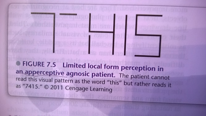
Maybe catering to those with apperceptive visual agnosia?
John Rabbit
Banned
the fact that the A is like 150% wider than all the other letters is really fucking with me.
eyeball_kid
Member
The new Index logo at least went in a different direction. I'm okay with this.