• Hey, guest user. Hope you're enjoying NeoGAF! Have you considered registering for an account? Come join us and add your take to the daily discourse.

Magic: the Gathering |OT10| Aether Revolt - That shit that make your Soul Burn slow

Status
Not open for further replies.

Rafy

Member
Here's the Wrath of God Invocation art in all it's glory:
C8CdVu-VUAAZRDC.jpg
 

aidan

Hugo Award Winning Author and Editor
List of revealed cards for a new page:

Aven Mindcensor
Chain Lightning
Consecrated Sphinx
Counterbalance
Counterspell
Cryptic Command
Maelstrom Pulse
Pact of Negation
Wrath of God

And an example:

Cryptic_Command_EN.png
 

Maledict

Member
How on *earth* did this get through design and signed off? It's appalling! It's looks like a Yu-Gi-Oh gimmick from a decade ago. It's difficult to read, unnecessarily different to normal cards, hides the amazing art and has a frame that looks like it was created by a first year art student.

Seriously, it's five different bad decisions all rolled into one. Getting this many things wrong actually takes some skill!
 

noquarter

Member
How on *earth* did this get through design and signed off? It's appalling! It's looks like a Yu-Gi-Oh gimmick from a decade ago. It's difficult to read, unnecessarily different to normal cards, hides the amazing art and has a frame that looks like it was created by a first year art student.

Seriously, it's five different bad decisions all rolled into one. Getting this many things wrong actually takes some skill!
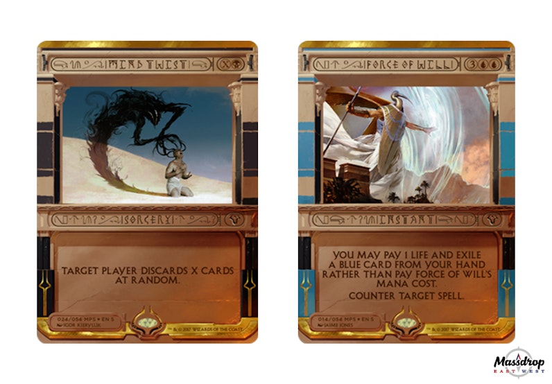
Maybe that was the contest, design the worst possible looking Wrath of God. Find a way to make a card that has great art and is a good card look horrible.
 
Based on the timeframe of when Liz Smith (who designed the Kaladesh frames) left and when James Arnold (who, full disclosure, is the husband of an old friend, but who generally does very good work) started, I'm guessing they had the intern cobble these together, lol.

The funniest thing about this to me is that it proves Maro was full of shit about being unable to print old-frame cards, since these aren't even human-readable much less machine-readable.
 

Maledict

Member
That's true. If you have machines capable of printing these you may as well have them crank out some copies of the Necromnicron at the same time.
 

aidan

Hugo Award Winning Author and Editor
How on *earth* did this get through design and signed off? It's appalling! It's looks like a Yu-Gi-Oh gimmick from a decade ago. It's difficult to read, unnecessarily different to normal cards, hides the amazing art and has a frame that looks like it was created by a first year art student.

Seriously, it's five different bad decisions all rolled into one. Getting this many things wrong actually takes some skill!

The weird thing to me is that there are so many fundamental usability issues with these (unreadable font, centre-aligned capitalized rules text, unnecessary visual noise in text fields, etc.) that should have been resolved during early design/drafting. It's one thing if they're ugly (no accounting for taste, after all), it's another entirely to create cards that are more difficult to play with than their regular counterparts (similar to the textless promos.) WotC has good artists and designers, so I'm not sure what went wrong here.
 

Rafy

Member
The weird thing to me is that there are so many fundamental usability issues with these (unreadable font, centre-aligned capitalized rules text, unnecessary visual noise in text fields, etc.) that should have been resolved during early design/drafting. It's one thing if they're ugly (no accounting for taste, after all), it's another entirely to create cards that are more difficult to play with than their regular counterparts (similar to the textless promos.)

Forget design, how did this go though marketing without anyone saying anything?!
 

Maledict

Member
This is going to sound really stupid but I didn't realise they had capitalised every letter. I just knew I was finding them really hard to read even the normal text but not why.

I mean, come the *fuck* on. You learn that capitalising everything makes it much harder to read at GCSE graphic design.
 
A full series of Masterpieces in unreadable glyphs wouldn't be a bad idea if you went all the way with it.

But these are somehow meant to be read?
 

aidan

Hugo Award Winning Author and Editor
Forget design, how did this go though marketing without anyone saying anything?!

Hasbro Marketing: "How are these going to make us money?"

WotC: "We've done this previously and been successful by implementing unique designs, a special foiling process, and curating a sought-after list of cards. Sets including these promos have been n% more profitable than sets that do not include them."

Hasbro Marketing: "Okay. Whatever. Good." *goes back to counting money*

Hasbro marketing doesn't care what these look like.
 

Rafy

Member
Hasbro Marketing: "How are these going to make us money?"

WotC: "We've done this previously and been successful by implementing unique designs, a special foiling process, and curating a sought-after list of cards. Sets including these promos have been n% more profitable than sets that do not include them."

Hasbro Marketing: "Okay. Whatever. Good." *goes back to counting money*

Hasbro marketing doesn't care what these look like.

They should care about people being able to read their product though
 

aidan

Hugo Award Winning Author and Editor
They should care about people being able to read their product though

They care about people buying their product. Yu-gi-oh is ugly as sin, but it sells well. That's all marketing cares about. WotC's designers are the ones who should care about people being able to read their products.

At the end of the day, we're still going to get a line from Hasbro during their quarterly call that Amonkhet is the fastest selling MTG set of all time, blah, blah, blah.
 

traveler

Not Wario
What the hell.... I'm stunned. They're just so so bad. Does anyone like these? Least I don't feel bad about getting ancestral visions earlier now.
 

Maledict

Member
Worship Invocation from the LRR stream

You have got to be kidding me.

What on earth went wrong during this project to result in cards *this* bad? How did they sign off on a picture of someone's fucking feet? The original worship had fantastic art, this is just awful.
 

darkside31337

Tomodachi wa Mahou
I've been playing magic for over 15 years and hands down these are the ugliest cards I have ever seen. They are total failures. Functionally useless with text being complete nonsense and yet failing aesthetically at the same time in every possible way. I can't believe they gave this the green light
 
I'm pretty sure I like these more than everyone else in the thread, but the "risks" WOTC has taken the last few years- lets get rid of answer cards, lets rotate cards early, lets start banning cards again- but not when the format actually needs it! have all blown the fuck up in their faces

Everything is running pretty hot and cold over there. The competitive balance situation is a tire fire, and this masterpiece issue makes it clear that they're running so many new initiatives at once that they can't keep all of them in good shape. At the same time, there's clearly stuff that's working -- MM2017 is phenomenal, Conspiracy 2 was great, SOI was a really strong large set, etc.

I would pull the banning off that list -- it wasn't a bad idea to ban in that context, it just wasn't enough to fix all the different shitty problems with the format.

Hasbro marketing doesn't care what these look like.

I... don't think you understand what a marketing team does
 

kirblar

Member
The reason "it's not for you" doesn't work here is because you have to play against them even if you don't want to, and they're super-unreadable upside down.
 

NameGenerated

Who paid you to grab Dr. Pavel?
Meh, I think they look pretty neat. The only thing I don't like are the nonsense characters surrounding the text. All the art is sick.
 

linid0t

Member
I think they would be better if they were full art - or at least much thinner frame.

Also I cannot believe that they went with partial hieroglyphics and full caps - very hard to read.

Sad that some of these cards have great art confined in such an inferior frame...

Maybe they'll look better in person.
 
The art looks great but the card around the art looks rough. I feel like these would have come across better if they dropped the rules text completely, but regardless these look a lot closer to straight collection pieces rather than cards to play with.
 

traveler

Not Wario
Will happily sell away any of these forces I encounter. Can't imagine anyone wanting to play these over the beauty we got last year.

Speaking of which, if they really want to give masterpieces a luxuriant feel, they need to focus more on the art itself. You could put a bunch of this cg mediocrity on limited fodder and I wouldn't bat an eye- shell out the big bucks and get your guays and nielsens to do these. Emphasize a painterly artistic direction to give them a level of class not present on the average card. And for the love of God, masterpieces should afford more room for the art, not less.

Mind twist art is good, at least. Too bad it had to be tarnished by this awful frame.
 

alternade

Member
I get what they were going for but these are really trash. I would have LOVED if they did it in a flat painted actual hieroglyphic style with just the name and mana cost.

Is this about to be the lowest value Masterpiece set yet? Can't wait to grab some cheap FOW lol
 
Status
Not open for further replies.
Top Bottom