Lol. It's literally just the power on top instead of to the left. Your suggestion is more drastic putting it on the opposite side of where it's always been.
Um... I think we're thinking the same thing, but not exactly
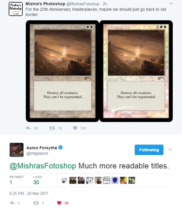
Quick and dirty example
Lol. It's literally just the power on top instead of to the left. Your suggestion is more drastic putting it on the opposite side of where it's always been.
Oh sorry, misread. I thought you meant put it in the bubble where the artist is.Um... I think we're thinking the same thing, but not exactly
Quick and dirty example
Mike Linneman, the fantastic art columnist over at Gatheringmagic, is putting together the biggest magic art exhibition to line up with GP Vegas. I'm seriously considering jumping in for that dinner option in the kickstarter.
Wonder if there's enough time for them to at least refine the frame a bit for Hour of Devastation printings. Assuming it's way too late, but even if they could just drop the wingdings, it'd make a huge difference.
So, it's not that I don't think marketing is involved with the process, I just don't think that their place in the workflow of set design/development/release/post-release would place them in a position where they're directly impacting the design of new borders/card layouts, etc.
Is it just me or is a big percent of these blue...

I don't get all the bitching about how unreadable the cards are. The whole issue with Textless Spells was that a player couldn't pick it up and know what the spell did- they just had the name. These are the opposite- the cards text boxes seem easier to read than even a normal magic card with large, bold print. Isn't that the part that is actually important?
I bet this is this exact conversation they had.
Design team idea man: the invocations should disrupt the opponent somehow.
Design team: say no more.
I really wish they would push these series to be art-centric, at least the Masterpieces had'full-art' even if the text box covered a portion of it.I don't think you actually have to go that far afield to fix the layout here. A lot of the Photoshopped versions really aim to tear it up completely or focus on aesthetic problems that people aren't necessarily any better at than WotC was; I spent 15 minutes just focusing on legibility and art presentation and I think you can go a long way with small tweaks:
Text box legibility is important for verifying the exact functioning of a card (which this does perfectly well.) Title bar legibility, and art size/visual impact, is important for easily telling similar cards apart, which this is significantly bad at.
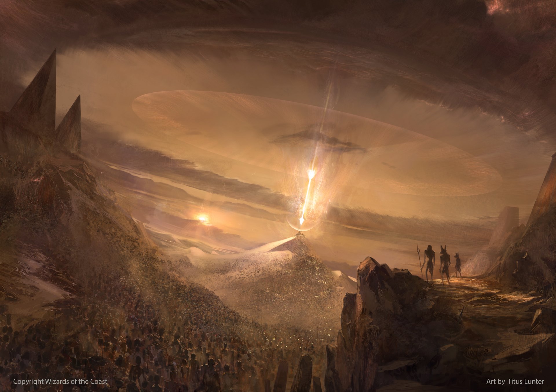
This card, Daze and Mind Twist have great art. Counterbalance and Counterspell look pretty good as well. Shame the border and text distract from that.That art is so so gorgeous. Easily my favorite WoG art of all time. The mockups make it so obvious how beautiful it could look in a standard frame. Design did an incredible disservice to Titus. I know it's already been posted, but just look at this!
The focus on impending doom instead of the scene of obliteration itself is a new take on wrath, the color palette fits both a white card and the ominous tone needed for it, the sheer scale of it is incredible, and the subtle use of an arrow as the delivery mechanism for the wrath of the white god- who's been depicted as an archer? Just perfect. <3
Imagine the tilt on a Terminus Invocation.Using these cards will be the new way to tilt opponents at tournaments.
Imagine in a few years on streams players with Expeditions, Inventions, Invocations, Incantations, Fables, Heroes, Treasures, Icons, Moments, etc in play. Those boards will be messy af.
Imagine in a few years on streams players with Expeditions, Inventions, Invocations, Incantations, Fables, Heroes, Treasures, Icons, Moments, etc in play. Those boards will be messy af.

In non eye searing news, random common.
Miasma Mummy - 1B
Creature -- Jackal Zombie
When Miasma Mummy enters the battlefield, each player discards a card.
2/2
I'm 100% a whale, but consistency is ultimately a higher aesthetic value than bling, at any cost. I can't see too many people wanting to fill their decks with total nonsense just because it's premium. (Although I also hope we don't get classic frame promos for 25th anniversary or any other occasion because I can't stand having classic and new frames in the same deck, so what do I know.)
I play commander with a couple whales at times it's already bad.
The black god is identical in both of them.
Same. I do like some bling though occasionally.
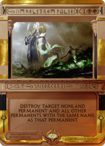
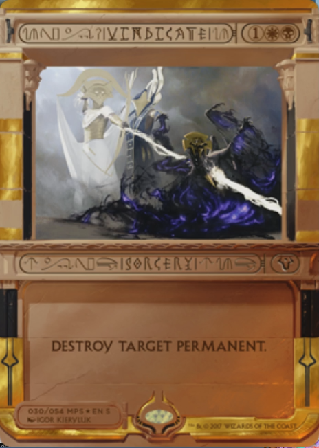
Someone on reddit pointed out Maelstrom Pulse and Vindicate are copy pastaing part of the art.
The black god is identical in both of them.
Clearly it's a cycle of enemy-pair removal, all connected by copied-pasted gods in the art.
Look for Lightning Helix, Fire/Ice, and... Temporal Spring Invocations rounding out the cycle.
(I just wanted to make someone imagine a split card Invocation)
Same. I do like some bling though occasionally.
Someone on reddit pointed out Maelstrom Pulse and Vindicate are copy pastaing part of the art.
The black god is identical in both of them.


Virtually every design decision on these sucks.
Unreadable font
Centered-caps lock text
Random nonsense symbols around the types/names
Tiny art
Stacked P/T
Sepia Tone Mana symbols.
The frame itself looks like random fucking blocks of color