-
Hey, guest user. Hope you're enjoying NeoGAF! Have you considered registering for an account? Come join us and add your take to the daily discourse.
You are using an out of date browser. It may not display this or other websites correctly.
You should upgrade or use an alternative browser.
You should upgrade or use an alternative browser.
Shenmue III to be published by Deep Silver, details for Gamescom meet and greet
- Thread starter DKHF
- Start date
GhostTrick
Banned
Just goes to show angle and lighting can make a difference.
It looks better but it doesn't change Ryo's face, which wasn't in question.
Pie and Beans
Look for me on the local news, I'll be the guy arrested for trying to burn down a Nintendo exec's house.
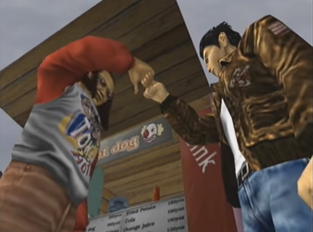
Shenhua's face makes me worry immensely about NPC's. If thats the level they've approached the 2nd most important character, god knows how generic Poser model-esque the rest of the cast are gonna look :/
kunonabi
Member
Shenhua's face makes me worry immensely about NPC's. If thats the level they've approached the 2nd most important character, god knows how generic Poser model-esque the rest of the cast are gonna look :/
I'm not too worried about them since the other npc we saw looked pretty good. It's just Ryo and Shenhua giving them fits for some reason.
Shenhua's face makes me worry immensely about NPC's. If thats the level they've approached the 2nd most important character, god knows how generic Poser model-esque the rest of the cast are gonna look :/
The Muscleman NPC (boss?) was pretty good. But I agree on your worries.
See below:But the middle one looks like Ryo and the other two don't, nothing to do with memory at all, it's in plain sight with your comparison.
Yip.Remember people have different perceptions. It is impossible for everyone to agree or disagree on the same thing.
I'm a giant hypocrite because I did one myself, but this whole Photoshopping the model shit is like a path to madness at this point anyway.
It's not even a second model, just a complimentary angle. Just goes to show first impressions aren't everything.Also, this second model looks amazing. Save for the jacket color. Now waiting for Shenhua to be fixed.
Anyway, now I'm home from work I can have a good n' proper look at these new images out of whatever mixer at Gamescom they were taken at, but at a glance I can dig it.

The logo doesn't look that bad from a distance, but nothing beats the cursive, and the white caligraphy version of this weird new logo is better than the liquid gold version IMO. I don't think they're longed for this world, though. Fans will eventually prevail.
At the very least I want to see the cursive logo on my Kickstarter backer sleeve for the game.
Ryo is:

There's still some proportional weirdness but the image on the standee makes it work more, I think. I'm excited to see it animated, actually.
Which hopefully will be the case tomorrow... :^)
breakYODAy
Member
Ryo looks much better and what I would expect in that poster shot, which gives me reassurance that Shenhua will look better in-game as well. My worries about the models are basically resolved at this point.
Still don't like that logo, and hope Suzuki hears that loud and clear from the fans. I worry that it's change was due to some trademark or legal issue created when Deep Silver signed on, and we are going to be stuck with it.
Still don't like that logo, and hope Suzuki hears that loud and clear from the fans. I worry that it's change was due to some trademark or legal issue created when Deep Silver signed on, and we are going to be stuck with it.
They will hear about the logo: https://youtu.be/WdFLyqyeoik
timmyp53
Member
They both look fine.I was fine with the E3 2015 logo, don't know why everyone complained. This is meh.
Also still not feeling the Ryo model, just make it feel/look like him. Still haven't captured him yet.

IronicSonic
Member
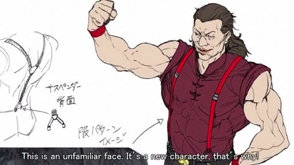
I wanna see HD Joy, Ren, and Ryo's one true love, Xiuying.
.

we already saw what other NPCs might look like and they look distinctive enough and full of personality...Shenhua's face makes me worry immensely about NPC's. If thats the level they've approached the 2nd most important character, god knows how generic Poser model-esque the rest of the cast are gonna look :/

back to topic i am really pleased with everything i saw recently i can't wait for tomorrow's showcase.
Ghost_Messiah
Member
Any word on when the dedicated Shenmue 3 Gamescom thread is going up Spaghetti? Just asking because we're less than 24 hours away from the reveal and/or potential footage.
Sectorseven
Member
Do we even know if the footage will be for the public or is it behind the curtains stuff?
Evidently the footage is being released simultaneously to backers, so I would assume it is a public showing.
Ghost_Messiah
Member
Evidently the footage is being released simultaneously to backers, so I would assume it is a public showing.
Yeah, Spaghetti also asked the team recently and they said:
As for anything released at gamescom, it will be made immediately available for the public. No worries there!
Thanks much
Joel & the Shenmue III Team
So everything they show on Tuesday should be made public immediately at some point tomorrow night, if my math is correct.