• Hey, guest user. Hope you're enjoying NeoGAF! Have you considered registering for an account? Come join us and add your take to the daily discourse.

Snake Pass, and how a bad home menu icon drags down my enjoyment of a game

Status
Not open for further replies.
So, yeah this a pretty trivial, first world complaint. But I get what you're saying all the same. I would understand if the game released with that icon, but they deliberately changed it to this? Why? It doesn't make sense that someone at Sumo would have spent time on this.
 
Nope, but it was on the leaked docs.

hI6fKRL.png


Also, now that I read it again, it's not required, but heavily recommended.

This is the first post in this entire thread that made me think, okay, maybe the OP has a point. Not a point that would get me to sympathize with "I enjoy the game less because of this," but the point that the old icon is what should be used instead of the new one, completely independent of subjective aesthetic appeal.

Like, I'm not one to demand slavish adherence to a company's design guidelines (otherwise everything I own would be an Apple product, because they're masters of that sort of thing), but it seems like Nintendo put some thought into those guidelines and that the thing people in this thread are complaining about is exactly why Nintendo created guidelines steering publishers away from overly simple icons.
 
This is the exact type of thread to describe NeoGAF.
.


*ahem*, Did they ever switch the icon back? I'm still pending the update that made it ugly and I don't want to install it and be stuck with this ugliness on my home screen. Also did the update add any noticeable gameplay or performance improvements?
 
D

Deleted member 30609

Unconfirmed Member
Reading this thread for the first time and despairing
 

D.Lo

Member
Damn I thought the bump meant they fixed it.

I deleted the game now anyway, ugly icon and at 4GB it is by far the biggest game on my system.
 
The best icon currently show on that home screen.


I heard from many people that this icon looks great and had to think about this thread. How weird, same shit like Snake Pass but because it's from the new good Sonic game, it's ok now?

It's as bad as the Snake Pass icon.
 

Neiteio

Member
G30fSiH.jpg


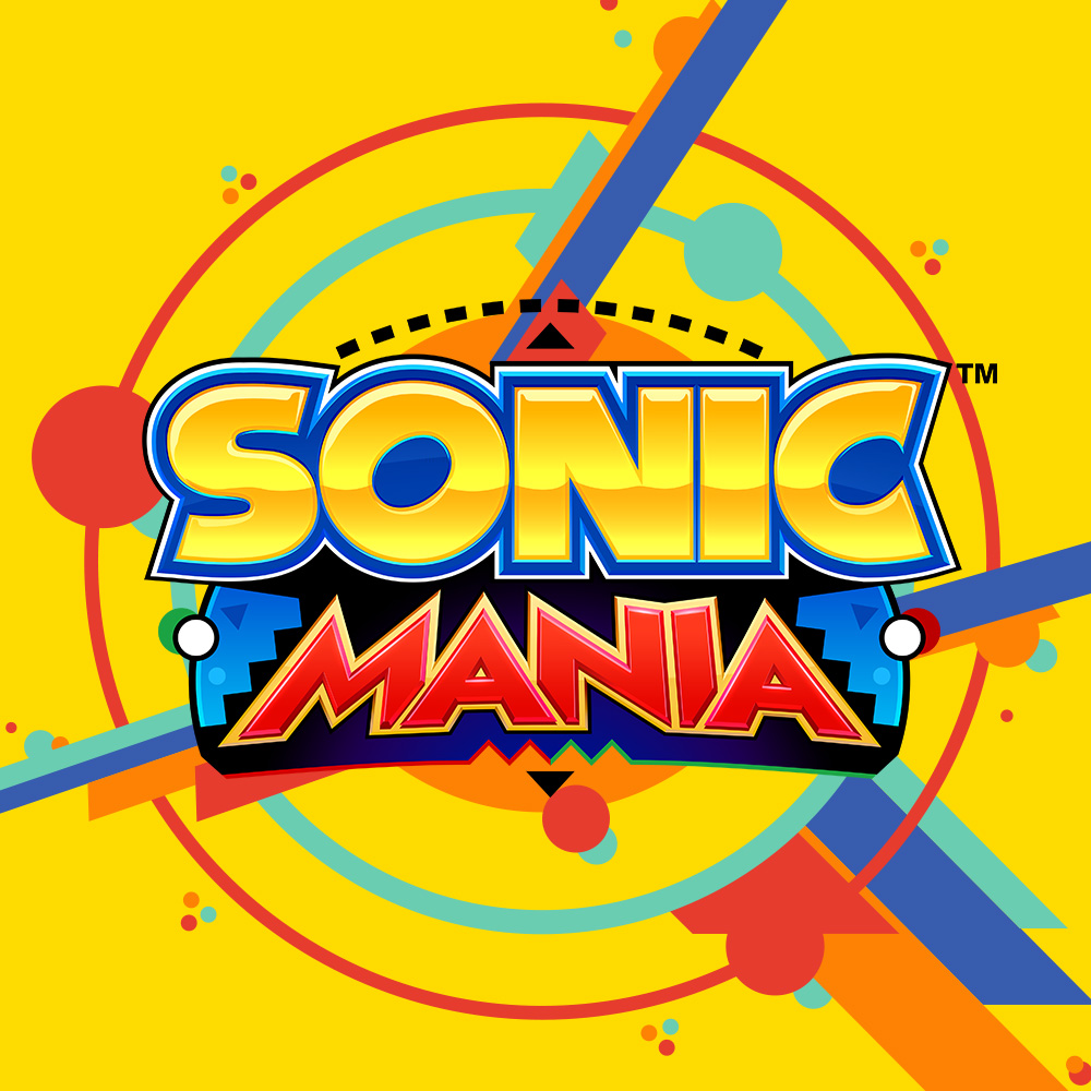
So what do we think of the Sonic Mania icon?
It's better than the Snake Pass icon.

The important distinction here is that the Snake Pass icon was once good, but then they patched it and changed it to shit.

I don't like it when people make things worse for no reason.
 

D.Lo

Member
The Sonic one is cleaner and features an iconic character so can get away with it slightly better. It would still be better if it had the game title, so it looked like a game box.

The Switch menu is not an iphone screen, they are large title tiles, not icons. Games should have the title to look like a movie poster, not an icon to look like a phone app.
 

LAA

Member
Think the difference between Sonic Mania's icon and Snake Passes icon is... Sonic is iconic and well known, so it can get away with it somewhat, while a Snake from Snake Pass isn't, and may not instantly remind you of Snake Pass.

That said, think it should still have a logo on it, especially when there's more than 1 sonic game on Switch, but the whole issue doesn't overwhelmingly annoy me as I can still still what each of these games are from first sight.
 

FinalAres

Member
I don't like either. As a digital only buyer, I want my icons to represent the artwork of the game, as it's effectively the front cover in my digital library.
 

Tyeforce

Member
Little Inferno and Human Resource Machine are like this also, I wonder why nobody seems to have brought them up (probably because so few people bothered to pick them up on Switch, which is a real shame).
NH8MDsR_d.jpg


It's not that they're bad, but...it's super inconsistent with other games' icons. It'd be nice if the icons for these two, Snake Pass, and Sonic Mania were more consistent with other Switch icon designs, I agree.
 
We got an email the other day with some guy from Reddit asking us to change our icon because "it looks like a phone game" which was a bit annoying to say the least. They person didn't even say anything about our game, like any feedback or whatever... just about the icon!

There's a quote by Alfred Korzybski that says "The map is not the territory."

So I just want to say that the icon is not the game. The experience of playing the game is far more important.
 

Griss

Member
I actually like the Sonic Mania icon in a vacuum, I just don't like that it doesn't correspond to the other icons. Just a small name on the bottom of it would be enough. But I can see that they were going for very simple, clean, pop art iconography of Sonic and it does pop off the screen and it looks great.

The Snake Pass one, on the other hand
-Looks terrible
-Doesn't conform to the suggestions / other icons
-Replaced something that didn't look terrible and DID conform

So I'd let this sonic one slide.

This thread and its obsession with the switch icon is a good example of toxic gaming culture.

Absolute nonsense. There's fun to be had in nitpicking tiny elements of aesthetics and game design - it's the reason forums like these exist. If you disagree or if such conversations upset you, you don't have to take part. The OP has been very calm and polite about his issue with the icon from the start, and he's well aware what a minor issue it is. He just thinks it's worth talking about, and I and others agree.
 

tolkir

Member
Little Inferno and Human Resource Machine are like this also, I wonder why nobody seems to have brought them up (probably because so few people bothered to pick them up on Switch, which is a real shame).
NH8MDsR_d.jpg


It's not that they're bad, but...it's super inconsistent with other games' icons. It'd be nice if the icons for these two, Snake Pass, and Sonic Mania were more consistent with other Switch icon designs, I agree.

More games to add to wall of shame.

- Snake Pass
- Voez
- Implosion
- Bulb Boy
- Little Inferno
- Human Resource Machine
- De Mambo
- Retro City Rampage DX
- Severed
- Sonic Mania

The age where Switch UI will be a row of Bobbleheads is closer.
 

Bazry

Member
We got an email the other day with some guy from Reddit asking us to change our icon because "it looks like a phone game" which was a bit annoying to say the least. They person didn't even say anything about our game, like any feedback or whatever... just about the icon!

There's a quote by Alfred Korzybski that says "The map is not the territory."

So I just want to say that the icon is not the game. The experience of playing the game is far more important.

Maybe that person hadn't bought your game and saw it browsing the store, then decided to give you some constructive criticism about your game icon and how it puts people like them off buying your game?

A game icon is your first impression of a digital game, just like retail packaging has always been your first impression of any product on a store shelf. If someone thinks it looks bad, they're not likely to go ahead and buy it
 

Griss

Member
We got an email the other day with some guy from Reddit asking us to change our icon because "it looks like a phone game" which was a bit annoying to say the least. They person didn't even say anything about our game, like any feedback or whatever... just about the icon!

There's a quote by Alfred Korzybski that says "The map is not the territory."

So I just want to say that the icon is not the game. The experience of playing the game is far more important.

Right, just like box art is irrelevant to the quality of a game. But people have been criticising and making fun of box art since game box art existed.

I have no idea what your icon is like and I'm not saying you should change it based on the opinion of one random dude, I'm just saying that it's hardly illegitimate criticism. It's just not very important or particularly helpful criticism.
 

D.Lo

Member
This thread is a good example of toxic gaming culture.
No. This is people critiquing elements of products. Literally the point of a gaming forum. What exactly is toxic about that? There are no personal attacks or any people getting attacked at all.
 
While the icon didn't impact my enjoyment of the game I definitely see a need to criticise it. It isn't actually *bad* per se, but it's inconsistent with 90% of Switch game icons and the size of the icons makes it stick out more.

More games to add to wall of shame.

- Snake Pass
- Implosion
- Bulb Boy
- Little Inferno
- Human Resource Machine
- De Mambo
- Retro City Rampage DX
- Sonic Mania

The age where Switch UI will be a row of Bobbleheads is closer.

These icons made more sense as iPhone-style "app" icons or Windows desktop icons, or 3DS/Wii U icons, yeah.
 
No. This is people critiquing elements of products. Literally the point of a gaming forum. What exactly is toxic about that? There are no personal attacks or any people getting attacked at all.

Just part of the whole nitpicking outrage culture of modern gaming that many find offputting.
 
We got an email the other day with some guy from Reddit asking us to change our icon because "it looks like a phone game" which was a bit annoying to say the least. They person didn't even say anything about our game, like any feedback or whatever... just about the icon!

There's a quote by Alfred Korzybski that says "The map is not the territory."

So I just want to say that the icon is not the game. The experience of playing the game is far more important.

He probably liked your game and almost not bought it because of the cheap/generic looking icon. If he just not bothered with your game because of the generic icon and bought the next game that looked more quality, you would have not got an email from him. If a developer not even bother to invest an hour to make a fitting icon for the Switch homescreen I assume they put not much effort in their games too.

Just part of the whole nitpicking outrage culture of modern gaming that many find offputting.

It's astonishing that some developer/people not know how important the first impression of a game is, and that is often the icon. If I had not read some reviews about, for example, Snake Pass, I would have not even looked at it after seeing the generic/cheap phone game icon in the eShop. That has nothing to do with "nitpicking".

A standard "bubbly smiling head" icon is probably something a marketing expert recommends because most phone games use it, but it is not appropriate for quality developed products and it could be fatal for sales of a indie console games.

It's already well known that "head"-icons was an ok fit for tiny mobile screens (but already oversatured even there), but are simply ugly on Tablets, Switch screen or TV-Screens. This is why Google/Apple & Co. recommends different icons for different screen sizes, but some designer simply copy their simple phone icon for all screen sizes.
 

BHK3

Banned
We got an email the other day with some guy from Reddit asking us to change our icon because "it looks like a phone game" which was a bit annoying to say the least. They person didn't even say anything about our game, like any feedback or whatever... just about the icon!

There's a quote by Alfred Korzybski that says "The map is not the territory."

So I just want to say that the icon is not the game. The experience of playing the game is far more important.

And boxart is not indicative of quality: http://gameranx.com/features/id/104...-sexualized-women-on-the-box-don-t-sell-well/

Just like movie posters: https://www.inc.com/yolanda-lu/3-lessons-from-bad-movie-posters.html

People like phone games which is what your icon represents the game as so you probably do have some sales, use the sales and make a better icon.
 
Just part of the whole nitpicking outrage culture of modern gaming that many find offputting.
I don't see any outrage in this thread to be honest. Your need to pivot to an extreme when referring to the most mundane of topics is far more indicative of any toxic nature the community has adopted.
 
The ๖ۜBronx;246248094 said:
I don't see any outrage in this thread to be honest. Your need to pivot to an extreme when referring to the most mundane of topics is far more indicative of any toxic nature the community has adopted.

I agree that this is a very mundane and unimportant issue.
 
The first impression of a digital game is not the icon, like a box is for a physical game, because by the time you see the icon, you've already bought it.

I'd like to see a more unified approach but I don't really care. The Neo Geo games piss me off most.
 
Status
Not open for further replies.
Top Bottom