Dagobert Duck
Member
The US SNES is the ugliest thing Nintendo ever put out.
The virtual boy would like to have a word with you...
Though I agree the US SNES is just ugly, it looks soulless
JAP and PAL SNES is glorious though,
The US SNES is the ugliest thing Nintendo ever put out.
YES. this is the real travesty people need to be talking about.The PC Engine turning into the TurboGrafx was a much bigger downgrade, though. They said it was because of added RF shielding for FCC rules but I think it was more because they felt the original was too compact and cute for North America.
.Lance Barr: The Super Famicom was maybe okay for the market in Japan. For the US, I felt that it was too soft and had no edge. We were always looking at future modular components (even the NES had a connector on the bottom), so you had to design with the idea of stacking on top of other components. I though the Super Famicom didn't look good when stacked and even by itself, had a kind of "bag of bread" look.
Not with that Yank name, no.
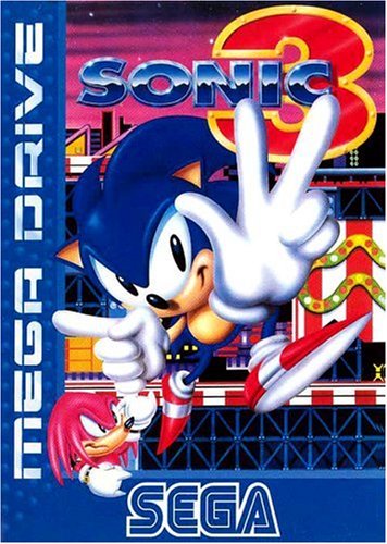
Oh, feck off with that Gynysys cack. It's not even Sega's first console, so the name doesn't make sense from that standpoint. And that logo...terrible. Just look at that sleek chrome sheen on that Mega Drive logo.BONUS:
Sega Genesis > Mega Drive
Mega Drive looks like a cheap Chinese knockoff with the tiny Mega Drive name almost not visible in the corner.
I'm sorry, but your Yank name deserves an exodus.
Do you just prefer getting blisters when playing rapid fire games.
Not with that Yank name, no.
Oh, feck off with that Gynysys cack. It's not even Sega's first console, so the name doesn't make sense from that standpoint. And that logo...terrible. Just look at that sleek chrome sheen on that Mega Drive logo.
I'm sorry, but your Yank name deserves an exodus.

Just so long as it's called Mega Drive, that is also acceptable.Bah, only one MD logo matters:
This, however, is not.US design looks like a piece of hardware.
PAL/JP version looks like something a baby would chew on.
Just so long as it's called Mega Drive, that is also acceptable.
Not with that Yank name, no.
Oh, feck off with that Gynysys cack. It's not even Sega's first console, so the name doesn't make sense from that standpoint. And that logo...terrible. Just look at that sleek chrome sheen on that Mega Drive logo.
I'm sorry, but your Yank name deserves an exodus.
Which one is the cheap knock off?
Lol wtf? It's only 2 purple buttons on the system and 4 on the controller. That's not exactly a lot of purple.The US SNES is the ugliest shit ever. All that purple, Jesus fuck... If it had retained the original colors it would have been less terrible (but still pretty ugly).
Not with that Yank name, no.
Oh, feck off with that Gynysys cack. It's not even Sega's first console, so the name doesn't make sense from that standpoint. And that logo...terrible. Just look at that sleek chrome sheen on that Mega Drive logo.
I'm sorry, but your Yank name deserves an exodus.
Nah, Genesis is a memorable and thematically fitting name for the console that was pushed as marking a new era in games. "Mega Drive" is nonsense speak that sounds like something you'd call a component for a failing beige home computer in the '80s.
Which one is the cheap knock off?
Replace Mega Drive with Dreamcast and change the year...
Well, today certain countries get special editions, but yeah it'd be huge if say Europe got a completely different model of the PS5
At least they bothered putting branding on the Genesis. Where is the branding on the Mega Drive? It looks like they deliberately didn't add a logo in order to not be sued by Sega.The Genesis definitely looks like the cheap knock-off in that comparison. It looks like they just slapped a large sticker on it.
I do actually quite like the Genesis name though, and typically refer to it as such these days, even though I grew up calling it a Mega Drive.
Never understood the love for the name, it's so bad. However that's the only Sega system that I truly enjoyed. Really wish I still had it.Dreamcast sounds crap tbh. Its only by virtue of the console itself being so awesome that anyone gives it a pass.
It's the only mainline Sega console that I don't like the name of.
At least they bothered putting branding on the Genesis. Where is the branding on the Mega Drive? It looks like they deliberately didn't add a logo in order to not be sued by Sega.
Genesis is such a trashy name. Trying to pander to the US Christian audience. I guess the Sega Bible, Sega 32X Torah and Sega CD Quran wasn't catchy enough.
Genesis is stylish. "Mega Drive" is dull and generic.
Genesis is such a trashy name. Trying to pander to the US Christian audience. I guess the Sega Bible, Sega 32X Torah and Sega CD Quran wasn't catchy enough.
SNES purple is the best color. Also you can't balance a drink on top of your bag of bread console.
The one with the big "LOOK AT ME AND THE STUPID NAME I HAVE" logo on top. Comes across as tacky.Which one is the cheap knock off?
Of all the Revelations I've seen, this one doesn't do the Job for me.Nah, Genesis is a memorable and thematically fitting name for the console that was pushed as marking a new era in games. "Mega Drive" is nonsense speak that sounds like something you'd call a component for a failing beige home computer in the '80s.
I'm gonna give you a hell yeah, for that.Talk about your Psalms, talk about Genesis 3:16 - Mega Drive 3:16 says Japan and Europe got the right, true name of Sega's cherished 16-bit console.

You know what, I'm gonna throw something new into the mix...the blue swirl looks the best.Never understood the love for the name, it's so bad. However that's the only Sega system that I truly enjoyed. Really wish I still had it.
The US SNES is the ugliest thing Nintendo ever put out.
You know what, I'm gonna throw something new into the mix...the blue swirl looks the best.
Guess I'm one of the weirdos that likes the US version more. Way more. Looks iconic, whereas the other version looks more like a piece of bootleg hardware.
The colorful controller buttons are dope, though.
There were revisions of both the SNES and Super Famicom late into the generation. This is where they started evening out, though I'm still not a fan of the two concave buttons on the SNES controller.


Nah, the model 2 nes, VB, wii u, Switch, and the 2ds are all uglier.
Because the other design are ugly.

The console in the middle is absolutely a looker... the others are terrible bad.
Nah, the model 2 nes, VB, wii u, Switch, and the 2ds are all uglier.
nah, Switch? are you crazy?
Wii U is neutral, VB looks cool.
maybe the 2DS but i still rank the US SNES above it. it's atrocious.
Even as a kid who hadn't seen what the JP/PAL SNES looked like, I found the US one really ugly and boring.
Super Famicom is way better looking in every aspect.
Probably $$$. The US design looks cheaper to manufacture. Reduction in cost is mentioned in the article.
Back in the 90s I preferred the US SNES because it looks less toy like. But these days I prefer the Super Famicom, its a lot less offensive and the design has aged better IMO. And Im glad the US didnt choose to design their own N64 - it would have been an eyesore compared to the sexy international version.
The SNES redesign was garbage. Just as terrible as the awful Wii redesign.

The Mega Drive represented the differences in culture between Sega and Nintendo at the time. Mega Drive was designed to look cool, trendy and stylish with 16 bit emblazoned in bold letters for all to see. The 16 bit thing was huge at the time, it was like having double D Dolby logo on your hifi at the time - it added to coolness factor. Whilst the SNES was just an unassuming grey box. The same contrast exists between the company mascots Sonic and Mario. Sonic was designed to be cool, whilst Mario is a fat old plumber.The Megadrive looked like something Sony would have put out at the time. It was very early 90s hi-fi in its appearance, a great looking console for the era.
My word, I really really miss Sega
Oh, feck off with that Gynysys cack. It's not even Sega's first console, so the name doesn't make sense from that standpoint. And that logo...terrible. Just look at that sleek chrome sheen on that Mega Drive logo.
I'm sorry
In playgrounds at the time all the cool kids liked Sega, whilst all the geeks were into Nintendo.


