• Hey, guest user. Hope you're enjoying NeoGAF! Have you considered registering for an account? Come join us and add your take to the daily discourse.

Why did NoA redesign the SNES for the US?

jstripes

Banned
Now I know who to blame for ruining such a classic design.

The common prevailing theory in the 90s was that America preferred boxy, rigid shapes to more compact or smooth/rounded designs. It's also the reason why the NES is a giant box compared to how tiny the Famicom is.
That's also what happened when the PC Engine became the TurboGrafx-16. They went from a nice, compact little console to a much larger, boxier console that was mostly full of air. Americans at the time perceived size as value.
 

lazyguy

Member
You are all crazy.
The American Snes looks rad as shit.
I think this might be one of those "this is the default so the other design looks better" kinda thing.
Like how most black consoles' white versions look better.
 

jstripes

Banned
Oh boy, how did we miss this part of the interview?

ND: What non-Nintendo consoles (current or past) do you think have the best and worst design?
LB: Besides the old Atari systems with the fake wood grain on the sides, I thought the Jaguar looked rather like a toilet. I always thought the Neo-Geo system was uninspired. I liked the old Atari 7800. It had a nice, clean, high-tech look. The Sega Dreamcast had a great, fresh look, that was a nice departure from previous systems.

viaFiyW.jpg


Well I think your face is uninspired. The Neo Geo is like a luxury car.
 

Ouroboros

Member
I also wanted to point out how NoA also changed the logo.

JP/EU use the left logo on the cover art for SNES games.

US uses the right logo on the cover art for SNES games

When I was a kid, I always thought the US logo was a dog paw and never understood why they picked a dog paw to be the logo.

I was a dumb kid back then.
 

Jeff-DSA

Member
The US SNES looks fine. I even like the purple color (I got a purple GameCube too).

I do think that the Super Famicom looked better, but it's crazy overblown how ugly everybody wants to claim the US SNES is. It definitely looks better than the v1 Genesis, which sort of looks like a humidifier.
 

fester

Banned
Who knew so many people would have rose-tinted nostalgia glasses for a bag of bread?

And that somehow a tiny logo on a boring beige box equals "most colorful."
 

QisTopTier

XisBannedTier
The loss of the rainbow buttons is the biggest failure of the na version

Na console looks like a jank old car

jp console is like a sleek car of the future in comparison
 

molnizzle

Member
The design is 100% the reason why 8 year old me asked for a Genesis instead of a SNES, despite having and loving the NES.

Genesis was sleek and black. SNES was boxy and purple. It didn’t look “cool” to a young American boy in the 90’s.
 

HYDE

Banned
There were revisions of both the SNES and Super Famicom late into the generation. This is where they started evening out, though I'm still not a fan of the two concave buttons on the SNES controller.

wPiBPeu.png

ZgPwGq1.png

I want the four colors and two convex and two concave buttons. Best of both worlds. Hell, make the dpad purple.
 

Jockel

Member
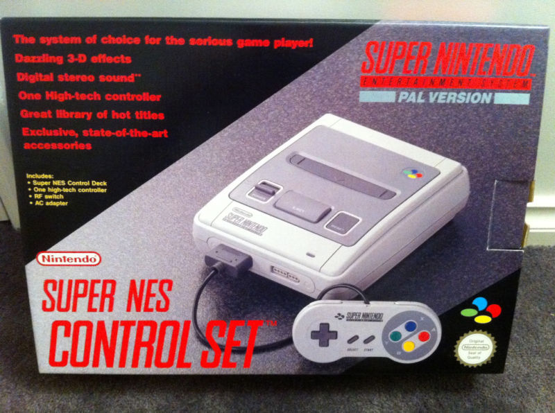
The SFC packaging is also miles better than Pal and Us version.

xBzCzuU.jpg
That sure is nice, but I also really like the silly gray carpet.
Super-Nintendo-Console-Brand-NEW-PAL.jpg

Nintendo seems to agree, as it's on the Mini as well.
As a bonus, this is the version that I was seeing on German store shelves all the time:
snes-konsole-power-station-original-controller-zubehoer.jpg
 
I imported a Super Famicom and got a SNES at launch and I preferred the look of the SNES. The Super Famicom looked off for some reason. Like it was just a rough draft. Probably just my horrible American tastes.
 

ItsTheNew

I believe any game made before 1997 is "essentially cave man art."
The US design is much better, thank god we didn't get the rainbow, pack of hot dog buns machine.
 
I like the symmetric look of the US Snes, the other versions have 3 totally different looking buttons/switches on the top of it which make it look like it was haphazardly strewn together with spare parts.

Plus the variation of concave and convex buttons on the US Snes controller made it easier to determine where your fingers were at without having to look at the controller. Though I agree to some extent that the lack of colors hampered the design.
 
The perfect one would be a mix of the two IMO.

Gimme gray buttons instead of purple on the US SNES and SFC colors with the US style convex/concave mix buttons on the controller.
 
The US SNES 2 is by far the best looking SNES... I kind of wish I had one, but I think the video output was worse on it because of cutting back costs. The controllers however, it's no contest. The US SNES controller with the concave buttons and dual purples is a work of art.
 
I also wanted to point out how NoA also changed the logo.

JP/EU use the left logo on the cover art for SNES games.

US uses the right logo on the cover art for SNES games

I love the colors used for JP/EU always reminded me of

SpecialZone_SMW.png


This level from SMW, I'm pretty sure this remained in the SMW US build. I remember seeing the logo as a kid and loving it a lot. Thinking it was something specific to SMW Special World.
 
Having seen the designs for other regions, I'm assuming they didn't want the console to look as bad. It was rounded out like a Sega Genesis but a Sega Genesis looks awesome (black and red, the red ring is almost like a gold chain around it's neck. Just looks cool) and non-NA SNES don't. They course corrected for the better imo.

Only decent foreign SNES is the mini-Famicon. That's rounded and Genesis awesome rather than OG Super Fami Crappy.
 

Currygan

at last, for christ's sake
The American Super Nintendo looks like an air conditioner from Raising Arizona or some trailer park shit . Our version is soooo much better
 

SCReuter

Member
JP/EU design is much better in my opinion. I feel the comparison to a sports car is pretty soot on. The US one looks like a blocky mess.

Super Famicom is more like a Toyota sedan. Neo Geo would be closer to a sports car.

USA went for that "superior" 'murican look

latest
And this is a better representation of the original Xbox with its stupidly enormous controller, not SNES, which is actually pretty sleek.
 
I always thought it was designed so that a normal sized cup could not be placed on it in any form because kids would put cups on the NES, they'd get knocked over, and Bam, no more NES.

Yeah, there was an Iwata Asks (I believe) some years ago where they went into detail. Apparently the designers were horrified by American cars having cup holders and wanted to redesign the console in such a way that it was impossible to set a drink on it.
 
I didn't even know that the Super Nintendo existed until the mid 00s due to a variety of circumstances. That said, going in fresh I prefer the American design.
 

Formosa

Member
The American design looks FUGLY. Both NES and SNES. Should've kept it original.

Edit: Even the SNES cartridges looks like ass.
 
I loved the US SNES redesign back then, and I still love it now.

The greys and purples and curved-edge boxy design are superior.
 

kotor22

Member
I mean he designed it and says its "maybe okay for Japan" US SNES is the definitive version confirmed.


lol

Also does anyone fucking read an OP ever? Or just reply to headlines, we got people in here trying to explain why the design was made for these markets when the answers are right there lol.
 

Formosa

Member
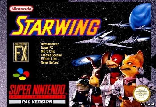
This even extended to the cartridges:


Imo the PAL one just fits the respective SNES design way better than the US one.

They even extended to the Art on the cartridges, ie: SF2.
NA just have to make everything more disgusting... Why??
 

SCReuter

Member
I feel like I'm supposed to say Super Famicom is better, but I dunno, it's starting to look more dated to me, almost like an anonymous, late 80s PC.
 

Mr Git

Member
Reading through so many posts praising the US design in this thread. That's okay I guess. But then I realise they're pronouncing SNES as an initialism and not an acronym and I just can't understand it.
 
Geez guys. It's more than okay to prefer one design more than the other (I was born in 1991 in the US--although I don't remember the Super Nintendo era very well--and I prefer the US look), but could we not be so gratingly mean to each other about the design of a early 90s children's toy? I know a lot of you are probably just exaggerating for comedic effect, but this harsh back and forth gets grating after a while.

Anyway, I like the US one more because I like electronics that are not sleek (especially if it's a toy. A reaction to our monotonous industrial design of today I guess), and I like the more subtle purple and grey look over the multicolored buttons. It eventually became a branding problem for them by the gamecube, but I like how Nintendo subtly favored purple in their console/accessories in the United States (think the N64 atomic purple controller and the canonically indigo gameboy color, in addition to the indigo gamecube). It gave a subtle hint of brand recognition to the console that the brand is missing today (although they tried to rip off Apple white there for a while).
 

low-G

Member
I like the faux plastic curtain on the base of the system. These edges are curved in much the same way as the system can simulate shading via an enhanced color gamut.
 

v0yce

Member
This again? The PAL/SFC has to be the most over praised design in gaming. Its really, really unremarkable.

Seriously, look at this sad thing.

wkXE3bC.jpg


Overall I like more modern, angular designs like the US SNES but the bump really hurts it. On the other hand the SFC has a better profile but the goofy light switch and giant logo bugs me.

What shouldn't be debatable is the color scheme. The warm grays and skittles rainbow on the SFC is bad. The cool gray and purples of the SNES looks really clean and timeless.

1tNM0TM.jpg


No contest.
 

Psxphile

Member
Marketing.
Marketing is the reason.
Marketing is always the reason.


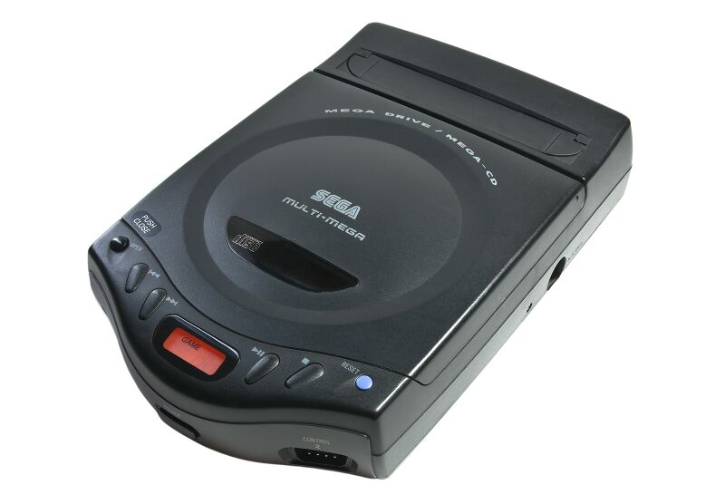
I didn't own one, but the Multi-Mega / CDX is a real beaut.

800px-Multimega.jpg


Damn thing is tiny too. I don't know how the hell they fucked up with the 32X and Saturn with this amazing bit of kit out there.

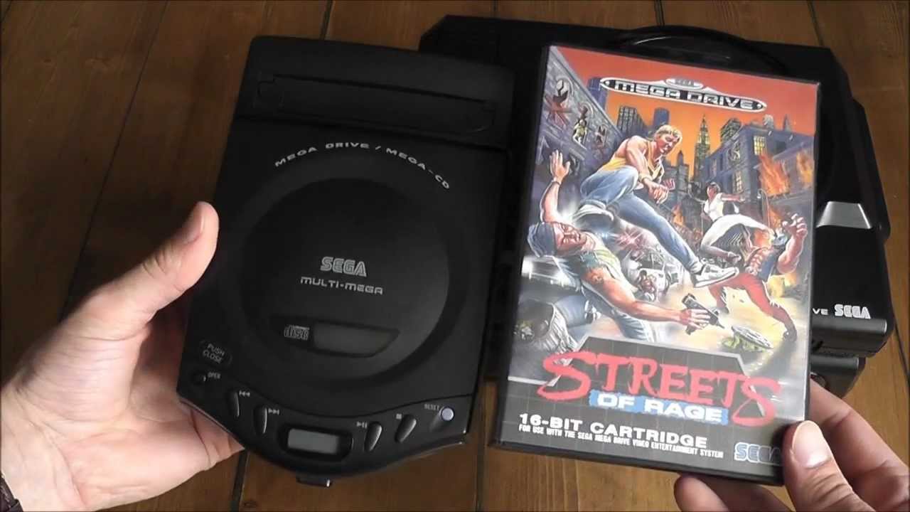
maxresdefault.jpg
The best mini-console Sega ever put out there. I wish I hadn't sold mine all those years ago, I was young and needed the money! :(

Its too soft for us!
That and the "bread bag" line... there's a joke here about American sensibilities and how we feel about flacid penises.

Yeah, I went there.


I want the four colors and two convex and two concave buttons. Best of both worlds. Hell, make the dpad purple.

FUCKING THIS (nay on the d-pad though, gross). Why oh why is anyone choosing one over the other? Fusion is the only answer! It's up to JPN/EU or third-parties though since NA won't give in to the rainbow because, again, marketing.
 
Top Bottom