-
Hey, guest user. Hope you're enjoying NeoGAF! Have you considered registering for an account? Come join us and add your take to the daily discourse.
You are using an out of date browser. It may not display this or other websites correctly.
You should upgrade or use an alternative browser.
You should upgrade or use an alternative browser.
Horribly photoshoped posters, keyart advertising etc
- Thread starter StalkerUKCG
- Start date
- Status
- Not open for further replies.


They were not content with butchering a literary classic, they had to butcher the art too.
Hurt and Scared
Member
lol your totally rightNicolas Cage is some kind of lightning rod for ridiculous looking posters
.


This Brazilian BD cover:

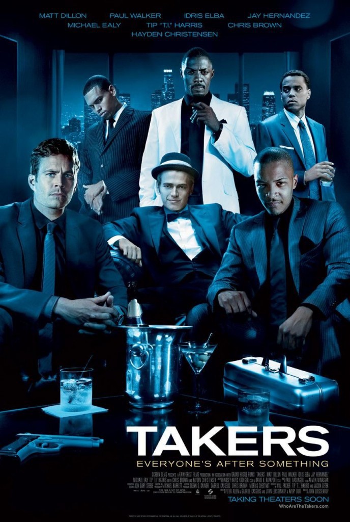
This is the worst. By far. Sorry Takers.
Wouldn't she have been 15 in this?
Oh shit you guys are referring to her boobs getting bigger. I thought they just slid over Radcliff for the poster lol.
Bane and his massive army of cardboard cutouts with poor resolution.

Now that is truly a big guy.
Solid SOAP
Member
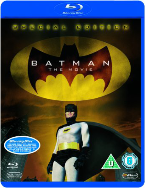
I'll see your Bane, and raise you a shitty Batman:Bane and his massive army of cardboard cutouts with poor resolution.

Seriously. The original version of this was awesome, this sucks
He is wondering which movie he is doing the poster for.Whatever is leaving him in a constant state of confusion on posters I'd like to know.
AHA-Lambda
Member
As bad as this is, and it gets mentioned all the time, I don't get why it's reached such infamy.
It's bad, it doesn't seem that bad. I'd argue that chef poster on the last page is worse.
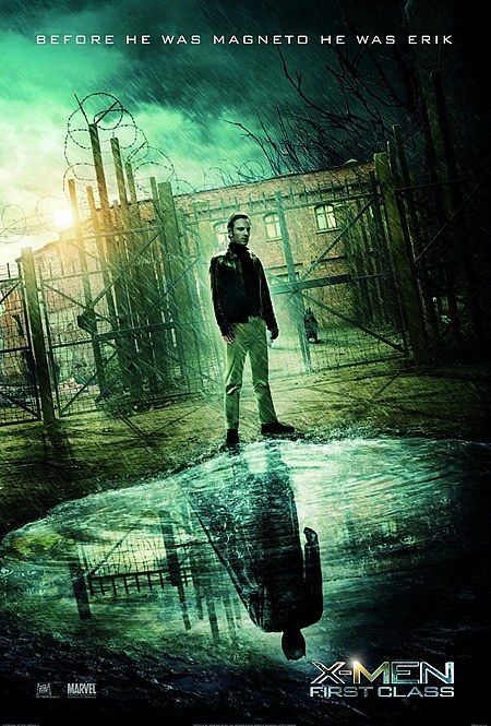
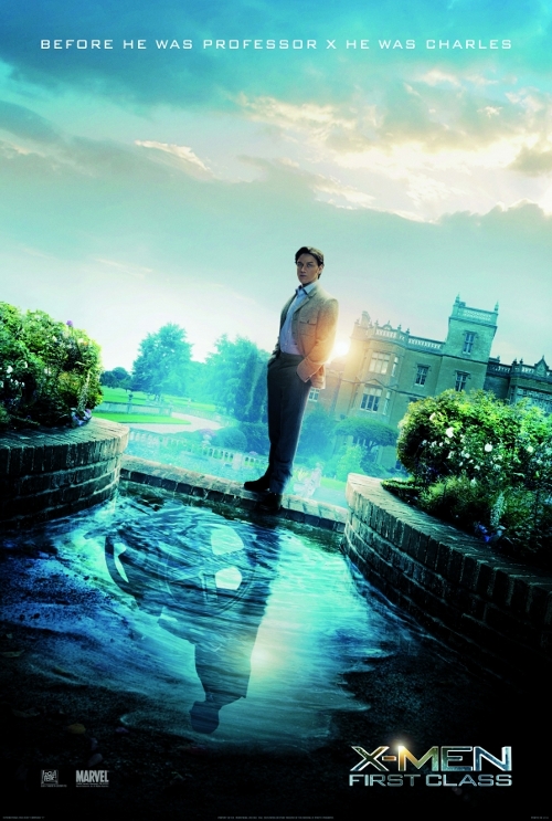
NOTHING beats the atrociousness of the First Class posters


Whereas this...
Prinz Eugn
Member
Considering these posters were probably done in 15 minutes for $6 by some severely underpaid and overworked designers, they look okay.
NOTHING beats the atrociousness of the First Class posters
If these just had the silhouette and not that awful head in the middle then they would've been decent. But I imagine some exec saw that and said "hmm, audiences are too dumb to know the guy in the wheel chair is Xavier. How about we put his head randomly somewhere in there."
NOTHING beats the atrociousness of the First Class posters
These are legit?
Edit: Wow - these are actually real. Nobody is topping this.
Davey Cakes
Member
The First Class ones are beyond stupid.

They were not content with butchering a literary classic, they had to butcher the art too.
FUN FACT: Emily Blunt had to turn down the role of Natasha Romanov because of her prior filming commitments to this movie.
Good job, Emily.
Escape Goat
Member
All of those movies made a lot of money so I guess it doesn't matter.
lol your totally right
This makes it look like the movie is some sort of mecha anime styled story where Cage pilots a giant wickerman.
Rumblebones
Banned
NOTHING beats the atrociousness of the First Class posters
Forgot about these.
Lumpy Onion
Member
Love the dude on the bottom right. Must be full of brains.

I always cringe at this poster. Look at his skin. That's some Vogue Photoshop shit.
Time for another general round of garbage


Cosmo Clock 21
Banned
Adding to the issues OP noted with HP4's poster, HP6 also has the same issues but also a really dumb title placement.
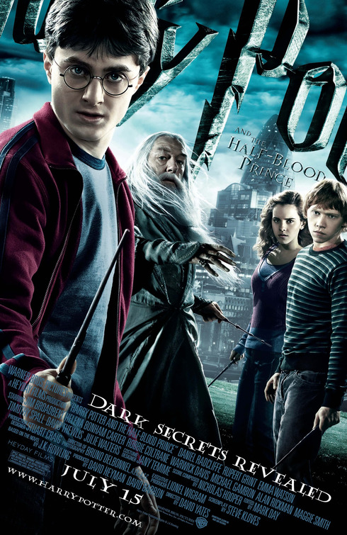
I mean, it's dead obvious it's a Harry Potter movie, but cmon.
It's pretty smart IMO; shows that they know public awareness of the logo is high enough that they don't need to include the entire thing in the poster for people to recognize it. It plus the DRAMATIC TILT helps to convey a sense of action in the poster.
It's pretty smart IMO; shows that they know public awareness of the logo is high enough that they don't need to include the entire thing in the poster for people to recognize it. It plus the DRAMATIC TILT helps to convey a sense of action in the poster.
On the other hand, the poster is god damn awful. Everyone looks weird and is just standing around in a field in front of London (?). Y Po deserved better.

It's actually not so bad but is that guy in the middle really supposed to be Matthew McConaughey? I just don't see it.
StalkerUKCG
Banned
There was an earlier version of the Takers poster that didn't even have the right skin tone on Paul Walker.

Paul's head 😂😂😂
This hot garbage.

This gets even funnier when you realize that Elijah Wood has two thumbs on the same hand.
This is the shot the poster designer appropriated, and in the process cut off part of Elijah's left thumb and moved it for no reason. You can see that part of the thumb remains in the original location in the poster.

Same "artist" of the X-Men First Class posters?

This Brazilian BD cover:
wtf
It's actually not so bad but is that guy in the middle really supposed to be Matthew McConaughey? I just don't see it.
Neither can we at that resolution.
CopperPuppy
Member
I'll see your Bane, and raise you a shitty Batman:
Seriously. The original version of this was awesome, this sucks
Also, here's Batman staring at a post, and those reflections make no sense at all.

And here's a 'Dark and Broody' version of the Adam West Batman
Exotoro
Member
Same "artist" of the X-Men First Class posters?
okay this wins
FlashbladeGAF
Member


I like how it's the exact same monkey image but in different clothes in these posters.

I'd watch the shit out of this.
somecrazymember
Banned
Haha nice
Lys Skygge
Member
I thought this was fine until I looked at their feet. Jesus that's bad lol.
(Prison Break)
Same "artist" of the X-Men First Class posters?
This one works far better than the X-Men ones, because at least the space is filled and there's some energy to the silhouettes. The other ones just look like you randomly feathered off the rest of the photos and randomly plopped them into the black mattes.
And yeah, I think Harry Potter wins for worst franchise key art. I don't particularly think Struzan was the right fight for the franchise, either, but there's so much interesting imagery to pull from, even having the same marketing mandates of "have the leads look at the viewer" could have resulted in dramatically more interesting art.
Star Wars: The Force Awakens wins the kitchen sink award. Would be a much nicer piece if they didn't try to throw in every new character that's in the movie.
Is that wax Elijah Wood ??
Looks like Mackenzie Crook in disguise.
NOTHING beats the atrociousness of the First Class posters
It's particularly heinous that they used those when they had another set of perfectly cool looking ones they made
wait the fuck up, there are other Dolittle movies?
NESpowerhouse
Perhaps he's wondering why someone would shoot a man before throwing him out of a plane.
Time for another general round of garbage
When I was a kid, I had the weirdest dream thanks to the Shark Tale Poster.
F0rneus
Tears in the rain

Baroquemantic
Member
Oh my god, I can't breathe. Lmao.
- Status
- Not open for further replies.