• Hey, guest user. Hope you're enjoying NeoGAF! Have you considered registering for an account? Come join us and add your take to the daily discourse.

Mozilla is trying a rebranding

Status
Not open for further replies.

jelly

Member
http://arstechnica.co.uk/business/2016/08/mozilla-is-changing-its-lookand-asking-the-internet-for-feedback/

Mozilla is trying a rebranding. Back in June, the browser developer announced that it would freshen up its logo and enlist the Internet's help in reaching a final decision. The company hired British design company Johnson Banks to come up with seven new "concepts" to illustrate the company's work

https://blog.mozilla.org/opendesign/now-for-the-fun-part/
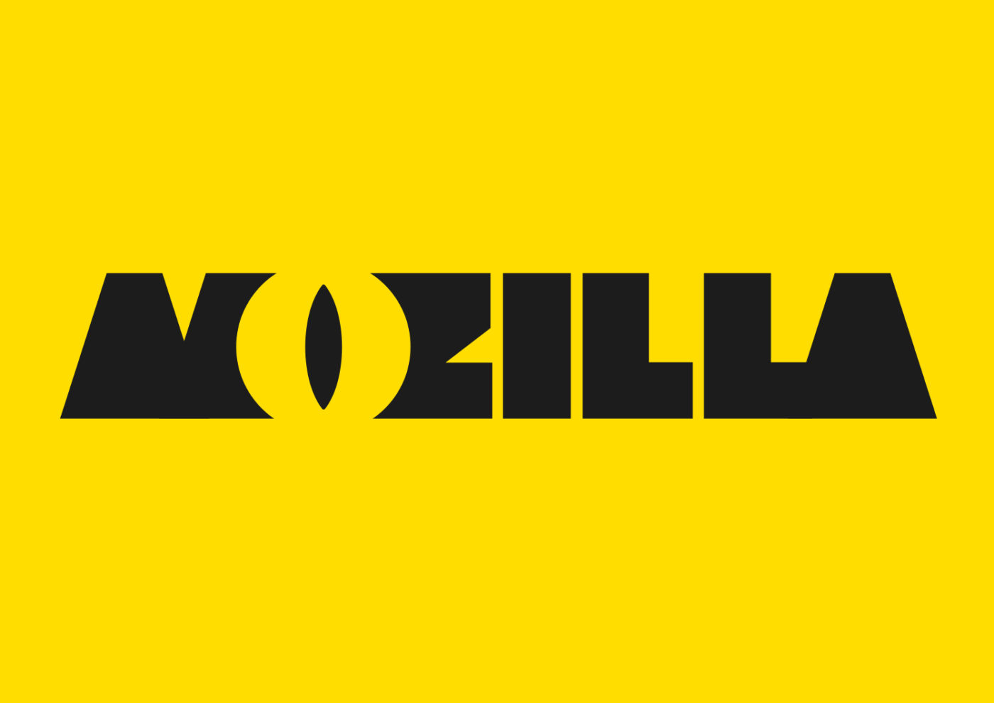
jb_Mozilla_A_eye_1-1400x990.jpg


jb_Mozilla_B_connector_1-1400x990.jpg


jb_Mozilla_C_open_1-1400x990.jpg


jb_Mozilla_D_protocol_1-1400x990.jpg


jb_Mozilla_E_wireframe_1-1400x990.jpg


jb_Mozilla_F_impossible_1-1400x990.jpg


jb_Mozilla_G_flikflak_1-1400x990.jpg


I see Pixar, Sky + Box, Zune.

Surely they should have just make it an open contest instead of paying one guy. They aren't good.
 

nortonff

Hi, I'm nortonff. I spend my life going into threads to say that I don't care about the topic of the thread. It's a really good use of my time.
All of those are awful.
 

C-Drive

Member
Some of the worst designs I've ever seen. They do need something other than just their name in a font, though.

Moz://a is the only redeeming one.
 
Can they please speed up Firefox after they get the logo situation figured out? It's probably my favorite, but I stopped using it since it's so much damn slower than the alternatives. :p
 
D

Deleted member 1235

Unconfirmed Member
I hate them all but

Moz://a

is clever. they should make a logo that doesn't suck out of that idea.
 

E-phonk

Banned
Some of the worst designs I've ever seen. They do need something other than just their name in a font, though.

Moz://a is the only redeeming one.

Agree, the Moz://a one is the only that stands out and seems at least slightly clever and ok.
I would consider more experimenting with variations and different fonts / colors, as i'm sure the idea could be done better.
 

jelly

Member
Moz://a is kinda clever but it doesn't really have a place much now, :// is usually hidden in browsers address lines and is only seen in links and wouldn't work as a smaller logo.
 
Status
Not open for further replies.
Top Bottom