• Hey, guest user. Hope you're enjoying NeoGAF! Have you considered registering for an account? Come join us and add your take to the daily discourse.

Horribly photoshoped posters, keyart advertising etc

Status
Not open for further replies.
TheAvengersLandscapeKeyArt2560x1080.jpg


Avengers had a budget of 220 million and grossed 1.52 billion. This Landscape Key Art is pretty fucking awful for such a high budget movie.

Just look at it, The lighting is fucked, Black widow is knee deep in fire and rubble, Hulk is gurning, Captain America is about 5 shades too bright for the image. The fire effects are inconsistent (look at the Quinjet) It's oddly Sharp and Blurry and I don't know what the hell Thor is doing.

I mean this is official Key Art for a HUGE movie. It's hobby grade

harry-potter-and-the-goblet-of-fire.11171.jpg


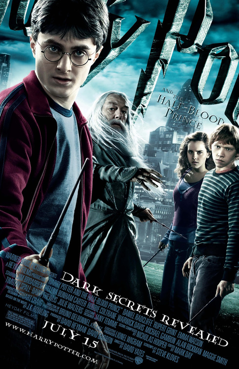
Harry Potter has always been pretty bad at this too. Nothing is level in this image.


In comparison

Mad Max Fury Road. Striking, Visually Cohesive.
b0eaa23cfd4e965276a59e1eb5a63a2c.jpg


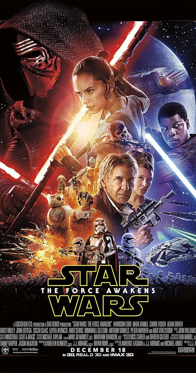
Star Wars The Force Awakens. Not without issues but not awful by any standard, Harkens back to the old posters. Fits in with the 6 previous box arts
MV5BOTAzODEzNDAzMl5BMl5BanBnXkFtZTgwMDU1MTgzNzE@._V1_UY1200_CR91,0,630,1200_AL_.jpg


It strikes me as insane that some of these make it to the public without anyone saying "this is shit try again"

Anything else this bad for big movies out there? Post 'Em
 

PixelPeZ

Member
Couple of my "Favorites":

Great film, great actors, what happened? Even when you go beyond the terrible photoshop, the concept is horrid, too!

p14569_p_v8_ah.jpg


Haven't seen the movie, but none of these people were in the same room. Hell, some of the heads weren't in the same room as the bodies.

enhanced-buzz-25696-1401928744-8.jpg


I see this around as it's a new one, and it's in the style of the older ones, but it really bothers me that the guys' eylines don't match up.

Bridget-Jones-online-image1.jpg


I'm sure there are a bunch more I can't remember right now, but the Groundhog Day one has stuck with me over the years as it's one of my favorite movies of all time and deserves better.

Edit: Damn, breaten with The Takers, but here's an alt Groundhog Day one, which isn't better:

groundhog-day-poster.jpg
 

ant_

not characteristic of ants at all
Often the final look is not decided by the artist or designer, but by business. Somewhere on the other side of these posters is a frustrated designer. Guaranteed.
 
NOTHING beats the atrociousness of the First Class posters

191430_195749240455540_170700836293714_553712_3837225_o.jpg
191430_195749243788873_170700836293714_553713_2329810_o.jpg
lmao what the fuck is this? This isn't what they actually used, is it?...

Mad Max posters are Godlike, fantastic designs.

I think the major problem is that often times you get great designers that get bogged down by an unoriginal, boring suit that doesn't know shit about design and asks them to change to what they want.
 

MMarston

Was getting caught part of your plan?
Adding to the issues OP noted with HP4's poster, HP6 also has the same issues but also a really dumb title placement.
harry_potter_and_the_half_blood_prince_ver19.jpg


I mean, it's dead obvious it's a Harry Potter movie, but cmon.
 
enhanced-buzz-17206-1401924350-8.jpg


I can understand the horse, but is it really that difficult to put a couple of people in an actual car and photograph it?

enhanced-buzz-18032-1401929346-4.jpg


Miley fades into the background, but it looks like they just cut Liam Hemsworth's head off in MS Paint.

enhanced-buzz-11552-1402017058-5.jpg


This speaks for itself.
 
Wish movie execs would be cool with bringing back illustrated covers. That kind of work under the right concept designer looks incredible.

Still cannot believe the Xmen posters are real.. HOW?!
 

border

Member
The Harry Potter and the Goblet of Fire is the only one that's truly hilarious. They are all supposed to be standing in a lake?
 

Anoregon

The flight plan I just filed with the agency list me, my men, Dr. Pavel here. But only one of you!
Oh boy time for one of my favourite subjects, terribly made movie posters.

I haven't even heard of any of these movies except for Best Friend's Girl. Wow.
 

Kinyou

Member
lg27GFr.jpg


Tv shows also often tend to have these terribly composed pictures with the cast lined up

vG17Oqa.jpg


(Prison Break)
 

J-Tier

Member
You'd think with the millions spent on these movies, the key art for posters and advertising would have a little more effort put into them. Not saying the designers are bad, but higher quality should be expected--which I'm sure most of these designers are capable of.
 
Status
Not open for further replies.
Top Bottom