• Hey, guest user. Hope you're enjoying NeoGAF! Have you considered registering for an account? Come join us and add your take to the daily discourse.

GAF Photography Assignment 80: Series

Status
Not open for further replies.

mrkgoo

Member
Theme: Series

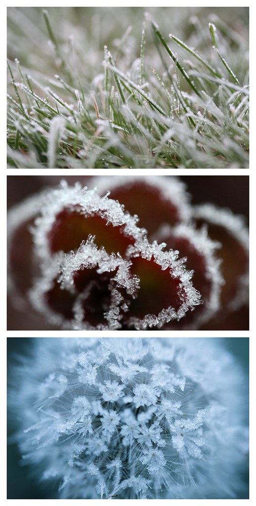
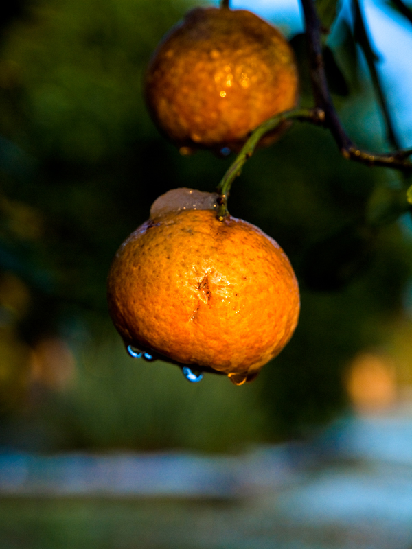
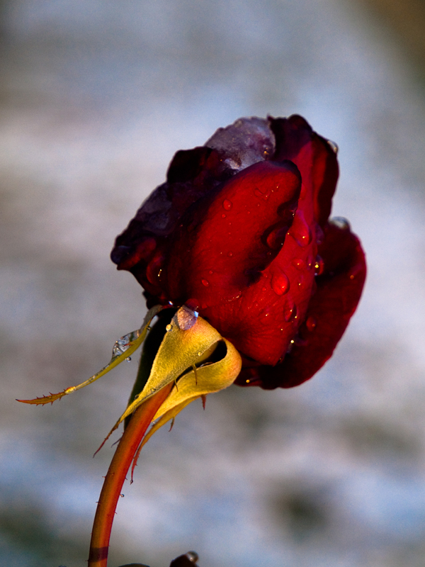
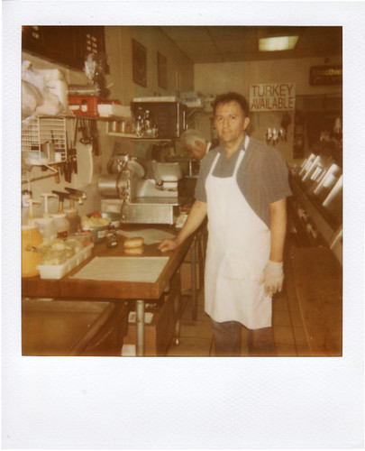
Pick a theme/subject and take at least 3 images to be presented as a photographic set or series. Can be a sequence of events, similar subjects, or even the same subject from multiple angles etc. Go nuts. The idea is to judge them as a whole. Presentation will be important - choose carefully how you choose to order them and present them. Because of this, perhaps we can be a more lax on the '800 on the long edge' rule, if people want to present images as one file.

Submissions are due by Sunday, December 13 at 11:59 PM PST.

Voting begins Monday, December 14 and ends on Tuesday, December 15 at 11:59 PM PST.

1) The theme can be interpreted as you see fit, but keep in mind others will be judging based on whatever criteria they see fit.

2) Only one photo per person, per assignment.
-- Photos must be taken during the assignment period.
-- Only photos to be posted in this thread are to be submissions.
-- You can change your submission by editing your post.
-- To avoid cluttering up the thread, please avoid quoting images.
-- Photos should be no larger than 800 pixels on the long edge.

3) One vote for your first choice (3 points) and one vote for your runner-up (1 point), which can be based on any criteria you see fit. You cannot vote for your own submission. Non-participants are also welcome to vote. Criticism/comments encouraged.

4) The "winner" should come up with a new theme/time period. Ties are broken first by the number of first choice votes, then by longest time since last win/thread start, then by whoever has the cheaper camera.

5) Have fun!

GAF Photography Assignment Threads FAQ
 

mrkgoo

Member
AlteredBeast said:
Question - are they going to be no more than 2400 pixels on the long edge all together or can we go nuts?

No hard and fast rules, but I suggest if you're going to make a super long photo, consider smallifying it and linking the large one - urge people to click it.

Also note to people, you can put a link behind an image by using the format:

[url=Link URL goes here][img]image URL goes here[/img][/url]
 

captive

Joe Six-Pack: posting for the common man
damn, this is going to be challenging to and possibly to vote for as well. Good theme.
 

aidan

Hugo Award Winning Author and Editor
Great theme!

Also, damn you, mrkgoo! We're tied again for the lead in wins! :lol
 

mrkgoo

Member
aidan said:
Great theme!

Also, damn you, mrkgoo! We're tied again for the lead in wins! :lol

I have no idea how many wins I have. I can count them on my own submissions ( have an album in iPhoto of my submissions), but I forget if I got them all. I can count which assignments I started, but I recall handing over one of them to someone else.

I think it's like 6 or 7.
 
Damn it! I don't think I can tackle this one...

Series, series, series?


I've got an idea! Time to take out the tripod!

:lol :lol :D:D :lol :lol
 

sc0la

Unconfirmed Member
Should have done this last year when I made movie from 431 still images on my dslr of me building a Lego star destroyer :lol
 

Dkong

Member
Congrats with the win mrkgoo! Damn, I didn't even think I'd get a lot of votes and in the end I got so close to winning an assignment haha. I like this theme too, I have lot's of idea's but the execution and especially finding the time to really capture the series that I want are going to be a problem I think.

By the way, how do those assignments statistics work, I've been wondering for a while now. Does Squirrel Killer have some kind of top secret database with everything ever posted in an assignment?
 
Dkong said:
By the way, how do those assignments statistics work, I've been wondering for a while now. Does Squirrel Killer have some kind of top secret database with everything ever posted in an assignment?
Pretty much.

Actually the database is still missing assignments 15-34, they're still only in the spreadsheet I used to keep. I've been meaning to get those into the DB so I can get back to the verbose stats I used to compile.
 

aidan

Hugo Award Winning Author and Editor
Squirrel Killer said:
Pretty much.

Actually the database is still missing assignments 15-34, they're still only in the spreadsheet I used to keep. I've been meaning to get those into the DB so I can get back to the verbose stats I used to compile.

Doooooooooooo it! I'm a whore for stats.
 

mrkgoo

Member
Thnaks people. I had a reply here before, now it's gone. Oh well, maybe imagining things.

DKong: Nah, your submission was super-strong, so I always thought it was a contender. Yeah, it was close, I was taken by surprise - it was the last first choice vote that threw me over. :D
 

mrkgoo

Member
Ok, I didn't really have this in mind when I made the thread, nor when I went out shooting this morning (actually, I went to shoot the sunrise, but it was completely foggy out).

When I got back and was looking at my harvest, these three just stood out to me and felt like they belonged. I especially liked how the third one turned out.

It maybe just a placeholder, or it might be my final submission. I'll see how the next couple weeks pan out for other ideas.

Click on through to get to a large version (1900x3750):

All images: EF-S 60mm Macro, f/2.8, 1/125s, iso1600.
 

aidan

Hugo Award Winning Author and Editor
Well, fuck. Way to discourage the rest of us from even giving this a shot, mrkgoo!

:lol
 

captive

Joe Six-Pack: posting for the common man
aidan said:
Well, fuck. Way to discourage the rest of us from even giving this a shot, mrkgoo!

:lol
Seriously. I liked these three as my submisson and then boom I see his, Fuuuu

All Images are ISO 400, Focal Length 60mm, f4.0
4161522280_e9a77b2f53_o.jpg

1/640
4161426660_b41bb958ca_o.jpg

1/400
4161522214_973100f332_o.jpg

1/640
 
I am really having a hard time with this assignment.

I am trying to tackle it from a true series approach but it's difficult! The idea I had didn't really pan out
 
mrkgoo said:
I have no idea how many wins I have. I can count them on my own submissions ( have an album in iPhoto of my submissions), but I forget if I got them all. I can count which assignments I started, but I recall handing over one of them to someone else.

I think it's like 6 or 7.
It's 7.* You handed #28 off to me after you won #27. Thanks, by the way, in case I forgot to say so at the time.

Also, I love this idea for a theme. I thought about using "Triptych" for a theme once, but I wimped out and did "Three" instead. If you look at the initial post, however, I changed the rules from "one photo" to "one entry" in hopes that someone would test the limits.
 

Forsete

Member
Here is a series of my cat.

4157538965_fb1da40df5_b.jpg

Bigger
Camera: Sony DSLR-A900
Exposure: 0.017 sec (1/60)
Aperture: f/8.0 (first pic is 2.8)
Focal Length: 40 mm
ISO Speed: 200
Flash: On, Fired
 

Dkong

Member
I've already seen them in the big thread, of course, but I have to say, beautiful pictures. It didn't dawn upon me the first time that you used a flash, could you please give some explanation on how you used it? I'm really inexperienced with using a flash and I don't know any theory, but I can think for myself so I'd like to know in what direction you aimed relative to the cat, and whether you used the omnibounce.
 

mrkgoo

Member
Squirrel Killer said:
It's 7.* You handed #28 off to me after you won #27. Thanks, by the way, in case I forgot to say so at the time.

Also, I love this idea for a theme. I thought about using "Triptych" for a theme once, but I wimped out and did "Three" instead. If you look at the initial post, however, I changed the rules from "one photo" to "one entry" in hopes that someone would test the limits.

Haha, thanks! I love your posts. So much subtle shenanigans going on. NEver noticed you changed it to 'entry'. I kind of lost track at one point where I had a huge lull in entries (I had to hunker down and complete a thesis).

As always thanks so much for keeping track of everything!
 

brerwolfe

Member
Dkong said:
I've already seen them in the big thread, of course, but I have to say, beautiful pictures. It didn't dawn upon me the first time that you used a flash, could you please give some explanation on how you used it? I'm really inexperienced with using a flash and I don't know any theory, but I can think for myself so I'd like to know in what direction you aimed relative to the cat, and whether you used the omnibounce.

i shot video for weddings occasionally and use these little light panels...the last wedding i shot, he photographer was running around with the same light panel on his 5Dmk2...it was super dark outside (7pm wedding in late november), so after looking at it, it made a lot of sense.

panel.jpg


the photographer said that it obviously helps because he can now see the picture before he takes it, he doesn't have to guess with the flash. constant light sources will probably become a huge thing, especially as the prices become more affordable. i think i'm going to get a 7D soon, i'll probably grab another one of these to stay with my kit.
 
Dkong said:
I've already seen them in the big thread, of course, but I have to say, beautiful pictures. It didn't dawn upon me the first time that you used a flash, could you please give some explanation on how you used it? I'm really inexperienced with using a flash and I don't know any theory, but I can think for myself so I'd like to know in what direction you aimed relative to the cat, and whether you used the omnibounce.
Strobist has some great posts on how to deconstruct a photo's lighting. Basically, look at shadows and reflections.

I'm guessing Forsete used an off-camera flash up and camera right with some sort of modifier. Look at the fourth photo, the light reflected in the cat's eye is definitely coming from above and looks to be a bit off axis to camera right. Also, the cat is looking at something, and I'd guess it's the flash. Another clue is the shadow of the cat's head. In the first three photos, there isn't one. In the fourth one, however, the cat has turned it's head, and in doing so, it's now casting a shadow on part of his body.

Of course, I could be wrong.
 
posting for phantomile co:

He doesn't care if he qualifies or not, he just liked the theme, and felt the need to do an assignment.

4171113738_cb773a3ba7.jpg


4170353987_819284b0e9.jpg


4171113000_bdc8e4520f.jpg
 

Rentahamster

Rodent Whores
Squirrel Killer said:
Strobist has some great posts on how to deconstruct a photo's lighting. Basically, look at shadows and reflections.

I'm guessing Forsete used an off-camera flash up and camera right with some sort of modifier. Look at the fourth photo, the light reflected in the cat's eye is definitely coming from above and looks to be a bit off axis to camera right. Also, the cat is looking at something, and I'd guess it's the flash. Another clue is the shadow of the cat's head. In the first three photos, there isn't one. In the fourth one, however, the cat has turned it's head, and in doing so, it's now casting a shadow on part of his body.

Of course, I could be wrong.
I think he bounced the flash up, with most of it reflecting off of the ceiling and the wall on the right.
 

Zyzyxxz

Member
nice, I like the theme he was going for.

Also those litepanels are damn expensive. I saw them in an article before and thought it was cool but I didn't expect them to charge so much for what just seems to be a bunch of lights that shine.
 

Rentahamster

Rodent Whores
Zyzyxxz said:
nice, I like the theme he was going for.

Also those litepanels are damn expensive. I saw them in an article before and thought it was cool but I didn't expect them to charge so much for what just seems to be a bunch of lights that shine.
Yep. Personally I think flashes are the way to go for dark photography since you are able to freeze action even with a long shutter speed.
 

hEist

Member
mrkgoo said:
Ok, I didn't really have this in mind when I made the thread, nor when I went out shooting this morning (actually, I went to shoot the sunrise, but it was completely foggy out).

When I got back and was looking at my harvest, these three just stood out to me and felt like they belonged. I especially liked how the third one turned out.

It maybe just a placeholder, or it might be my final submission. I'll see how the next couple weeks pan out for other ideas.

Click on through to get to a large version (1900x3750):
.

we got a winner!
 

mrkgoo

Member
Nice stuff coming in.

Thanks for the vote in confidence, but I'd like to remind people (and I hate to be the one to do this), but please don't post non-submissions until the assignment is over, and please don't quote images. Just to keep things tidy. :)
 

AlteredBeast

Fork 'em, Sparky!
Time to do a little critiquing (no offense, just trying to be helpful as far as my opinion goes)

mrkgoo - fantastic submissions as always. Your sharpness, coloration (especially the ice blue dandelion) and contrast are pretty much perfect. My one non-gripe is that the other two submissions are super zoomed in and cropped close. The first picture, I would have done the same with. In keeping this sort of crop, I would have emulated your previous assignment's submission by flipping the image so that the grass is falling to the right.

silverbullet1080 - These pictures make me think of a product guide from some videogame magazine from the mid 90's. The contrast is too high and too sharp in places and the wall behind each object really doesn't jive with me. I dislike the images how they are rotated on different angles as well.

phantomile co. - There isn't much to say about these. The medium is obiously holding you back, as you have taken some great shots. These are not great shots, though, other than for the "real" aspect of the expressions and setups. The burned corners on the pictures with the bleeding color throughout makes me think of my first camera, a Polaroid Sun 600. Whether that was on purpose or an inherent flaw in the film/photo paper it is a nice feature of the shots.

forsete - I like the lightness of these pictures. The sharpness and detail in these is great. The contrast of this picture is my favorite part. Unfortunately, your skin is reflected in the faucet on a couple shots which is a bit distracting. Just the right amount of bokeh on everything besides the first picture. You have a great looking cat, though. I dont see my old cat ever drinking from a fountain or faucet. :)

captive - I really really dislike the color of these pictures. Everything is so saturated and...wrong. I don't know what it is, but it is so saturated. The pictures themselves are awesome and everything else is awesome. The rose especially. Unfortunately, do to the color, I dislike looking at these pictures.

scythian empire - This is a kind of coloration that I enjoy. Everything isn't too intense and I really like the light coming through everything except for the second shot, where I think the sharp contrast really takes over everything (probably intended) I would really love to see full sizes of the first and third shots to see more detail. They look a tad on the sharp size at the resolution they are at right now. That first picture is one of my favorites I have seen in a long time in any of these assignments.
 

captive

Joe Six-Pack: posting for the common man
AlteredBeast said:
captive - I really really dislike the color of these pictures. Everything is so saturated and...wrong. I don't know what it is, but it is so saturated. The pictures themselves are awesome and everything else is awesome. The rose especially. Unfortunately, do to the color, I dislike looking at these pictures.
Interesting, would you say the rest from that same day(from my dog to the before the fire) picture are oversaturated? I'm not in front of my home PC, but I edited them all pretty much the same with minor adjustments to each. In particular the rose I adjusted white balance and the tone curve, but did not touch saturation.
I've always asked if my pictures look right as my monitor is not calibrated, just carefully matched to print outs i have had done. I like a little more saturation than what images straight out of the camera provides, however this could be thrown off if my monitor is flatter than it should be.
http://www.flickr.com/photos/35765710@N02/
 
AlteredBeast said:
scythian empire - This is a kind of coloration that I enjoy. Everything isn't too intense and I really like the light coming through everything except for the second shot, where I think the sharp contrast really takes over everything (probably intended) I would really love to see full sizes of the first and third shots to see more detail. They look a tad on the sharp size at the resolution they are at right now. That first picture is one of my favorites I have seen in a long time in any of these assignments.

Yeah, the sharpness and high contrast was intended on the second shot, and personal, it's my least favourite shot of the series. I tried to go for one image which would stand out from the other two as being central. I may change it around later on in the week if anything comes up. Thanks for the comments.

Here are the high res shots, since you asked. 1st and 3rd.
 

mrkgoo

Member
AlteredBeast said:
Time to do a little critiquing (no offense, just trying to be helpful as far as my opinion goes)

mrkgoo - fantastic submissions as always. Your sharpness, coloration (especially the ice blue dandelion) and contrast are pretty much perfect. My one non-gripe is that the other two submissions are super zoomed in and cropped close. The first picture, I would have done the same with. In keeping this sort of crop, I would have emulated your previous assignment's submission by flipping the image so that the grass is falling to the right.


Thanks for the comments. Funny you should mention, because the two main faults I have with my own submission are the same two you mention - the wider shot of the grass, as well as the leaning to the left. I chose not to flip the image, as I like to keep it as it was when I saw.

With a lot of my grass shots, I struggle to find the exact angle and what gets in the frame. I was in fact trying to get a leaning to the right shot when I was out there, as I think it's a more natural looking lean. That said, I think it creates a sort of balance with the red shot which leans down and to the left in a sort of opposite angle.

I was considering trying some crops of the grass, but none of them were that compelling - what made the image work is the multiple blades, and cropping them back to one didn't seem to do it for me. If you look at the quarterly threads where I posted the whole image, you'll notice that the way I framed it on its own is a 16:9, but I reverted to 3:2 for the series (and have since deleted the 16:9 version from my library).

Overall, I have noticed those two things you mention :loll, and they concerned me too, but in the end, I decided not to mess with the composition of the first shot. I wanted each to work as its own image, and the things I tried with the first one didn't work for me. I considered going back out and taking that one again, but I doubt I will.

For the record, heres what I did with the three shots:

Green: No edits, JPEG straight out of camera.
Red: No edits, but cropped to be closer.
Blue: A slight shift to the blue, and a slight increase in sharpness (probably not noticeable when down sized).
 

mrkgoo

Member
Scythian Empire said:
Re-edited my submission and realised how it follows the trend of mrkgoo's "green, red, blue" theme, which was un-intended :lol

:lol

Actually, the third picture stands out as being a little different from the other two because of that centre bright out of focus light in the others. But like I can make comment about one being slightly different from the other two :p
 

Timbuktu

Member
I'll put this up for now. I've posted a series of others in the photography thread. Been doing a lot of landscape recently. The only thing is that definition and texture was quite important for me, not sure if that shows...

4175592598_6db987fc42_b.jpg
 
Status
Not open for further replies.
Top Bottom