• Hey, guest user. Hope you're enjoying NeoGAF! Have you considered registering for an account? Come join us and add your take to the daily discourse.

GAF Photography Assignment 80: Series

Status
Not open for further replies.

BlueTsunami

there is joy in sucking dick
That's absolutely awesome, mrnorush

I had a similar idea but not as cool and I don't think I'll be able to execute (its been snowy and overcast).
 

Rentahamster

Rodent Whores
AlteredBeast said:
captive - I really really dislike the color of these pictures. Everything is so saturated and...wrong. I don't know what it is, but it is so saturated.
Oh? The color looks fine to me. To each his own, I guess.

mrnorush said:
series of 9 photos during a sunset put together
Hell yeah, that's awesome! I did a similar shot for a project a while back, but it was only 3 moments (sunrise, noon, night - hope to GOD no one touches your tripod, hahaha). I love your take on that and the way you composited them together. The composition showcases the Space Needle well, and I would have never thought about intentionally not feathering/blending the layers - I really like the solid transitions that give the shot a cool pattern to it.
 

captive

Joe Six-Pack: posting for the common man
Rentahamster said:
Oh? The color looks fine to me. To each his own, I guess.
This is what i was wondering. My monitor isn't calibrated but all the pictures i have had printed matched close enough for me.
I haven't had anything printed in a while and he had me worried that the monitor had adjusted or something.
especially since the overall picture saturation wasn't touched. The contrast is bumped a little. And some of the separate color channels are bumped but reds, pinks and purples are 0 or close to it.


mrnorush - that is a fantastic image. I also believe you could sell that if you wanted.
 

AlteredBeast

Fork 'em, Sparky!
It must just be me, then. Something about the coloration just grinds on my mind for some reason. They are really great shots, I just can't look at them.
 

Forsete

Gold Member
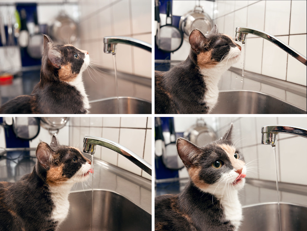
Dkong: Thanks. Well its not that technical, the flash was aimed up (mounted on the camera) and reflected off the ceiling/underside of cup-board and off the tiles. My cat was actually looking at the AF assist light which she saw on the wall at one point, wondering where it went. :D

AlteredBeast: Thanks, yes I agree about the reflection in the tap. I noticed it first when I was reviewing the pics on the PC, but by then my cat was up to something else. I got a bit of a FFFUUU face when I saw it. :)

mrnorush: Really great shot.
 
RSZ_0001ps-1.jpg


RSZ_0002ps.jpg


RSZ_0003.jpg


Canon 20D, 85mm 1.2L, ISO 400, 1/125 sec, f/2.0, flash
Canon 20D, 85mm 1.2L, ISO 400, 1/125 sec, f/2.5, flash
Canon 20D, 35mm 1.4L, ISO 400, 1/4 sec, f/4.0
 

aidan

Hugo Award Winning Author and Editor
ajtq10.jpg


Camera: Canon Rebel XT
Aperture: f/1.8
Shutter Speed: 1/4 sec
Focal Length: 50 mm
ISO Speed: 100

Click for Bigger

I had a whole series of nature-y shots, but after mrkgoo, captive and Scythian Empire, I just couldn't really compete with those. And then mrnorush came in and put the assignment in a chokehold. So I thought I'd have a bit of fun with some christmas lights and some creative presentation.
 

aidan

Hugo Award Winning Author and Editor
Rentahamster said:
Very nice topic, mrkgoo, it brought out a lot of creativity in everyone.

Yes! This has easily been one of my favourite topics to watch, given the creativity we've all invested in our submissions. Good job, everyone!
 

AlteredBeast

Fork 'em, Sparky!
Yeah, these assignment threads are really getting great again. :)

With that, a critique of the submissions I haven't talked about.

mrnorush - I have seen this type of idea shot before, years before and I loved it then and love it now. Great shots, really. Vegas is one of the better places on the earth if you are looking to get a sunset shot without getting a shot of the sunset, if you get my drift. :) I would love to see another 2 or 3 shots on the "still sun" edges of the picture, though that isn't completely needed. other notes: Why the different size cuts from each picture? Did you try reversing the order of the time, too? It might look cool to see the latest shot be on the outside and go backwards in time from there.

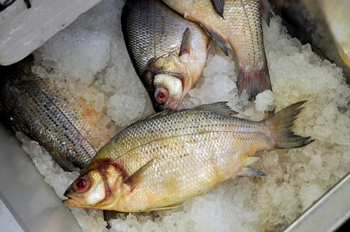
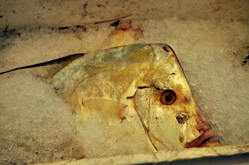
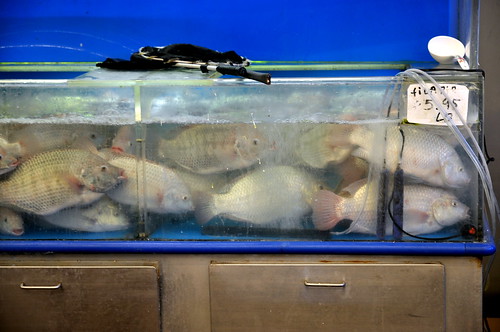
the_painted_bird - I really like the pop that your pictures have. Great sharpness and framing of the shots. I would love to see the eye in the middle of the first picture close-up. Those fish seriously live a sad life judging by that last shot.

evanylee - everytime I look at your last shot in the series, I think that guy has no pants on. I dislike that picture for the reason that his "hairy legs" distract me. The second shot is my favorite. The lighting all came together and the pose is great. The first shot would be great, but her hand really picked up a lot of the light and is a lot lighter than her perfectly lit face. A little distracting. The second to last picture is my least favorite. Really harsh light.

ronito - I love the dog's expression. It reminds me of the "why are you looking at me" expression that so many submissive dogs have. Unfortunately, the shots aren't as in focus as I would like them and they are pretty much 3 of the same picture.

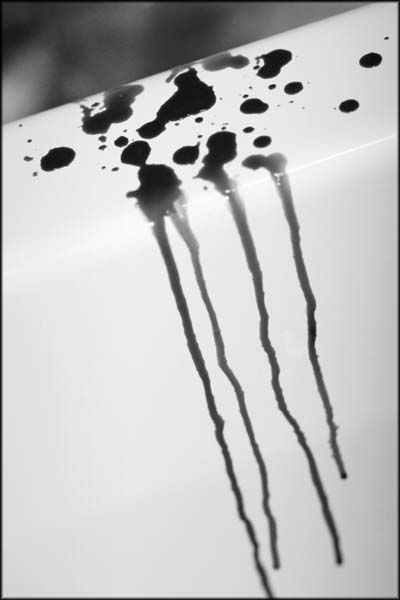
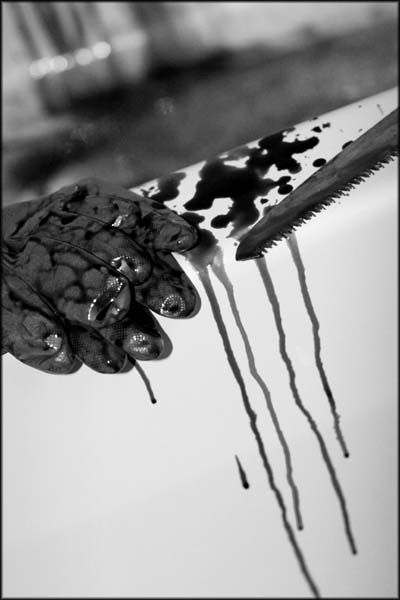
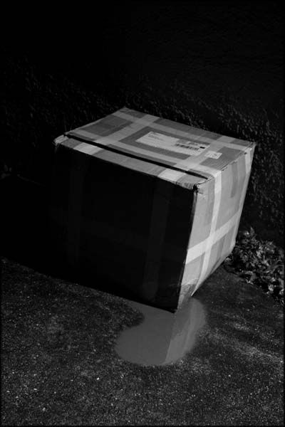
Lucky Forward - I can't argue with these pictures much. I think they are really well set up and shot. I would have preferred a little less set up, though. These shots seem as staged as they actually were. If the gloves were in the bottom of the tub (with a nice blood streak down the side) and the blade was placed more haphazardly, it would be much more believable. That said, the last picture is horrific but the blood looks a little pale in contrast to the blood running down the sides of the tub. Different liquid used? I love the noir, harsh lighting on the last picture.

aidan - The bloomed out of focus lights look nice, but I am not entirely sold on the polaroid-style presentation of the pictures. If they had been actual Polaroids that had then been photographed, I would probably be floored. Even more so if they had been mixed in with old "family" picture in a scatter. It would really have caught a very nostalgic Christmas vibe with me. As it is, I like the pictures, but the virtual polaroid setup doesn't really grab me with the shadows and layout. it might had the colors been subdued and the pictures looked old and shoddy, a la real polaroid shots.

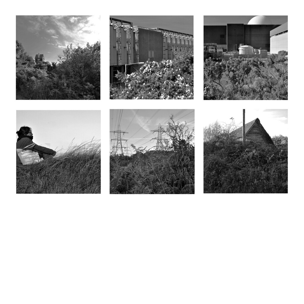
timbuktu - Love the texture in shots. You really nailed that aspect of it. The black and white was really well done, too as the photos all pop individually. Great look. Why the extra white space beneath the photos?


Camera model: Canon EOS Digital Rebel XTi
Lens: EF 50mm f/1.8 MkII
Post Processing: For the individual photos, mostly just crop and curves adjustments in GIMP. Composition done in GIMP as well.
What I was smoking: Series of Christmas ornaments, kept the warm white balance for atmosphere. Background color is actually the reference tone I pulled from this image (same light conditions) while testing color correction.
 

sc0la

Unconfirmed Member
2q8riom.jpg

14bjqrr.jpg

nbyuyv.jpg


Ornamental Kale (Flowering Cabbage) and Christmas lights. composition is haphazard because I forgot about this assignment until tonight and didn't have a chance to think about putting these together like mrnorush, or the b&w landscapes
 

sc0la

Unconfirmed Member
BTW mrnorush. I think that shot is amazing. the only thing that bothers me about it is that there is such a strong hold and rhythm towards the center that I would have cropped to center the space needle. Other than that that is an awesome series. Well done.

Was that taken from Kerry park?
 

AlteredBeast

Fork 'em, Sparky!
Fantastic late entries, guys :)

Squirrel Killer - Love the warmth of your photo. Captured the Christmas nostalgia for me perfectly. Love the tones and idea of your photo (had similar idea, but decided away from it).
Two of the ornaments look a tad out of focus, though. The snowflake and snowman both look awesome. The lighting from the Christmas lights and the warmth throughout is really great.

scola - love the color of this cabbage! So vibrant. Your bokeh is awesome, the depth of field on each picture with the sharpness, detail, and lighting really make these shots awesome. Doesn't matter if you ran out of time and didn't get to make a grandiose undertaking. These images really stand out.
 

AlteredBeast

Fork 'em, Sparky!
Thanks to all the participants! Happy Voting!

All the entries for this assignment:
mrkgoo said:
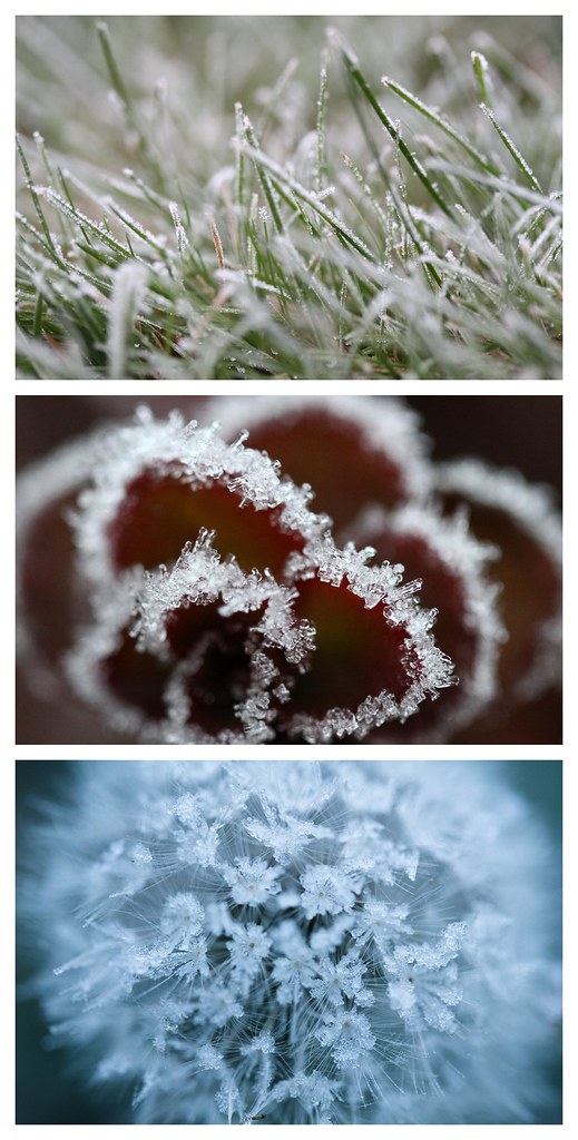
Click on through to get to a large version (1900x3750):

All images: EF-S 60mm Macro, f/2.8, 1/125s, iso1600.

captive said:
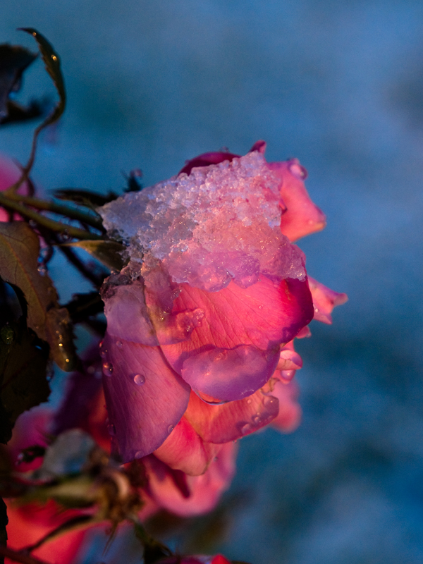
All Images are ISO 400, Focal Length 60mm, f4.0
4161522280_e9a77b2f53_o.jpg

1/640
4161426660_b41bb958ca_o.jpg

1/400
4161522214_973100f332_o.jpg

1/640

Forsete said:
4157538965_fb1da40df5_b.jpg

Bigger
Camera: Sony DSLR-A900
Exposure: 0.017 sec (1/60)
Aperture: f/8.0 (first pic is 2.8)
Focal Length: 40 mm
ISO Speed: 200
Flash: On, Fired

Madvillain said:
posting for phantomile co:
4171113738_cb773a3ba7.jpg


4170353987_819284b0e9.jpg


4171113000_bdc8e4520f.jpg

silverbullet1080 said:

AlteredBeast said:


Click for larger versions...

Scythian Empire said:
My submission for now (2nd edit).

10s7iuf.jpg

Timbuktu said:

mrnorush said:
series of 9 photos during a sunset put together
4175710154_15f9c5056b_b.jpg

the_painted_bird said:

evanylee said:

ronito's wife said:

Lucky Forward said:
RSZ_0001ps-1.jpg


RSZ_0002ps.jpg


RSZ_0003.jpg


Canon 20D, 85mm 1.2L, ISO 400, 1/125 sec, f/2.0, flash
Canon 20D, 85mm 1.2L, ISO 400, 1/125 sec, f/2.5, flash
Canon 20D, 35mm 1.4L, ISO 400, 1/4 sec, f/4.0

aidan said:
ajtq10.jpg


Camera: Canon Rebel XT
Aperture: f/1.8
Shutter Speed: 1/4 sec
Focal Length: 50 mm
ISO Speed: 100

Click for Bigger

Squirrel Killer said:


Camera model: Canon EOS Digital Rebel XTi
Lens: EF 50mm f/1.8 MkII
Post Processing: For the individual photos, mostly just crop and curves adjustments in GIMP. Composition done in GIMP as well.
What I was smoking: Series of Christmas ornaments, kept the warm white balance for atmosphere. Background color is actually the reference tone I pulled from this image (same light conditions) while testing color correction.

scola said:

...if there are any other entries within the next half hour, cool, I am just tired and wanted to post this before I went to bed. :)
 

Rentahamster

Rodent Whores
1st: mrnorush

For the reasons I stated in a previous post: Hell yeah, that's awesome! I did a similar shot for a project a while back, but it was only 3 moments (sunrise, noon, night - hope to GOD no one touches your tripod, hahaha). I love your take on that and the way you composited them together. The composition showcases the Space Needle well, and I would have never thought about intentionally not feathering/blending the layers - I really like the solid transitions that give the shot a cool pattern to it.


2nd: mrkgoo

Great series. Green-Red-Blue: great. Common theme of ice: great. Variety in the common theme of ice: great. This is a great exercise in a visual juxtaposition of varying colors, shapes, and patterns amidst a central theme of ice and frost. Very stimulating contrasts for the eyes to enjoy.

nitpicks - I think I would have liked the red image be the first in the series. That way it would keep the traditional RGB order. Also, the Red and Blue photos are round in character and I think the lines of the Green photo would be nice to have in the middle for separation. I can't really say for sure, though, unless I actually did rearrange it. I'm too lazy to do that myself, so take my nitpick with a grain of salt.

Oh yeah, I also like the nice white borders you have around the pictures. Nice and clean. And nature-y. I could see this framed and on my wall.


Random comments:

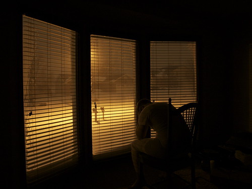
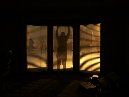
Altered Beast - First photo has the subject's head obscured by the wall. It messes up the silhouette a tad. Otherwise, nice idea, and great warm tones.

Scythian Empire - I always enjoy your use of backlighting and the toning and color processing you do to the pics.

evanylee - Nice work. A bit too many photos, IMO, however. Edit the number down, and try to tell a story or find a theme.

ronito's wife - Cute subject - but the one slow shutter speed is introducing lots of blur to the photos. You need more light. The photos are a bit too similar as well - especially the second and third one.

Lucky Forward - very awesome and creative. First and second photos are a bit too similar. Either change one of the two photos, or make the third photo be the same bathtub again, but with an additional element to the scene that gives meaning to the series, completes a story/narrative, or puts an ironic twist on the scene, implying a scenario that the reader didn't expect.

Squirrel Killer - good stuff, but I don't really like the way you arranged the photos. I know you're trying to make it into the shape of a Christmas tree, but in its current form without any borders, it looks a little plain.
 
I havent submitted any entries, so I dont know if my vote will count, but here is my layman's point of view anyways:

1st: Altered Beast

Beautiful photos... they just speak to me. Cant explain why, or in what way... but it feels like there is an interesting story there.

2nd: mrnorush

What a great concept, and so well executed too! I'd love for you to actually do more stuff like that... I think there is a chance of something amazing coming out with more pictures in that style put together in an album/portfolio.

3rd: Forsete

Very simple photos but they came out so well. Also, if that is your cat, it is beautiful. You should post more pics of her like mrkgoo does. Do you think the pics would have had more 'pop' if you used a shorter shutter speed and the water was 'frozen'? Just curious about your decision!

Also, mrkgoo, the best individual photo of this thread is your third one.

Great entries everyone, congratulations! :D
 
Gosh! Couldn't participate this time! Jeez

The shots are amazing! But I am putting heavy emphasis on the "series" aspect of the assignment so my choices might not be the usual suspects! Please don't killme

Anyway here is my voting

1st place MrNorush I love Seattle and I love the pictures! Very creative and it underscores the "series" aspect remarkably well! I would hang that picture from my wall.

2nd Place Timbuktu Damn you! That's kind of what I had in mind when thinking about the "series" requirement! But you pulled it off much much much better than I would ever do! You sir have my vote!

Special Mention: Forsete. That's just awful cute and very "series"ish
Special Mention: Altered Beast. Love the idea at first but I think the execution could have been much better
Special Mention Madvillian. I feel the pics feel a little bit too static as they don't flow as well. Maybe some other pics from the set would have added more flow.

Other Critique

mkgoo, captive and scythian empire. As always your shots are amazing! But I didn't feel your sets captured what I wanted from a "series" assignment. If you feel like you could explain to a newbie how this do capture a series I would be delighted to learn
SilverBullet1080, EvanyLee, Ronito's Wife, Aidan. Great shots but I don't think they capture a series progression.
The_Painted_Bird. I think you set your series backwards! I would have honestly liked it 10 times more if you'd organized your pics backwards.
LuckyForward. Great shots! Very very interesting idea and great composition but I felt shortchanged through the series, it made me feel like wanting to see more but couldn't. Not saying there is anything bad with it but it kind of frustrates my brain LOL
 

mrkgoo

Member
Hectorse: A photographic series does not necessarily mean it has to show a progression of time. A 'series' in this context is merely a set of photos that follow a same theme, in my case, frost on plants. Technically, even, they don't even have to follow a theme. They're referred to as a series because they are presented together. Just a collection of images, really.

Funny you should mention, though. I was concerned that it might get misinterpreted and tried to look up a definition before I posted it. I couldn't find a clear definition, so went with my gut. I was considering calling it 'Photographic Set', but 'Set', didn't sound flattering, and it's common for it to be referred to as a series. Well, I thought so at least. I tried to explain as best I could and give examples of different things people could try in the first post.

Rentahamster: Thanks for the comments. I'm well aware of the colour order I presented them in - I'm very happy that you and AlteredBeast pointed out the very things I mulled over for some time when I was compiling my entry. I always consider RGB as a sort of natural order. But why is that, I asked? There's nothing other than convention. I tried that very order, and for the exact reason of the spiky green in the centre threw me. I didn't like how it then weighted with the non-spkiy images book-ending the column of images. It may have looked 'balanced', but then it looked distinctly hourglass shaped or like a sandwich, meaning you lost the green grass entirely. As the lightest (thin) image, I placed it on the top, and the image with the most impact on the bottom to make an easy progression on the eyes, weighting towards the bottom.

Oh, and thanks for noticing the white borders! Again, the emphasis for this assignment for me was presentation. I actually remade my submission several times, each trying a different thickness of white border.

AlteredBeast: thanks for collating!

iamcool: heh, thanks for noticing my copious amounts of cat photos.

As for my votes, I'm going to have to think over this one. Great entries, but I definitely have my comments.

Thanks for submitting, and thanks for the comments!
 

Rentahamster

Rodent Whores
mrkgoo said:
I tried that very order, and for the exact reason of the spiky green in the centre threw me. I didn't like how it then weighted with the non-spkiy images book-ending the column of images. It may have looked 'balanced', but then it looked distinctly hourglass shaped or like a sandwich, meaning you lost the green grass entirely. As the lightest (thin) image, I placed it on the top, and the image with the most impact on the bottom to make an easy progression on the eyes, weighting towards the bottom.
Ah, I see. Like I said, I can't really say for certain unless I rearrange them, as I don't see my mind's eye doing it justice. I'll take your word for it that it looks better this way.
 

mrkgoo

Member
Rentahamster said:
Ah, I see. Like I said, I can't really say for certain unless I rearrange them, as I don't see my mind's eye doing it justice. I'll take your word for it that it looks better this way.

Definitely subjective. The centre image, I feel needs to have 'weight' or 'body' to it. You'll notice that tonally, the red one is the darkest. Thanks again for commenting. It really is great to know that I thought of the same things as you!
 

AlteredBeast

Fork 'em, Sparky!
1. mrnorush - fantastic idea and execution...can I get all 9 raw images? I would love to edit this in a few different ways/ "_

2. scola - Love the color and the bokeh.

Honorable Mention - mrkgoo - nearly perfect like always. Great shots.
 

captive

Joe Six-Pack: posting for the common man
hectorse said:
mkgoo, captive and scythian empire. As always your shots are amazing! But I didn't feel your sets captured what I wanted from a "series" assignment. If you feel like you could explain to a newbie how this do capture a series I would be delighted to learn
Thanks!
I wasn't quite sure how to approach it. I had some ideas like actually doing a time sequence with christmas lights, since i just hung mine. But it snowed in Houston, this was the earliest it had ever snowed in Houston, so I went out shooting and i ended up taking the three I took and decided my "theme" would be frost/snow/ice on the vegetation. I liked the sun setting at my back and the light hitting the three subjects with the melting ice on them.
Perhaps I should have done frost snow and the results on plants that aren't suited for ice and snow. I went back out just the other day and most of the three plants/flowers i took pictures of are all dead or deformed.

That said I'm still really new to all this so if the colors look off to you please tell me as my monitor is not calibrated and its a cheap-o one.


1) Mrnorush - fantastic idea, and great execution.
2) mrkgoo - Love the dandelion. You were my number one vote till mrnorush came along.

Aidan - very interesting I like it.
Lucky Forward - maybe i'm dumb, I dont get the sequence. I love the pictures each themselves, the first two in particular are very disturbing and have a kind of film noir effect going on. I've looked and looked i just dont get the connection, aside from mailing bloody body parts, which is disturbing. :lol
 

mrkgoo

Member
Votes last (haven't decided yet), comments first, in order of appearance:

mrkgoo: To be honest, I feel this is some of my strongest images, in particular the last one. It was near fluke too. I actually woke up to take pictures of the sunrise, but it was completely foggy out, so I went for a walk at 7am. Everything was frosty. I had been meaning to take some macro shots of frost, so this was a perfect opportunity. The first two photos are actually someone's lawn and garden area that I took some Autumn pictures (aidan: same place where I took some of those 'leaf with water' and some ant shots). It's a good place for it because the garden is just over waste height next to the sidewalk, so I can lean and take image without actually kneeling.

Later on, my mind was distracted (I think I was listening to a podcast) and I made a wrong turn down a street. I turned around and was about to back tracked when I looked down and saw the dandelion. I knew I wanted cooler images than I normally take, so instead of whitebalancing to the shade like I normally do, I used auto, which does turn out cooler.

It wasn't until I got back and really saw what I had captured. I really liked it. Looking at my other images, I knew it would make a good example for the assignment I had set. My greatest joy was actually reading rentahamster's and AlteredBeasts comments. The VERY things they were nitpicking over were things that I obsessed over as well - it was great to know I wasn't crazy and alone in my concern over minutiae.

(and to be honest, I always get a kick out of compliments, so thanks people!)

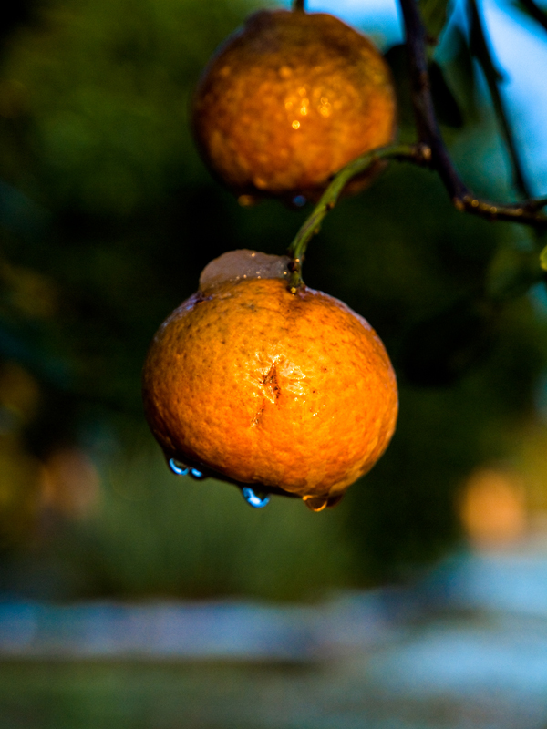
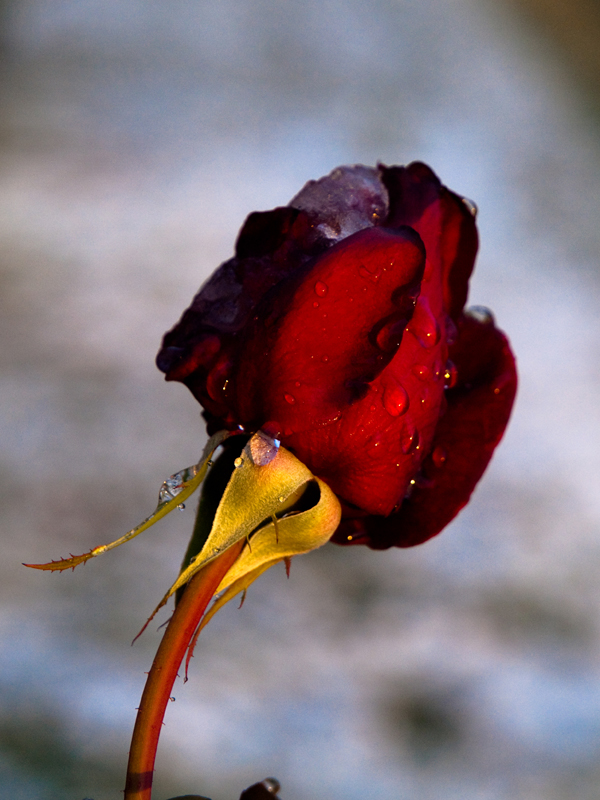
Captive: I get the theme, but I can't help but feel the images need something more. I do like the mix of colours you've got going, however. The top image is a strange composition - I'm not sure the empty space above the flower works. The citrus shot is also odd to me - it's so small in the frame, and directly in the centre. I like the last rose shot, it works well on its own. Maybe crop out the little bit on the bottom. As for presentation, I like to think that these would've worked with a nice white border. I seldom present images with a border, and many times they can look better for it. It was a reason why I chose this topic - to try and get people to think about presentation. Maybe it would've worked better with the images side by side (works well with portrait oriented images) as opposed to forcing people to scroll through them. When I post in the quarterly threads, I avoid putting two portrait images after one another if I can help it.

Forsete: I'm so glad you entered this, as I love it. Really clean shots, and there's definitely a story being told here, a progression of events. Honourable mention for sure! I I noticed that the first image has a narrower DOF, but I decided that it doesn't really detract from the sequence.

Phantomile: Great portraits - you really do capture images like there's a story to tell. I'm not sure I dig the burnt corners, which look a bit tacky to me - nearly like a click in effect (I don't know if it is or not, but that's the way it looks to me).

silverbullet1080: A very vibrant image! It doesn't show up for me within the thread for some reason, but I can click through. I'm not normally a fan of over use of 'tilt=dynamic', but it works well with your presentation. A very playful set. I want to say that it kind of irks me that there's an XBox controller within the Nintendo items, or that there's a DS within the console controllers, but it does look nice with the four images. The ii remote shot is particularly nice (even the angle it's placed at after the DS shot)! Well done.

AlteredBeast: I like how your series makes me pause to figure out what is going on. In particular, I like how you've ghosted the image in the last shot to really punctuate the series. I hope I'm guessing correctly, and that it represents frustration of staying indoors on a snowy day/night? Maybe just an overall mood, if not that (can be frustration, depression, boredom, or just time passing - I like thinking about it). Either way, I think each image is a strong image in its own right. Presentation-wise, I think the images are slightly too similar. I like the last image the most.

Scythian Empire: Nice, I like the blue/green/red - a good choice in order of presentation too. Expertly shot. Each image is strong, and the do fit a a similar style in shots. I really like the middle shot (can't remember the one you had before). Although I think the leftmost image sticks out against the other shots, I still like it a lot. It has simple lines, and a compelling mood. Honourable mention!

Timbuktu: I've always marveled at your simple, but effective landscapes. They look like they're easy to capture, but whenever I'm out, I don't get the same pleasant images. I like your choice of presentation. Unlike others here, I'm not getting the theme immediately. I appreciate your use of smaller images to suit the thread.

mrnorush: a striking image for sure! And definitely the most original in presentation of a series. At the risk of sour-grapes, however, I'm not gushing over it. I think it's very novel and well done, I can't help but feel it's slightly 'gimmicky' for my tastes. It gives me vibes of tacky rainbow colour fonts or something. The Space Needle not being in the exact centre of the effect kind of irks me. To be honest, it really is a great picture, but there's something that doesn't quite sit with me, and it's not any one thing, as in isolation, each element you've done very well. I think it's maybe the overall effect is a bit overwhelming. I still kind of want to vote for it, though...it's that initially striking.

the_painted_bird: I really like that first shot. In other circumstances, I may have voted for it. The lines of the ice box and the fish is really great! The other two pictures are less exciting to me. I think a bit of presentation could go a long way too - even if it's just separating the images with a blank line in between.

evanylee: I'm so jealous of people who can take portraits like this! Each one is very good. My only real complaint is that there are just too many images in one go. Maybe fine for an exhibition, but for this thread, perhaps a tighter selection of the best, or ones that go together would have more impact. I tend to find viewing too many images at once simply dilutes them, unless they are intended to be viewed as a whole.

Ronito's wife: Pets make for a great series! I kind of want to kick myself for saying, but the image quality kind of ruins these images for me. For these kinds of portraits, with the kind of equipment you're using, you either need better lighting, very awesome composition, or go for an effect or some punchy processing. As it stands, they look a bit snapshotish. Maybe a fancy presentation could help (maybe like aidan's or silverbullets would suit!). Partially, the way the 2nd and 3rd look so similar makes me want to see if those were separated by the 1st picture instead. Regardless, I always do enjoy your submissions, and I do like that last shot - the colourful lights in the background combined with that particular mount you captured is endearing (right now, I have your images open in another window, and I have him/her peaking around behind my current window).

Lucky Forward: Oh man, I love it. At first, I want to complain about the the two shots being so similar, but I can tell it's very deliberate to kind of set up the last. I'm trying to imagine the first scene with no splatter, and just start off clean. I think that would give a more even sequence. It's giving me a real 'Dexter' vibe... a little part of me is hoping it's chocolate sauce you used (I think that's what they used in 'Psycho'). An honourable mention, for sure. And to be a hypocrite, I think the portrait and scrolling to view kind of work here. :/

aidan: I keep finding myself being a bit of a hypocrite. Calling out mrnorush's image as being a bit gimmicky, and kind of holding it against it for that.... then seeing yours which is total gimmick, but me absolutely loving it. Could be brighter, but I'm generally fascinated by images made from dots - be it magazine prints, or RGB pixels on an LCD. I'm mesmerised by how the dots form. This is probably more digital art than photography in my books, but I still find it a compelling image. I'm not sure I want to vote for it, because it works mostly for how you've presented it, rather than the photos themselves...then again, the whole assignment was supposed to be about presentation.

scola: Wow! I love the colours here! Each images really works as a great shot on its own. Love the out of focus parts and how they really add to your compositions, both in colour and arrangement. The only thing is , I don't think they make a compelling set. The first two are a bit too similar (or the third too different). Same complaint about gaps between photos as well. Still, lovely, lovely images.

Squirrel Killer: I really like this. It's simple, but has a real charming, warming quality about it. I'm a little taken aback by the lack of gaps in between (it's makes the images kind of meld together in a jarring way), but I appreciate what you were going for (the tree shape and decorations). The colour of the background is really nice, and the idea it was the colour balance makes me smile. Each shot seems to be nicely taken too. Worthy of an honourable mention!


-------
So votes. I really don't know - there are a lot of strong images, and going back and reading my comments, I feel I've perhaps been a bit individually negative. Rest assured, I think all the submissions have been great! Hopefully people don't really take my comments too harshly. Sometimes, I don't even want to mention them, because a lot of my complaints are really small nitpicks, but if they were my shots, I'd like others to point them out. I'm not trying to say that my way is the only way, the best way or even a good way - just trying to give another perspective on it. So please take my comments with a grain of salt, and just see them as another subjective opinion.

Thanks to all - I really appreciate people giving this one a go. Hopefully people can see that a bit of presentation can change how an image is perceived.

Oh man, so hard to choose.
First Choice: Forsete. Very well presented, and each image captures a very unique moment. Each could be an individual photo, but together they also work really well.
Runner up: Lucky Forward. These perhaps don't work on their own, but I do like them as a set.

Super special mention: aidan. I actually had written up a 'first choice' vote for you, but decided that I couldn't vote for it because largely what I found compelling was the effect over the top. It could be nearly anything else under the effect, and I would probably find it just as striking. Well, maybe not - the way the colours combine with the dot effect is very visually impactful.... they do suit each other a lot, but I still think the effect is the winner here. If you see what I mean. Maybe I'm just overthinking this. Geez, it's late.

edit: Having a quick look back, there's at least one image in each set that I really like, and given the right assignment theme, I could vote for it. So in that vein, everyone gets an honourable mention.
 

Zyzyxxz

Member
I would give comments for all but I work 80 hours a week every week so I'm just gonna vote because I've no energy to critically comment each photo.

1st Mrnorush: Best use of the theme and it shows you really tried.

2nd: Altered Beast: I really like how it has some sort of narrative, I see the despair of winter in it which is something I'm going through as its starting to snow and get freezing cold.

runner up: Mrkgoo - really love the pictures and as always impressed by what your 7D can capture.
 

BlueTsunami

there is joy in sucking dick
1) mrnorush : Definitely love the concept, style, subject and execution. Perfect submission!

2) timbuktu: Something about this series that flows (harmony to it). The way the subjects are presented in the photographs are very subtle, which I really like. Lovely black and white renditions throughout.
 
1. mrnorush - The best submission for me by a long shot. The way you decided to go for a photo over time really captures the theme more than anyone in the thread. The tones are perfect, composition is perfect, the width of each frame is perfect. As BlueTsunami said...Perfect submission!

2. mrkgoo - I was mesmerised by your submission at first and thought it would go un-challenged, however it just falls short on the creative side compared to my first choice. Excellent flat tonality to go with the winter feel. You've really inspired me to take more "natural" shots such as these.
 
First - mrnorush - Brilliant shot that combines artistic vision with technical know-how and and post-processing trickery. My only nit is I agree with scola that the needle could have been perfectly centered in the darkest swath. Well done!

Runner-up - Forsete - Nice sequence nicely executed, lit well without screaming "flash!". Incredible detail on the big version. Nitpick, the background tilts this way and that, as evidenced by the lines of the tiles.

Comments:

mrkgoo - I always love your stuff, so allow me to take a few shots...the first shot doesn't do a lot for me because there's no real center of interest and I don't care for the OOF blades in the foreground, second shot seems like it's composed a little too tightly along the bottom edge, third shot...superb!

captive - Beautiful lighting on all of them, I think the third is most successful because you've eliminated the clutter from the background.

silverbullet1080 - Nice, I could easily see that in a magazine ad with text down the right side of the page. Nit...dust off that black controller.

Altered Beast - Great concept, but I wish you'd silhouetted your head against the middle of a window rather than losing it against the window frame in the first two.

Scythian Empire - Great lighting, I think the third one works best because the subject is strongest.

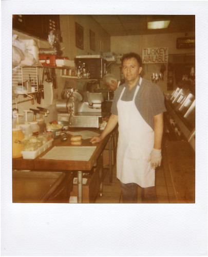
Timbuktu - Nicely done, but the shot of the person seems out of place in the series.

the_painted_bird - On the first two, I like the close-in composition and rich color, but on the second I wish you could have excluded the edge of the bin at the bottom and gotten all of the fish jaw. The third doesn't look like it belongs with the series as much, perhaps another close in shot through the side of the tank would have worked?

evanylee - Great portraits, but as a series I would leave out the two "couple" shots and just go with all vertical head-on shots (even though the horizontal couple shot is great individually.)

ronito's wife - I'm a sucker for dog shots and I like the way they fill the frame, but I would try to nail the focus on the eyes to make them pop as the center of interest.

aidan - Simple idea with a terrific presentation, bright, colorful, fun to look at. It might have worked better as a series if the sequence developed a bit, like starting wider and zooming in, or opening up the f-stop further with each shot.

Squirrel Killer - Warm, homey, sentimental...very nice! Nit...maybe the background could have been wider and extended below to make the tree shape of the arrangement stand out more.

scola - The first shot is fantastic, I like it a lot, but the other two just seem like weaker versions that don't advance the idea of a series.


AlteredBeast said:
That said, the last picture is horrific but the blood looks a little pale in contrast to the blood running down the sides of the tub. Different liquid used? I love the noir, harsh lighting on the last picture.

Rentahamster said:
Lucky Forward - very awesome and creative. First and second photos are a bit too similar. Either change one of the two photos, or make the third photo be the same bathtub again, but with an additional element to the scene that gives meaning to the series, completes a story/narrative, or puts an ironic twist on the scene, implying a scenario that the reader didn't expect.

I used diluted chocolate syrup which showed up very well for the bathtub flash pictures, but outside under the floodlight it did come out far lighter than I expected.

Rentahamster, I was trying to think cinematically with a tight shot of dripping blood, pulling back as the gloves and blade are placed down, then a quick cut to the next scene where we see the horrific end product.

captive said:
Lucky Forward - maybe i'm dumb, I dont get the sequence. I love the pictures each themselves, the first two in particular are very disturbing and have a kind of film noir effect going on. I've looked and looked i just dont get the connection, aside from mailing bloody body parts, which is disturbing. :lol

Not so much mailing, I was thinking more like a mob hit where the remains get left in a box somewhere in an alley as a warning...or maybe it's a serial killer's work...the viewer can fill in the blanks. What can I say...I'm not all sunshine and puppy dogs. :p
 

captive

Joe Six-Pack: posting for the common man
mrkgoo said:
Captive: I get the theme, but I can't help but feel the images need something more. I do like the mix of colours you've got going, however. The top image is a strange composition - I'm not sure the empty space above the flower works. The citrus shot is also odd to me - it's so small in the frame, and directly in the centre. I like the last rose shot, it works well on its own. Maybe crop out the little bit on the bottom. As for presentation, I like to think that these would've worked with a nice white border. I seldom present images with a border, and many times they can look better for it. It was a reason why I chose this topic - to try and get people to think about presentation. Maybe it would've worked better with the images side by side (works well with portrait oriented images) as opposed to forcing people to scroll through them. When I post in the quarterly threads, I avoid putting two portrait images after one another if I can help it.
Thanks for the recommendations. I noticed that too on the citrus one and the background being noisy. I had several pictures of it I may post the others to see what you guys think.
On the citrus being dead center, I have noticed this about my pictures, it's something that I've been trying to work on by other looking more closely as i take the picture or cropping the final result. I actually did crop the last rose picture to make a better composition.

I knew you had said "presentation matters" and i totally forgot. Oops.

Lucky Forward said:
captive - Beautiful lighting on all of them, I think the third is most successful because you've eliminated the clutter from the background.
Thanks. I'm glad you guys liked the lighting. These were all taken at sunset and i was a little rushed as the sun set faster than I would have preferred.
I definitely see what you and mrkgoo mean by noisy background.


Lucky Forward said:
Not so much mailing, I was thinking more like a mob hit where the remains get left in a box somewhere in an alley as a warning...or maybe it's a serial killer's work...the viewer can fill in the blanks.
They're fantastic pictures none-the-less
Lucky Forward said:
What can I say...I'm not all sunshine and puppy dogs. :p
Just mostly right? :p


I'd also like to thank Squirrel killer for keeping track of all the stats an tallying. After trying to tally just two people in the last assignment that shit is hard.
 

Xun

Member
First: Forsete
Second: mrkgoo

Honourable mention: mrnorush

I absolutely love all of the entries, so it was a hard one to pick!

I really wish I saw the topic sooner though, I would've loved to have entered into this! :(
 

Zeppu

Member
Hi photo-gaf!

Question, is there a "I'm a complete noob but would *really* like to start photography" thread?

If not, I'm a complete noob but would *really* like to start photography. Where do I start? I'm not in a position to buy an SLR, maybe something mid-range and see where I go.

Any suggestions whatsoever?
 

captive

Joe Six-Pack: posting for the common man
josephdebono said:
Hi photo-gaf!

Question, is there a "I'm a complete noob but would *really* like to start photography" thread?

If not, I'm a complete noob but would *really* like to start photography. Where do I start? I'm not in a position to buy an SLR, maybe something mid-range and see where I go.

Any suggestions whatsoever?
Camera equipment megathread
http://www.neogaf.com/forum/showthread.php?t=144603
Gaf Q4 photography thread
http://www.neogaf.com/forum/showthread.php?t=375729

There's already tons of helpful information in both, but feel free to ask questions.
 

Timbuktu

Member
1) Forsete - I wasn't not a cat person, but you have turned me around. Very crisp, clean, beautiful light and most importantly, it feels genuine and spontaneous too.

2) Lucky Forward - I love how you got me thinking about whether it is about crime scene photos or someone documenting their own work and had me comparing the details in the photos. I do wonder if what it would be like to have a slightly open box, or if the box is slightly to the side and the camera centering on the shadow it's casting.

Honarable mentions

mrnorush- impeccable in terms of taking an idea and executing it. Symmetry don't usually sit well with me though and maybe have the needle at the centre is a bit on the nose. Perhaps I've been watching too much Frasier.

Timbuktu - Nicely done, but the shot of the person seems out of place in the series.

In retrospect, I should have left out the two photos on the left in my series. I think I liked the floating house photo and the other one was somewhat included to make six. The other four has a more direct theme about energy and landscape. Thanks for the feedback guys! And thank you mrkgoo for a great theme. I haven't been in these assignments for a long time and it's great to see some many good photos for this one.
 

aidan

Hugo Award Winning Author and Editor
First - mrnorush: Like, seriously, dude. A fantastic idea, terrific execution and stop-you-in-your-tracks beauty. What more could we ask for?

Runner-up: mrkgoo - I had you penned in as the winner as soon as you posted. mrnorush made me change my mind, but that just speaks to the incredible quality of the entrants this time around. Beautiful. The only gripe I have is that this is one instance where gear is as much the culprit for these beautiful photos as anything else. Not many people on the forum have the gear to compete with photos like this.

Honourable Mention: Scythian Empire - Beautiful.

AlteredBeast said:
aidan - The bloomed out of focus lights look nice, but I am not entirely sold on the polaroid-style presentation of the pictures. If they had been actual Polaroids that had then been photographed, I would probably be floored. Even more so if they had been mixed in with old "family" picture in a scatter. It would really have caught a very nostalgic Christmas vibe with me. As it is, I like the pictures, but the virtual polaroid setup doesn't really grab me with the shadows and layout. it might had the colors been subdued and the pictures looked old and shoddy, a la real polaroid shots.

I would have loved to have done it with real polaroids, but don't have the equipment to pull it off. Really, I wasn't trying to emulate polaroid photos, but rather just present the photos in a more interesting way than most of the other submissions here.

mrkgoo said:
aidan: I keep finding myself being a bit of a hypocrite. Calling out mrnorush's image as being a bit gimmicky, and kind of holding it against it for that.... then seeing yours which is total gimmick, but me absolutely loving it. Could be brighter, but I'm generally fascinated by images made from dots - be it magazine prints, or RGB pixels on an LCD. I'm mesmerised by how the dots form. This is probably more digital art than photography in my books, but I still find it a compelling image. I'm not sure I want to vote for it, because it works mostly for how you've presented it, rather than the photos themselves...then again, the whole assignment was supposed to be about presentation.

[...]

Super special mention: aidan. I actually had written up a 'first choice' vote for you, but decided that I couldn't vote for it because largely what I found compelling was the effect over the top. It could be nearly anything else under the effect, and I would probably find it just as striking. Well, maybe not - the way the colours combine with the dot effect is very visually impactful.... they do suit each other a lot, but I still think the effect is the winner here. If you see what I mean. Maybe I'm just overthinking this. Geez, it's late.

You're not overthinking it at all. In fact, you more or less grasped what I was going for with the photo. Sometimes a photo can speak for itself, sometimes the presentation speaks volumes. Usually I wing my assignment, but this time around I had a very specific image in mind with the coloured circles and the polaroid frames. I'm glad you appreciate what I was going for, even if I couldn't win your vote!
 

Rentahamster

Rodent Whores
josephdebono said:
Hi photo-gaf!

Question, is there a "I'm a complete noob but would *really* like to start photography" thread?

If not, I'm a complete noob but would *really* like to start photography. Where do I start? I'm not in a position to buy an SLR, maybe something mid-range and see where I go.

Any suggestions whatsoever?
http://www.neogaf.com/forum/showthread.php?t=370635

Lucky Forward said:
Rentahamster, I was trying to think cinematically with a tight shot of dripping blood, pulling back as the gloves and blade are placed down, then a quick cut to the next scene where we see the horrific end product.
Oh, I see. In that case, I think it would have been better if the first shot was more zoomed in, or taken macro style.

It's just that the framing of the bathtub in the first and second photos is almost the same.
 
Status
Not open for further replies.
Top Bottom