Votes last (haven't decided yet), comments first, in order of appearance:
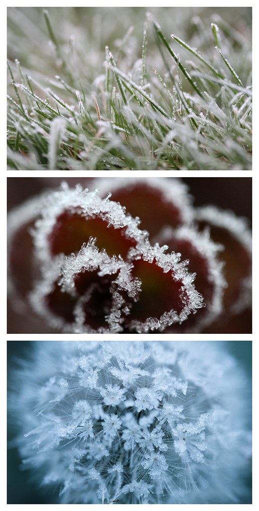
mrkgoo: To be honest, I feel this is some of my strongest images, in particular the last one. It was near fluke too. I actually woke up to take pictures of the sunrise, but it was completely foggy out, so I went for a walk at 7am. Everything was frosty. I had been meaning to take some macro shots of frost, so this was a perfect opportunity. The first two photos are actually someone's lawn and garden area that I took some Autumn pictures (aidan: same place where I took some of those 'leaf with water' and some ant shots). It's a good place for it because the garden is just over waste height next to the sidewalk, so I can lean and take image without actually kneeling.
Later on, my mind was distracted (I think I was listening to a podcast) and I made a wrong turn down a street. I turned around and was about to back tracked when I looked down and saw the dandelion. I knew I wanted cooler images than I normally take, so instead of whitebalancing to the shade like I normally do, I used auto, which does turn out cooler.
It wasn't until I got back and really saw what I had captured. I really liked it. Looking at my other images, I knew it would make a good example for the assignment I had set. My greatest joy was actually reading rentahamster's and AlteredBeasts comments. The VERY things they were nitpicking over were things that I obsessed over as well - it was great to know I wasn't crazy and alone in my concern over minutiae.
(and to be honest, I always get a kick out of compliments, so thanks people!)
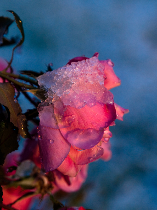
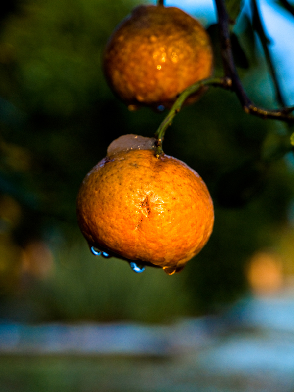
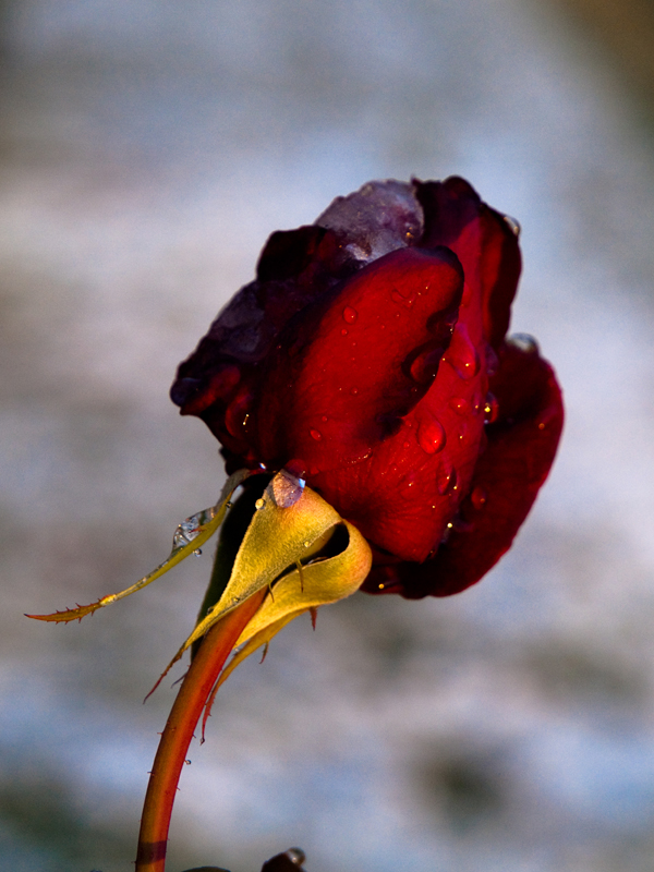
Captive: I get the theme, but I can't help but feel the images need something more. I do like the mix of colours you've got going, however. The top image is a strange composition - I'm not sure the empty space above the flower works. The citrus shot is also odd to me - it's so small in the frame, and directly in the centre. I like the last rose shot, it works well on its own. Maybe crop out the little bit on the bottom. As for presentation, I like to think that these would've worked with a nice white border. I seldom present images with a border, and many times they can look better for it. It was a reason why I chose this topic - to try and get people to think about presentation. Maybe it would've worked better with the images side by side (works well with portrait oriented images) as opposed to forcing people to scroll through them. When I post in the quarterly threads, I avoid putting two portrait images after one another if I can help it.
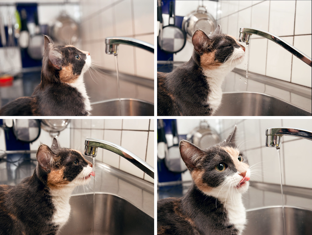
Forsete: I'm so glad you entered this, as I love it. Really clean shots, and there's definitely a story being told here, a progression of events. Honourable mention for sure! I I noticed that the first image has a narrower DOF, but I decided that it doesn't really detract from the sequence.
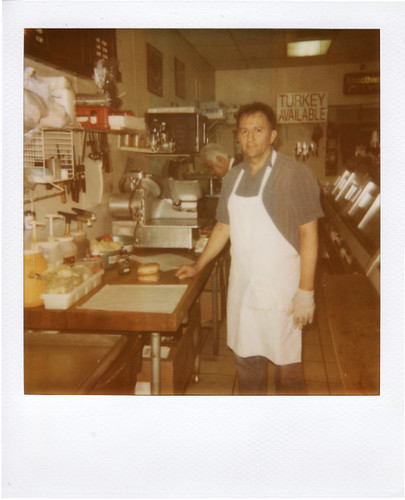
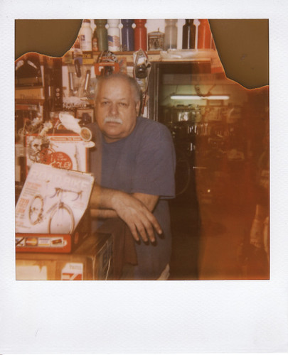
Phantomile: Great portraits - you really do capture images like there's a story to tell. I'm not sure I dig the burnt corners, which look a bit tacky to me - nearly like a click in effect (I don't know if it is or not, but that's the way it looks to me).
silverbullet1080: A very vibrant image! It doesn't show up for me within the thread for some reason, but I can click through. I'm not normally a fan of over use of 'tilt=dynamic', but it works well with your presentation. A very playful set. I want to say that it kind of irks me that there's an XBox controller within the Nintendo items, or that there's a DS within the console controllers, but it does look nice with the four images. The ii remote shot is particularly nice (even the angle it's placed at after the DS shot)! Well done.
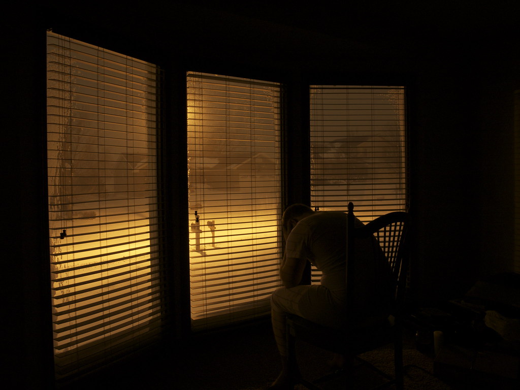
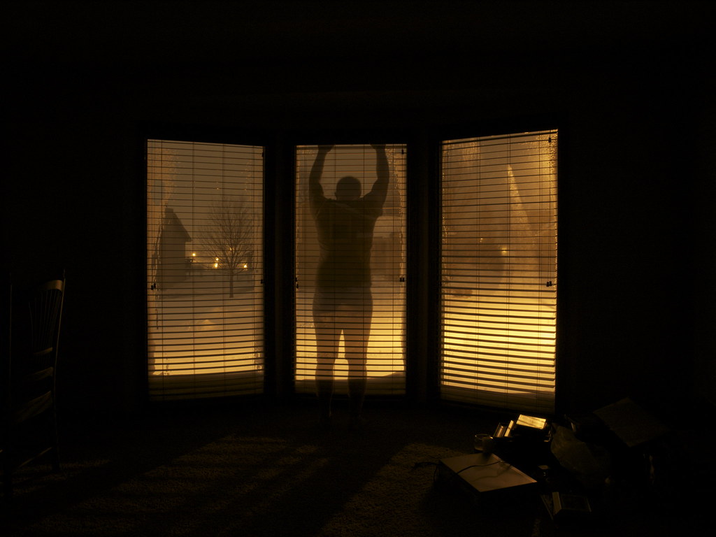
AlteredBeast: I like how your series makes me pause to figure out what is going on. In particular, I like how you've ghosted the image in the last shot to really punctuate the series. I hope I'm guessing correctly, and that it represents frustration of staying indoors on a snowy day/night? Maybe just an overall mood, if not that (can be frustration, depression, boredom, or just time passing - I like thinking about it). Either way, I think each image is a strong image in its own right. Presentation-wise, I think the images are slightly too similar. I like the last image the most.
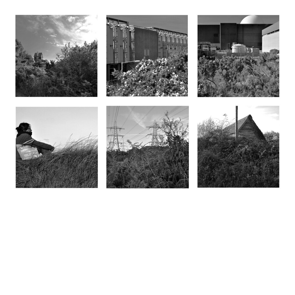
Scythian Empire: Nice, I like the blue/green/red - a good choice in order of presentation too. Expertly shot. Each image is strong, and the do fit a a similar style in shots. I really like the middle shot (can't remember the one you had before). Although I think the leftmost image sticks out against the other shots, I still like it a lot. It has simple lines, and a compelling mood. Honourable mention!
Timbuktu: I've always marveled at your simple, but effective landscapes. They look like they're easy to capture, but whenever I'm out, I don't get the same pleasant images. I like your choice of presentation. Unlike others here, I'm not getting the theme immediately. I appreciate your use of smaller images to suit the thread.
mrnorush: a striking image for sure! And definitely the most original in presentation of a series. At the risk of sour-grapes, however, I'm not gushing over it. I think it's very novel and well done, I can't help but feel it's slightly 'gimmicky' for my tastes. It gives me vibes of tacky rainbow colour fonts or something. The Space Needle not being in the exact centre of the effect kind of irks me. To be honest, it really is a great picture, but there's something that doesn't quite sit with me, and it's not any one thing, as in isolation, each element you've done very well. I think it's maybe the overall effect is a bit overwhelming. I still kind of want to vote for it, though...it's that initially striking.
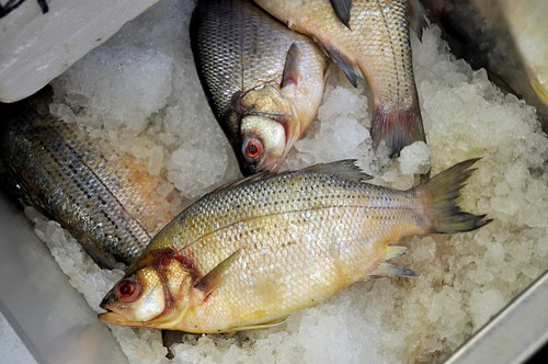
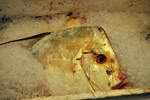
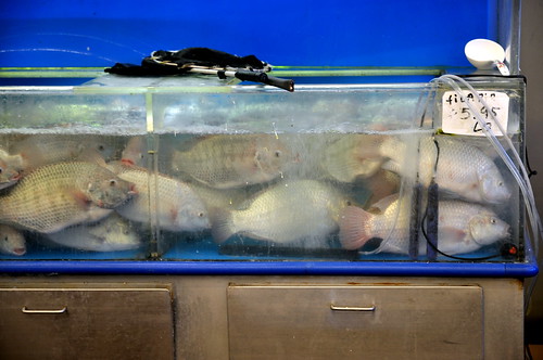
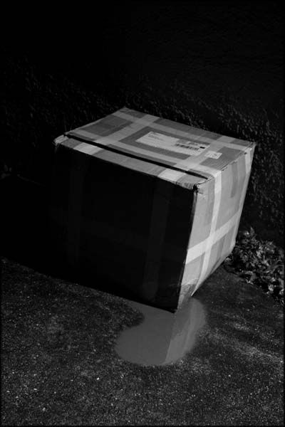
the_painted_bird: I really like that first shot. In other circumstances, I may have voted for it. The lines of the ice box and the fish is really great! The other two pictures are less exciting to me. I think a bit of presentation could go a long way too - even if it's just separating the images with a blank line in between.
evanylee: I'm so jealous of people who can take portraits like this! Each one is very good. My only real complaint is that there are just too many images in one go. Maybe fine for an exhibition, but for this thread, perhaps a tighter selection of the best, or ones that go together would have more impact. I tend to find viewing too many images at once simply dilutes them, unless they are intended to be viewed as a whole.
Ronito's wife: Pets make for a great series! I kind of want to kick myself for saying, but the image quality kind of ruins these images for me. For these kinds of portraits, with the kind of equipment you're using, you either need better lighting, very awesome composition, or go for an effect or some punchy processing. As it stands, they look a bit snapshotish. Maybe a fancy presentation could help (maybe like aidan's or silverbullets would suit!). Partially, the way the 2nd and 3rd look so similar makes me want to see if those were separated by the 1st picture instead. Regardless, I always do enjoy your submissions, and I do like that last shot - the colourful lights in the background combined with that particular mount you captured is endearing (right now, I have your images open in another window, and I have him/her peaking around behind my current window).
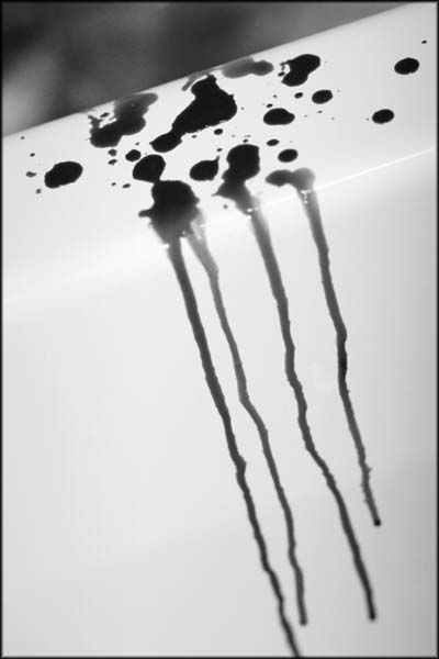
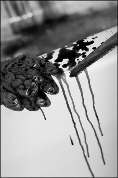
Lucky Forward: Oh man, I love it. At first, I want to complain about the the two shots being so similar, but I can tell it's very deliberate to kind of set up the last. I'm trying to imagine the first scene with no splatter, and just start off clean. I think that would give a more even sequence. It's giving me a real 'Dexter' vibe... a little part of me is hoping it's chocolate sauce you used (I think that's what they used in 'Psycho'). An honourable mention, for sure. And to be a hypocrite, I think the portrait and scrolling to view kind of work here. :/
aidan: I keep finding myself being a bit of a hypocrite. Calling out mrnorush's image as being a bit gimmicky, and kind of holding it against it for that.... then seeing yours which is total gimmick, but me absolutely loving it. Could be brighter, but I'm generally fascinated by images made from dots - be it magazine prints, or RGB pixels on an LCD. I'm mesmerised by how the dots form. This is probably more digital art than photography in my books, but I still find it a compelling image. I'm not sure I want to vote for it, because it works mostly for how you've presented it, rather than the photos themselves...then again, the whole assignment was supposed to be about presentation.
scola: Wow! I love the colours here! Each images really works as a great shot on its own. Love the out of focus parts and how they really add to your compositions, both in colour and arrangement. The only thing is , I don't think they make a compelling set. The first two are a bit too similar (or the third too different). Same complaint about gaps between photos as well. Still, lovely, lovely images.
Squirrel Killer: I really like this. It's simple, but has a real charming, warming quality about it. I'm a little taken aback by the lack of gaps in between (it's makes the images kind of meld together in a jarring way), but I appreciate what you were going for (the tree shape and decorations). The colour of the background is really nice, and the idea it was the colour balance makes me smile. Each shot seems to be nicely taken too. Worthy of an honourable mention!
-------
So votes. I really don't know - there are a lot of strong images, and going back and reading my comments, I feel I've perhaps been a bit individually negative. Rest assured, I think all the submissions have been great! Hopefully people don't really take my comments too harshly. Sometimes, I don't even want to mention them, because a lot of my complaints are really small nitpicks, but if they were my shots, I'd like others to point them out. I'm not trying to say that my way is the only way, the best way or even a good way - just trying to give another perspective on it. So please take my comments with a grain of salt, and just see them as another subjective opinion.
Thanks to all - I really appreciate people giving this one a go. Hopefully people can see that a bit of presentation can change how an image is perceived.
Oh man, so hard to choose.
First Choice: Forsete. Very well presented, and each image captures a very unique moment. Each could be an individual photo, but together they also work really well.
Runner up: Lucky Forward. These perhaps don't work on their own, but I do like them as a set.
Super special mention: aidan. I actually had written up a 'first choice' vote for you, but decided that I couldn't vote for it because largely what I found compelling was the effect over the top. It could be nearly anything else under the effect, and I would probably find it just as striking. Well, maybe not - the way the colours combine with the dot effect is very visually impactful.... they do suit each other a lot, but I still think the effect is the winner here. If you see what I mean. Maybe I'm just overthinking this. Geez, it's late.
edit: Having a quick look back, there's at least one image in each set that I really like, and given the right assignment theme, I could vote for it. So in that vein, everyone gets an honourable mention.