

All I can think of when I see the spiral hallway is "Welcome to wonderland, Alice" and Cheshire Cat.
-
Hey, guest user. Hope you're enjoying NeoGAF! Have you considered registering for an account? Come join us and add your take to the daily discourse.
You are using an out of date browser. It may not display this or other websites correctly.
You should upgrade or use an alternative browser.
You should upgrade or use an alternative browser.
New Majora's Mask 3DS vs N64 side by side graphics comparison
- Thread starter chadboban
- Start date
I like these a lot. The parts where they re-envision stuff looks nice.
Circle Pad Pro
Wow haven't used my CPP on my XL since Revelaitons.
bequietdrive
Member
Neever played this game, but now I can't wait.
Yep, the darkness and atmosphere is still fully intact in the 3DS. The spirit is all there, it's just much more interesting to look at now.Watching the actual footage makes me lean totally towards the 3DS.
It's great to see the Zelda team finally realize their artistic intent with this definitive version of the game.
")
Master Yoshi
Member
Looks like they spent alot of time making a N64 game look like a really good original xbox game. Nintendo can you please put out a 2014 quality system in 2016.
Get out.
Nice! Thanks for this, will add to the OP
All I said is that desolate and muddy worlds do not exist entirely due to artistic intent, which was the implication of the post I was quoting. The image I included was an example of how some of the changes were certainly in keeping with the spirit of the game, and the muddiness was not something they necessarily wanted.
You can want the game to look just like the original, I only caution against the notion that anyone can claim the artistic decisions made in that game were not heavily constrained by hardware. You may have formed a personal connection with the game based upon it being exactly as it was, but that in no way obligates the developers to keep it that way, especially when they've done such an excellent job of keeping the spirit of the game in their enhancements so far. There has been a lot of talk from people about the original intent that went into Majora's Mask, what the game "is," how it's being "compromised," but this slavish adherence to the most superficial elements needs to stop. When we start elevating such minor elements as infallible and untouchable, we miss entirely what actually mattered about the original game, and skirt with the fringes of legit lunacy.
Your writing style is awesome
Excellent points too, I completely agree.
This reminds of OoT 3D pre-release; some people thought the game had a blanket yellow tint due to a screenshot/footage of sunrise.
The only change that was (imo) worse was removing the blood stains from the bottom of the well (and possibly some areas in the Shadow temple?).
Elfforkusu
Member
My body is so ready.
We need a Master Quest mode where you play as Fierce Deity Link through the whole game, and instead of Epona, you ride Goht.
Also, at the end you slice the moon in half, the two halves falling and destroying Termina, and you don't even care.
Only way they could possibly improve this game.
Also, at the end you slice the moon in half, the two halves falling and destroying Termina, and you don't even care.
Only way they could possibly improve this game.
Mihael Mello Keehl
Banned
DAMNThe 3DS version looks better in every way. Probably my favorite change is Goht:
N64 Poop Smudge Peasant:

3DS Glorious Master Race:
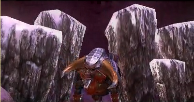
You think that's sexy, may I direct your attention to Post #415DAMN
Glorious gifs of Goht, courtesy of based Chadboban:

I can't even begin to describe how excited this makes me.
Goht is the... erm, GOAT Zelda boss.
Lol. What are you doing Link? xD Kid ran right into the center to get ran over.
Skel1ingt0n
I can't *believe* these lazy developers keep making file sizes so damn large. Btw, how does technology work?
Glorious gifs of Goht, courtesy of based Chadboban:

I can't even begin to describe how excited this makes me.
Goht is the... erm, GOAT Zelda boss.
DAMN!!!
Majora's Mask is the only Zelda game in my personal Top Ten. Mom bought this - AND an expansion pack... AND the strategy guide for my 6th grade self. Awesome memories.
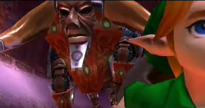
I just love the idea of a giant clockwork bull, idling in a cave, a frozen piece of tech... suddenly lurching to life with unholy steam power!
His name ain't Buhl!
LOL! Btw, neat bit of Goht trivia -- his name apparently comes from the German word for the sound a falling tree makes, or something to that effect. Like their version of "timber!" Or at least, I recall reading this in an interview with the localization lead, in an old issue of Nintendo Power.His name ain't Buhl!
This will forever annoy me. I remember hearing the beautifully updated music during the trailer (which eventually appeared during the end credits), and wishing the entire soundtrack would get that treatment.
Damn. I wish they'd just re-orchestrate the music rather than... "remake" the music to sound exactly like it did on the N64. I mean, if they're already going to change a bunch of stuff from the original, might as well remix the music too.
Ideally, there would be a way to play the original music as well as a new, remixed soundtrack. Think the GB Sounds item in Pokemon Heart Gold/Soul Silver that would start playing the Gameboy versions of the soundtrack. A jukebox in the Milk Bar, perhaps? Or an additional ability for a mask?
/dream
DieNgamers
Member
Some nitpicky thoughts because MM is one of my favourite games of all time and I played it too much:
+ nice framerate, it also looks smooth in general
+ updated models
+ portable Majora's Mask in 3D? Oh yeah!
- Too much purple (spinning tunnel scene, sky at night, creepy majora shaking-effect at the beginning, general lighting)...Why would they do that?
- New Link looks good but also kinda dead to me. The old face hat more "soul". (Maybe I'm just old, that's probably it.)
- the new cartoon-y moon
Lol. What are you doing Link? xD Kid ran right into the center to get ran over.
He learned his evasive maneuvers from watching Prometheus.
dampflokfreund
Banned
- Too much purple (spinning tunnel scene, sky at night, creepy majora shaking-effect at the beginning, general lighting)...Why would they do that?
- New Link looks good but also kinda dead to me. The old face hat more "soul". (Maybe I'm just old, that's probably it.)
- the new cartoon-y moon
Because purple is part of Majoras Mask atmosphere.
Was it revealed before that song of double time now lets you choose which hour to skip to?
https://www.youtube.com/watch?v=u0kIDSbrgwo#t=890
Personally it will save so much time when going for completion.
https://www.youtube.com/watch?v=u0kIDSbrgwo#t=890
Personally it will save so much time when going for completion.
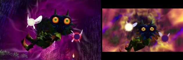
I love the addition of dynamic lights emanating from the fairy on the 3DS version.
Is it just me, or does MM 3D version look like a way bigger upgrade than OoT 3D was?
DieNgamers
Member
Because purple is part of Majoras Mask atmosphere.
It wasn't a big part of the MM I played...The original was always quirky and colorful in its own freaky way. Oh well. It's not that important, the overuse of purple just feels a bit off.
Doczu
Member
I love the addition of dynamic lights emanating from the fairy on the 3DS version.
Is it just me, or does MM 3D version look like a way bigger upgrade than OoT 3D was?
They did have a lot more time to tinker with the graphics. They had a ready engine from OoT3D, jst like the original Majora looks better than OoT because of having a foundation to build on, they didn't start from scratch.
Purple is kind of Majora's color. The spinning tunnel scene probably has purple fog to go with the purple fog they added in the scene before it. It fits with the whole deku theme of the area and makes it feel more like a place rather than trees floating in a void.Some nitpicky thoughts because MM is one of my favourite games of all time and I played it too much:
+ nice framerate, it also looks smooth in general
+ updated models
+ portable Majora's Mask in 3D? Oh yeah!
- Too much purple (spinning tunnel scene, sky at night, creepy majora shaking-effect at the beginning, general lighting)...Why would they do that?
- New Link looks good but also kinda dead to me. The old face hat more "soul". (Maybe I'm just old, that's probably it.)
- the new cartoon-y moon

Here's a comparison of 12:30AM of the first day:
And here's 2:22AM on the first day:
Looks pretty much like a night sky.
Link's old face was more static. He's more expressive now.
But once again, it's not about the textures, but how it looks overall or the impression it gives you. And I'm pretty sure N64 computed a variety of colors than brown.
He is right, however. The N64 can only do vibrant colors if you don't use atmospheric effects like fog, light shafts, overlapping cloud layers and so on. As soon as you do, it becomes muddy and unsaturated due to the limited blending capabilities.
nkarafo
Member
These 3 are exactly my nitpicks so far. Haven't played the game so i don't know if there are more, but these are the ones that bother me already. Especially the moon face. This is not just a detail, the omnipresent moon and the way it looks is kinda important for this game.- Too much purple (spinning tunnel scene, sky at night, creepy majora shaking-effect at the beginning, general lighting)...Why would they do that?
- New Link looks good but also kinda dead to me. The old face hat more "soul". (Maybe I'm just old, that's probably it.)
- the new cartoon-y moon
The old moon is the one that looks goofy - a tiny flat face on a perfectly round body.These 3 are exactly my nitpicks so far. Haven't played the game so i don't know if there are more, but these are the ones that bother me already. Especially the moon face. This is not just a detail, the omnipresent moon and the way it looks is kinda important for this game.
The new one with its ear-to-ear snarl and gnarly nose looks MUCH creepier.
nkarafo
Member
For younger children maybe.The new one with its ear-to-ear snarl and gnarly nose looks MUCH creepier.
For me the old one looks much creepier and unsettling because it looks weirder and has an emotionless stare. Because its a huge rock, not a person.
For younger children maybe.
For me the old one looks much creepier because it looks weirder and has an emotionless stare.
I was 11 back when Majoras Mask first came out and I still prefer the new design.
Actually, I agree with this:
The new Moon looks like it's genuinely pissed off. The old Moon looks like it just shit itself.
New moon all day every day. Thanks.
nkarafo
Member
Looks like a ghoul/monster from a ghostbusters cartoon or Scooby Doo, so no thanks for meNew moon all day every day. Thanks.
Looks like a ghoul/monster from a ghostbusters cartoon (the one with the monkey member), so no thanks for me
Cool, play the original and enjoy 17fps
nkarafo
Member
Being 17fps has absolutely nothing to do with how the moon rock looks : /Cool, play the original and enjoy 17fps
Also i never said i won't play the remake.
Being 17fps has absolutely nothing to do with how the moon rock looks : /
No. But theres nothimg you can do. The new design is here now, either deal with it or don't play it.
He learned his evasive maneuvers from watching Prometheus.
Haha, yeah!
The effect for when Skullkid curses Link isn't as cool. I miss the blue veiny things. Also, the animation for the Song of Soaring is pretty disappointing, the assets just kind of pop in and out of existence.
>___>
Haha, yeah!
The effect for when Skullkid curses Link isn't as cool. I miss the blue veiny things. Also, the animation for the Song of Soaring is pretty disappointing, the assets just kind of pop in and out of existence.
>___>
Skullkid cursing Link is a lot better now IMO. There's a lot of things I don't like about this remake, but that's not one of them.
Crossing Eden
Hello, my name is Yves Guillemot, Vivendi S.A.'s Employee of the Month!
Yes they can, in fact, we now have the technology to more accurately render one because the hardware is much better and flexible. Also don't think anyone should talk about artist intentions when the devs of the remake are much more likely to have discussed these things with the original devs and concept themselves for hours on end during the development cycle about how it should look, what should be added, what should look similar but with higher texture quality etc., especially since they aren't entirely limited by the tech compared to back then. It's no coincidence that not some things look the same and some things don't and I find it disrespectful to the devs and original artists to tell them that no they're wrong and that everything should look the same but with higher quality textures when some scenes clearly benefit from added effects, like the original foggy forest scene now actually looking like an actual foggy forest.Because now that we have great graphics, desolate/muddy areas that evoke emptiness can't exist. All games must have detailed areas with lots of colors and visual effects. Because who cares about art direction. We just want shiny graphics.


Wanna know why it does? Because of better technology, using better technology is not a bad thing by any means and i'm positive that the devs are grateful that they have it at their disposal.
pinkurocket
Member
The remade graphics look amazing. The use of bright colors is so striking, it really offsets the dark undertone of the game.
I think the problem usually ends up being better graphics = less imagination.
You had to use your mind a bit in older games. I'd say most horror games were scarier with crappier graphics simply because they were so obscure, I'd end up projected unholy thoughts onto every creepy thing I saw.
Human paranoia/imagination took up a chunk of the experience. That's basically why it's not going to be good enough for a lot of people.