-
Hey, guest user. Hope you're enjoying NeoGAF! Have you considered registering for an account? Come join us and add your take to the daily discourse.
You are using an out of date browser. It may not display this or other websites correctly.
You should upgrade or use an alternative browser.
You should upgrade or use an alternative browser.
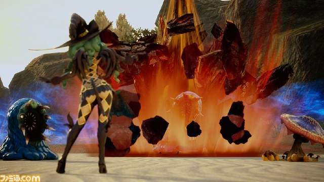
Star Ocean 5 screens (Now in "HD"!)
- Thread starter SolidSnakex
- Start date
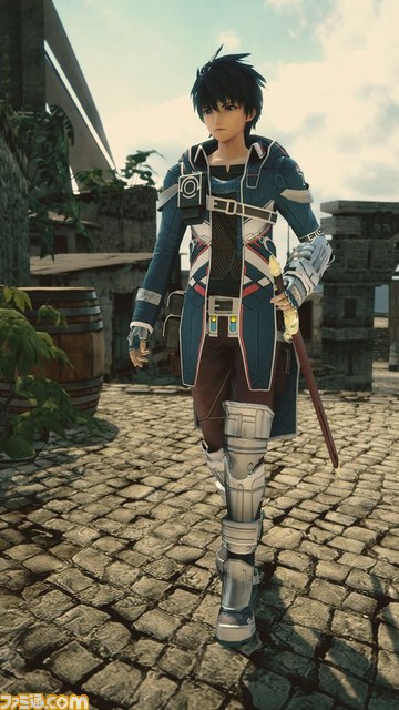
The eyes seem further away from the nose than it should be.
In my opinion its the guy's face that looks scrunched the fuck together. I like the girl's face quite a bit.
Looks hype as hell. Yes, the character design is questionable, but frankly as a lifelong dedicated save-the-world console JRPG fan I'm not ashamed to admit I've lowered my standards considerably in the past decade. I've had to; there isn't much that calls out to me.
Star Ocean 5 is calling out to me. Maybe it wouldn't have in 2001 (well, in 2001 I'd be asking how they managed to make Spirits Within into a game, but you know what I mean) but in 2015? Yes please, I'll take three.
Also, dat effing skybox. Look at those clouds. Look at them.
Star Ocean 5 is calling out to me. Maybe it wouldn't have in 2001 (well, in 2001 I'd be asking how they managed to make Spirits Within into a game, but you know what I mean) but in 2015? Yes please, I'll take three.
Also, dat effing skybox. Look at those clouds. Look at them.
Go_Ly_Dow
Member
yeah...not so hyped anymore lol
Its Star Ocean. What did you expect? Haha.
Its always been a bit b-tier. Still very enjoyable none the less.
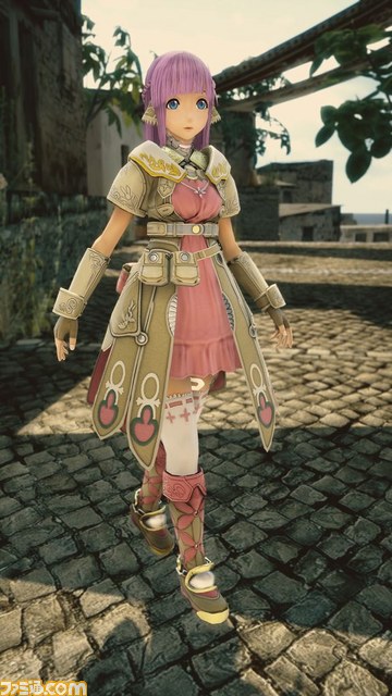
There is something way off about the girl's face.
The main girl of a Star Ocean game has a hilariously derpy face?

I'm noticing a trend here...
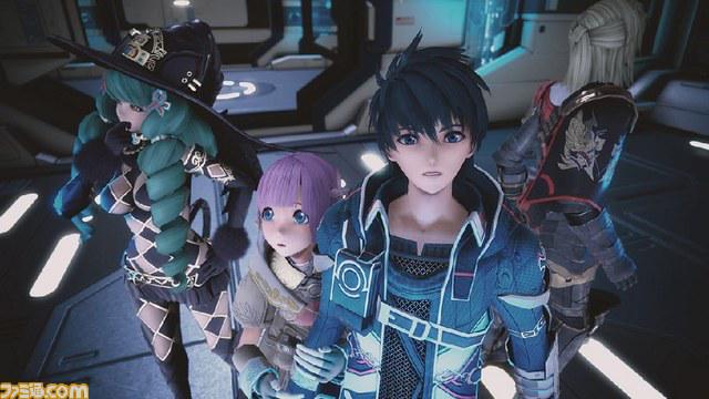
The character models look very out of place. Looks like they are shopped in.
Yeah kinda, they're more anime/cartoon stylized than the other stuff like the stone floor.
Big Hero 6? Hiro is that you?
Go_Ly_Dow
Member
I don't like the character designs. This makes me think SO4 and not SO2 and SO3.
I think you may need some refreshing the quality of SO3's character designs.


Cliff, Nel and Label were all had good personalities anyway so was a major step up from 4.
Looks pretty nice actually.
They do, if you scroll down to hide the heads. She does look like she's got a bigger head the male character. Maybe it's the angle, in the other screenshots it looks better.
Good god that face they don't even look like they belong in the same game.
They do, if you scroll down to hide the heads. She does look like she's got a bigger head the male character. Maybe it's the angle, in the other screenshots it looks better.
The difference between the man's and girl's face is jarring. It's like they went full-blown anime and moe for the girl. I don't really like her design either.
As for the winged cat wizard girl thingy, we need a good look at her face too. I really can't say if I find her design original or if it is a mix of too many things which comes out as a mess in the end.
And, well, we still don't know what their personality (and VA) will be like. That's the most important thing.
The main girl of a Star Ocean game has a hilariously derpy face?
I'm noticing a trend here...
Oh god.
Yep, unfortunately it is the exception. The rest is unbearable.Now there's a character design I can get behind.
MagnoSauce
Member
People are quick to knock the visual fidelity, but if this is an example of SE going for a "modest budget, modest returns" type game rather than something big budget, then I'm all for it. Mid-tier budget games are direly needed on all platforms right now.
Psycho_Mantis
Banned
I think you may need some refreshing the quality of SO3's character designs.
Cliff, Nel and Label were all had good personalities anyway so was a major step up from 4.
Its like they just forgot what those jrpgs looked like back in the day lol
Basileus777
Member
People are quick to knock the visual fidelity, but if this is an example of SE going for a "modest budget, modest returns" type game rather than something big budget, then I'm all for it. Mid-tier budget games are direly needed on all platforms right now.
As long as it's not a Drakengard 3 type of low budget technical disaster.
The Praiseworthy
Member
That FLAT face :\
They need to fix at ASAP.
Beside that... the game looks good to me.
InfiniteNine
Rolling Girl
As long as it's not a Drakengard 3 type of low budget technical disaster.
I'm kinda surprised that got released with such a low average framerate that dips even further. I still enjoyed the game but damn was it rough.
In my opinion its the guy's face that looks scrunched the fuck together. I like the girl's face quite a bit.
They have different head shapes clearly. I doubt the MC's face always looks like that (it looks like his eyes are squinting) And I think it's just the distance (and angle) in each picture that makes it seem off. They'd probably look better up close. Regardless, I like the designs.
(They look pretty normal in that picture IMO)
I think you may need some refreshing the quality of SO3's character designs.
Cliff, Nel and Label were all had good personalities anyway so was a major step up from 4.
Fucking

Lol
GasProblem
Member
I'm ok with the girls design. She's an elf, I think it's fine she has a differenct facial structure. It does make her look a bit derpy but oh well.
Burn the witch though. Hope there's some secondary outfit for her.
Burn the witch though. Hope there's some secondary outfit for her.
Devilgunman
Member
It's Star Ocean, alright? Not sure what people expect from character design.
")
They have different head shapes clearly. I doubt the MC's face always looks like that (it looks like his eyes are squinting) And I think it's just the distance (and angle) in each picture that makes it seem off. They'd probably look better up close. Regardless, I like the designs.
(They look pretty normal in that picture IMO)
She's wearing a damned checkerboard.
RedAssedApe
Banned
They have different head shapes clearly. I doubt the MC's face always looks like that (it looks like his eyes are squinting) And I think it's just the distance (and angle) in each picture that makes it seem off. They'd probably look better up close. Regardless, I like the designs.
(They look pretty normal in that picture IMO)
she still looks pretty derpy here. could be part of her character though so will withhold more judgement until we get more info lol
I think you may need some refreshing the quality of SO3's character designs.
Cliff, Nel and Label were all had good personalities anyway so was a major step up from 4.
huh
Maybe I was just traumatised by SO4 and the effect is lingering.
InfiniteNine
Rolling Girl
She's wearing a damned checkerboard.
Checkerboard pattern is nice but she should be wearing some additional clothes and not a skirt that basically amounts to a belt.
D
Deleted member 57681
Unconfirmed Member
That witch is ridiculous. How does she even get dressed?
confirmed mainstay in my party
SoulUnison
Banned
Oh god, no. What?
This just doesn't work.
Right in the Uncanny Valley.
Langdon Alger
Banned
There is something way off about the girl's face.
Seriously.
Risk Breaker
Member
eh I can feel the uncanny valley
I'm not sure that word means what you think it means, as awful as the faces are.
She's wearing a damned checkerboard.
Her outfit is strangely alluring. Also at least her face looks fine in that shot and another shot from the scans.
MagnoSauce
Member
I'm not sure that word means what you think it means, as awful as the faces are.
Maybe he lives in an alternate reality where anime people are real?
Good god that face they don't even look like they belong in the same game.
Because the original character artist also helped on the MC and other characters model. But for Miki, it's test model by the programmers. So I think we can expect some changes for Miki
Dragon1893
Member
Dark_castle
Junior Member
I'm not sure that word means what you think it means, as awful as the faces are.
Actually it was looking pretty uncanny right there with the moe kawaii face and photorealistic environment and lighting.
AndyMoogle
Member
What's wrong with your faaaaaaaace?
I don't get it. No one else notices the guys compressed as hell face?
The dudes face is really scrunched and the girls face is way far apart. I like them both. We can have some odd looking main characters, can't we?
It beats the whole same face syndrome you get in a lot of anime at least.
Edit: Mage needs a skirt with that belt, though.
The dudes face is really scrunched and the girls face is way far apart. I like them both. We can have some odd looking main characters, can't we?
It beats the whole same face syndrome you get in a lot of anime at least.
Edit: Mage needs a skirt with that belt, though.
Boss Doggie
all my loli wolf companions are so moe
SO3 is years ago, with that said Sophia is terribly designed.
KZObsessed
Member
Never been a fan of Star Ocean character designs but overall it looks quite nice. I really liked Star Ocean 3 except for the big story twist and ending.
GifGafIsTheBestGaf
Member
I see something very wrong with the symbol on the pink girl's dress.
Damn it can't be unseen lol