Note: this is not talking about the quality of the game itself, pls don't jump on me.
I was looking at the Tesco website debating whether to pre-order, and it still blows my mind how utterly awful the cover art is.
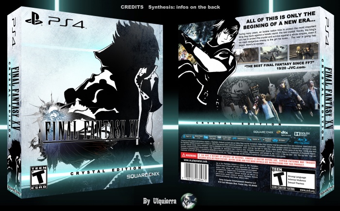
What is Gladiolus pointing at? Where the fuck is Prompto going? Noctis' hilariously bad action pose. It just looks like dumb generic fighty game 22922828. This suggestion from the other thread:
would have been great.
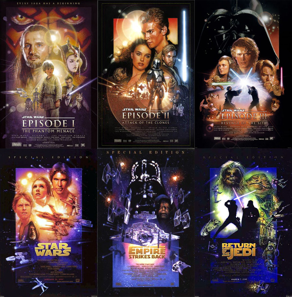
Alternatively, as the old saying goes, if it ain't broke don't fix it:
Reversible cover, sure, but that's not the first impression newcomers are going to have when they see it on the shelf. Also it just looks really bad. Blegh.