I mean, seriously. It needs to be redesigned completely from scratch. What were they even thinking? It's not just "bad" or "flawed", it's fucking shit.
Sad thing is it was much better before when it still had options for sorting. I say bring them back and also let us change them on the fly right from within the Cover Sheet with a toggle to collapse notifications for each app into one icon that expands when we tap it and gives us easier clearing options.
We all need to send feedback to Apple about it now if we want them to make any effort whatsoever for next summer.
I mean I'm always excited to see what each new iOS and macOS version brings, but it's always a letdown when they completely disregard something you fully think should be done.
But anyway, onto Control Center.... PLEASE let us rearrange those bottom icons by using the Home Screen method of long-pressing and manually moving them around. It's so clunky to rearrange them the way you do now because while the icons you interact with are in a grid of 4 icons per row, the interface for moving them around and removing them is a single one column list that is a pain in the ass if you want icons in a specific order or grouping. I mean come on.
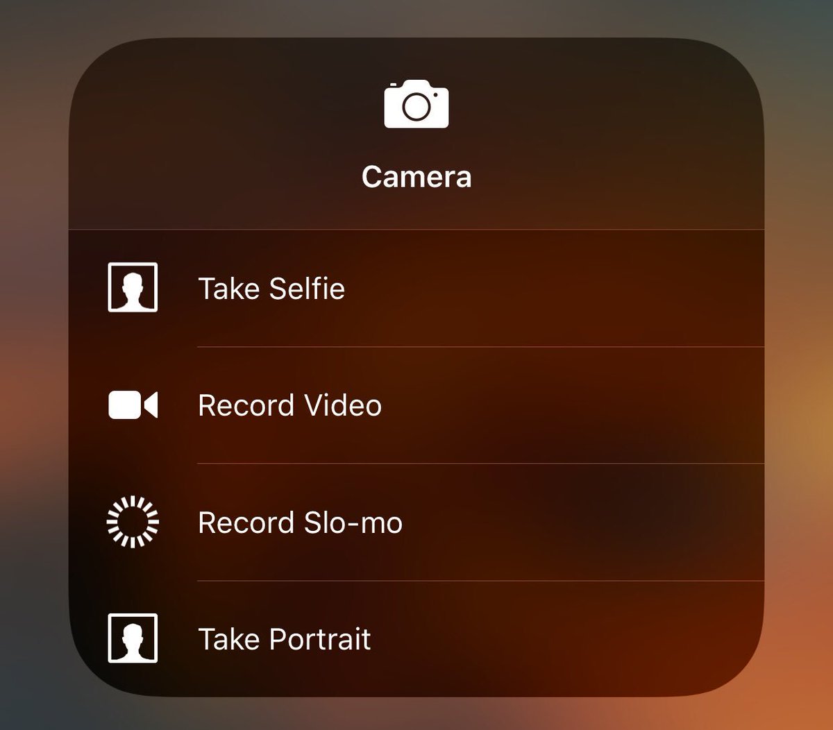
Also why is there a weird distinction between some icons that have 3D Touch and that don't. For one thing you can't really tell at a glance which one's have 3D touch, but the ones that don't have two separate "nope! You can't do that" notifications. One where it shakes and blurs properly to tell you no, but another where it doesn't do anything except act like you are just holding down a button which ends up activating it if you cancel. For example: 3D Touch on the Stopwatch or Alarm icons and you get a shake and the action is canceled. But 3D touch on the Low Power icon and you get no shake at all and it doesn't matter how long you hold it down, when you lift your finger it activates the button. Same thing happens with the DND While Driving icon. Sure you can just drag away to cancel but that's not the point really.
I also went on a Twitter mini-rant about the ugliness of the rounded Control Center 3D Touch boxes vs the beautiful Home Screen 3D Touch boxes which I'll just link to:
https://twitter.com/TheRealAbed/status/920464218394189825
But yeah, the radius of the corners of the CC boxes is HORRIBLE on the eyes and looks so wrong. But the one's you get on the Home Screen icons look so good. It's like two separate teams designed them and the CC one's smoked something really bad before they did. I blame Jony for approving it.