• Hey, guest user. Hope you're enjoying NeoGAF! Have you considered registering for an account? Come join us and add your take to the daily discourse.

Xbox One Dashboard Getting Redesigned. Bye Cortana!

Mista

Banned
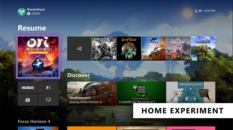
ConsoleHomeExperiment_HERO.jpg


As Xbox Insiders, your feedback helps inform the decisions and updates we make on Xbox, from new features to how gamers interact with the console itself. Based on your valuable feedback, we’ve been continuing to iterate on two key experiences on Xbox, delivering you a faster Home experience and evolving the way we support Xbox voice commands to improve the voice experience.

Evolving Home
The Home on Xbox One is the first thing you see when you turn on your Xbox One, and we want to deliver an easy and seamless experience for you to navigate your console. We’ve heard your feedback and have continued to iterate on Home to get you into your gaming experiences faster and keeping more of your content front and center. With today’s update, we’re experimenting with a streamlined user interface.

With this new experimental Home design, the first thing you’ll notice is we’ve removed the Twists from the top of Home in favor of separate buttons that launch your gaming experiences. The goal is to let you jump into Xbox Game Pass, Mixer, Xbox Community and Microsoft Store quicker than ever. We’ve also shifted things around to make more room for your recently played titles.

We need your help testing out the new interface. The new experimental Home rolls out this week to select Xbox Insiders in our Alpha and Alpha Skip Ahead rings. For more details on rollout, keep an eye on the Xbox Insiders section of Xbox Wire. The Home experience will continue to evolve and change based on your feedback, so please let us know what you think and share your ideas for Home at the Xbox Ideas Hub. You may see this layout change and even come and go as we iterate on your feedback.


Changes to voice commands on Xbox One
Last fall, we expanded Xbox voice commands to hundreds of millions of smart devices by enabling Xbox One to connect with Xbox Skill for Cortana and Alexa-enabled devices. Xbox Skill continues to grow and change based on your feedback, including new updates that rolled out earlier this month.

Building on these efforts, we are now further evolving the way we support voice commands on Xbox and are moving away from on-console experiences to cloud-based assistant experiences. This means you can no longer talk to Cortana via your headset. However, you can use the Xbox Skill for Cortana via the Cortana app on iOS, Android, and Windows or via Harmon Kardon Invoke speaker to power your Xbox One, adjust volume, launch games and apps, capture screenshots, and more —just as you can do with Alexa-enabled devices today. We’ll also continue to improve the Xbox Skill across supported digital assistants and continue expanding our Xbox voice capabilities in the future based on fan feedback.

Starting this week, this update will roll out to our Alpha Skip Ahead ring and will fully rollout to all users this fall. As part of these changes, this update will temporarily disable dictation for the virtual keyboard on Xbox One. Don’t worry though, our team is working to provide an alternative solution and will have more details to share soon.

As always, your feedback is important to us and our partners as we continue to evolve the Xbox One Home and shape the digital assistant and voice command experience on Xbox. We have some exciting updates in the works and can’t wait to share what’s next, so stay tuned for more.

Xbox
 

Cynn

Member
Cortana isn't being removed or replaced other than moving the logic to the cloud and adding in the other "AI" options of Alexa. Who uses this stuff anyway? The only thing I use voice commands for is telling my phone what alarm to set.

The marketing for these things kills me too. "Google do I need to wipe my ass?"
 

Gavin Stevens

Formerly 'o'dium'
I hope we can still skip forward/back pages with LB/RB.

But yeah looking much cleaner. Still not quite what I would want myself, but better.
 
  • Like
Reactions: TLZ

Spukc

always chasing the next thrill
it still looks the funding same get rid of those dumb ass squares micro...

windows for phones is DEAD STAHP IT
 
Last edited:

Chittagong

Gold Member
Why can’t they just make a home screen that is a long horizontally scrolling list of all my most recently played games like everyone else? Jfc

“This is not hard to understand”
 
I just hope they have managed to make it faster and smoother. I swear, it is hard to believe that it is still so janky and prone to just freezing and becoming unresponsive. It actually seems like it has gotten worse as time has gone on.
 
They are putting the games you played last at the forefront, finally, it only took them 5 years.

The Xbox One/X was sincerely the generation that lost me as an Xbox fan; a truly mediocre execution in most aspects.
?
You make 1 button push to select previous games played now.
The new dash is 1 button as well.
It's the exact same thing as now just to the right instead of below. One is down on stick. The other is right on stick.
 

Skyfox

Member
Take your cloud crap and your ads and cram them up your ass MS.

Most unresponsive net-dependent, ad-riddled garbage of a UI I’ve ever been forced to push through to get MY content that I paid for.

Turn off your internet and watch the UI. Such a joke. Even Apple weren’t stupid enough to make a completely web loaded interface in this day and age.

Look at the snes classic. Look at the psp. No ads, no webshit, no subscription services in your face.

We all know why it’s shit MS. It’s greed.
 
Last edited:

Bernkastel

Ask me about my fanboy energy!
Cortana is dying, they might kill her in Halo too, that would be cool (pls, i can't stand anymore)
Hope Windows 10 get rid of Cortana as well all those forced updates too.
They are not killing Cortana. It is getting lots of improvements and a new design. They even separated it into an app, so they can update it more frequently

At 5:17, he talks about the new Cortana.
Currently, Cortana is separate from Search, so I don't know what your issue is.
 
Last edited:

godhandiscen

There are millions of whiny 5-year olds on Earth, and I AM THEIR KING.
?
You make 1 button push to select previous games played now.
The new dash is 1 button as well.
It's the exact same thing as now just to the right instead of below. One is down on stick. The other is right on stick.

It's not the same, otherwise they would have made the change and announced it as an improvement.

This shows me from the moment I turn on the Xbox, what games I was playing last, it puts those games at the forefront of the experience.
It allows the user to keep their focus on they games they enjoy instead of being inundated by their user engagement UI patterns, which end up promoting experiences that not all users enjoy (store, streaming, etc).

Cortana dying is the second best thing of this update. Microsoft went the road of "me2" and delivered a half assed experience that did not provide a better user experience, just a marketing box check. Another show of their awful mismanagement.

The Xbox brand is suffering in sales because people don't recommend it to their friends, and Microsoft is finally noticing.
 

Mattyp

Gold Member
Why can’t they just make a home screen that is a long horizontally scrolling list of all my most recently played games like everyone else? Jfc

“This is not hard to understand”

You can just pin every game in your library to the home screen and remove all scrolling, just press down once.

I prefer the group option on the home page much better then folders and scrolling.
 
Last edited:

DiscoJer

Member
I'm probably missing something, but it always seems like a huge chore to even get to the list of games I have installed on my Xbone. It's almost like it's hidden. It should be a whole tab on the front screen like Mixer, the store, Game Pass, etc
 

The_Mike

I cry about SonyGaf from my chair in Redmond, WA
A character from Halo as the voice command prompt is clever but SONY won so easily because they continued to improve the XMB.

Okay, this is a satire post right?

PS4 is the worst UI in history with major waste on the home screen.

And now they won because of the UI? First it was because of the graphics, then the exclusives, and now the UI? How the winning factor keeps changing is pretty interesting.
 

Otterz4Life

Member
I'm probably missing something, but it always seems like a huge chore to even get to the list of games I have installed on my Xbone. It's almost like it's hidden. It should be a whole tab on the front screen like Mixer, the store, Game Pass, etc
It’s the square to the right of the Ori square/left of the Gears 4 square. That’s the “My Games & Apps” shortcut. All it takes is Right > A.
 

StreetsofBeige

Gold Member
I hate how UI have symbols. I guess it cuts down on needing to translate words, but just cut out the icon crap and just say Game Library or Store. Game Pass is written out.
 
Last edited:
  • Like
Reactions: TLZ

JohnnyFootball

GerAlt-Right. Ciriously.
Okay, this is a satire post right?

PS4 is the worst UI in history with major waste on the home screen.

And now they won because of the UI? First it was because of the graphics, then the exclusives, and now the UI? How the winning factor keeps changing is pretty interesting.
Everyone knows you're a Sony hater, but this is literally the dumbest post you have made. The PS4 is what all gaming UIs should be: quick and to the point.
 

Codes 208

Member
Everyone knows you're a Sony hater, but this is literally the dumbest post you have made. The PS4 is what all gaming UIs should be: quick and to the point.
It took them awhile to reach that point. Before they *finally* added folders it was a major pain in the ass to dig through my library to play games that werent recent.

UI speed was definitely better than xbox’s was, but one could argue that was mismanagement on the xbox’s hardware side than software.
 
Last edited:
D

Deleted member 471617

Unconfirmed Member
Definitely looks a lot better as it doesn't seem to have all that excessive clutter on the dashboard.
 

TLZ

Banned
Nice. This looks much better. Rather this than digging into my hidden games and apps section. I'd actually prefer if my Xbox turns on and goes straight into my games and apps section. Maybe give us an option to make our games and apps section the home UI.

Okay, this is a satire post right?

PS4 is the worst UI in history with major waste on the home screen.

And now they won because of the UI? First it was because of the graphics, then the exclusives, and now the UI? How the winning factor keeps changing is pretty interesting.
You switch on the PS4 and the games are literally in your face. That is all you need on a games console.
 
Last edited:

The_Mike

I cry about SonyGaf from my chair in Redmond, WA
Everyone knows you're a Sony hater, but this is literally the dumbest post you have made. The PS4 is what all gaming UIs should be: quick and to the point.

*sigh* are you five years old?

Seriously. Sony hasn't killed my wife or my daughter. Sony make electronics. I have no reason to hate Sony. Stop that fanboy shit.

I don't enjoy Sonys games, but saying I hate them is just beyond insanity.

On SonyGAF you either worship Sony or wish them dead apparently.

I find it time wasting when I have to go all the way to library on my PS4 because of the horizontal menu design.

Why do I have to scroll through a million icons to get to my library? Why waste the front page with my friends activity feed when I just want to start up a game instead?

Yes, I have a PS4. I have all Playstations except vita - which I've had once, but sold. That's crazy though cus I hate Sony right?

Grow up. Not being interested in something is not the same as hating it.
 
Top Bottom