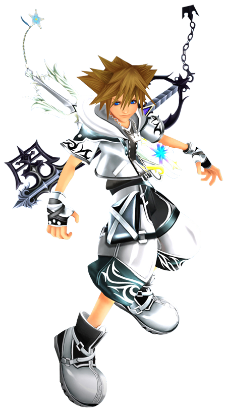
Huge fan of KH but I don't like what they did to Sora imo..
Before (KH3 initial reveal in 2013):

E3 2015 (new outfit and hair)
Not saying he looks terrible but that hair change is bothering me so much.
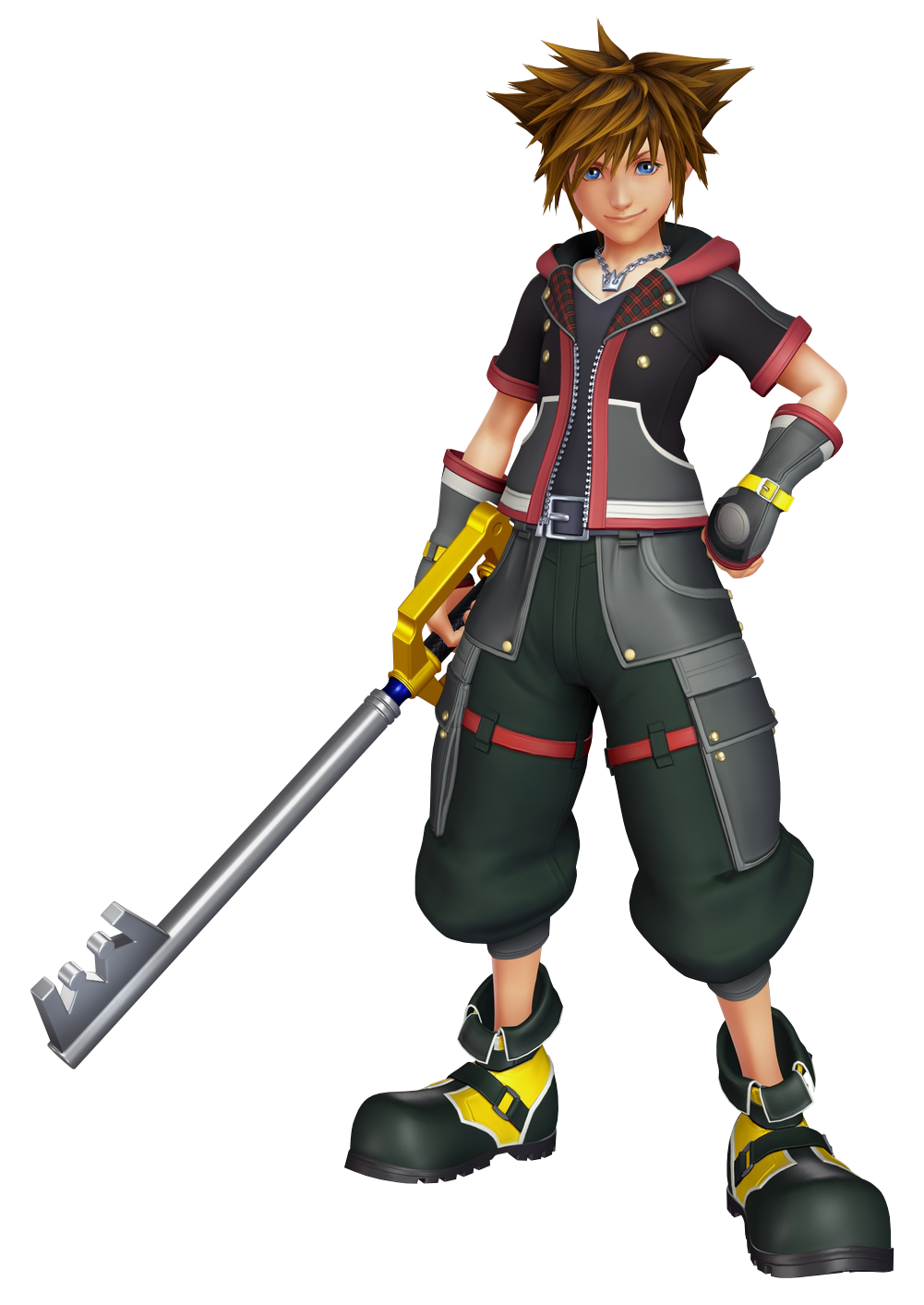
Nomura has changed his belts fetish for a buttons one.