• Hey Guest. Check out your NeoGAF Wrapped 2025 results here!

Bloodstained village footage

I don't really agree. Paying your employees more than a living wage is not just self-service or friend-service. It's just a different way of doing things. And the correct way in my opinion.
Using indie developers who are barely supporting themselves while working is not a healthy baseline to set.

A lot of the 1 man teams you are thinking of might not be able to handle the management responsibilities that would come with a larger team and budget.

It's never as easy as "Oh man he is making something awesome with ____ much money, imagine what he cold do if he had __________!!!"

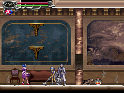
Before I get too off topic, I will say I think the whole "dilapidated roofs that just happen to be perfectly placed platforms" just doesn't work as well in 3D as it does in 2D.
It stands out a lot more and just looks kind of silly and jarring.
You definitely misunderstood my post.

I'm not talking about a "living wage". I'm talking about people who's work output and financial acumen go far beyond that of what we see here with Bloodstained simply because they won't need to hire a zillion people to get shit done, they won't need to work people thin, they don't need larger teams, etc. Every penny counts to them so they spend it wisely without the added fluff of doing "business as usual".

They definitely won't set a shitty baseline but they won't go out of their way with expenses they don't need.

That's the point. When it comes to small studios, there is none of that baggage. There are none of those bad habits from larger companies that become money sinks.

That's my point. Efficiency. Not Ramen for B/L/D and a rolled up shirt as a pillow.
 
People voted for the cartoon shading.

This too. I'm not sure what people expected would happen. They had already released a few examples of the look of the levels, without too much comment, afterwards people voted for the more cell shaded art style on the characters.

as I was saying the concept art gave me the impression of SOTN with Vanillaware's games artstyle it's like the perfect combination for me , I'm quite disappointed how the game looks in term of visuals :( other than that looks fantastic and no I'm not saying this is Mighty no 9 2.0 this game looks way better IMO
You need to understand what concept art means, games seldom replicate concept art, particularly those in 3D. For the most part they have made the game target the general look of that art.
 
It's Inti Creates don't expect too much for the visuals haha. Looks similar to Dracula X Chronicles for PSP which is fine with me.
 
Yeah something about the lighting doesn't work maybe? I can't figure it out.

Maybe Castlevania's gothic art style just doesn't transition well to 3D? But then again I just finished Bloodborne
 
It looks pretty bad. I hope they improve it a lot. This being a 2.5D makes it worse by default, however I think it could look much better than what it does. There's way better looking 2.5D games out there.

No, it doesn't. The best looking side-scroller is still a 2.5D game and there aren't many great looking 2D games.
 
This too. I'm not sure what people expected would happen. They had already released a few examples of the look of the levels, without too much comment, afterwards people voted for the more cell shaded art style on the characters.


You need to understand what concept art means, games seldom replicate concept art, particularly those in 3D. For the most part they have made the game target the general look of that art.

This is a wild and unfounded expectation.


You might be right that's on me , I'm open to accept this if they showed me a good looking game , but this does not look good
 
Those images just show the same problems this demo footage does. All aspects of the game look like they belong in different games.

The characters look like they belong in some anime game. The environments don't.

Yeah pretty much this. It looks like 2 different games smashed together.
 
im fine w it. doesnt seem to different from CV style, Persephone in DOS being a magical anime girl w a evil vacuum cleaner

funfact-fallout.png


anime + gothic environments have been CV style for most of the recent entries, ofc go back a few decades and people complained Alucard in SOTN too bishonen so cant please everyone ¯\_(ツ)_/¯
 
No but it does look like this to me, which was revealed pretty early


So in spite of being interested in this game, you've somehow managed to avoid the kickstarter video, the developmental updates, the beta AND the reveal at Microsoft's Gamescom conference.

Impressive feat.

You couldn't have said it better than me.

I just saw the quote and i was about to type something like this , thank you very much
Anyway , as i said it before , there is little to no reason to panic given what we know , what was choosen and the current state of the game currently.

It's also intresting that vanillaware style is ... kinda unique to vanillaware. There are alone doing this because they can , they have the tools and the expertise to do so. You can't just copy that 2D style and animation without extensives ressources ( time AND money )
Expecting something like vanillaware 2d style is unrealistic even if you haven't followed bloodstained numerous kickstarter updates.
 
Does this look like this to you ??

Bloodstained-Concept-Art.jpg


I dunno I was expecting Vanillaware's games style


odin-sphere-leifthrasir-ps-vita-screenshots-20160110-001.jpg


it doesn't look good but I will wait till it get close to release and see if it improved
We're not here to walk you through this.

Those concept art images say right there "not in-game screenshots" (a disclaimer which has been there from the beginning despite your baseless claims) and the FAQ section of the Kickstarter page explains that the game will be 2.5D and explains why they made that decision.

They've been clear about it literally since day one of the crowdfunding campaign a year and a half ago. It's on you if you still thought it was going to be sprites even after so many screens, videos, and even a playable demo from last year have released. You don't have to like it but you can now stop acting surprised that it's not 2D.
 
It doesn't look great, isn't like it's a solid looking game where people's subjective nature takes over. And it is a decent amount of money.

I'm sure many won't hate the game later if it's good. There is nothing wrong with saying something is good or bad for what it is at the time.
That's not really what my post is about, though.

It's this repeat illogical reaction to unfinished works that has filled this thread with childish comments and FUD-like comparisons to Mighty Number 9. It's a giant case study against transparent development processes, which is kind of a core part of the Kickstarter experience.

I just don't see what's so hard about using a little bit of brainpower in realising this is clearly unfinished and things will change. I wouldn't even call the footage "good" personally, but I can see what they're aiming for and I know they've got like a year+ of development left.
 
Igarashi. He managed to lose money om DS games with a good 30% of recycled content. He's doesn't have half the talent people think he has. Remember he was not the original director of SOTN and came in a third into development.

If he was losing money on them why did Konami of all companies let him do 3 if them? What is your source that these games lost money?

It's kind of irrelevant that he became the director of SoTN halfway through development, he worked on games afterward, several of which turned out better than SoTN did.
 
Igarashi. He managed to lose money om DS games with a good 30% of recycled content. He's doesn't have half the talent people think he has. Remember he was not the original director of SOTN and came in a third into development.
What a bullshit ridden post you wrote here. I assure you if they all lost money Konami wouldn't have had him make 3 (THREE!) Castlevanias on DS.

It is to my knowledge that Order of Eclessia made the least money so they stopped coming but not one of them lost Konami money.
 
Igarashi. He managed to lose money om DS games with a good 30% of recycled content. He's doesn't have half the talent people think he has. Remember he was not the original director of SOTN and came in a third into development.

Haha so ridiculous. while I'm not sold on the idea that this game will live up to my hopes, this line of baloney is completely baseless.
 
Some people really, really detest IGA, huh? . Who did ever produce so many thightly designed and polished Metroidvanias (and I'm not talking those 2-7 hours indie ones) in such a short time, let alone in their whole career?

Meanwhile people were all over Inafune acted like he was some gaming god and called him the father of Megaman despite just starting as an illustrator on the first game and being equally as responsible for churning out tons of samey sequels for years.

I always thought IGA was a really humble guy while Inafune came across as somewhat of a jerk.
 
That's not really what my post is about, though.

It's this repeat illogical reaction to unfinished works that has filled this thread with childish comments and FUD-like comparisons to Mighty Number 9. It's a giant case study against transparent development processes, which is kind of a core part of the Kickstarter experience.

I just don't see what's so hard about using a little bit of brainpower in realising this is clearly unfinished and things will change. I wouldn't even call the footage "good" personally, but I can see what they're aiming for and I know they've got like a year+ of development left.

There is some warrant to those ideas at least in some way rather we can agree to that or not.

There is obviously going to be comparisons and worry since they take a similar fashion of creation KS > Japanese Dev etc even though I admit that it may not end up as bad or good but this will be another subjective issue. There is a chance it ends up like that game in some parts though. People do have their ideas and this will be the case in every single thing and we will always have our own thoughts and disagreements. I can't really worry or fault people too much for their ideas rather they are somewhat wrong... but especially in what they are seeing here none of us know how it will end up or release. None of us know how early it is or how it may or may not change from what we see now so I can't argue for or against anyone's opinion too strongly. I can't agree with the ones who find it terrible or the ones who say it's early it will change. Both may be wrong or right?

So, I just say we take their opinion as that. their idea.
 
Because it's not finished.

It's not ugly just because it's unfinished. It's also some really bad art direction choices and other issues.

This game isn't going to go from looking like it does now to some fucking masterpiece in 12 months. People need to stop kidding themselves with this shit.
 
I honestly don't even find this ugly, I didn't back it but the footage I've seen seems nice enough, maybe because I'm sane enough to set my expectations straight, it's not like this looks like Mighty No Nine, that game was legit ugly, this? Nah.


It's just the village being an unfinished area, this Castle shot is gorgeous.

Igarashi. He managed to lose money om DS games with a good 30% of recycled content. He's doesn't have half the talent people think he has. Remember he was not the original director of SOTN and came in a third into development.

Managed to lose money so they let him make 3 with the last one having the most amount of new assets implying a higher budget?

That makes no fucking sense lol

If he was losing money on them why did Konami of all companies let him do 3 if them? What is your source that these games lost money?

It's kind of irrelevant that he became the director of SoTN halfway through development, he worked on games afterward, several of which turned out better than SoTN did.

Him becoming "director" was more a formality than anything, as I understand it he was always the main guy behind Symphony. But there's always been this anti-IGA sentiment in the CV community for some reason with people trying to discredit him left and right
 
My biggest problem isn't the art style, its the animations. They're really stiff looking and almost looks like the character is just sliding around on top of the environment and not "in" the environment, if that makes sense. Hopefully this can easily be improved.
 
Going to echo a lot of people and say the game is super-ugly, and unless that changes I'll have no interest.
 
Some people really, really detest IGA, huh? . Who did ever produce so many thightly designed and polished Metroidvanias (and I'm not talking those 2-7 hours indie ones) in such a short time, let alone in their whole career?

Meanwhile people were all over Inafune acted like he was some gaming god and called him the father of Megaman despite just starting as an illustrator on the first game and being equally as responsible for churning out tons of samey sequels for years.

I always thought IGA was a really humble guy while Inafune came across as somewhat of a jerk.

IGA had essentially a smear campaign run against him where people would give all the credit to Toru Hagiwara (some people even calling him the father of the series despite only working on 3 titles, one of which was as a programmer) and downplay the quality of the later titles.

I think a lot of this is bitterness due to the series largely abandoning the classic style but even that seems pretty misguided. The industry changed and those type of titles largely switched genre or died. Eventually it swing back and those type of titles are now viable again (mostly as indies and some Nintendo releases) but even then IGA still released a few despite them largely going against the grain of trends during those times.

Anyway it seems like a lot of the criticism hads gone away with interviews clarifying what IGA's role in SoTN was being translated over the past few years.
 
Can someone from a developer perspective explain why they would go from 2D to pseudo 3D?

Personally I think it looks alright but it looks generic as hell unlike the 2D style which I thought was really nice.
 
Can someone from a developer perspective explain why they would go from 2D to pseudo 3D?

Personally I think it looks alright but it looks generic as hell unlike the 2D style which I thought was really nice.

sprite art and animation is a lot more work and thus costs a lot more money to pay people to produce
 
Can someone from a developer perspective explain why they would go from 2D to pseudo 3D?

Personally I think it looks alright but it looks generic as hell unlike the 2D style which I thought was really nice.

The game was 3D from the very start of it's announcement. 3D was chosen because it's a cost cutting measure.
 
Can someone from a developer perspective explain why they would go from 2D to pseudo 3D?

Personally I think it looks alright but it looks generic as hell unlike the 2D style which I thought was really nice.

Not a dev (officially) but 3D assets are quicker and easier to create than sprite based assets in this day and age. I hope that basically gets the point across in a simple enough manner.
Prior Castlevania games have largely recycled enemy assets (not all of them, but quite a few) which helped cut down dev time.
 
For now, I am fine with the look of the game. Nothing amazing, but that's not a triple A game anyway.

Of course, pixel-art 2D (240 lines) would have been amazing, but this was never going to happen.
 
Interesting, I just assumed sprites / 2D would be easier than making 3d models, etc. Shows how much I know about game development...
 
Interesting, I just assumed sprites / 2D would be easier than making 3d models, etc. Shows how much I know about game development...

The whole thing is that a 3D model can be made and then animated however it's needed but a character made out of sprites needs to have every frame of animation done manually.

If you've ever played BlazBlue you'll be aware it's a 2D fighting game, but they actually made the sprites using 3D models as the source to cut costs.
 
What a bullshit ridden post you wrote here. I assure you if they all lost money Konami wouldn't have had him make 3 (THREE!) Castlevanias on DS.

It is to my knowledge that Order of Eclessia made the least money so they stopped coming but not one of them lost Konami money.

This guy's still salty that people didn't love Lords of Shadow as much as him from back in the day... jesus christ.

It's the same bullshit argument constantly for some years now...

Interesting, I just assumed sprites / 2D would be easier than making 3d models, etc. Shows how much I know about game development...

The problem lies within animation.
 
We have new information regarding this Village Footage update courtesy of Iga's community manager Mana over on the official Bloodstained fan forums. This is what she posted:

Hi everyone! It's been a while since we shared the new environment and I've been going back and forth with the team on the topic matter. Thank you for the all feedback as always.

Although the environments we shared are work-in-progress, they are roughly 80% complete. This is the kind of look and feel the final product will have. We would not share a half-baked progress for backers to give feedback, so to brush off the concerns with, “It’s still an unfinished piece” is unnecessary. If you have a concern and have an idea that may rectify the problem, we are open to suggestions. However, IGA and the team are fully aware of their preferences and when it comes to balancing the visual graphics and the overall gameplay, they will decide where to push and pull on the quality. I’m going to share what we’ve been discussing and the changes that are planned.


Missing Features

Before I get into the changes, there are certain features that are missing in the village screenshot and video we shared. One is the breakable candles. As you can see in the beginning of the area, there’s a space on the top left corner where the candle should be. I believe it wasn’t included due to some adjustments that didn’t make it in time. The candles act as a partial light sources if you take that into consideration. Another is the reflection capture. The reflection capture, as it may be obvious from the name, reflects light sources on a given surface. This gives the nice reflective light on the ground and adds metallic or wet look to certain areas. This enhances the overall look, but for some reason, the roofs blinded us with glittery gold effect and we had to put it off until it was tweaked. Other missing features include enemies and NPCs, but our purpose is to only share the new environment on its own.


Visual vs. Gameplay

There’s been a long debate on which to prioritize – the visual graphics or the gameplay. As much as we would like to balance both equally, sometimes improving one aspect could hinder the other. For example, almost all Castlevania games have bright foregrounds which are shades lighter than the backgrounds – Platforms are easily visible and has a classic Castlevania look. On the other hand, this could look very artificial and ruin the atmospheric vibe of the game – “stage/indoor” look, light source is unnatural, and unrealistic. We’ll need to choose and decide what we all agree on in terms of both visibility and aesthetics.


Changes

Roof platforms will be emphasized differently. They will look more horizontal and flatter where Miriam will land. Thickness will be added to the edge so that it will not look like she is landing on a piece of paper.

Doors, carts, bricks on the houses will change colors – We all agreed that they were too blended in. Textures may be overly used.

The m̶o̶o̶n̶ sun will look more like a sun.


Unfortunately, the house structures are too expensive to change at this process (Thanks Tom Happ for chiming in on the KS comment section!). I suggested making the tree leaves greener and it actually helped lessen the attention to the boxy feel.
Another suggestion was to remove the red reflection on the ground.

I may be forgetting something but I'll pop up again if I have anything to add. Cheers

I'm happy to see they're taking feedback so seriously. And, like a fellow poster on the forums said, if the IGN screenshots from last year are any indication of a finished area we're in for a treat. This shots have finished lightning sources, reflections and candles which I'm sure will make a difference on the village once implemented (as well as the mentioned changes).

ceeoeae20160920165859117jpg-fe186b.jpg

ceeoeae20161004105254452jpg-f9a915.jpg

ceeoeae20160920170143134jpg-f9a917.jpg

ceeoeae20161004110421303jpg-f47b3f.jpg


Also LOL at the Village featuring the sun. I swore it was a blood red moon. Happy to see they'll rectify it and make it look more like a sun.
 
First i've seen of this, imo the character model doesn't really gel with the background/aesthetics.

I can respect that. I think everything will look better in motion once enemies are also present. But one thing is to state what you said and other is go full "it looks just as bad as Mighty No 9" like many did in this very thread is just stupid and objectively false.
 
We have new information regarding this Village Footage update courtesy of Iga's community manager Mana over on the official Bloodstained fan forums. This is what she posted:


I'm happy to see they're taking feedback so seriously. And, like a fellow poster on the forums said, if the IGN screenshots from last year are any indication of a finished area we're in for a treat. This shots have finished lightning sources, reflections and candles which I'm sure will make a difference on the village once implemented (as well as the mentioned changes).

ceeoeae20160920165859117jpg-fe186b.jpg

ceeoeae20161004105254452jpg-f9a915.jpg

ceeoeae20160920170143134jpg-f9a917.jpg

ceeoeae20161004110421303jpg-f47b3f.jpg


Also LOL at the Village featuring the sun. I swore it was a blood red moon. Happy to see they'll rectify it and make it look more like a sun.

Surprised they felt the need to run damage control. Were people really that unhappy with the way this game looks? It is what it is.

When it comes to visuals, the scenery is the least of my problems with this game to be honest. Is the hideous boob monster from the demo still in the game? That thing is the epitome of bad taste.
Damage control? Have you been following this project? They have been receptive to backer feedback once day one. This so not damage control, Christ. Would you prefer for them to not listen at all?
 
On one hand I don't think this really needs a new thread. On the other hand as an addon to the original village footage discussion it's sure to be buried.
 
On one hand I don't think this really needs a new thread. On the other hand as an addon to the original village footage discussion it's sure to be buried.
That's what I was pondering too. Should I open a new thread for this or not? Unsurprisingly few have replied to my update. So maybe we should? If only a mod could change the thread title to reflect the updated status though. If only.
 
Damage control? Have you been following this project? They have been receptive to backer feedback once day one. This so not damage control, Christ. Would you prefer for them to not listen at all?

Seriously .
They have been answering fans , providing feedback , explain their technical choices in term of rendering , level design and such . What damage control ? There is no damage , just a simple discussion between a fanbase and the creators.

Other devs should do the same. but they probably won't since it's so easy to spin goodwill and active discussion into something negative.
 
Top Bottom