• Hey Guest. Check out your NeoGAF Wrapped 2025 results here!

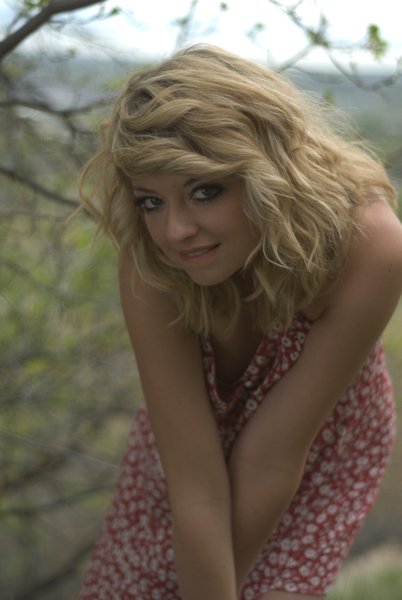
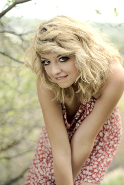
Digital Photography - Post Processing **Befor and After**

Status
Not open for further replies.
JDSN said:
Ive seen a lot of people in the pictures thread using some douchey filter that makes everything look pinkish and blueish, how can I make my pictures as hateable as those?

People have different methods, but here's how I would go about getting that look in Photoshop.

1. Open your photo and prepare to create two additional layers
2. Layer > New Fill Layer > Solid Color (I'd use white)
3. Lower the opacity of the solid color layer to something below 50%
4. Then again, Layer > New Adjustment Layer > Color Balance
5. Play with the colors to get the douchey hues you want :D
 
b.e.r.g said:
Had to chop the cake, but you think it's a big deal?

I think it looks better with the cake. It adds context to the image and acts as something in the foreground to draw the eyes to the two main subjects.
 
I'll bite.

Usually my processing is pretty light. I don't go for the huge color casts that are popular these days. But I exposed this photo poorly, and it needed help.

example1.jpg
example2.jpg


In Lightroom:
Bring up exposure, bring up the black clipping a bit, add a little highlight recovery, decrease saturation, increase Vibrance, bump up Clarity

In Photoshop:
Switch to Lab color, unsharp mask the Lightness channel, copy Lightness channel, paste as its own layer, switch back to RGB color, blend pasted Lightness layer as Linear Dodge, 37%. This adds luminescence to the image and helps fill in the foreground (I was shooting against the light).
Tweak curves and levels to add contrast.
Add color balance layer to add yellow to highlights and just a tinge of blue in the shadows.
Add a curves layer to burn in the edges some.
 
fz50no.jpg


Just color correction. At first I thought the overexposure would be a problem, but it actually made it look cool in post. No cropping either!

2w3unvr.jpg
 
These before and after pics are great! I am still trying to learn how to use my DSLR, but I think later I will have a go messing with the pics I already have. :D
 
saltinekracka said:
I don't know much about photography/digital enhancement, but how is this lighting effect achieved? The "bright center, shadowed frame" look?

Thats vignetting (caused by the mechanical/build of some lenses, I believe it has to do with the entrance pupil) but people add it in post for the retro/dramatic feel. As far as how to add it in post? My B&W converter (Nik Silver Effex) has a dedicated slider to the amount of vignetting (to correct or add) and where its placed (you can offset it).

Edit: jiji :bow That sounds more specific to that particular image
 
dark_chris said:
Good stuff. =)
I use Lightroom on mine to just fix the photo up. I have been away from using photo editing software since i been so busy this past semester. I finally got time to retouch my old photoshoot pics.
http://img.photobucket.com/albums/v95/darkchris66/JocelynBA3.jpg[/IM]

Before
[IMG]http://img.photobucket.com/albums/v95/darkchris66/DSC01922-1.jpg[/IG]

After
[IMG]http://img.photobucket.com/albums/v95/darkchris66/DSC01922.jpg
WOULD.
 
saltinekracka said:
I don't know much about photography/digital enhancement, but how is this lighting effect achieved? The "bright center, shadowed frame" look?
Disclaimer: know that there are multiple ways to skin a cat in Photoshop.

0.) Create a new layer above your photo/image

1.) Draw a circle with the elliptical marquee tool around the area you want most visible, or the focal point of the area.

2.) Add additional circles to your main circle if you want a bigger area by holding Shift and dragging for more circles (step only if necessary for more areas in addition to your main area)

3.) right-click your circle and press "Select Inverse" from the drop-down menu. Now all of the area outside the circle is selected.

4.) right-click any area outside your circle(s) now and select "Feather" from the drop-down menu.

5.) Change the Feather radius to 250 pixels (its max...but you can play with this to your liking later) then hit "OK" to close the menu.

6.) Edit --> Fill --> Black

7.) Change the opacity of your layer to 50% and see what you think. :D Adjust to your taste.

that's basically how it's done.

I'm sure someone will chime in with an alternate method or two...but this is one you can use as you see fit.
 
I help my dad out with print advertising for his small construction company. They don't really have budget for much--let alone professional photography. So, most of the time, I'm handed a CD full of super-flat shots that a backhoe operator has shot with a point-and-shoot digital camera, and it's my job to find the art in them. It's actually pretty fun. Here are a few examples...

2rqznuf.jpg
15i6qo9.jpg


35cq7hu.jpg
24uxbnc.jpg


2dsoche.jpg
x0tulx.jpg
 
jiji said:
I'll bite.

Usually my processing is pretty light. I don't go for the huge color casts that are popular these days. But I exposed this photo poorly, and it needed help.

http://trevorwilsonphoto.com/misc/example1.jpg[img][img]http://trevorwilsonphoto.com/misc/example2.jpg[img]

In Lightroom:
Bring up exposure, bring up the black clipping a bit, add a little highlight recovery, decrease saturation, increase Vibrance, bump up Clarity

In Photoshop:
Switch to Lab color, unsharp mask the Lightness channel, copy Lightness channel, paste as its own layer, switch back to RGB color, blend pasted Lightness layer as Linear Dodge, 37%. This adds luminescence to the image and helps fill in the foreground (I was shooting against the light).
Tweak curves and levels to add contrast.
Add color balance layer to add yellow to highlights and just a tinge of blue in the shadows.
Add a curves layer to burn in the edges some.[/QUOTE]
I hope you don't mind but i think you brightened her up too much, her skin no longer looks natural.
Also is that the sister from that 70s show?
 
Lots of great examples.

Hmm, so I guess I should be shooting in RAW then? I always avoided it for some reason. :\
 
dark10x said:
Lots of great examples.

Hmm, so I guess I should be shooting in RAW then? I always avoided it for some reason. :\

Lots of latitude with RAW, problem is you have to process them. So if your the type of shooter that likes to dabble here and there but not process constantly then maybe RAW+JPEG outputt could be for you. Obviously takes up more space though.
 
I still think some of the post processing is just too much. Super high contrast pictures kind of strain my eyes, especially on a computer screen.

e.g.

 
Just played around with shadows/highlights and slight curve adjustment.

Before:
4313799449_2b0b8e7ddb_b.jpg


After:
4313029483_b47d0e122b_b.jpg


need to edit out that helicopter : /
 
hectorse said:
I still think some of the post processing is just too much. Super high contrast pictures kind of strain my eyes, especially on a computer screen.

e.g.


Well I think you're a boring person.

In your picture, the leopard doesn't really stand out against the background. Also, I think the saturation captures the feeling of being hot and humid, which it was when I took it. Plus, it was made to be printed.
 
If you were to go with a more subtle color correction like that, I think I would increase the exposure. The picture has both bright whites (the fur), but they seem kind of greyish in samusx's version.

Then again, I'm no professional.
 
Mar said:
Oh, I forgot to mention.

Cropping is regarded as cheating in most circles around photography. You can post process the photos out the wazoo (besides changing the content of the photo itself), but cropping an image is frowned upon as you aren't relying on skill in composition nor are you growing your skill as a photographer.

Cropping is regarded as cheating? :lol :lol Dude, go to any photography school and they will laugh at you for implying cropping is cheating. No one thinks that except for assholes with their heads up their ass. There are probably many photographers who strive not to crop, but they wouldn't consider it cheating if you did.

Did you take an intro to photography class or something? A good professor in an intro photo class will forbid you from cropping, that doesn't mean it's cheating. Imposing that rule on a beginning photographer will get their mind cranking and thinking about composition before they snap the photo, which is good.

Anyways, this topic should seriously be renamed "Photo Post-Processing Gone Bad." So many of you go WAY too far. To me, content and composition are KING when it comes to photos, while post-processing is necessary but honestly not as important (in the day-and-age of Photoshop actions, a "cool looking photo" isn't worth much anymore). Strive to put something interesting in front of your lens and the PP process becomes more rewarding.
 
sarcoa said:
Just played around with shadows/highlights and slight curve adjustment.


need to edit out that helicopter
: /
why?


my goodness, people with the cheetah/jaguar...

can i be a total noob and ask what program you guys are using to edit your photos?
I use Adobe Lightroom
I believe a lot here are using photoshop and adobe camera raw(same thing as lightroom)
 
captive said:
why?


my goodness, people with the cheetah/jaguar...

Leopard.

I appreciate any constructive criticism, but people have to understand that what looks good on their monitor might not look good on anyone else's. Right now I'm installing my Spyder to calibrate my monitor, and I'll see if that makes a difference.

shadowcomplex said:
can i be a total noob and ask what program you guys are using to edit your photos?

Photoshop CS2 for the leopard, but now I have CS4.
 
ianp622 said:
Leopard.

I appreciate any constructive criticism, but people have to understand that what looks good on their monitor might not look good on anyone else's. Right now I'm installing my Spyder to calibrate my monitor, and I'll see if that makes a difference.
that's actually a good point i was going to mention.
All the monitors i use on a daily basis are about the same so i know how they look vs print media(which is what i want, i care a lot less about how they look on a monitor). Pretty much all of the Leopard edits look too "hot" to me.
 
captive said:
that's actually a good point i was going to mention.
All the monitors i use on a daily basis are about the same so i know how they look vs print media(which is what i want, i care a lot less about how they look on a monitor). Pretty much all of the Leopard edits look too "hot" to me.

Agreed with the leopard thing. I don't like my pictures as hot, but I wanted to give an example of how high contrast doesn't necessarily mean loss of detail.

I think that with a strong composition and interesting subject found in the leopard, there is not much to add.
 
For all you people with monitors made from rainbows, here's another go:

9tzep4.jpg


This is a little more like what it looks like in print in a warmly lit room.

I went with "hot" because it was overexposed, and I thought I'd use that as a strength rather than trying to correct it (since details are lost more easily to overexposure than to underexposure).
 
mik said:
I help my dad out with print advertising for his small construction company. They don't really have budget for much--let alone professional photography. So, most of the time, I'm handed a CD full of super-flat shots that a backhoe operator has shot with a point-and-shoot digital camera, and it's my job to find the art in them. It's actually pretty fun. Here are a few examples...


2dsoche.jpg
x0tulx.jpg
what did you do here? to make the scratches stand out so well.
 
10p13wi.jpg


2922p6r.jpg


Im not good at this or anything, i just like this effect in some of my photos.


Any advice by someone with more knowledge on what else could i do with photos like this ?
 
OK, I need a sanity check here.

Am I the only one who thinks that many of the 'after' shots in this thread look awful? I mean, blown-out highlights, unnaturally high saturation, loss of shadow detail, etc. I understand that sometimes you want intentionally want to create a photo that looks unnatural (like if you are going for the look of a movie poster or comic book), but a lot of skill goes into enhancing a photograph without making it look like it has been heavily processed.
 
tokkun said:
OK, I need a sanity check here.

Am I the only one who thinks that many of the 'after' shots in this thread look awful? I mean, blown-out highlights, unnaturally high saturation, loss of shadow detail, etc. I understand that sometimes you want intentionally want to create a photo that looks unnatural (like if you are going for the look of a movie poster or comic book), but a lot of skill goes into enhancing a photograph without making it look like it has been heavily processed.
to each his own I guess
the only time I go for the ridiculous saturation/contrast/blowout look when I'm shooting quick dirty snapshots using bestcam on my iPhone. I much prefer at least semi natural processing for my landscapes/portraits.

I do like the x-pro effects but I haven't tried it myself yet, had no reason to. I dislike overcooked HDR with massive halos etc.
 
I don't really know how to use Photoshop, but I like Lightroom for its more focused feature set and friendlier UI. Still, I only know how to do the bare minimum and basically I push sliders around until the photo approaches something I like. I'm not a big creative person so I use it mainly to rescue photos that have poor lighting.

oPHC6.jpg

JTXlW.jpg
 
Processing is not cheating. Photography is about communicating what captured you or creating something beautiful, not just some scientific documentation of imagery. Whatever processing it takes to make the expression right is the minimum you should use.

I have better stuff but when I got a new PC I didn't think through the file-transferring process very much and so I'm having trouble finding the originals. Also my old monitor was crappy so these aren't quite as good as they looked to my eye then.

6GeSH.jpg


MEj3z.jpg


LYr3w.jpg


XH3SZ.jpg


SEU6q.jpg


All but the wine drinking ones were complete amatuer film shots using 800 film and generically developed at walgreens, so that's why the colors are so jacked.
 
Status
Not open for further replies.
Top Bottom