• Hey Guest. Check out your NeoGAF Wrapped 2025 results here!

Digital Photography - Post Processing **Befor and After**

Status
Not open for further replies.
Dice said:
I have better stuff but when I got a new PC I didn't think through the file-transferring process very much and so I'm having trouble finding the originals. Also my old monitor was crappy so these aren't quite as good as they looked to my eye then.

http://imgur.com/6GeSH.jpg[/IMG

[IMG]http://imgur.com/MEj3z.jpg[/IMG

[IMG]http://imgur.com/LYr3w.jpg[/IMG [IMG]http://imgur.com/XH3SZ.jpg[/IMG

[IMG]http://imgur.com/SEU6q.jpg[/IMG

All but the wine drinking ones were complete amatuer film shots using 800 film and generically developed at walgreens, so that's why the colors are so jacked.[/QUOTE]

oddly enough, aside from the fourth one, i think all the before shots look way better.
 
tokkun said:
OK, I need a sanity check here.

Am I the only one who thinks that many of the 'after' shots in this thread look awful? I mean, blown-out highlights, unnaturally high saturation, loss of shadow detail, etc. I understand that sometimes you want intentionally want to create a photo that looks unnatural (like if you are going for the look of a movie poster or comic book), but a lot of skill goes into enhancing a photograph without making it look like it has been heavily processed.

It really depends on what the goal of the photo is. For example, some people manipulated my Leopard photo to provide an accurate representation of colors. I, on the other hand, wanted a striking image that conveyed the emotion of the leopard and the environment through color. To me, my image conveys heat and humidity, and it makes me feel like the leopard is almost drooling. The overexposure wasn't in post, but I used it to convey heat, like blinding sun (which would cause similar blowouts in the highlights). Plus, it wasn't as dramatic in print. I didn't lose any details in the shadows or highlights, since the original photo wasn't using the full range anyway.
 
Has Apple stopped setting their gamma default to 1.1? I think it messes up the way a lot of Mac people see and adjust their photos.
 
Dice said:
Has Apple stopped setting their gamma default to 1.1? I think it messes up the way a lot of Mac people see and adjust their photos.
unfortunately, many people were suckered into buying GLOSSY MacBook Pro's.

the problem I've observed with all glossy MBP's is that they over-contrasted, over-saturated, and the crush black and white at the top and bottom ends.

the hair of brunettes on a black background begins to disappear on a glossy MBP, whereas on the matte you can still see separation. I tested this extensively in 3 Apple Stores just to be sure.

Nobody should buy a glossy-screen MBP if they care at all about color accuracy. a color calibration unit may dampen the over-saturation and contrast problems, but it can't do anything about the blacks being crushed. seems to simply be the nature of the glossy hardware.

for everyone else, it's okay because your average person thinks "colors that pop" is *always* a good thing. people who care about photo accuracy or color reproduction in general know better.

in summary: get a matte screen if you're interested in a MBP and are in this thread.
 
ymmv said:
71skgj.jpg


AnkitT said:


Great ! thanks, would be cool if you can tell me what you did.
 
SalsaShark said:
Great ! thanks, would be cool if you can tell me what you did.
yes. The OP didnt explicitly say to include how you got to the result you posted however a lot of people are asking and really whats the point of doing a before and after without telling what you did?

BTW Samusx all your pics are showing as bandwidth exceeded by photobucket for me, including your avatar. :lol
 
Dreams-Visions said:
for everyone else, it's okay because your average person thinks "colors that pop" is *always* a good thing. people who care about photo accuracy or color reproduction in general know better.
Tell me about it. It's like the masses have no concept of contrast or detail at all. Similar things go on with speakers/sound systems. Just let the bass take a shit on my head and make it as 3D surround as possible! Who cares about balance or separation? I don't need it to make sense, I just need it to boom and swoosh!
 
Dreams-Visions said:
unfortunately, many people were suckered into buying GLOSSY MacBook Pro's.

the problem I've observed with all glossy MBP's is that they over-contrasted, over-saturated, and the crush black and white at the top and bottom ends.

the hair of brunettes on a black background begins to disappear on a glossy MBP, whereas on the matte you can still see separation. I tested this extensively in 3 Apple Stores just to be sure.

Nobody should buy a glossy-screen MBP if they care at all about color accuracy. a color calibration unit may dampen the over-saturation and contrast problems, but it can't do anything about the blacks being crushed. seems to simply be the nature of the glossy hardware.

for everyone else, it's okay because your average person thinks "colors that pop" is *always* a good thing. people who care about photo accuracy or color reproduction in general know better.

in summary: get a matte screen if you're interested in a MBP and are in this thread.

this doesn't make sense; matte screens do something to reduce the intensity of light (polariser, coating), glossies don't. if your macbook pro has weird colour settings then a glossy screen will reproduce those settings more accurately, but if the colour settings are fine it should absolutely be better for photos (in a good lighting situation, at least, which an apple store may not actually provide).

not that i'd ever buy an MBP with a glossy screen, because it's a laptop and that would be impractical, but i use a glossy imac that obviously never goes outside and the colour reproduction is great. there's no such thing as "glossy hardware" to ruin colours.
 
Not my photo, but it caught my eye and I've been looking to do something for this thread.
tumblr_l31wfaKCm81qarumno1_400.jpg
rp9pg.jpg

Duplicate blurred soft light layer at 50% opacity
Curves layer for cross processed look
Curves layer to adjust contrast
Vignette, overlay, ~70%
Lens Correction to fix the angle.
 
SalsaShark said:
Great ! thanks, would be cool if you can tell me what you did.
:lol Sorry.

1- I first made a b/w gradient map set at 50% optacity.
2- Then I used curves to adjust contrast a bit, since the pic looked a bit washed out to me.
3- Then, to set a cool tone to the image, I used a cooling photo filter set to "soft light" and optacity at 75%.
4- Added hue/saturation adjustment layer, adjusted saturation to +40.
5- Added b/w gradient map, set to "multiply" at 25% optacity.
 
b.e.r.g said:
Good work! I also like the crop samusx recommended.
b.e.r.g said:
Don't be afraid to criticize my photos though :p This is just a hobby and I'll never stop learning.
I'm glad you said that, as I hope you do revisit this photo just one more time to save the details on the cake which are present in the original photo. Being able to see the 30 would finish it nicely I think.
Great stuff b.e.r.g :)
 
commissar said:
Good work! I also like the crop samusx recommended.
I'm glad you said that, as I hope you do revisit this photo just one more time to save the details on the cake which are present in the original photo. Being able to see the 30 would finish it nicely I think.
Great stuff b.e.r.g :)
Hey thanks! I tried to preserve some of the highlights, but it wasn't very easy so I didn't bother :p Afraid I'll have to use HDR or something similar. A lot of photographers are way too afraid of blown highlights imo. I don't really mind loosing a few details to overexposure. I think the bright light creates a warm summerly mood. Though I agree that the "30" would be a neat detail.

I like samusx crop as well, and my intention when keeping the cake in focus was indeed to guide the viewer, but I can't seem to have both :( I need my crops to be 3:2, 2:3 or 1:1...
 
AnkitT said:
:lol Sorry.

1- I first made a b/w gradient map set at 50% optacity.
2- Then I used curves to adjust contrast a bit, since the pic looked a bit washed out to me.
3- Then, to set a cool tone to the image, I used a cooling photo filter set to "soft light" and optacity at 75%.
4- Added hue/saturation adjustment layer, adjusted saturation to +40.
5- Added b/w gradient map, set to "multiply" at 25% optacity.

Thanks :D
 
25gcdon.jpg


1109elk.png


Unsharp mask.
DoucheBag Filter, the easy way. (New Fill Layer -> Gradient Map -> Orange,Blue -> Reverse that bitch -> Set to Screen/Lighten -> Lower the Opacity, I usually hit between 40-50% -> Do anything you want after that)
Messed with the exposure a bit too, as well as slightly touching the curves.

Douchebag Evolved

dnfs5t.jpg


123xxxc.png


Unsharp Mask
Curves --> Preset/Cross Process+Lowered Opacity
Selective colour to eliminate the some of the blues (Still apparent on her shirt, and even their eyes)
Judging from the stickers on the lightswitch, I turned blue into green and green into orange.
Colour Balances
Exposure and Raised Offset
Lens Correction for Vignetting
Holy shit the veins in her hand are blue

With this one I'm unsure if that's all I did, I know I did THIS at least but I'm working off my memory.
 
So to get us off the leapord and "douche hues" as people are referring to them.

I have this picture of an Osprey.

The original is very flat and kind of washed out. One, it was cloudy and overcast, yay fantastic lighting! Two, I was using an EC20, which is a 2x teleconverter. Even though I was using it with the excellent 150mm f2.0(which some reviewers have said is possibly one of the best lenses ever made) there is a loss of contrast and chromatic abberation is a possibility. And three, I shot with +1/3 exposure bias.

Imo the before is pretty bad.
First thing I had to crop because I couldn't get close enough(previous experiences with this bird where that it would fly away at the exact same distance every time) and because the wind was blowing about 20 mph so camera shake wouldnt let me get the right framing i wanted.

Basically as with my last one just messing with the tone curve again. To make it look like an S but ultimately to make the picture look better.

highlights +43
light 0
darks -22
shadows -35

and then beneath the exposure bar
contrast +25
blacks +15

then just a little noise reduction to taste, for web do more for print do less imo in print on my camera it looks more like grain.

And finally the only thing I couldn't and still cant figure out, is how to get the red fringing above the birds white on its head. I've noticed that the EC20 + any combination produces fringing on subjects with white against a darker background.
Lightroom 3 beta's defringe option doesn't really do much for this particular picture. That or im doing it wrong which is entirely possible.

Before
P3212299-4.jpg


After


fun facts
Osprey's have two opposable talons, one of which is reversible to frontwards and backwards.
When diving for prey they will dive headfirst until the last second right before they hit the water they will do a 180 flip and hit the water feet first to grab their prey.

 
mik said:
I help my dad out with print advertising for his small construction company. They don't really have budget for much--let alone professional photography. So, most of the time, I'm handed a CD full of super-flat shots that a backhoe operator has shot with a point-and-shoot digital camera, and it's my job to find the art in them. It's actually pretty fun. Here are a few examples...

http://i45.tinypic.com/2rqznuf.jpg[/IM G] [IM
G]http://i45.tinypic.com/15i6qo9.jpg[/IM G]

[IMG]http://i47.tinypic.com/35cq7hu.jpg[/IM
G] [IMG]http://i48.tinypic.com/24uxbnc.jpg[/IM G]

[IMG]http://i50.tinypic.com/2dsoche.jpg[/IMG ] [I MG]http://i50.tinypic.com/x0tulx.jpg[/IM G][/QUOTE]
Wow man, you make completely average photo's look totally bad ass :) Great job.
 
I guess I'll jump aboard the "Leopard processing" train...

O5XOD.jpg

Original

4El39.jpg

Color corrected

k807w.jpg

Black and White

For me, when attacking the image as far as color correction, I felt that an honest representation of the Leopards color was in order (of course the processing is all coming from my assumption of the leopards color at the time). The background has a weird color cast though, this is when B&W can help a photograph.

All I did was use the "Color Balance" tool in Photoshop, adjusted the Shadow, Mid and Highs to taste and then fidgeted with the Blue, Red and Greens with the Curve tool (trying to manipulate the intensity and color cast of the background). With the Black and White I use Nik's Silver Effex Pro and added a slight Blue tone to the B&W. I also lowered the "structure" of the B&W within that plugin which gives the image a less harsh feel (great for scenes that are a little too contrasty or busy backgrounds).
 
(not photo but video)
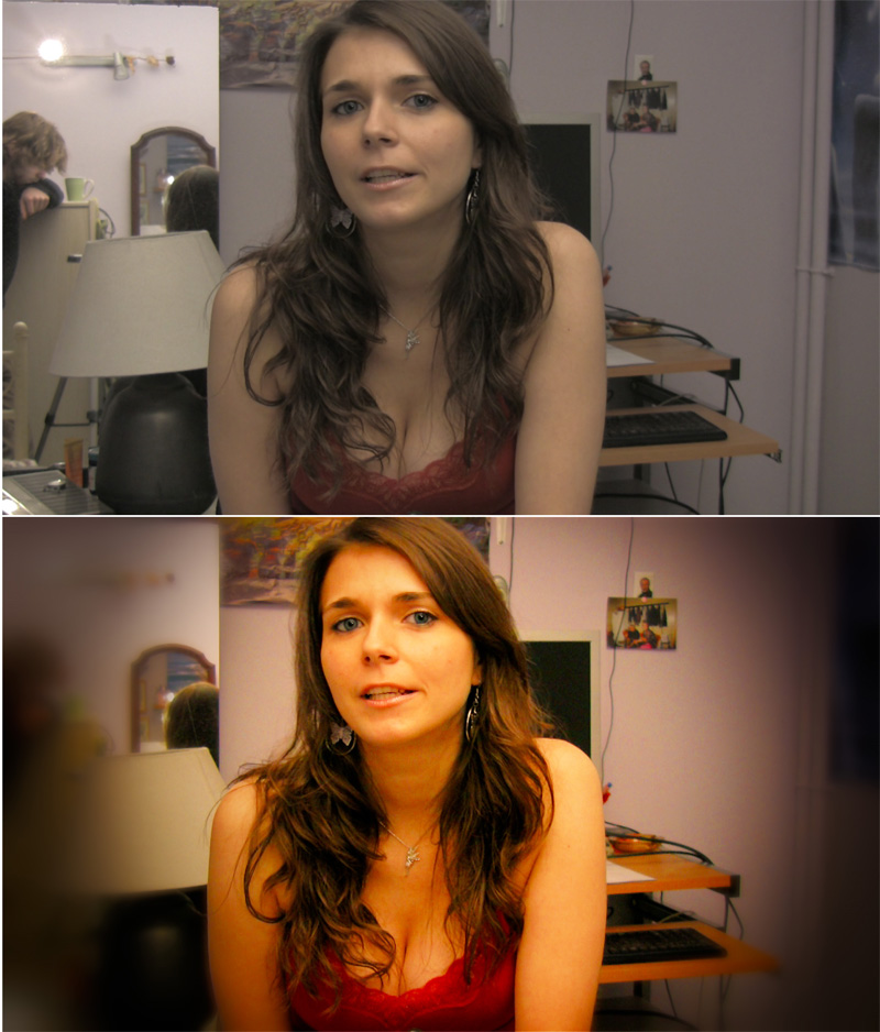
I do post on our YouTube vids which are recorded in HDV so they're compressed with MPEG2, meaning I start off with a source that's already way worse than JPEG. But you can still do a lot by shooting with the flattest/most 'unprocessed' settings possible so you can work with the data that's the most raw off the cmos chip.
tcpost2.jpg

(used the Magic Bullet Looks plugin in Sony Vegas for this, don't remember the setup exactly, it involved exposure, vignet, edge blur, 3-strip, curves, some sharpening afterwards)
 
My first before/after post, and my first attempt at REALLY using Photoshop (cs5):
882087367_g6dMd-XL.jpg

882087396_fUF8U-XL.jpg


Some white balance tweaking, cropping, and a HELL of a lot of healing brush, selective content replacement, and luck. I could touch up the bottom left a good bit more, but I think this is decent enough for 10 minutes of work.
 
For all you photogs that like the vintage look, I just made this image showing a sort of cross processing filter that you can use in Nik's Color Effex Pro...

wtWfY.jpg


Its a plugin so all it requires is the user to select the mixture he or she likes and the intensity applied (0 to 100%). The plugins cost some money but there's boatloads of other filters to choose from too (like Black and White, simulation of the High Key/Low Key look, Cross White balancing etc).
 
Fireye said:
My first before/after post, and my first attempt at REALLY using Photoshop (cs5):
http://fireye.smugmug.com/Other/Misc/IMG1249/882087367_g6dMd-XL.jpg[/]
[img]http://fireye.smugmug.com/Other/Misc/IMG1249post/882087396_fUF8U-XL.jpg[/]

Some white balance tweaking, cropping, and a HELL of a lot of healing brush, selective content replacement, and luck. I could touch up the bottom left a good bit more, but I think this is decent enough for 10 minutes of work.[/QUOTE]
Awesome! Shows how powerful CS5 can be! Capturing sky/clouds is hard. I love a dramatic sky, but I'm yet to master it.

Added some summer, just for fun :)

[IMG]http://www.abload.de/img/summercloudspdh5.jpg
 
captive said:
highlights +43
light 0
darks -22
shadows -35

and then beneath the exposure bar
contrast +25
blacks +15

then just a little noise reduction to taste, for web do more for print do less imo in print on my camera it looks more like grain.

Wow thanks for this post. I've never used the tone curve before because it looked intimidating, but I downloaded your photo and followed your slider settings. I'm amazed :D
 
Zoe said:
What steps would I need to take to make the colors in this photo:

SDC11850.jpg


match this one?

SDC11849.jpg
looks like a white balance issue to me, if you shot raw its super easy to fix, if its jpeg that's beyond me.
 
Zoe said:
What steps would I need to take to make the colors in this photo:

http://i237.photobucket.com/albums/ff319/ztsukino/private/SDC11850.jpg[/MG]

match this one?

[IMG]http://i237.photobucket.com/albums/ff319/ztsukino/private/SDC11849.jpg[/MG][/QUOTE]
[img]http://www.abload.de/img/sdc11849aw0b8.jpg

What I did:
1- Made a new layer with the 1st photo and blurred it to hell (85 gaussian blur)
2- Set the layer to soft light.

edit: Looks like I misunderstood what you wanted.
 
Photoshop? Load both photos. Then: Image -> Adjustments -> Match color (use the first photo as the source for the color match)

2nm42lh.jpg


I then selected the guy behind the huge plate and fixed the white levels, bleached the remaing purple parts and used the clone stamp to fix some more damage.
 
^ Thanks, I'll give it a try!

(obviously those aren't the originals, I didn't want to post 5MB pictures)

captive said:
looks like a white balance issue to me, if you shot raw its super easy to fix, if its jpeg that's beyond me.

Unfortunately my camera does not shoot raw :(
 
as someone who knows nothing about photography, doesn't this stuff kind of cheapen it? i mean basically anyone who has photoshop can be a photographer now, and none of the difficulty in creating pretty things in the days before computers is there
 
Duki said:
as someone who knows nothing about photography, doesn't this stuff kind of cheapen it? i mean basically anyone who has photoshop can be a photographer now, and none of the difficulty in creating pretty things in the days before computers is there
Yes and no in my opinion.
I started out with film developing and printing my own stuff. So to me a RAW image is just that raw, or to me an undeveloped negative. I use lightroom just like i did the dark room. To adjust contrats, dodge and burn etc.

I dont use photoshop and i can think of 2 instances where i've cloned anything out of an image using lightroom. One was my downtown shot of Houston and i cloned out some very minor lens flare. And i recently shot a portrait and cloned out a wall hook. The subject was blocking it but he moved and i didnt notice.
So im not for doing super heavy modifications like cloning stuff out and using photoshops content aware fill but you do have to develop images.

And im not even getting into "seeing" a photograph with the camera, it does take practice and skill. I think many people can do it, but they have to learn and develop it, i think its rare that someone can pick up a camera and take fantastic photos without any prior knowledge or practice.
 
Duki said:
as someone who knows nothing about photography, doesn't this stuff kind of cheapen it? i mean basically anyone who has photoshop can be a photographer now, and none of the difficulty in creating pretty things in the days before computers is there

The ability to actually compose a good photograph, find interesting light and subjects and the ability to process an image without it looking garish is not such an easily acquired skillset that it cheapens the process. Also post processing isn't a new thing now that computers and photoshop are here its just been made easily accessible and in turn usable by the masses. I think its all the better for it.
 
Tiger (still doesn't look right. needs further editing which I'm too lazy or incompetent to do):
s33oz6.jpg


bad artificial kitchen lighting killed the colors in this pic:
et9t20.jpg


Raw FTW:
2druwx3.jpg
 
BlueTsunami said:
The ability to actually compose a good photograph, find interesting light and subjects and the ability to process an image without it looking garish is not such an easily acquired skillset that it cheapens the process. Also post processing isn't a new thing now that computers and photoshop are here its just been made easily accessible and in turn usable by the masses. I think its all the better for it.
Sounds like a very strong parallel to recording. When you had 24 track machines with 2" tape and 48-channel+ boards, things were a tad complicated. Now you can strip it down to a computer and an interface and things aren't as complex.

If anything it's revealed a lot more people who don't have good vision and foresight. It's been a magnifying glass for lazy technique, and to some extent bad art.
 
I processed that one almost half a year ago, so I don't remember everything. Camera was a 40D in RAW, initial RAW processing in Lightroom, most of the work done in Photoshop. A lot of it was fixing all the different color temperatures in the photo (outside, service area, showroom inside, etc) by masking those sections off. With each of the areas masked off I made individual adjustments with Levels, Brightness (sometimes), Contrast, Saturation. I isolated the sky and brought that way down with Levels and then messed around with saturation and contrast. I was surprised to get so much back in the sky with the RAW. The "Service / Service / Express" words I made stand out more. Did some slight dodging/burning to certain areas. I removed whatever kind of ventilation that was on top of the roof in the before. If I had cared a bit more I would have tried to remove the trash can and the fire hydrant. CS5s content aware fill is perfect for tasks like that. On really tricky photos like this, isolating different elements of the photo and working on specific areas is key.
 
before.jpg


after.jpg


Curves, colour balance, levels to get the desired colours.

Image of SMB masked onto the glasses and blended, with Hue / Saturation.

Some High Pass Filter to sharpen selective areas.

Done.

There is some truly great work here, quite inspiring. Photography has been a dead end for me for quite a while, and after my degree, I was considerring hanging up the camera for a bit. Perhaps I wont now.
 
Duki said:
as someone who knows nothing about photography, doesn't this stuff kind of cheapen it? i mean basically anyone who has photoshop can be a photographer now, and none of the difficulty in creating pretty things in the days before computers is there
I couldn't disagree more. If "everyone" can do it, then why isn't everyone doing it? Art is about being new, different, interesting. Something everyone can do and something you see every day isn't very interesting. World class photographers are as hard to come across now as ever.

You could also say the same about color film, or digital music, or next-gen gaming, or HD. Movies, music and certainly games aren't necessarily any better today. Technology is constantly evolving and so must art do.

Also, photo is not all about art. It's about capturing memories and photojournalism as well, and I can't really see much harm in better looking family photos or prettier journalism :)
 
b.e.r.g said:
I couldn't disagree more. If "everyone" can do it, then why isn't everyone doing it? Art is about being new, different, interesting. Something everyone can do and something you see every day isn't very interesting. World class photographers are as hard to come across now as ever.

You could also say the same about color film, or digital music, or next-gen gaming, or HD. Movies, music and certainly games aren't necessarily any better today. Technology is constantly evolving and so must art do.

Also, photo is not all about art. It's about capturing memories and photojournalism as well, and I can't really see much harm in better looking family photos or prettier journalism :)

I completely agree. That, and everything that is possible on Photoshop can be done in the darkroom. There is nothing wrong with a process becomming more streamlined, and easier to use. Difficulty for the sake of difficulty is pointless, especially when the turnaround for commercial photography is so quick.

I have been shooting exclusively on film for the last couple of years, now, and even then, I will scan and use Photoshop to make corrections and alterations, purely because of ease of use.
 
Status
Not open for further replies.
Top Bottom