Where'd you find another one?
On her IG
Where'd you find another one?
On her IG
FUUUUUCK Tony Stark.
NeoGAF.Why is every thread involving a hot woman awful.
Damn she looks fine
My God. I posted on Reddit that I fucking loved it.
Getting downloaded like crazy suddenly. My god that is a hateful place these days.
I don't like that other Photoshop. Found this one on Twitter, and like it a lot more. Until I saw this, I didn't think a white skinned version (as in color white, not race white) would work.

Aesthetically, I like it a lot. I don't know if I like it more than the other, but both would work out well, IMO. Both give out different feels.
I don't think they would actually ever do it, and for good reason, too. Context behind painting a POC's skin white, is too much. It can't really be ignored.
if it were her eyebrow would be blond and her eye either blue or the same as her other.
Right? Not a vitiligo expert but that seems like it's how it works.
dawg.....
i'm bout to put on the cape
No shit, right? 9 pages.
Speaking of aint shit Tony Stark...
I just don't see the problem with a racebent character that balances visual elements of the comic book character and design sensibilities of the film universe it's being adapted to. It's simply a slightly different take on the character.
I'm glad I'm not the only one to notice.Why is every thread involving a hot woman awful.
Why is every thread involving a hot woman awful.
Because "hotness" is subjective?
lol @ Deadpool being the rug
Well thanks for doing that nowI don't like that other Photoshop. Found this one on Twitter, and like it a lot more. Until I saw this, I didn't think a white skinned version (as in color white, not race white) would work.
Aesthetically, I like it a lot. I don't know if I like it more than the other, but both would work out well, IMO. Both give out different feels.
I don't think they would actually ever do it, and for good reason, too. Context behind painting a POC's skin white, is too much. It can't really be ignored.
If accuracy is integral to the enjoyment, then doesn't that mean the viewer just wants slavish adaptations where looks matter than substance? Venom in the movies wasn't accurate to the comics. For obvious reasons.

Characterisation should matter more. There's no critic worth their salt still thinking criticising Xmen movies for having black leather suits is a worthy battle to die on.
Well then...
I don't like that other Photoshop. Found this one on Twitter, and like it a lot more. Until I saw this, I didn't think a white skinned version (as in color white, not race white) would work.
Aesthetically, I like it a lot. I don't know if I like it more than the other, but both would work out well, IMO. Both give out different feels.
I don't think they would actually ever do it, and for good reason, too. Context behind painting a POC's skin white, is too much. It can't really be ignored.
Is this really the same as whitewashing? People just want to see if the comic look had been possible. Something that happens tons of times a live action version is revealed.People trying to whitewash a black woman, meanwhile my friend that has vitiligo is marking out that she's got a superhero that looks like her in some way
*looks at images*
I should watch Atlanta, shouldn't I?
People trying to whitewash a black woman, meanwhile my friend that has vitiligo is marking out that she's got a superhero that looks like her in some way
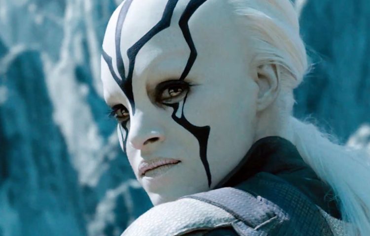
That character's an alien.
Does this count as whitewashing to you?
Biggest crime in that movie was making her an alien.
Does this count as whitewashing to you?
And Domino is a mutant.That character's an alien.
That character's an alien.

 HYPE
HYPE