-
Hey, guest user. Hope you're enjoying NeoGAF! Have you considered registering for an account? Come join us and add your take to the daily discourse.
You are using an out of date browser. It may not display this or other websites correctly.
You should upgrade or use an alternative browser.
You should upgrade or use an alternative browser.
FAST Racing Neo out this week (still a December release)
- Thread starter blu
- Start date
Release date from the new 60fps trailer:
http://fast.shinen.com/neo/video/shinen_fast_racing_neo_nintendo_direct_1080p60.mp4
(make sure to watch it on a big-ass monitor, full-screen)
update: rats.
Does anyone else love the music for this trailer? Hope it's in the game.
Does anyone else love the music for this trailer? Hope it's in the game.
Yep the music is great. Martin said at GC that they got an extra person to make the music and that pays off.
-shadow-
Member
There's no way this one is going to be topped!Let me also add:
FAST Racing Neo |OT| Sunbathing under F-Zero suns
FAST Racing Neo |OT| F that, Zero shadow of doubt
FAST Racing Neo |OT| Cleaner than VW
FAST Racing Neo |OT| Clean German cars
Amazing!
brainchild
Banned
I would actually combine two of the previous ideas for OT name:
FAST Racing Neo |OT| Clean German cars
I like it.
I sat down to read this thread.
At one point I opened up Hecht (Optics) off my shelf to check some stuff.
This has been me for the better part of the day while also doing some measurements in the background.
At one point I opened up Hecht (Optics) off my shelf to check some stuff.

This has been me for the better part of the day while also doing some measurements in the background.
Someone on fb asked if it will fit with 2GB left on his harddrive and shinen said yes.
So <2GB.
WTF, what witch craft is this!!??...either that or it only has like 5 tracks
Davey Cakes
Member
Not witchcraft. Wizardry.WTF, what witch craft is this!!??...either that or it only has like 5 tracks
Shin'en are known for their skills in this area.
The game has 16 tracks!
Not witchcraft. Wizardry.
Shin'en are known for their skills in this area.
The game has 16 tracks!
Isn't Nano Assault Neo only like 80MB?
Tertullian
Member
Isn't Nano Assault Neo only like 80MB?
Nano Assault Neo is shockingly tiny.
Pokemaniac
Member
Isn't Nano Assault Neo only like 80MB?
Closer to 50MB. That one makes heavy use of procedural generation for graphics.
Closer to 50MB. That one makes heavy use of procedural generation for graphics.
I remember them shrinking the file size after launch but couldn't remember just how low it went. 50MB is insane.
Zombegoast
Member
They said the size would be at least 640mb.
blu
Wants the largest console games publisher to avoid Nintendo's platforms.
Shin'en getting sloppy ;pThey said the size would be at least 640mb.
Astral Dog
Member
Not witchcraft. Wizardry.
Shin'en are known for their skills in this area.
The game has 16 tracks!
WTF, what witch craft is this!!??...either that or it only has like 5 tracks
I thought the technique they were using (randomnly generated geometry or something) was well known for using little memory? it would make sense, and yes this is Shin En ;P
blu
Wants the largest console games publisher to avoid Nintendo's platforms.
Not randomly but still procedurally. There's a difference.I thought the technique they were using (randomnly generated geometry or something) was well known for using little memory? it would make sense, and yes this is Shin En ;P
Nope. Just "December 2015".So no release date yet?
lol Nice one!Let me also add: ...
FAST Racing Neo |OT| F that, Zero shadow of doubt ...
First impression:
Speed comes across.
The crafts are a bit overdone.
The coloring of the game is a bit off.
Prevolition
Member
FAST Racing Neo |OT| Too Fast For The Captain
FAST Racing Neo |OT| Falcon JAB!
FAST Racing Neo |OT| F-Neo X Comes Next
FAST Racing Neo |OT| Falcon JAB!
FAST Racing Neo |OT| F-Neo X Comes Next
The coloring of the game is a bit off.
IIRC, Manfred discussed their choice of colors during the E3 Treehouse Live stream. Something like, the whole team was fans of old arcade games, and wanted lots of bright arcade-like colors in the game.
Davey Cakes
Member
FAST Racing Neo [OT] Wir fahr'n, fahr'n, fahr'n auf der Autobahn
Get a Kraftwerk reference in there.
Get a Kraftwerk reference in there.
FAST Racing Neo [OT] Wir fahr'n, fahr'n, fahr'n auf der Autobahn
Get a Kraftwerk reference in there.
Yes...
I'm all-in for arcade-like colors and appreciate it more than natural colors inIIRC, Manfred discussed their choice of colors during the E3 Treehouse Live stream. Something like, the whole team was fans of old arcade games, and wanted lots of bright arcade-like colors in the game.
these kind of games. However, the choice of arcade-like colors (the color
tones and their saturation levels) with respect to each other and with respect
to the environment doesn't match together for me. Additionally, the crafts
don't stood out, colors are way too desaturated, and their designs/shapes are
way too similar. From behind they all look the same (almost). Many of the
effects are overdone or too pronounced like the sonic shield, the flashing
gems while hitting, or the very long booster strips. The screen is clutter
with too much unnecessary (non useful) stuff, if you ask me.
brainchild
Banned
I'm all-in for arcade-like colors and appreciate it more than natural colors in
these kind of games. However, the choice of arcade-like colors (the color
tones and their saturation levels) with respect to each other and with respect
to the environment doesn't match together for me. Additionally, the crafts
don't stood out, colors are way too desaturated, and their designs/shapes are
way too similar. From behind they all look the same (almost). Many of the
effects are overdone or too pronounced like the sonic shield, the flashing
gems while hitting, or the very long booster strips. The screen is clutter
with too much unnecessary (non useful) stuff, if you ask me.
Different strokes, I guess. I think they've done a fantastic job with their use of color and effects. I also think their craft designs are well thought out with lots of little details that car aficionados can appreciate.
I mean, just look at this beauty
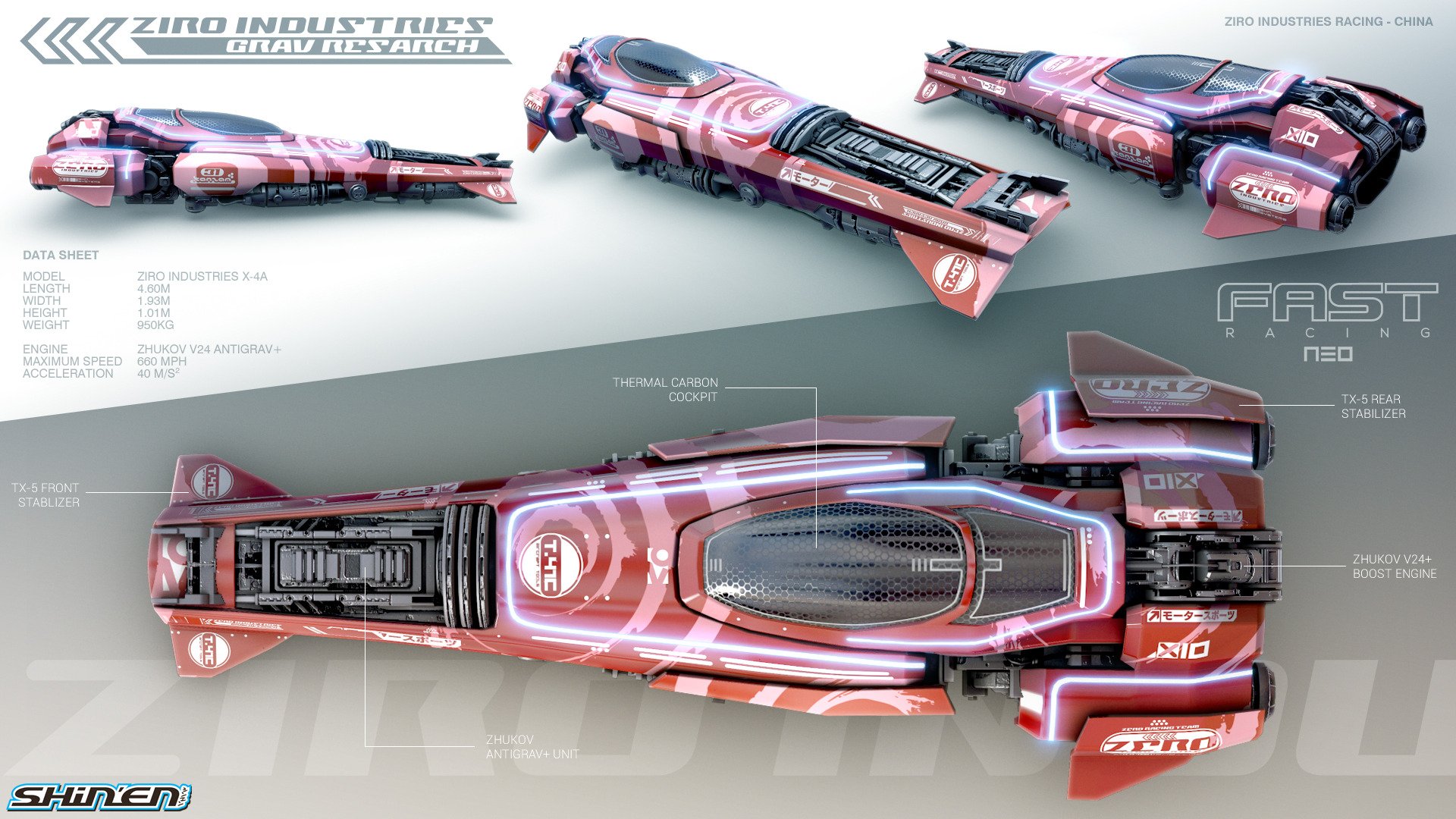
Perfection.
Winner, winner, chicken dinner.FAST Racing Neo [OT] Wir fahr'n, fahr'n, fahr'n auf der Autobahn
Get a Kraftwerk reference in there.
kuroneko0509
Member
doubt this is new thread-worthy, but seems the game is 1.8k yen (inc. tax) in Japan
http://www.inside-games.jp/article/2015/11/25/93365.html
or i'm too slow as the Japan price was known already
If you single things out, they look way good. No question about it. Well, IDifferent strokes, I guess. I think they've done a fantastic job with their use of color and effects. I also think their craft designs are well thought out with lots of little details that car aficionados can appreciate.
I mean, just look at this beauty
Perfection.
don't want to diminish their work/achievement, I rather want to point out that
the representation of the game could be more sound.
If the game is also meant to play online (perhaps competitive) many of the
"smearing" effects become rather distracting.
Let's consider the boost strips again. They are very long and almost uniform
in color. This produces an almost 0Hz region on the screen (and in your eyes)
for a rather long time while approaching the strip and crossing it. This is a
design failure in my book considering you want people to perceive a really
FAST game. Additionally, such regions make your eyes "blind" for a brief
moment (different story). Well, I think they wanted to try something new rather
than copying the standard boost pads seen in many similar games, which is a
complete valid approach. I just want to mention that the strips etc. need more
work. They need structure to pump up the frequency and they need sort of a
velocity-depend filter to filter out time-aliasing (aliased high frequencies
resulting in beat frequencies).
Perhaps this is all nitpicking on an average-gamer scale. xD
doubt this is new thread-worthy, but seems the game is 1.8k yen (inc. tax) in Japanhttp://www.inside-games.jp/article/2015/11/25/93365.htmlor i'm too slow as the Japan price was known already
Published in Japan by ARC SYSTEM WORKS, interesting.
So it should be 15/$ I guess. Now it just needs to come out, hopefully before Xenoblade.
El Sabroso
Member
Let me also add:
FAST Racing Neo |OT| Sunbathing under F-Zero suns
FAST Racing Neo |OT| F that, Ziro shadow of doubt
FAST Racing Neo |OT| Cleaner than VW
Just made an adjustment to reference one more thing, needs to be that OT
brainchild
Banned
If you single things out, they look way good. No question about it. Well, I
don't want to diminish their work/achievement, I rather want to point out that
the representation of the game could be more sound.
If the game is also meant to play online (perhaps competitive) many of the
"smearing" effects become rather distracting.
Let's consider the boost strips again. They are very long and almost uniform
in color. This produces an almost 0Hz region on the screen (and in your eyes)
for a rather long time while approaching the strip and crossing it. This is a
design failure in my book considering you want people to perceive a really
FAST game. Additionally, such regions make your eyes "blind" for a brief
moment (different story). Well, I think they wanted to try something new rather
than copying the standard boost pads seen in many similar games, which is a
complete valid approach. I just want to mention that the strips etc. need more
work. They need structure to pump up the frequency and they need sort of a
velocity-depend filter to filter out time-aliasing (aliased high frequencies
resulting in beat frequencies).
Perhaps this is all nitpicking on an average-gamer scale. xD
You're talking about the motion blur that correlates with boosting along the strips? I mean, you have a valid point about losing visual information during that time (as with all motion blur), so I'm not going to argue with you on that point. However, near as I can tell, the crafts do not coalesce with the boost strips (or the environment for that matter) during these moments. You can still make out the crafts from the boost strips, so I don't see the problem.
More importantly, the visual design here is based on the concept of optical flow, due to traveling so quickly. If you've ever seen movies or documentaries that try to represent time dilation at blistering speeds, you'll notice that they do the same thing. The effect definitely conveys the feeling of speed for most people, so again, I don't see a problem there.
Furthermore, the motion blur is directly tied to velocity, as optical follow (at least Shin'en's implementation of it) is calculated by motion vectors.
Anyway, I'd say the long boost strips indicate good design. The uniform colors help them to stand out amidst the environment when motion blur is activated, and the strips are long so that the player is given enough time to boost through the environment and catch up to other players without relying on saving up boost energy. It's just an accessible and balanced way to play the game without make things too complicated, while still keeping the mechanics engaging.
We'll just have to agree to disagree here. To my mind, this is looking to be their most polished game yet in terms of the intuitiveness and simplicity of their game design. All of the visual elements have a great balance between accessibility and challenge.
Let's not forget that in real life, futuristic high speed racing would look a lot like this

Nope.You're talking about the motion blur that correlates with boosting along the strips? ...
FAST Racing Neo |OT| Cleaner than VW
It's straight up impossible to top this.
I'd be really mad if the OT isn't gonna be called that.
brainchild
Banned
Nope.
Then I take back what I said, you don't have a single valid argument in that post, aside from the fact that you just don't like the colors.
At least with the motion blur, you could objectively argue that visual information is lost. Without that, your argument is nonsense, as the rest of the image in a given scene retains visual clarity and poses no challenges to gameplay.
Your concern trolling is noted.
EDIT: And just so we're clear (so you don't think I'm just outright dismissing your concerns), the temporal aliasing you describe is very minimal in this game (and is something present to some degree in any content using signal processing). While the pixels that display the boost strips are generally in the same range of color, they aren't exactly the same color, and the sampling rate is nowhere near as low as 0hz, and would still satisfy the Nyquist sampling criterion, as the sampling rate of the boost strips is sufficient to deliver a discrete sequence of samples.
So as I said before, this is a non-issue as far as gameplay is concerned, and is certainly nothing to criticize Shin'en for. Now, with motion blur, that is something that is actually affecting the gameplay, but the degree of temporal aliasing that you describe is only theoretical, and does not apply to this game.
There is another dev interview: http://www.nintendolife.com/news/20...hind_the_scenes_of_fast_racing_neo_-_part_two
Sadly there is still no release date. It wasn't added today so I guess it won't come out before next week at the earliest? Kinda annoying.
Sadly there is still no release date. It wasn't added today so I guess it won't come out before next week at the earliest? Kinda annoying.
Davey Cakes
Member
I don't get why there can't just be a release date already. The game is set to release in December, which is one day away.
Just announce it for the third Thursday in December (the 17th) and be done with it. Sheesh.
Just announce it for the third Thursday in December (the 17th) and be done with it. Sheesh.
blu
Wants the largest console games publisher to avoid Nintendo's platforms.
I don't think that Shin'en's call, or at least not for the larger part.I don't get why there can't just be a release date already. The game is set to release in December, which is one day away.
Just announce it for the third Thursday in December (the 17th) and be done with it. Sheesh.
Not a release this week, but maybe a release date this week? More specifically tomorrow:
https://twitter.com/ShinenGames/status/671695575033782274
https://twitter.com/ShinenGames/status/671695575033782274
And please FASTen your seatbelts because tomorrow we have big news
for #FAST Racing Neo!
Not a release this week, but maybe a release date this week? More specifically tomorrow:
https://twitter.com/ShinenGames/status/671695575033782274
FAST Amiibo bundle!
wild wild rice
Member
Not a release this week, but maybe a release date this week? More specifically tomorrow:
https://twitter.com/ShinenGames/status/671695575033782274
Siiiiick. So this news tomorrow, Game Awards the day after, Playstation conference and Xenoblade on Friday? We gon eat this week.
LordOcidax
Member
Xenoblade X and Fast, Great.Not a release this week, but maybe a release date this week? More specifically tomorrow:
https://twitter.com/ShinenGames/status/671695575033782274
Not a release this week, but maybe a release date this week? More specifically tomorrow:
https://twitter.com/ShinenGames/status/671695575033782274
Please release this week!
Davey Cakes
Member
Placing my bets on next week, as that Twitter post seems "excited."
Similar threads
- 75
- 2K
cireza
replied