-
Hey Guest. Check out your NeoGAF Wrapped 2025 results here!
You are using an out of date browser. It may not display this or other websites correctly.
You should upgrade or use an alternative browser.
You should upgrade or use an alternative browser.
Final fantasy VI launches on android tomorrow £10.99/14.99
- Thread starter chickdigger802
- Start date
Vyse The Legend
Member
That's probably because the UI needs to work on devices of all sizes.
Both Android and iOS allow developers to tailor the UI to different screen sizes. Moreover, there is plenty of space to the right of the ugly character action boxes.
MilkyOctave
Member
The background looks great, but the sprites do not. Especially those enemy/monster sprites, what's with the edges?
I wanna see how this scene looks like "updated"

Have you not played FFVI before?Looks great! Price isn't too bad, but I'll still wait for a sale.
MagiusNecros
Gilgamesh Fan Annoyance
Did FF5 iOS have scrolling battle menu's?
CharminUltra
Member
LOL that looks hideous :X
ShockingAlberto
Member
I think the backgrounds look sterile and kind of amateur, personally.
So? Why is that a big deal? Most of the time you're probably going to be attacking or using magic, which will be at the top from the looks of things anyway.1) Scrolling
Why not? It looks nicer than just having the character's name in all capital letters, which is what the original UI had..2) Uglier version of the sprite in the upper left-hand corner. Why are there two sprites?
Looks fine to me. Certainly less ugly than the SNES font.3. Terrible font as always.
What does this even mean? It looks perfectly readable and functional, isn't that the point? If you're referring to all the empty space on the buttons, I'm sure that's intentional. It makes controlling the menus easier. Big buttons are better than a bunch of tiny ones when you're working with a touch interface.4. Lots of dead spacing in the UI as a result of point #3.
Because those need to be separate from the character menus?5. Why is run in the upper left-hand corner? Why is there a pause button on the right, and fast-forward (quick autobattle) on the upper right? To put it simply, very inconsistent, haphazard UI design.
chickdigger802
Banned
something about that ui just looks off. like the bottom is cutoff. weird, butchered android version?
sirseanconnery
Banned
Wow that price is bullshit.
Breakfast at Noon
Member
vita or bust.
TheJollyCorner
Member
Happy 20 Year Anniversary, FFVI.

Huh. With the way the UI is set up it doesn't look like you need to press anything to switch from one character's command list to another.
If the peeps in charge of this port wanted to give a bit of a buff to one of the worst characters in FF6, they could take advantage of that to make it possible to use Cyan's abilities without making it impossible to issue commands to the rest of your party while he's charging up. He could get his sword-charging on while you continued to fight with everybody else.
They should do that. I hope they did.
Magicpaint
Member
The entire look just feels sterile for some reason but it's not horrible or anything. The sprites on the UI look terrible though.
I, too, was one of those people.. It was the only plausible explanation in my mind at the time. I would have never, in a million years, thought they would subject FFVI to this engine.
Oh come on, stop exaggerating.. you don't know how painful to play the upressed GBA version through emulator (I wish I can see thing at native res) but no one sell GBA or 320 x 240 TV anymore at these day.
Stop bitching for chance/choice for people that want play the game, many people like me not seeing Michael Jordan playing for Chicago Bulls you know, excuse us please.
hitsugi
Member
Oh come on, stop exaggerating.. you don't know how painful to play the upressed GBA version through emulator (I wish I can see thing at native res) but no one sell GBA or 320 x 240 TV anymore at these day.
Stop bitching for chance/choice for people that want play the game, many people like me not seeing Michael Jordan playing for Chicago Bulls you know, excuse us please.
You're funny and completely ridiculous. If anyone is bitching, it's you about people having an opinion. I hate to say it, but, grow up.
Glass Rebel
Member
Happy 20 Year Anniversary, FFVI.
jesus :lol
7DollarHagane
Banned
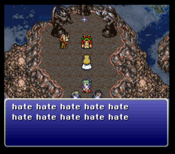
This redone art was a little more acceptable with ff4 and even 5 as those are cartoonist, more whimsical games. FF6 has its own unique look which is horribly mutated here.
not to mention the annoyance of touch screen controls.
sticking with the gba version with the better audio quality hack.
not to mention the annoyance of touch screen controls.
sticking with the gba version with the better audio quality hack.
Vyse The Legend
Member
So? Why is that a big deal? Most of the time you're probably going to be attacking or using magic, which will be at the top from the looks of things anyway.
Why not? It looks nicer than just having the character's name in all capital letters, which is what the original UI had..
Looks fine to me. Certainly less ugly than the SNES font.
What does this even mean? It looks perfectly readable and functional, isn't that the point? If you're referring to all the empty space on the buttons, I'm sure that's intentional. It makes controlling the menus easier. Big buttons are better than a bunch of tiny ones when you're working with a touch interface.
Because those need to be separate from the character menus?
Let's try a different approach. Here's the FFV iOS UI:
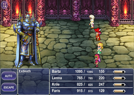
While it's not pretty either, it's infinitely nicer, more cohesive than the FF6 monstrosity. It also disproves many of your points above (the run/auto buttons needing to be separate, for example).
Orniletter
Banned
leaked footage:
...oh well, if that is what the audience wants....ok...I guess
...oh well, if that is what the audience wants....ok...I guess
Let's try a different approach. Here's the FFV iOS UI:
While it's not pretty either, it's infinitely nicer, more cohesive than the FF6 monstrosity. It also disproves many of your points above (the buttons needing to be separate, for example).
That looks less usable than the new FF6 UI honestly.
FlashbladeGAF
Member
Oh come on, stop exaggerating.. you don't know how painful to play the upressed GBA version through emulator (I wish I can see thing at native res) but no one sell GBA or 320 x 240 TV anymore at these day.
Stop bitching for chance/choice for people that want play the game, many people like me not seeing Michael Jordan playing for Chicago Bulls you know, excuse us please.
We got 2 full 3d remakes of FF 3 and 4
How could we not expect Square to follow up 5 and 6 with their own 3D Remakes.
Going from dedicated portable game machines that can produce reimagined 3D graphics to a mobile device with graphics that look like it was up-res'd, then traced, then filtered, is a big let down. especially with the 3DS having been an announced and our expectations shifting to the remakes being available on an even more powerful machine
Glad you get to experience it and I am glad it's available, but at the same time FF6 should have been given a proper remake than a half assed port.
Vyse The Legend
Member
That looks less usable than the new FF6 UI honestly.
I'm glad you're not in charge of designing UI.
Looks fine for FFVI on a phone. I don't know what you guys were really expecting.
The original untouched game, because this new updated version they weren't going to buy anyway since it's for phones somehow will make their original copies disappear.
It's not like most phones support emulation allowing you to play the original game.
hitsugi
Member
Dude.
We got 2 full 3d remakes of FF 3 and 4
How could we not expect Square to follow up 5 and 6 with their own 3D Remakes.
Going from dedicated portable game machines that can produce reimagined 3D graphics to a mobile device with graphics that look like it was up-res'd, then traced, then filtered, is a big let down.
Glad you get to experience it and I am glad it's available, but at the same time FF6 should have been given a proper remake than a half assed port.
The 2D FF1 & 2 remakes on PSP also had (vastly) superior art styles compared to the FF Dimensions look which is being carried on here.
That looks less usable than the new FF6 UI honestly.
I have to agree honestly. The FFV picture doesn't really show how you would select individual characters easily, or any of the actual selecting of commands.
I kind of like that the FFVI one breaks them up into individual UI for each character, which might be a first for the series. And I like that they each have a portrait.
Is it perfect? No, not even close. But I don't think it's terrible, and it's trying something new from the looks of it.
Celes is right.
Relaxed Muscle
Member
So? Why is that a big deal? Most of the time you're probably going to be attacking or using magic, which will be at the top from the looks of things anyway.
The big deal is that is not good UI design. It shouldn't be needed at all, even if you don't use the other commands as much.
Why not? It looks nicer than just having the character's name in all capital letters, which is what the original UI had.
Opinions.
But the fact is that portraits aren't really needed and they use a space that could be use for other things....like menu commands.
Looks fine to me.
System fonts, are horrible. Opinions again, but I can assure you you are in the minority here. They don't fit the game at all.
What does this even mean? It looks perfectly readable and functional, isn't that the point? If you're referring to all the empty space on the buttons, I'm sure that's intentional. It makes controlling the menus easier.
Between all that space being empty and those horrible 3D shadow buttons it looks just plain bad, almost amateur photoshop bad.
Even if they're big to be easily to press, dosn't mean there's need to be half the button space not used at all. Or have to be so ugly.
Because those need to be separate from the character menus?
There's no reason to have the run menu button so separated from the comands, when is actually a battle command. Certainly it barely fits being alongside the pause button, which is not related to commands or the battle itself.
Is a pretty mess.
You may like it, but that dosn't mean is not breaking several UI good practices.
I think the backgrounds look sterile and kind of amateur, personally.
Same and they crash with the filtered sprites.
Considering FF VI had such beautiful pixel art is almost insulting.
Both Android and iOS allow developers to tailor the UI to different screen sizes. Moreover, there is plenty of space to the right of the ugly character action boxes.
That space would be for the 4th party member.
chickdigger802
Banned
The original untouched game, because this new updated version they weren't going to buy anyway since it's for phones somehow will make their original copies disappear.
It's not like most phones support emulation allowing you to play the original game.
its quite easy to get a snes emulator on android phones and ios7 is jbed so shouldn't be long for that either.
That horrible smoothing filter...
It's not a filter. These are redrawn sprites. They actually put in effort to make it look like this.Can't wait to see that with the ugly filter ON.
HolyBaikal
Banned
I really, really like this port so far. I will buy it immediately.
Terra looks adorable in this.
Though this topic doesn't tell me how much it is going to cost in US money. I would assume it will also be available tomorrow in the US? And perhaps cost about $15?
Terra looks adorable in this.
Though this topic doesn't tell me how much it is going to cost in US money. I would assume it will also be available tomorrow in the US? And perhaps cost about $15?
Vyse The Legend
Member
That space would be for the 4th party member.
Yes, but see the FF5 iOS screenshot.
They somehow made it work there.
That UI is terrible for a myriad of reasons:
A) Does not display active time bar. This is CRUCIAL to Final Fantasies of that era as you have to input your command as quickly as possible, since battles are running in real time. In the harder boss battles, time is of the essence. You can't dilly dally around.
B) The HP/MP displays are lined up horizontally, not vertically. Again, this only hinders the player as they have to glance over each individual party member's stats and see who's in the red.
C) Portrait of the character right next to HP display and NO NAME?! I don't think I've ever seen an RPG where they don't display names in combat. I think this would be frustrating for a new player who hasn't familiarized themselves with the characters and doesn't know who does what.
D) WTF at those stupid buttons around the corners?
Relaxed Muscle
Member
Looks much better.
Definetly they look much better...than Kemco RPG games.
chickdigger802
Banned
I really, really like this port so far. I will buy it immediately.
Terra looks adorable in this.
Though this topic doesn't tell me how much it is going to cost in US money. I would assume it will also be available tomorrow in the US? And perhaps cost about $15?
V was $16
To be fair, at this point in combat, the ATB bar would be full. It's very possible that once you select a command, a bar shows up.That UI is terrible for a myriad of reasons:
A) Does not display active time bar. This is CRUCIAL to Final Fantasies of that era as you prepare to input your command as quickly as possible. In the harder boss battles, time is of the essence. You can't dilly dally around.
B) The HP/MP displays are lined up horizontally, not vertically. Again, this only hinders the player as they have to glance over each individual party member's stats and see who's in the red.
C) Portrait of the character right next to HP display and NO NAME?! I don't think I've ever seen an RPG where they don't display names in combat. I think this would be frustrating for a new player who hasn't familiarized themselves with the characters and doesn't know who does what.
D) WTF at those stupid buttons around the corners?
That UI is terrible for a myriad of reasons:
A) Does not display active time bar. This is CRUCIAL to Final Fantasies of that era as you prepare to input your command as quickly as possible. In the harder boss battles, time is of the essence. You can't dilly dally around.
The new UI might work a whole lot better than an ATB bar honestly. Now you don't even need a bar really, because you have a separate UI for each character, and can move to select them the moment their turn is available.
I haven't tried it yet, but it might not be that bad.
No name is weird I guess, but the portrait isn't weird. They have portraits by the character bar in the early builds of FFXV even.
TheJollyCorner
Member
Definetly they look much better...than Kemco RPG games.
lol
ThatsMytrunks
Member
I think the background art in that shot looks pretty great. The redrawn sprites really don't, though.