SecretMoblin
Member
Some of them look like corporate logos from Cyberpunk or something.
Wipeout team logos!



Some of them look like corporate logos from Cyberpunk or something.
I love them, but to me they seem almost too modern... like the flags of some dystopian future society.

Some cities have great flags too.
Toronto


One of the worst flags I have ever seen

One of the worst flags I have ever seen
Why the heck does the blue gap between the two white lines disappear and turn into one white line under the leaf? It hurts.What? Boo this man. That's slick and simple. Even if I didn't tell someone what city that was from, they could so easily figure it out.
Have to agree, it's a horrible flag.
Why the heck does the blue gap between the two white lines disappear and turn into one white line under the leaf? It hurts.
Why the heck does the blue gap between the two white lines disappear and turn into one white line under the leaf? It hurts.
This flag was officially never used but I always thought it was an interesting yet flawed concept, EU flag design proposal:

That Venice one just has too much going on.
And in Ethiopia: IS THAT SCAR?


This flag was officially never used but I always thought it was an interesting yet flawed concept, EU flag design proposal:
I think it was a neat idea, it's like a barcode for bankruptcy.

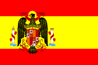
I don't really know much about Franco's Spain, but from a design perspective its flag is like a supercharged version of the current flag:

The green panels at the top and the bottom of the flag symbolise the land, while the blue panel in the centre represents the waters of the Torres Strait. The thin black stripes between the green and blue panels signify the Torres Strait Islanders themselves. The white five-pointed star at the centre of the flag represents the five major island groups, and the white dhari (dancer's headdress) around it also symbolises the Torres Strait Islands people. White symbolises peace, while the star is a symbol for navigation
The Japanese prefecture flags are reminiscent of family crests.
One of these look familiar?
Yeah that's Hyrule right there. Know which prefecture/family?
Well erm, the Nazi Germany flag is a hugely effective piece of design. Fascists make good flags I guess.
So I was reading up about Georgia and came across its old Soviet flag


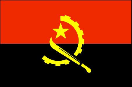
Angola


In 2001, the North American Vexillological Association conducted a poll on its website, asking its members and the public their opinions of flag designs in the U.S. and Canada.
Responses came in from 100 NAVA members and over 300 members of the public in 20 countries. Participants rated 72 flags on their design qualities (rather than on political, historical, or geographic considerations) on a scale of 0 to 10, where 10 was the best score. They were asked to rely on their personal sense of good flag design in rating the flags, which appeared on the web page. They cast well over 29,000 individual votes.





This flag was officially never used but I always thought it was an interesting yet flawed concept, EU flag design proposal:


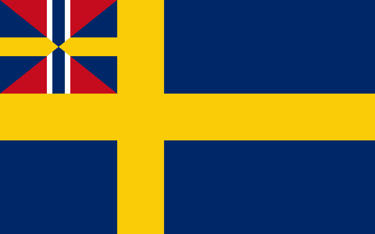
Sildesalaten. The old union mark on the Norwegian and Swedish flags.

I love them, but to me they seem almost too modern... like the flags of some dystopian future society.

My favorite is this flag of the House of Welf as Kings of Hannover
so classy
Ugly horse ruins it, imo.
Übermatik;47501240 said:
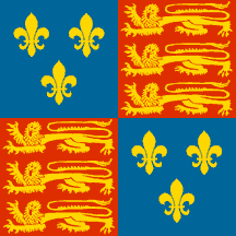

I've always liked the WWI German Navy flag

Ugly horse ruins it, imo.
Like a findus beef lasagna.
For those interested:
The North American Vexillological Association's 2001 State/Provincial Flag Survey
http://www.nava.org/flag-design/survey/state-provincial-survey-2001
10 Best Flags:
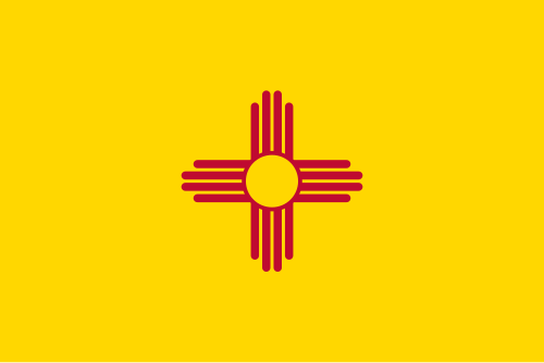
1. New Mexico (8.61)
2. Texas (8.13)
3. Quebec (8.04)
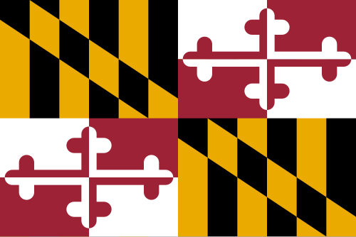
4. Maryland (7.97)
5. Alaska (7.96)
6. Arizona (7.92)
7. Puerto Rico (7.66)
8. District of Columbia (7.48)
9. Marshall Islands (7.19)
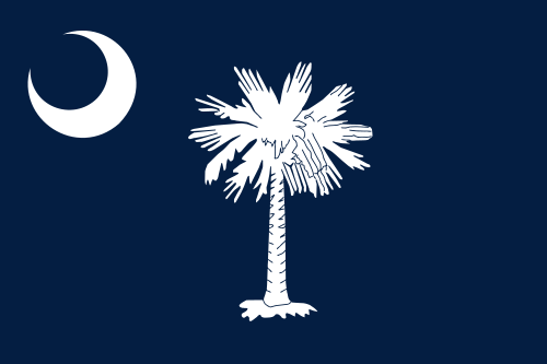
10. South Carolina (7.16)