First of all, awesome entries all around. The level of these assignments has gone up dramatically in the last couple of months. While it's cool to see so many astonishing pics, it's getting way too hard to judge them.

It has to be done, though, so here goes:
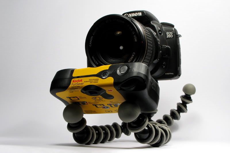
Winner:
Lucky Forward: Like I said before, great shot. I love almost every aspect of this image, maybe apart from the right side of the shot, which is a bit too light compared to the left edge. I love the positioning, the personification of the 20D, the humor... awesome.
Runner-up:
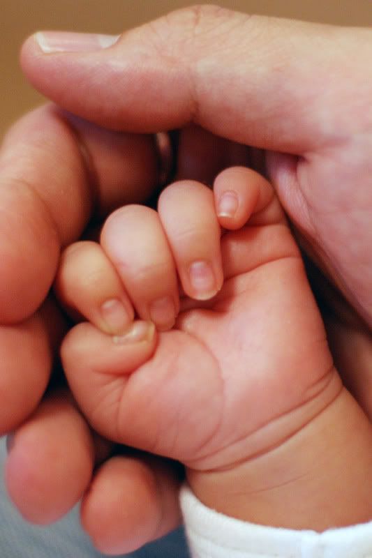
SealSqueal: Love the colors, love the moment you've captured. Great shot all around.
Honorable mentions:
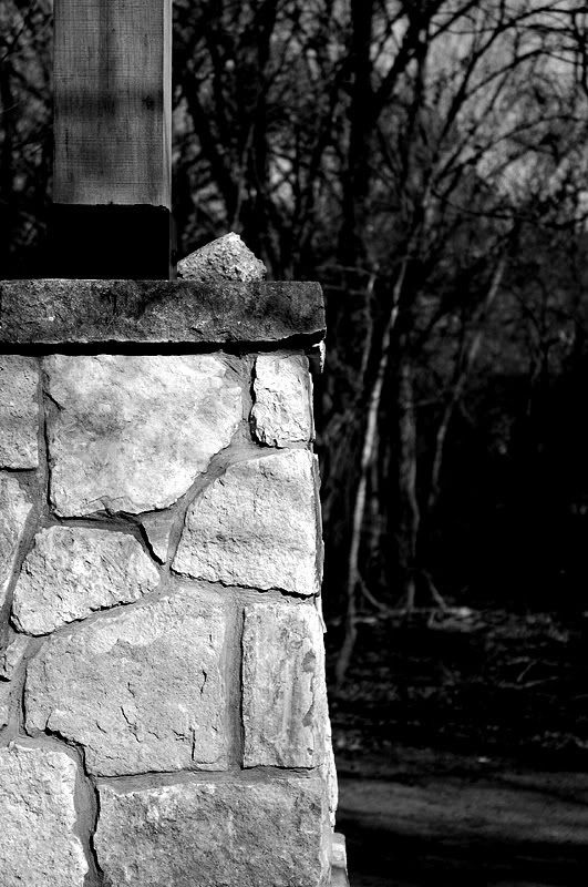
AirBrian: It seems to me that the brick wall is on the verge of overexposure. Other than that, great shot. There's a definite contrast between the calm and cool brick wall and the dark and scary woods.
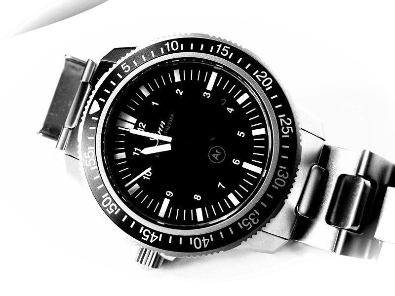
OnkelC: Like someone said, the top left corner is a bit distracting. Maybe crop it a bit tighter? Apart from that, great shot. Nice exposure, lovely contrast, and... a left-handed watch?
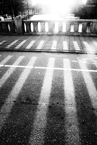
Roi: Beautiful. I would've liked to see it a bit less exposed, though. Right now the sun is a bit too powerful, and the shadows could've been even more powerful had they been a bit darker.
Squirrel Killer: A great shot, but it looks a bit too contemporary, if that makes any sense. I think what I'm longing for is the look that really old photographs have, some graininess, some dust, stuff like that. It's almost as if this shot was made for that, and now that it's not there, it bothers me. Go figure.
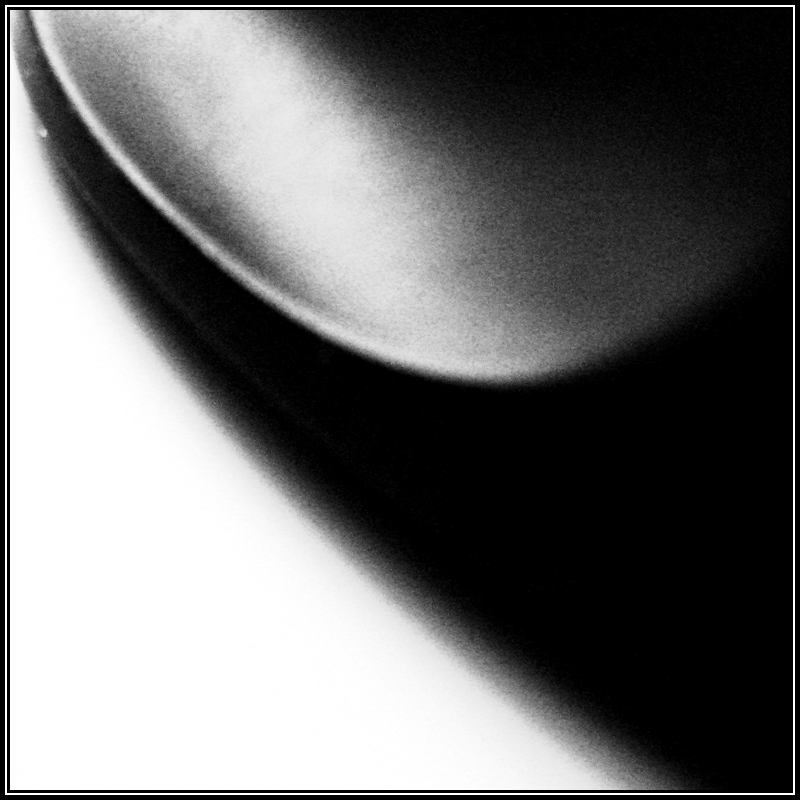
aidan: I don't know what that is, but it looks cool. The brightest parts seem a bit overexposed, though.
Other comments:
LRS: It's funny that this shot is at the same time pleasing and somehow distracting. I can't seem to find a spot to focus my eyes at. Lovely texture on the blue part.
hey_monkey: Like the idea, but the keyboard could've, ironically, used some more contrast. Might be the keyboard's fault as well.
thatbox: Haha, like the setting a lot. Other than that, though, it comes off a bit bland. Maybe up the contrast?
giga: Nice macro, but a bit weak topic-wise for me.
mrkgoo: Topic-wise a good setting, but it was a really tough assignment. The Wii seems a bit out of focus, too.
ScientificNinja: Is it just me not having slept, or is the shot a bit out of focus? A beautiful shot nonetheless, and one of the best topic-wise.
Forsete: I think this picture would've been more powerful in B&W. Right now it comes off half-idyllic (the sky), half-creepy (the trees), and although there's that contrast(!), it's not as capturing as it could be.
rampur: I agree with Shadowmancer. I think you could've cropped it a bit tighter, though.
joshschw: The three pencils/pens come off a bit overdone. I think the contrast between old and new would've been more powerful with just two pen(cil)s and maybe the ink bottle.
Rentahamster: Lovely yellow! It's a bit weak on the topic side, though.
guess: I didn't know churches that tacky existed. That said, I saw a Mercedes Benz with "Jesus helps" emblazoned on the rear bumper (big letters, too) today. The photo seems a bit bland somehow. Might be the grey sky.
Tf53: The item in question is a
Logitech MX1000 mouse lying on my brand new home office desk. I've been really busy as of late (work deadline, moving house), so I'm just glad to have snapped anything at all. I had a really tough time coming up with anything contrast-y, so I decided to take the artsy route.