-
Hey, guest user. Hope you're enjoying NeoGAF! Have you considered registering for an account? Come join us and add your take to the daily discourse.
You are using an out of date browser. It may not display this or other websites correctly.
You should upgrade or use an alternative browser.
You should upgrade or use an alternative browser.
GAF Photography 2009: Assignment Thread 65 - Still Life
- Thread starter LRS
- Start date
- Status
- Not open for further replies.
captive said:Damn you, Lucky!
Olympus E510
50mm Macro
1/100 @ f2.0
ISO 400
:lol
I still want to change my entry, but we'll see if I can do anything. Probably not. :/
Squirrel Killer
Member

Camera model: Canon EOS Digital Rebel XTi
Lens: EF 50mm f/1.8
Focal length: 50 mm
Exposure time: 1/40 second
Aperture: f/8.0
ISO: 100
Post Processing: Crop, adjust curves and levels, increase saturation, resize in GIMP.
What I was smoking: Traditional interpretation of the theme, with non-traditional subjects. Meh, I'm not as enamored of this as I was when I took it. My intent, beyond the non-traditional subject, was to use natural light as opposed to carefully positioned studio lights (my eating area is perfectly set up for natural light portraits.) But I'm thinking the subjects are too boring to warrant so much as a photo, much less an unconventional technique.
BlueTsunami
there is joy in sucking dick
Camera: Canon Rebel XT
Lens: Canon 50mm f/1.4
Exposure: 1/80th (+1 Stop in PP)
Aperture: 3.5
Post Processing: Exposure adjustment and Niko B&W in CS3
Lucky Forward
Member
Here we go...
youta said:Rationale: I find it a bit ironic that "still life" usually involves images which show stillness, but lack life. If anything, photography grants us the power use that "still" as a verb, and capture a moment of life, in this case an instant of beauty and poise.
Then again, perhaps I just like hot chicks. At least it's better than what's been going on in this thread so far
Maybe NSFW, just linking because I don't want to further derail this thread (btw, lighten up guys, go take some photos!)
Still Life
sankt-Antonio said:^
well here is my artsy-fartsy
understanding of "modern" still-lifes:
(whatever that means)

the idea was to show a weirdo with a gasmask
praying to the technica-god ...
and the ipod being some kind of golden lamb
because in still lifes (in my mind)
things where shown witch
where important or meaningfull for people
or expensive ... whatever...
hey iam on painkillers
all week
mrkgoo said:Possibly filler:

(No, it's not sleeping, but it's definitely 'at rest').
Squirrel Killer, indeed.
xBerserker said:

Celery&Lager said:I would like to try something more arranged but just in case I don't have time:

aidan said:A more traditional take on the theme:
Camera: Canon EOS Digital Rebel XT
Exposure: 0.02 sec (1/50)
Aperture: f/5.0
Focal Length: 50 mm
Exposure: +1.15
ISO Speed: 400
Timbuktu said: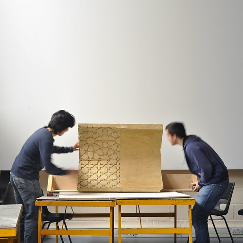
Camera: Nikon D90
Exposure: 0.1 sec (1/10)
Aperture: f/9.0
Focal Length: 50 mm
ISO Speed: 200
Exposure Bias: 0 EV
Flash: No Flash
scola said:wanted to shoot some miniatures against a backdrop from a magazine or a landscape but it didn't work out. I want to do a traditional still life but I probably won't have time before the deadline.

sneaky77 said:I understand this is not what most people understand by this theme and I am pretty new at this anyway but since it was an exercise in patience to get this shot I just wanted to post it
Papi said: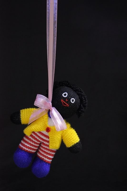
Canon EOS 450D, 1.6 seconds, f/8.0, ISO200
op_ivy said:
tried to do something interesting with the theme. rather then completely still i wanted to capture the rain with a touch of motion, and this dying rose branch fit in nicely with the "life" aspect.
LRS said:

sarcastor said:
this was taken near the golden gate bridge in San Francisco
Lucky Forward said:
Canon 20D, 85mm f/1.2L, ISO 100, 1/100, f/1.2
This was one of the more enjoyable assignments. I'm referring, of course, to eating/drinking the subject during editing.
captive said: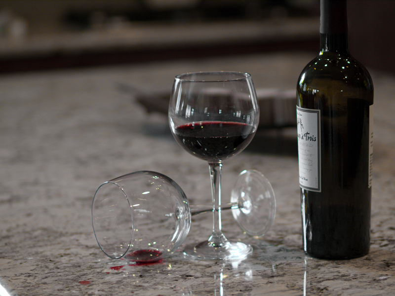
Olympus E510
50mm Macro
1/100 @ f2.0
ISO 400
Squirrel Killer said:
Camera model: Canon EOS Digital Rebel XTi
Lens: EF 50mm f/1.8
Focal length: 50 mm
Exposure time: 1/40 second
Aperture: f/8.0
ISO: 100
Post Processing: Crop, adjust curves and levels, increase saturation, resize in GIMP.
What I was smoking: Traditional interpretation of the theme, with non-traditional subjects. Meh, I'm not as enamored of this as I was when I took it. My intent, beyond the non-traditional subject, was to use natural light as opposed to carefully positioned studio lights (my eating area is perfectly set up for natural light portraits.) But I'm thinking the subjects are too boring to warrant so much as a photo, much less an unconventional technique.
Tf53 said: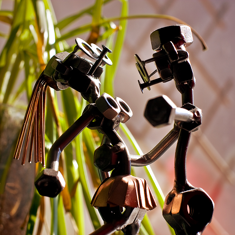
Camera: Canon EOS 40D
Lens: EF 50mm f/1.4
Exposure: 0.008 sec (1/125)
Aperture: f/8.0
Focal Length: 50 mm
BlueTsunami said:
Camera: Canon Rebel XT
Lens: Canon 50mm f/1.4
Exposure: 1/80th (+1 Stop in PP)
Aperture: 3.5
Post Processing: Exposure adjustment and Niko B&W in CS3
nib95 said: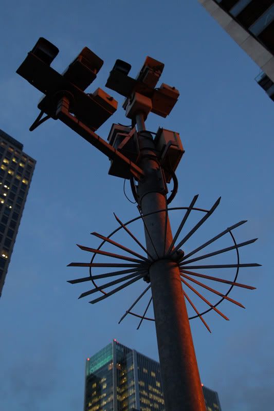
Canon 500d
21mm
1/50 @ f/4
ISO 800
Post process: None (apart from resizing)
I'm sorry if I sound negative, I don't mean any harm with any of my comments. That said:
Winner: op_ivy: I love this shot. The colors seem strong but at the same time a bit washed out, which suits the mood perfectly. A really strong picture.
Runner-up: BlueTsunami: Great shot. A really nice combination of in-focus and out-of-focus stuff, great composition, and the b/w suits it really well.
Comments:
youta: She's got man hands! I don't like the empty space on the right. I would've preferred a portrait orientation.
sankt-Antonio: It is a bit artsy-fartsy to me. I can't make out the bottom and the iPod seems weird on the top.
mrkgoo: Apart from the vegetation and the texture of the fur, the shot is a bit boring. I'm not really feeling it themewise either.
xBerserker-: I wish there wasn't a reflection just above the dog's eyes. I would've also cropped it a bit tighter, so that there wasn't as much red stuff.
Celery&Lager: The edge of the front object needs a bit more contrast with the background. Now it half blends in and half doesn't. The DOF is also a bit too narrow.
aidan: I like the composition, except for the shadow that's cut off to the right. I don't like the 5-blade bokeh of the 1.8, but that's a matter of taste.
Timbuktu: Not feeling the empty space here either. And your life isn't completely still. The thing the guy is holding looks really cool, though. What is it?
scola: Looks a bit soft to me. The critter is awesome, and the bokeh looks ok, but it's a bit blurry and dark.
sneaky77: I'm not quite sure whether I want a closer crop or not. On the other hand the grass and the fence create a nice contrast, but on the other the squirrel is quite small in this version. Nice capture nonetheless.
Papi: I don't advocate racial hate. That said, I really like this shot. You could've maybe cropped out a bit more from the right, but other than that I really dig it. HM.
LRS: This is also a strong image, but I wish the vase didn't go out of the frame. Good colors, though. HM.
sarcastor: There's not much of interest in the pic, and it looks a bit mundane. Maybe you could've exposed it for the bright spot on the floor to give it a moodier look?
Lucky Forward: Good composition, but maybe just a bit too tight. The DOF is a bit too shallow, and the reflection in the bottle drops this pic to just an HM. Could I have some of the grapes?
captive: For some reason the shot isn't as powerful as it maybe could've been. Maybe the point of view is a bit ordinary? Seems a bit soft as well.
Squirrel Killer: Props for the Gamecube. I don't like the crease in the fabric, though.
nib95: Hmh, the shot seems empty and busy at the same time. I'm not really feeling the composition, and the red-ish tint doesn't do it favors.
That said:Winner: op_ivy: I love this shot. The colors seem strong but at the same time a bit washed out, which suits the mood perfectly. A really strong picture.
Runner-up: BlueTsunami: Great shot. A really nice combination of in-focus and out-of-focus stuff, great composition, and the b/w suits it really well.
Comments:
youta: She's got man hands!
I don't like the empty space on the right. I would've preferred a portrait orientation.sankt-Antonio: It is a bit artsy-fartsy to me. I can't make out the bottom and the iPod seems weird on the top.
mrkgoo: Apart from the vegetation and the texture of the fur, the shot is a bit boring. I'm not really feeling it themewise either.
xBerserker-: I wish there wasn't a reflection just above the dog's eyes. I would've also cropped it a bit tighter, so that there wasn't as much red stuff.
Celery&Lager: The edge of the front object needs a bit more contrast with the background. Now it half blends in and half doesn't. The DOF is also a bit too narrow.
aidan: I like the composition, except for the shadow that's cut off to the right. I don't like the 5-blade bokeh of the 1.8, but that's a matter of taste.
Timbuktu: Not feeling the empty space here either. And your life isn't completely still.
The thing the guy is holding looks really cool, though. What is it?scola: Looks a bit soft to me. The critter is awesome, and the bokeh looks ok, but it's a bit blurry and dark.
sneaky77: I'm not quite sure whether I want a closer crop or not. On the other hand the grass and the fence create a nice contrast, but on the other the squirrel is quite small in this version. Nice capture nonetheless.
Papi: I don't advocate racial hate. That said, I really like this shot. You could've maybe cropped out a bit more from the right, but other than that I really dig it. HM.
LRS: This is also a strong image, but I wish the vase didn't go out of the frame. Good colors, though. HM.
sarcastor: There's not much of interest in the pic, and it looks a bit mundane. Maybe you could've exposed it for the bright spot on the floor to give it a moodier look?
Lucky Forward: Good composition, but maybe just a bit too tight. The DOF is a bit too shallow, and the reflection in the bottle drops this pic to just an HM. Could I have some of the grapes?
captive: For some reason the shot isn't as powerful as it maybe could've been. Maybe the point of view is a bit ordinary? Seems a bit soft as well.
Squirrel Killer: Props for the Gamecube. I don't like the crease in the fabric, though.
nib95: Hmh, the shot seems empty and busy at the same time. I'm not really feeling the composition, and the red-ish tint doesn't do it favors.
sankt-Antonio
:^)--?-<
1st blue zunami
2nd LRS
2nd LRS
xBerserker
Member
1st - BlueTsunami (I love this shot! Do you have a full size version on Flickr you can link to?)
2nd - mrkgo
2nd - mrkgo
Tf53 said:mrkgoo: Apart from the vegetation and the texture of the fur, the shot is a bit boring. I'm not really feeling it themewise either.
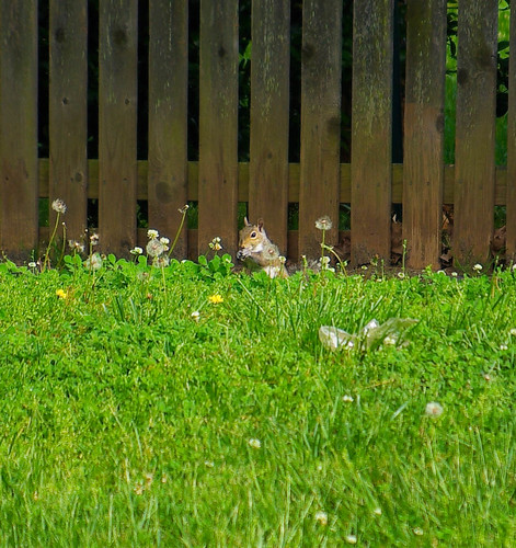
I didn't feel it particularly themewise either. I was trying to be a bit sarcastic with a literal interpretation (the life is still). After a hike, I saw a dead squirrel lying in the vegetation. It looked like it was sleeping and so peaceful. I posted it as a filler, fully intending to replace it with a 'proper' still life (particularly since others started posting non-traditional still lifes as well - it just makes mine look more stupid).
But I didn't get around to it. Because I'm lazy and a procrastinator.
1. captive - I like that this one fits the theme and still kind of tells a story. Also: is that Menage a Trois wine? :lol
2. Tf53 - awesome.
Seemed like a lot of people just ignored the theme and did whatever they felt like. Which is fine, of course, but was kind of disappointing--I was looking forward to seeing a wide variety of takes on still lifes.
Papi - I'm not usually prone to this, but that image really set off my cultural "you just don't do that" sensors.
BlueTsunami - lovely shot. Funny, it reminds me of a photo my sister took back when we took a photo class together.
youta - cool pic, but I'm at work, so I can't go back and look at it again to tell you what I liked about it.
mrkgoo -
Squirrel Killer - what good is a GameCube without games?
First: Lucky Forward: I really liked this shot. Colourful (sorry captive - your one was a bit cool for my tastes), inviting, expertly taken. One of my ideas was to deliberately copy this shot, but with Coke, raisins and some processed cheese slices :lol, but at the market, it just left me wondering what I would do with the processed cheese :/. But your image is totally still life to me, but conveys both a story and emotion. Well done.
Runnerup: Blue Tsunami Just such an awesome shot. Foreground blur often doesn't work, but it's great here.
I, too, was hoping that with such a theme we'd get a lot more actual set pieces. My entry was pretty much a joke-entry (for me anyway).
Comments:
Sankt-antonio: I have trouble telling what is going on. Maybe that's the point. The background is distracting, and the movement isn't 'blurred' enough for me. When it's a controlled environment, I think the effects can be achieved better.
Xbeserker: A nice enough shot. I always find it a struggle with this kind - whether to crop in tight (more intimate), or to leave it wider (show isolation more).
Celery&Lager: Nice and sharp. Not enjoying the composition - reminds me of some of my earlier stuff when I was playing around. Is it me, or is this shot kinda green?
Aidan: Expertly put together. How do you get the blues and yellows like that? Is it from an indoor and outdoor lighting? An honourable for sure. I would've considered voting if the subject choice happened to have a bit more meaning (to me).
Timbuktu: I actually liked this shot a lot. It's a shame that you were 'forced' to resize somewhat. I believe different images can be better or worse depending on their presentation - and I felt this one worked at a larger size. I'm not actually one to support a forced size limit in these threads, but it does keep things under control.
scola: I love the DOF in this shot, but the subject is kind of uninteresting and has too much of a "I couldn't think of anything, but wanted to enter anyway" kind of feel. Which is ok, of course, because that's 40% of my entries, but you have to try and add some context to it- that could be anything in place of the zerg. I had some entries similar, and I look back at them now and wonder what I was thinking.
sneaky77: When posting something 'against the grain' in regards to theme interpretation, the appeal is often completely about that interpretation. So if it has been already interpreted that way previously, the impact is lessened for both those shots, but more in particular for the one posted later. In this case, the image has to be a lot stronger technically. Unfortunately, yours seems to be a cross between my own, and Xberserker's, and I feel it doesn't add anything technically. The composition seems a bit flat, and the vertical fence offset at an angle is distracting.
Papi: Oh boy. It certainly has meaning! Subtle, but nice. I'm not sure the dark background was a good choice, however. Still, an honourable.
op_ivy: "life that is still" interpretation is definitely running a bit dry by now (lol). Even the first person to do something like this doesn't make it necessarily clever (lol)- actually it's pretty obvious. I do like the composition though. Maybe a B&W version makes more sense?
LRS: It's ok. I really don't have much to say about it.
sarcastor: I really like the photo, but I can't figure out the interpretation at all.
captive: as I said above, a nice shot, but beaten, and doesn't do it any better than the one before. And not warm/inviting enough.
Squirrel Killer: I sit there really pondering this image, because I keep thinking there's some meaning in having CDs with the GameCube... :lol I'm not a fan of cloth backgrounds.
TF53: A nicely taken dynamic shot. I wonder if it has more meaning to you than it does to me, however.
nib95: As much as I like shots of poles and lights (I do), I'm not feeling any interesting take on the theme. 500D! How is it?
muntersaur
Member
1. Blue Tsunami - easily the stand-out entry for me.
2. Aidan - unusual subject and great use of shadows
Hm - Papi purely because the subject caught me off-guard and could be seen as exceptionally bad-taste, something which I would never have expected from the idyllic connotations normally associated with still life photography.
2. Aidan - unusual subject and great use of shadows
Hm - Papi purely because the subject caught me off-guard and could be seen as exceptionally bad-taste, something which I would never have expected from the idyllic connotations normally associated with still life photography.
Cosmic Bus
pristine morning snow
1. op_ivy
2. BlueTsunami
I really like Timbuktu's photo, but to me, it doesn't fit the theme so I can't justify voting for him here.
2. BlueTsunami
I really like Timbuktu's photo, but to me, it doesn't fit the theme so I can't justify voting for him here.
umm... I thought the 'stillness' in the object would be brought out by the moving people next to it and also in the symmetry, large depth of field and emptiness in the image. I think I understand still life more as a painting genre and doesn't mean as much to me in photography. btw that thing was something we made testing patterning techniques in ferrocement.
I'm gonna go for:
1. mrkgoo
2. Lucky Forward
I'm gonna go for:
1. mrkgoo
2. Lucky Forward
youta
Member
Damn, quality is through the roof.
Papi (#1):
Wow, that's a powerful image. Winner without a doubt.
Tf53 (#2):
Very good. A solid 2nd place.
sankt-Antonio:
Not quite sure of the intention. The blur at the bottom doesn't quite balance the composition.
mrkgoo:
I like this picture, sad as I find it to be. I'd have slightly preferred the rule of thirds to be applied, with the squirrel closer to the bottom right, and a little smaller.
xBerserker:
Cute puppy. I think this could have worked better in B&W with a bit more contrast.
Celery&Lager:
Very colourful and organic. I find it fits the theme in a different way (since you mention lack of arrangement): there is still some life left in that dying vine.
aidan:
Nice composition, and a good example of why the rule of thirds often works well.
Timbuktu:
Again, not sure of the intention. I think it might have worked better using a higher shutter speed (presumably at higher ISO and larger aperture, since I'm guessing the light wasn't great). As it is the blur is distracting.
scola:
I think this is a still life just as it is. I like the picture, is just needs a slightly more exposure and a sharper focus (on the creature's eyes, at least).
sneaky77:
Again, rule of thirds would have helped here. I'd zoom in and crop out the bag.
op_ivy:
Very nice, I like the rain.
LRS:
Another nice, rather poetic image.
sarcastor:
I just wish the window framed something interesting.
Lucky Forward:
It's very well made, but looks like an ad.
captive:
Interesting contrast with Lucky Forward's. Similar idea, not nearly as good technically, but doesn't look like an ad.
Squirrel Killer:
As per its description, the execution is OK, if a tad underexposed (and careful with background creases, like the one in the middle running below the controller), but the subject isn't that memorable.
BlueTsunami:
Nice image. I wonder if it's one of those cases where colour might have worked better, hard to say.
nib95:
The buildings are distracting, without them a B&W silhouette might have been more interesting.
youta: I love this shot. Excellent gradient range from black to white. I like the amount of detail captured from the texture of the subject's hair to the soft, glistening feel of the lips. lighting is perfect. I like the way the subject's body is positioned and the overall composition of the shot. This is my favourite shot of the thread but I can't figure how it relates to the theme.
sankt-Antonio: I like the effect at the bottom. The colours and softness are soothing like a watercolour piece.
mrkgoo: I thought this was a wombat. The shot didn't really interest me.
xBerserker: I don't know how this shot relates to the theme.
Celery&Lager: I feel the yellow is overpowering and the focus of the subject seems to be neglected.
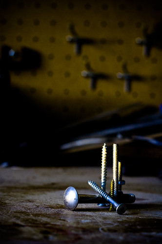
aidan: Good shot. Good composition. I think the background draws my attention away from the screws, especially that metal thing at the back because I can't figure out what it is. I like the details in the screws, but I think I would've preferred a closer shot of the screws and the arrangement.
Timbuktu: Having moving people in your seems like the opposite of still life. I don't know what the people are supposed to be doing or what it's meant to mean. I can see a bit of symmetry in the shot, if that's what you were going for, but I really don't understand it. What are they making/looking at?
scola: The subject is a bit too soft. I think the darkness enhances the menancing nature of the subject.
sneaky77: If the squirrel wasn't in this shot then this would make for a decent symmetrical shot because of the square crop and the contrast between the grass and fence.
op_ivy: The focus feels a bit soft at the end where the deteriorated flower is. I really like the colour of the leaves. The contrast feels a bit too strong. I like your choice of subject.
LRS: The focus feels a bit soft but it suits the calmness of laying petals and the book, which evokes feelings of calmness and relaxation. The tipped vase makes for a nice contrast. Good work.
sarcastor: I found the paint on the walls to be the most interesting part of this shot.
Lucky Forward: Nice arrangement and colours. The softness enhances the feeling of relaxing and enjoying some wine and fucking delicious cheese. I think that if you had wet the grapes then they'd look just as delicious. The reflections are a bit distracting. Excellent work.
captive: Ahhh, this shot reminds me of all those times getting drunk in people's apartments. I find the relections and the bright spot in the bottom left corner to be distracting.
Squirrel Killer: I like how the stack of CDs mirrors the size of the GameCube. I don't find the shot very interesting though. Seems a tiny bit underexposed. The creases are distracting. Wish I could read the CD labels.
Tf53: That's pretty cool. The lighting feels really harsh and the background is a bit distracting. I really enjoy the colours and I find the subject pretty interesting.
BlueTsunami: Nice composition. I think I would've preferred bolder contrast.
nib95: Are they cameras? I like how the subject exists in the blue space between the buildings at the top but then I don't like how it clashes with building at the bottom. I like the red lighting; coupled with the spikes and the uncertainty of the subject, it gives it a sense of peril like it's a mechanical beast standing against the cool blue sky.
I'm finding it hard to pick a winner. I found it hard to relate a lot of the shots to the theme and I guess I expected more setup shots with controlled lighting.
First vote goes to Tf53.
Second vote... hmm... Lucky Forward.
My piece attempts to portray the idea that a pretty pink ribbon is used to cover the blatant image of lynching as much as the facade of a child's doll covers the racist imagery. It's making the statement that if a golliwogg is just a doll then here is a doll with a pretty ribbon tied in a neat bow around it. It's supposed to evoke emotion and a strong response in the viewer.
sankt-Antonio: I like the effect at the bottom. The colours and softness are soothing like a watercolour piece.
mrkgoo: I thought this was a wombat. The shot didn't really interest me.
xBerserker: I don't know how this shot relates to the theme.
Celery&Lager: I feel the yellow is overpowering and the focus of the subject seems to be neglected.
aidan: Good shot. Good composition. I think the background draws my attention away from the screws, especially that metal thing at the back because I can't figure out what it is. I like the details in the screws, but I think I would've preferred a closer shot of the screws and the arrangement.
Timbuktu: Having moving people in your seems like the opposite of still life. I don't know what the people are supposed to be doing or what it's meant to mean. I can see a bit of symmetry in the shot, if that's what you were going for, but I really don't understand it. What are they making/looking at?
scola: The subject is a bit too soft. I think the darkness enhances the menancing nature of the subject.
sneaky77: If the squirrel wasn't in this shot then this would make for a decent symmetrical shot because of the square crop and the contrast between the grass and fence.
op_ivy: The focus feels a bit soft at the end where the deteriorated flower is. I really like the colour of the leaves. The contrast feels a bit too strong. I like your choice of subject.
LRS: The focus feels a bit soft but it suits the calmness of laying petals and the book, which evokes feelings of calmness and relaxation. The tipped vase makes for a nice contrast. Good work.
sarcastor: I found the paint on the walls to be the most interesting part of this shot.
Lucky Forward: Nice arrangement and colours. The softness enhances the feeling of relaxing and enjoying some wine and fucking delicious cheese. I think that if you had wet the grapes then they'd look just as delicious. The reflections are a bit distracting. Excellent work.
captive: Ahhh, this shot reminds me of all those times getting drunk in people's apartments. I find the relections and the bright spot in the bottom left corner to be distracting.
Squirrel Killer: I like how the stack of CDs mirrors the size of the GameCube. I don't find the shot very interesting though. Seems a tiny bit underexposed. The creases are distracting. Wish I could read the CD labels.
Tf53: That's pretty cool. The lighting feels really harsh and the background is a bit distracting. I really enjoy the colours and I find the subject pretty interesting.
BlueTsunami: Nice composition. I think I would've preferred bolder contrast.
nib95: Are they cameras? I like how the subject exists in the blue space between the buildings at the top but then I don't like how it clashes with building at the bottom. I like the red lighting; coupled with the spikes and the uncertainty of the subject, it gives it a sense of peril like it's a mechanical beast standing against the cool blue sky.
I'm finding it hard to pick a winner. I found it hard to relate a lot of the shots to the theme and I guess I expected more setup shots with controlled lighting.
First vote goes to Tf53.
Second vote... hmm... Lucky Forward.
You can still buy golliwoggs in Australia, even though many consider them to be blatantly racist.Cyan said:Papi - I'm not usually prone to this, but that image really set off my cultural "you just don't do that" sensors.
My piece attempts to portray the idea that a pretty pink ribbon is used to cover the blatant image of lynching as much as the facade of a child's doll covers the racist imagery. It's making the statement that if a golliwogg is just a doll then here is a doll with a pretty ribbon tied in a neat bow around it. It's supposed to evoke emotion and a strong response in the viewer.
I noticed this as well. The softness was probably a result of leaving the aperture open. I didnt have a chance to re-shoot it though.tf53 said:captive: For some reason the shot isn't as powerful as it maybe could've been. Maybe the point of view is a bit ordinary? Seems a bit soft as well.
Thanks, that's what I was going for. And yes it is, my parents love wine. I shot the photo at their house.Cyan said:1. captive - I like that this one fits the theme and still kind of tells a story. Also: is that Menage a Trois wine? :lol
Anyway, I definitely was not going for inviting, I was trying to make the red of the wine and green wine bottle really stand out, I lowered all the color levels except for reds, orange and green. I had never tried that in light room, it seemed as though the wine in the glass was too dark.
1)tf53
2)op_ivy
scola - probably a little soft and maybe try to have more of it in focus.
sneaky77 - I think it needs a smaller crop or a closer zoom so that the squirrel is bigger in the frame.
BlueTsunami - maybe color? I dont really know, it seems slightly flat to me.
Oh yea, forgot to say, I was a little disappointed that some were so loose with their interpretation of "still life."
mrkgoo said:op_ivy: "life that is still" interpretation is definitely running a bit dry by now (lol). Even the first person to do something like this doesn't make it necessarily clever (lol)- actually it's pretty obvious. I do like the composition though. Maybe a B&W version makes more sense?
:lol wow
BlueTsunami
there is joy in sucking dick
LRS: I dig the colors of some of the objects and the rustic feel of the image. The arrangement doesn't feel staged either, as if you walked up on this scene sprawled out before you.
mrkgoo: I don't think I've ever seen a squirrel sleeping before (in person). I also love the way the vegetation is surrounding it and the contrast between the two. I get this comforting image from the shot.
mrkgoo: I don't think I've ever seen a squirrel sleeping before (in person). I also love the way the vegetation is surrounding it and the contrast between the two. I get this comforting image from the shot.
op_ivy said::lol wow
?
Explain.
I do like your shot, I just don't the theme interpretation was that interesting (for what it's worth, I didn't really like mine either).
What I meant to say is that I do like your shot, and that it may be even better in B&W (for me). No offence intended.
Edit: to clarify, my traditional interpretation of "still life" is generally inanimate objects predominantly in an artificial setting. I put (lol)s in my comments for your image, because I am well aware of the hypocrisy in my statements, seeing as I was the first to put such a loose definition image. I was basically saying it was not that clever from my submission.
Blue Tsunami: It's not sleeping - I'm pretty sure it's dead.
BlueTsunami
there is joy in sucking dick
mrkgoo said:Blue Tsunami: It's not sleeping - I'm pretty sure it's dead.
Oh man ;_;
BlueTsunami said:Oh man ;_;
I guess not that comforting in the end :lol. Feel free to change your vote/
mrkgoo said:?
Explain.
I do like your shot, I just don't the theme interpretation was that interesting (for what it's worth, I didn't really like mine either).
What I meant to say is that I do like your shot, and that it may be even better in B&W (for me). No offence intended.
Edit: to clarify, my traditional interpretation of "still life" is generally inanimate objects predominantly in an artificial setting. I put (lol)s in my comments for your image, because I am well aware of the hypocrisy in my statements, seeing as I was the first to put such a loose definition image. I was basically saying it was not that clever from my submission.
Blue Tsunami: It's not sleeping - I'm pretty sure it's dead.
apologies then. i read it as an insult. it was probably the "lol"s
BlueTsunami
there is joy in sucking dick
xBerserker said:1st - BlueTsunami (I love this shot! Do you have a full size version on Flickr you can link to?)
I tend to only upload as 800 on the long end for Flickr but here's the shot at 1900 on the long end...
http://i41.tinypic.com/aoxegj.jpg
mrkgoo said:I guess not that comforting in the end :lol. Feel free to change your vote/
It definitely changes the interpretation but I would say the image is even more powerful now that I know its not sleeping
op_ivy said:apologies then. i read it as an insult. it was probably the "lol"s
Yeah, sorry - I wasn't very clear. I was lol-ing, because I was basically self-criticising... uh...myself. In general, an alternative interpretation of a classic theme has to be pretty clever to get my attention - mine wasn't particularly clever.
Sorry again - it wasn't meant to be insulting, just giving my viewpoint.
BlueTsunami
there is joy in sucking dick
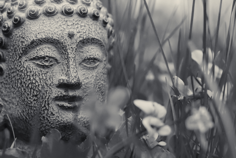
To those who wanted to see the image in color...

I personally preferred it in B&W despite losing the purple in the flowers. The B&W added to this dreamy effect that I was going for. Also the face stood out more within the image. I also had this subtext going on with the contrast of the hard textured stone face and the softness and delicateness of the grass that the B&W conveyed more.
I personally preferred it in B&W despite losing the purple in the flowers. The B&W added to this dreamy effect that I was going for. Also the face stood out more within the image. I also had this subtext going on with the contrast of the hard textured stone face and the softness and delicateness of the grass that the B&W conveyed more.
Well, it definitely succeeded in that regard.Papi said:It's supposed to evoke emotion and a strong response in the viewer.
BlueTsunami said:To those who wanted to see the image in color...
http://i41.tinypic.com/2418pw2.jpg[IMG]
I personally preferred it in B&W despite losing the purple in the flowers. The B&W added to this dreamy effect that I was going for. Also the face stood out more within the image. I also had this subtext going on with the contrast of the hard textured stone face and the softness and delicateness of the grass that the B&W conveyed more.[/QUOTE]
I actually like it, if it werent for the grass and flowers. Now that I have seen it in color i cant unsee the grass and flowers in the black and white.
BlueTsunami said:To those who wanted to see the image in color...
http://i41.tinypic.com/2418pw2.jpg[IMG]
I personally preferred it in B&W despite losing the purple in the flowers. The B&W added to this dreamy effect that I was going for. Also the face stood out more within the image. I also had this subtext going on with the contrast of the hard textured stone face and the softness and delicateness of the grass that the B&W conveyed more.[/QUOTE]
It actually reverses the point of interest. In the B/W version, the statue is the main poitn of interest, whereas in the color version it's left more in the background as the purple flowers steal the attention.
Squirrel Killer
Member
First Choice: LRS - A still life with a narrative. Great accomplishment.
Runner Up: op_ivy - This is a great example for those who wanted to take a non-traditional approach to the assignment.
Honorable Mentions:
Lucky Forward - The very definition of a modern still life. Excellent as usual.
sankt-Antonio - I considered voting for this because, as an image, I love it, although the reflection of the iPod is a bit distracting. While you "get" what a still life is supposed to be, I'm not sure I "get" what's going on in the bottom of the image.
I feel the need to preface my comments... I apologize if I offend anyone, but I'm really disappointed that there were so few people who even attempted a still life. I know some were planning on replacing their entries with something else later, but at least eight entries are clearly not still lifes, and personally I'd put another two of three in the "not" column. It seemed more time was spent rationalizing how entries could be shoehorned in to the theme than people just taking a still life. I'm trying to not be dismissively, "You're subjects are boring" here, but I'm not quite feeling up to commenting on the entries that clearly miss the point of the assignment. (Even if I do love some of them, such as Timbuktu's.)
Other Comments:
youta - Not a still life.
mrkgoo - Not a still life.
xBerserker - Not a still life.
Celery&Lager - Not a still life.
aidan - Well executed still life. Interesting colors.
Timbuktu - Not a still life.
scola - I feel like I've seen this same type of shot a thousand times before, and I don't think I ever thought of them as "still lifes" before, but I guess technically, it is.
sneaky77 - Not a still life.
Papi - You certainly sparked an emotion in me, just not a positive one. That's something.
sarcastor - Not a still life.
captive - Nice execution, although the many reflections take away a little from the shot.
Tf53 - Like with scola's entry, geek-friendly trinket, shallow DOF? Yeah, I feel like I've seen this type of shot before.
BlueTsunami - I love the contrast of lines of the grass against the more organic shapes in the statue, which also helps the use of mono.
nib95 - Not a still life.
Regarding my entry:
I agree on the under-exposure too, I did it to control the reflections of the CD cases and controller, but I think instead, I should've diffused the light better.
And for Papi:
Nirvana - Nevermind
R.E.M. - New Adventures in Hi-Fi
Power of Dreams - Immigrants, Emigrants and Me
Uncle Tupelo - No Depression
R.E.M. - Murmur
Bob Mould - Workbook
Gene - Olympian
Game Theory - Lolita Nation
Green Day - Dookie
Camper Van Beethoven - Telephone Free Landside Victory
Smashing Pumpkins - Siamese Dream
The Connells - Darker Days
The Smiths - Strangeways, Here We Come
Joy Division - Closer
I wouldn't necessarily put that forth as my list of favorite albums, but I would certainly recommend them all.
Runner Up: op_ivy - This is a great example for those who wanted to take a non-traditional approach to the assignment.
Honorable Mentions:
Lucky Forward - The very definition of a modern still life. Excellent as usual.
sankt-Antonio - I considered voting for this because, as an image, I love it, although the reflection of the iPod is a bit distracting. While you "get" what a still life is supposed to be, I'm not sure I "get" what's going on in the bottom of the image.
I feel the need to preface my comments... I apologize if I offend anyone, but I'm really disappointed that there were so few people who even attempted a still life. I know some were planning on replacing their entries with something else later, but at least eight entries are clearly not still lifes, and personally I'd put another two of three in the "not" column. It seemed more time was spent rationalizing how entries could be shoehorned in to the theme than people just taking a still life. I'm trying to not be dismissively, "You're subjects are boring" here, but I'm not quite feeling up to commenting on the entries that clearly miss the point of the assignment. (Even if I do love some of them, such as Timbuktu's.)
Other Comments:
youta - Not a still life.
mrkgoo - Not a still life.
xBerserker - Not a still life.
Celery&Lager - Not a still life.
aidan - Well executed still life. Interesting colors.
Timbuktu - Not a still life.
scola - I feel like I've seen this same type of shot a thousand times before, and I don't think I ever thought of them as "still lifes" before, but I guess technically, it is.
sneaky77 - Not a still life.
Papi - You certainly sparked an emotion in me, just not a positive one. That's something.
sarcastor - Not a still life.
captive - Nice execution, although the many reflections take away a little from the shot.
Tf53 - Like with scola's entry, geek-friendly trinket, shallow DOF? Yeah, I feel like I've seen this type of shot before.
BlueTsunami - I love the contrast of lines of the grass against the more organic shapes in the statue, which also helps the use of mono.
nib95 - Not a still life.
Regarding my entry:
Thanks! It's my nod to mortality.Vox-Pop said:Squirrel Killer, you should win for just having Joy Division's Closer.
Although you can't see it, it does have Animal Crossing in it. That's all it needs. The only reason the cover isn't welded shut is so I can time travel.Cyan said:Squirrel Killer - what good is a GameCube without games?
Tf53 said:Squirrel Killer: Props for the Gamecube. I don't like the crease in the fabric, though.
mrkgoo said:Squirrel Killer: I sit there really pondering this image, because I keep thinking there's some meaning in having CDs with the GameCube... I'm not a fan of cloth backgrounds.
youta said:Squirrel Killer:
As per its description, the execution is OK, if a tad underexposed (and careful with background creases, like the one in the middle running below the controller), but the subject isn't that memorable.
Note to self: Iron the drop cloth.Papi said:Squirrel Killer: I like how the stack of CDs mirrors the size of the GameCube. I don't find the shot very interesting though. Seems a tiny bit underexposed. The creases are distracting. Wish I could read the CD labels.
I agree on the under-exposure too, I did it to control the reflections of the CD cases and controller, but I think instead, I should've diffused the light better.
And for Papi:
Nirvana - Nevermind
R.E.M. - New Adventures in Hi-Fi
Power of Dreams - Immigrants, Emigrants and Me
Uncle Tupelo - No Depression
R.E.M. - Murmur
Bob Mould - Workbook
Gene - Olympian
Game Theory - Lolita Nation
Green Day - Dookie
Camper Van Beethoven - Telephone Free Landside Victory
Smashing Pumpkins - Siamese Dream
The Connells - Darker Days
The Smiths - Strangeways, Here We Come
Joy Division - Closer
I wouldn't necessarily put that forth as my list of favorite albums, but I would certainly recommend them all.
Squirrel Killer said:First Choice: LRS - A still life with a narrative. Great accomplishment.
Runner Up: op_ivy - This is a great example for those who wanted to take a non-traditional approach to the assignment.
Honorable Mentions:
Lucky Forward - The very definition of a modern still life. Excellent as usual.
sankt-Antonio - I considered voting for this because, as an image, I love it, although the reflection of the iPod is a bit distracting. While you "get" what a still life is supposed to be, I'm not sure I "get" what's going on in the bottom of the image.
I feel the need to preface my comments... I apologize if I offend anyone, but I'm really disappointed that there were so few people who even attempted a still life. I know some were planning on replacing their entries with something else later, but at least eight entries are clearly not still lifes, and personally I'd put another two of three in the "not" column. It seemed more time was spent rationalizing how entries could be shoehorned in to the theme than people just taking a still life. I'm trying to not be dismissively, "You're subjects are boring" here, but I'm not quite feeling up to commenting on the entries that clearly miss the point of the assignment. (Even if I do love some of them, such as Timbuktu's.)
Other Comments:
youta - Not a still life.
mrkgoo - Not a still life.
xBerserker - Not a still life.
Celery&Lager - Not a still life.
aidan - Well executed still life. Interesting colors.
Timbuktu - Not a still life.
scola - I feel like I've seen this same type of shot a thousand times before, and I don't think I ever thought of them as "still lifes" before, but I guess technically, it is.
sneaky77 - Not a still life.
Papi - You certainly sparked an emotion in me, just not a positive one. That's something.
sarcastor - Not a still life.
captive - Nice execution, although the many reflections take away a little from the shot.
Tf53 - Like with scola's entry, geek-friendly trinket, shallow DOF? Yeah, I feel like I've seen this type of shot before.
BlueTsunami - I love the contrast of lines of the grass against the more organic shapes in the statue, which also helps the use of mono.
nib95 - Not a still life.
Regarding my entry:
Thanks! It's my nod to mortality.
Although you can't see it, it does have Animal Crossing in it. That's all it needs. The only reason the cover isn't welded shut is so I can time travel.
Note to self: Iron the drop cloth.
I agree on the under-exposure too, I did it to control the reflections of the CD cases and controller, but I think instead, I should've diffused the light better.
And for Papi:
Nirvana - Nevermind
R.E.M. - New Adventures in Hi-Fi
Power of Dreams - Immigrants, Emigrants and Me
Uncle Tupelo - No Depression
R.E.M. - Murmur
Bob Mould - Workbook
Gene - Olympian
Game Theory - Lolita Nation
Green Day - Dookie
Camper Van Beethoven - Telephone Free Landside Victory
Smashing Pumpkins - Siamese Dream
The Connells - Darker Days
The Smiths - Strangeways, Here We Come
Joy Division - Closer
I wouldn't necessarily put that forth as my list of favorite albums, but I would certainly recommend them all.
I do find it somewhat ironic that a lot of entries for other assignments end up kind shoe-horned still-lifes, and when we finally get a still-life assignment, many of us actually don't take a still life shot. :/
I agree with you SK, and I would be the first guilty culprit in this scenario.
I'm normally one to try and NOT be the 'clever' one with a different interpretation, because, well, I'm not that clever. I really was just lazy this week.
I feel like I've been told off by my school teacher.Squirrel Killer
Member
Have you seen my entries? More like the class retard.mrkgoo said:
Squirrel Killer said:Have you seen my entries? More like the class retard.
If that were true, that'd be even worse
But it's not true. I think you're one of the more underrated photographers around here, and I really enjoy your entries. There's always this sense of perseverance in your shots that I really admire.
Celery&Lager
Member
First: Lucky Forward, yum!
Second: Aidan although I don't like the composition. You've chosen to pull back from the screws but I don't get their connection with the background apart from the complementary colours. As Papi said i would have preferred you to have zoomed in and bring out the details and textures. It would have made for a more dramatic image too I think.
squirrel killer, your comments are pretty much spot on, you've sussed us out.
Papi: Great pic and well done for making people uncomfortable. Nothing should be out of limits.
Second: Aidan although I don't like the composition. You've chosen to pull back from the screws but I don't get their connection with the background apart from the complementary colours. As Papi said i would have preferred you to have zoomed in and bring out the details and textures. It would have made for a more dramatic image too I think.
squirrel killer, your comments are pretty much spot on, you've sussed us out.
Papi: Great pic and well done for making people uncomfortable
. Nothing should be out of limits.Count me in the group that was frustrated by the lack of actual still lifes presented here. Though I'm, frankly, not a fan of still life's, and known to bend themes around my photos from time to time, I felt this was a very specific theme and am disappointed to see so many entries that aren't even close to hitting the theme.
In any case:
First: Lucky Forward - The best of the bunch, both on theme and execution. Looks like an ad. I would have liked a wee bit less DOF, but otherwise it's fantastic.
Runner-up: LRS - Haunting image, great colours. If I could have voted you both in first place, I would have.
HMs: Everyone who actually submitted a still life.
Comments:
Papi - This makes me uncomfortable, and not in a good way.
op_ivy - It's a nice picture, and I suppose I consider it a still life. But it still feels more like a branch you found in a rain, instead of a meticulously crafted subject
captive - Deliciously ironic that you posted this right after Lucky. I love the story it tells (it manages to be naughty by leaving things unsaid), but the execution just wasn't as strong as Lucky's photo.
SK I don't get why there's a Gamecube and some CDs.
Tf53 - Great lighting.
BlueTsunami - I prefer the colour one. Your reasons for B&W are good, but the purple and green in the other shot are too good to lose.
Re: mine - Thanks for the votes, everyone. For those who wanted a closer crop of the subject, I posted one a few days ago in the Q2 thread. Maybe I should have submitted it here!
youta
Member
Squirrel Killer said:Note to self: Iron the drop cloth.
That's one possibility, but lacking an iron, board, and/or time, a good option is to just squeeze the cloth into a tight ball (and keep it that way if you'll use it as your background, otherwise you'll have the same problem again if you fold it). When you spread it out it'll be wrinkled, but you won't have the few distracting creases.
sankt-Antonio
:^)--?-<
thanks for you guys critics...
the picture is 180° upside down
and the ipods reflection is natural...
since i couldn`t move my right arm, i was not in a mood to try harder
but yes its very hard to "see" the gasmask and the moving hand
edit:
on a side note,
i think that Celery&Lager`s picture had the best colours... i like these yellowish vintage like stuff
aidan said:op_ivy - It's a nice picture, and I suppose I consider it a still life. But it still feels more like a branch you found in a rain, instead of a meticulously crafted subject
busted
Celery&Lager
Member
Thanks for the great feedback guys. Some more comments:
LRS: I really don't like the whiteness/blankness of the book cover. Being in the in the middle it overpowers the lovely colours around it.
Sankt-Antonio: I didn't get it.
Blue Tsunami: Great photo but I would put it in the non-still life bunch. Well maybe marginally there.
sarcastor: As youta said, I was looking trying to figure out what you framed in the window.
captive: Love the theme but I find the colours cold and harsh.
op_ivy: I find it a bit ugly and not aesthetically pleasing at all.
scola/squirell killer: Sorry but I found your subjects left me completely unimpressed.
tf53: Looks very dynamic for a still life. Also not sure I like the shadows.
- Status
- Not open for further replies.