First Choice: VNZ - The strong converging lines make this a visually arresting shot. Interesting to hear that you had to take it blind.
Runner Up: ErnieMcCracken - I don't think the background's horizon helps the image, but it's a nice, clean set up shot.
Honorable Mentions:
chaostrophy - Initially, this was a first or second choice for me, I love the framing. The more I contrasted it against VNZ's entry, however, the flatter, less dynamic, and more conventional this entry became. I still love it though.
aidan - The slight angle is accentuated by the reference verticals on the sides of the image, but the subject is interesting. I like how the edges of the graphitti are so sharp in contrast the griminess of everything else.
Other Comments:
mrkgoo - You and The_Inquisitor kind of stole each other's thunder a bit. Feels a bit staged.
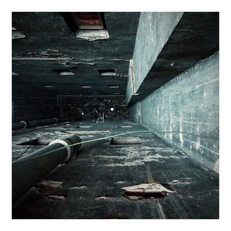
captive - Great tone. With the building on the left cut off as it is, the image feels incomplete or as if it's missing something.
The_Inquisitor - You and mrkgoo kind of stole each other's thunder a bit. Nice tone and composition, but perhaps stopping down a bit would've given a little more DOF to keep the subject more in focus.
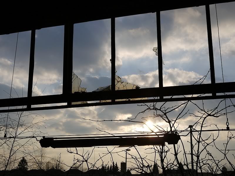
ChryZ - I like this shuject and composition. If the atmospheric conditions had been a bit kinder to you, this could've been a standout image.
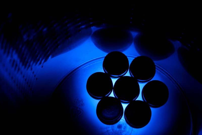
Timbuktu - I'm a sucker for square formatted images, but the connection to theme feels tenuous.
Chorazin - Literal is ok, but the composition feels a bit blah, somewhat snapshotty.
MTE - Interesting subject, but I think the lighting variance distracts.
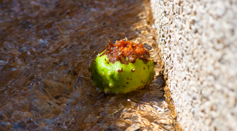
Lucky Forward - Heh, I had a similar idea, though you may want to heal out the polypropylene recycling marks. Sharp as ever.
ronitoswife - Neat and sharp capture.
AnkitT - I love the tone, DOF, and composition, but I'm not on the same page as you on theme.
brerwolfe - I don't think the subject was strong enough to make this a compelling image.