Vigilant Walrus
Member
In UI design when it comes to video games, there is nothing that is more awesome use of the medium than didactic UI. Most famous example is Dead Space;
Essentially, the UI elements are build into the games world. Instead of having you press START and then navigating through menus that take you out of the game, it's integrated right here while playing in real time.
It just doesn't speak to immersion, but also consistency between the menu, navigation, UI and exterior GUI interfacing with the game itself.
If you take a game like Battlefield 1;
You might very well say that this Sans serif geometric font is clashing with the aesthetic of a historic military game, but personally I don't mind clean minimalist aesthetics in games where I want to try and forget there are UI elements. In my mind, Battlefield 1 is best if I forget the health bar, the radar, the ammo count and other elements.
You might argue that taking a font that was popular in 1919 might have been much more credible to the source material, but doing that can be extremely obnoxious and distracting;
Mount and Blade is one of my favorite games, but I greatly dislike the UI, and in some of these shots being from the sequel, you can unfortunately see that they are continuing with the shitty UI and font design.
What is the problem? Skeuomorphic "trashcan" UI rectangulars with anno Itunes 2002 style gradiant metal rims looks so fucking amateurish. It's utterly disgusting. The low transparency of elements on top of each makes it difficult to read, and the choice to go with a classical medieval font with poor legibility and readability is disasterous.
You got a game with so many characters (120 player battles) and you have lots of numbers and stats squeezed into items and gear. So there is specific calculative reading needing. This is not the place to go for "immersive historical reading" for fuck sake.
Mount and Blade is incredible. It's one of the most incredible metal games you'll ever play. You don't know what fun is until you've scaled a castle on a floating horse horizontally. Or made a corpse mountain pinata with the screams of your enemies. Bannerlord looks incredible. But I hate the UI.
I really. Truly. Fucking. Hate. That. UI. And I don't just mean that I dislike it. I hate the UI with a preoccupying hate. I think about it daily. In the shower. When baking bread. I hate that ui. I hate that dafont.com piece of shit garamond-esque font. I have to squint my eyes to see what it says. poor optical spacing, and then with all those clown colors, it just becomes worse.
I'd 100 times more, want a clean sans font that reduces eye strain. I dont want the UI or the font choice to take me out of the game. It's very hard to do what Dead Space did. It's a fucking masterpiece of UI design. Star Citizen is trying to. But look at the development diaries of how difficult it is.
If Star Citizen can pull it off, that will be amazing. But there is a difference between making immersive fonts and UI that fit the world building, and one that truly does it well like Dead Space.
MnB is perhaps an extreme example. If you take the UI of a game like Bloodbourne, you can see it in a much less offensive state;
Why the lines on the text? Icons are not aligned to the text, rectacles within rectacles break the theme of the overall UI aesthetic of scrolling through a book. Which is a good idea. But you can see here that the UI designers were not able to integrate the UI anywhere near as well as Dead Space, allthough it is a much better experience than Mount and Blade.
The font is classical, but it's much easier to read. the openings are larger, and compared to MnBs whose font design is just made more difficult to read by that annoying outline outside the letters. ughh.
Another game, where I don't think the "immersive" font design is worth it, is diablo. the cross in the o really gets old. the color coded reading is annoying. poor readability;
I think it's a shame, because I like what D3 tries to do with its interface. Now, I don't like aspects of it, but you don't have to play a lot of D3 to feel a sense of consistency across the navigation, character panes and menus. Unfortuately the UI always distracts me.

Essentially, the UI elements are build into the games world. Instead of having you press START and then navigating through menus that take you out of the game, it's integrated right here while playing in real time.
It just doesn't speak to immersion, but also consistency between the menu, navigation, UI and exterior GUI interfacing with the game itself.
If you take a game like Battlefield 1;

You might very well say that this Sans serif geometric font is clashing with the aesthetic of a historic military game, but personally I don't mind clean minimalist aesthetics in games where I want to try and forget there are UI elements. In my mind, Battlefield 1 is best if I forget the health bar, the radar, the ammo count and other elements.
You might argue that taking a font that was popular in 1919 might have been much more credible to the source material, but doing that can be extremely obnoxious and distracting;


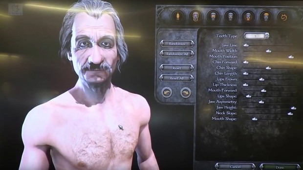
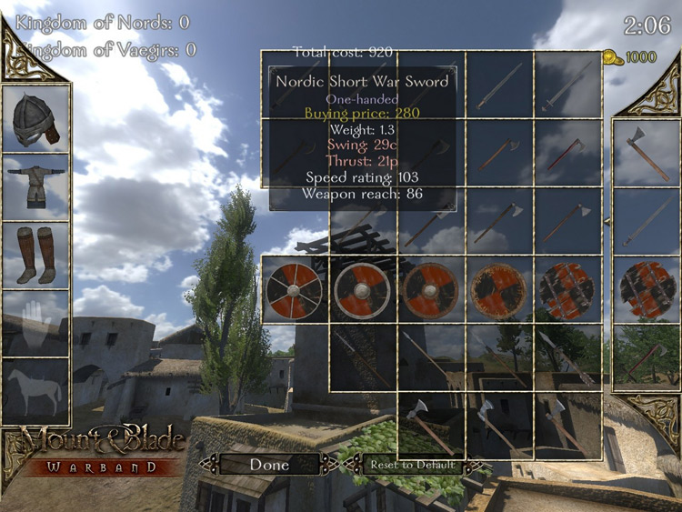

Mount and Blade is one of my favorite games, but I greatly dislike the UI, and in some of these shots being from the sequel, you can unfortunately see that they are continuing with the shitty UI and font design.
What is the problem? Skeuomorphic "trashcan" UI rectangulars with anno Itunes 2002 style gradiant metal rims looks so fucking amateurish. It's utterly disgusting. The low transparency of elements on top of each makes it difficult to read, and the choice to go with a classical medieval font with poor legibility and readability is disasterous.
You got a game with so many characters (120 player battles) and you have lots of numbers and stats squeezed into items and gear. So there is specific calculative reading needing. This is not the place to go for "immersive historical reading" for fuck sake.
Mount and Blade is incredible. It's one of the most incredible metal games you'll ever play. You don't know what fun is until you've scaled a castle on a floating horse horizontally. Or made a corpse mountain pinata with the screams of your enemies. Bannerlord looks incredible. But I hate the UI.
I really. Truly. Fucking. Hate. That. UI. And I don't just mean that I dislike it. I hate the UI with a preoccupying hate. I think about it daily. In the shower. When baking bread. I hate that ui. I hate that dafont.com piece of shit garamond-esque font. I have to squint my eyes to see what it says. poor optical spacing, and then with all those clown colors, it just becomes worse.
I'd 100 times more, want a clean sans font that reduces eye strain. I dont want the UI or the font choice to take me out of the game. It's very hard to do what Dead Space did. It's a fucking masterpiece of UI design. Star Citizen is trying to. But look at the development diaries of how difficult it is.
If Star Citizen can pull it off, that will be amazing. But there is a difference between making immersive fonts and UI that fit the world building, and one that truly does it well like Dead Space.
MnB is perhaps an extreme example. If you take the UI of a game like Bloodbourne, you can see it in a much less offensive state;

Why the lines on the text? Icons are not aligned to the text, rectacles within rectacles break the theme of the overall UI aesthetic of scrolling through a book. Which is a good idea. But you can see here that the UI designers were not able to integrate the UI anywhere near as well as Dead Space, allthough it is a much better experience than Mount and Blade.
The font is classical, but it's much easier to read. the openings are larger, and compared to MnBs whose font design is just made more difficult to read by that annoying outline outside the letters. ughh.
Another game, where I don't think the "immersive" font design is worth it, is diablo. the cross in the o really gets old. the color coded reading is annoying. poor readability;
'

I think it's a shame, because I like what D3 tries to do with its interface. Now, I don't like aspects of it, but you don't have to play a lot of D3 to feel a sense of consistency across the navigation, character panes and menus. Unfortuately the UI always distracts me.