AuthenticM
Member
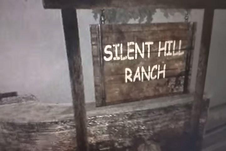
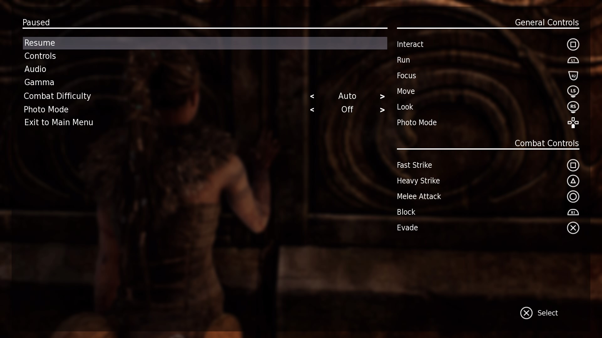
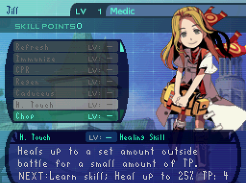
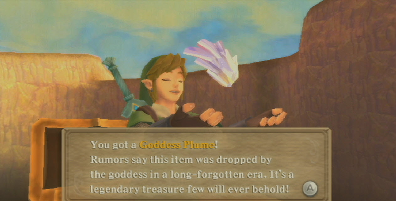
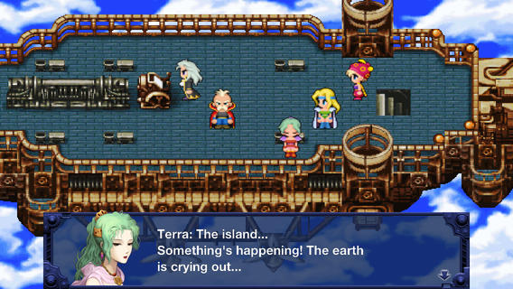
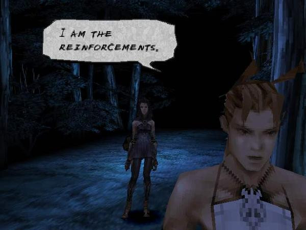
A few games have fonts amazing enough that you notice them. Most games have fonts that are kind of nondescript; they do the job and you don't notice them. And then there are some games that have fonts bad enough that you notice them and keep noticing them throughout the whole game because of how much of an eye sore they are.
Mario + Rabbids falls into the last category.
Every time it comes up, I am distracted from enjoying the content of what's being communicated, as part of me focuses of that past-due-oatmeal bland shit that passes for a font.
An incredible amount of care and love went into making this game. I just don't understand how they didn't apply that to the font. It's not like the Mario franchise has a history of using bad fonts. Au contraire. The Paper Mario games use an incredible font. Why couldn't they just use those if they were too lazy coming up with their own? I mean, shit, even the dialogue box looks lame.
Mario + Rabbids falls into the last category.
Code:
[IMG]http://static.mnium.org/images/contenu/actus/JeuxVideo/Mario_Lapins/mario_lapins_test_1.jpg[/IMG]Every time it comes up, I am distracted from enjoying the content of what's being communicated, as part of me focuses of that past-due-oatmeal bland shit that passes for a font.
An incredible amount of care and love went into making this game. I just don't understand how they didn't apply that to the font. It's not like the Mario franchise has a history of using bad fonts. Au contraire. The Paper Mario games use an incredible font. Why couldn't they just use those if they were too lazy coming up with their own? I mean, shit, even the dialogue box looks lame.