• Hey Guest. Check out your NeoGAF Wrapped 2025 results here!

Games that use bad fonts

A few games have fonts amazing enough that you notice them. Most games have fonts that are kind of nondescript; they do the job and you don't notice them. And then there are some games that have fonts bad enough that you notice them and keep noticing them throughout the whole game because of how much of an eye sore they are.

Mario + Rabbids falls into the last category.

Code:
[IMG]http://static.mnium.org/images/contenu/actus/JeuxVideo/Mario_Lapins/mario_lapins_test_1.jpg[/IMG]

Every time it comes up, I am distracted from enjoying the content of what's being communicated, as part of me focuses of that past-due-oatmeal bland shit that passes for a font.

An incredible amount of care and love went into making this game. I just don't understand how they didn't apply that to the font. It's not like the Mario franchise has a history of using bad fonts. Au contraire. The Paper Mario games use an incredible font. Why couldn't they just use those if they were too lazy coming up with their own? I mean, shit, even the dialogue box looks lame.
 
CQjrJgHWgAEl63D.jpg
 
Yeah. I don't mind fonys good or bad, but in Mario x Rabbids it just looks so plain and lame. Compared to the rest of the game.
 
I predict people will answer Persona 5, but I personally warmed up to Persona 5's main font. The deadline countdowns, daytime transitions and stuff still look kind of bad, though.
 
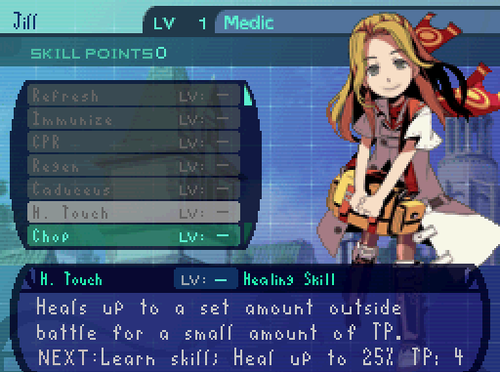
Lots of Japanese PSP games had ugly monospaced English fonts, right?

lots of japanese games period. they're in love with the fullwidth characters, like these

and when they don't they pick horrible serif fonts for all kinds of purposes
 
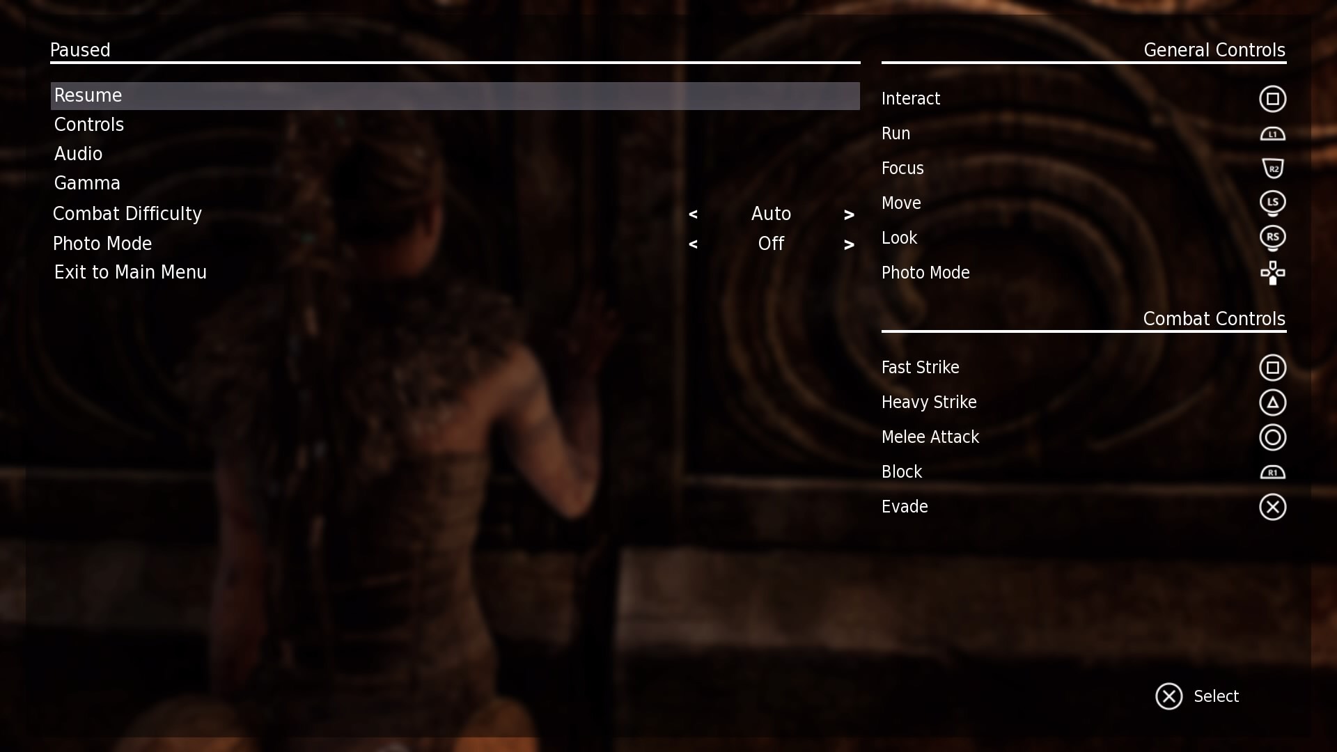
I got a good recent one: Hellblade. They have this entire aesthetic worked out and even have a special font for the Hellblade title used ingame, but the menu font is... this plain thing:


It was so out of place that it felt like a placeholder font that would be replaced in the full game.
 
I don't have any problems with the Mario+Rabbids font. Eh, maybe I'm in a minority or something.

Surprised this isn't Xenoblade Chronicles X: The Thread.
 
Was Persona 5's font bad?

Mostly it was the whiplash from seeing it go from Japanese to English. I'd at least agree the Japanese font used is better than the English version.

But then again the game has a very specific Japanese aesthetic. English letters were always going to be a bit odd in that game.
 
Was Persona 5's font bad?

No, I personally never have issue with it. Im guessing most people played Import version first prefer the Japanese version over english one.


my answer is Xenoblade X. not because it ugly or anything but mostly because the text it so god damn small.
 
Though fine for legibility, I wasn't a huge fan of the typeface used in the Octopath Traveller demo. Kinda a hybrid of a generic sans serif with some hints of comic sans. Just didn't seem like it fit with the world or tone of the game.

Project-Octopath-Traveler-1.jpg
 
Mario + Rabbids falls into the last category.

Code:
[IMG]http://static.mnium.org/images/contenu/actus/JeuxVideo/Mario_Lapins/mario_lapins_test_1.jpg[/IMG]

Font itself is harmless. It's not bad, but yeah, doesn't match the aesthetics of the game like at all. Really sticks out.

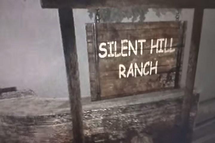
Nothing beats the comic sans in silent hill HD though.
That and the infamous cod picture pointing out like 16 different fonts used at the same time.
 
I've never played Nuts & Bolts, but I'll never forget watching gameplay around launch and immediately recognizing their choice in font. Not in a good way, of course.

I think it's not out of place in the game at the very least, but Nuts and Bolts had a problem where the text was practically illegible on Standard Def TV's because it was too tiny (I think Dead Rising had this problem too).

Thankfully I upgraded to an HD monitor not long after getting N&B, so I didn't have to deal with it for long.
 
Fonts unfortunately seem to be a low priority item in a lot of games. I don't have screencaps but the most recent 2 examples that come to my mind are Batleborn and Lawbreakers. It really sucks when a beautifully made game messes up fonts though but I'm blanking on examples right now.
 
As mentioned above, the text in Dead Rising was quite hard to read on standard definition displays. I don't know if it was a font problem or something else, I just remember the text being hard to read.
 
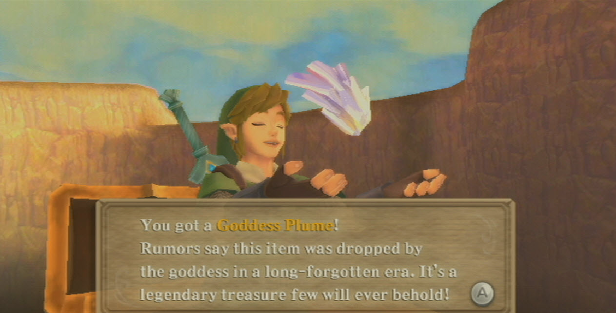
I really don't like the look of Breath of the Wild's font:
SSUHMbD.png

Breath of the Wild is just italic Helvetica, right? I agree that it seemed a little bit out of place for Zelda but I could also tell that it was an intentional choice. For whatever reason, they wanted the UI to feel very streamlined and modern, to pair with the aesthetics of the Sheikah Slate, the Temple architecture, and other Ancient materials. I think it really works for the game, since a major theme was highly advanced technology encroaching on an primitive, post-apocalyptic world.
 
I can't say I ever notice fonts, unless they are hard to read. I can't imagine caring that much about this kind of stuff tbh :P

Though fine for legibility, I wasn't a huge fan of the typeface used in the Octopath Traveller demo. Kinda a hybrid of a generic sans serif with some hints of comic sans. Just didn't seem like it fit with the world or tone of the game.

Project-Octopath-Traveler-1.jpg
See, this is perfectly fine to me, pretty, even.
 
You nailed it. This has bugged me since the reveal. Seems so out of place from the rest of the game.

It's a major pet peeve of mine when indie games go for the low resolution pixel art look but then fuck it up by mixing in high resolution elements. It just looks so sloppy.
 
EnFYe88.png


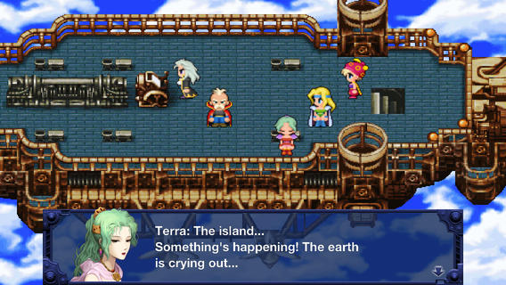
Might be a controversial answer but I didn't like how dialogue in Final Fantasy XII was all caps. With such a great script, you'd think they wouldn't mistreat the basic rules of typography.
 
A lot of old 2D games really had this problem. I remember having to constantly reread sentences to figure out what they were saying.

I thought some of letters just looked way off.

EDIT: As much as I love them, this thread reminded me that not only do FFXII and Vagrant Story have shitty fonts, but also Tactics itself. That one was so weird.

Dude I made an entire thread just talking about how much I hate the font used in Crash Bandicoot N. Sane Trilogy

I'm just gonna be lazy and link it here:
Can we please talk about that horrid font used in Crash Bandicoot N. Sane Trilogy?

It still bugs me

Holy crap, I can't believe I missed that threat. What a shit show! I havent touched the remake trilogy yet. At least I've been warned now.
 
Top Bottom