SuicidalSteve
Member

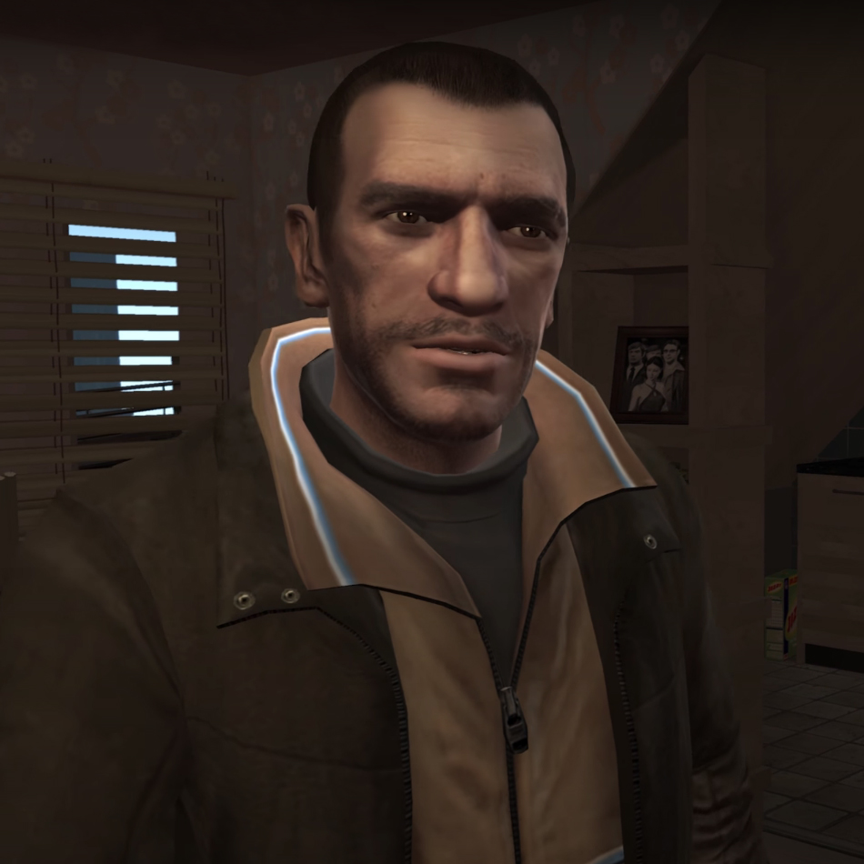
Now that i look closer Drake looks like niko but with more hair...I just can't unsee it
JP - US - Euro

Whoever decided to use black font for the logo on the European one blew it, so US wins.
Kirby Mass Attack

I'm pretty sure the American box art was censored. This version was what most retails had:American
Japanese
What if I prefer blue?NA:
JP:
Come on, Japan wins there. When in doubt always bet on boobies.Backyard Wrestling
NA:

JP:


The japanese cover has Juggalos and Juggs. How can it not be better?Backyard Wrestling
NA:
JP:
JP - US - Euro
Whoever decided to use black font for the logo on the European one blew it, so US wins.
If Drake didn't have a derpy ass face I'd prefer the foreign one.
I've never understood why games like the Tales series need to have the entire cast on the box art, it makes them seem so crowded and with no focus. Usually Japanese and EU box art are pretty cool as they go for simple, strong images over cast shots (such as the longrunning, iconic FF box art) but having a dozen characters all in outlandish costumes makes a cover seem ridiculous.America:
Japan
I have the EU cover and it isn't black on mine - it's silver foil. So it wins.
I've never understood why games like the Tales series need to have the entire cast on the box art, it makes them seem so crowded and with no focus. Usually Japanese and EU box art are pretty cool as they go for simple, strong images over cast shots (such as the longrunning, iconic FF box art) but having a dozen characters all in outlandish costumes makes a cover seem ridiculous.
You have to be kidding, the US one is as generic as they get and screams "focus testing !!!".
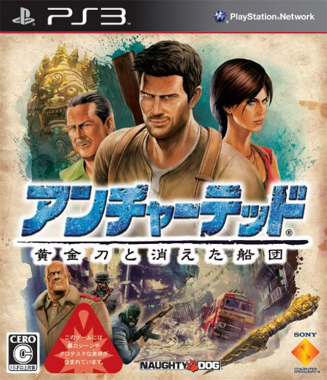
Its a darn indiana Jones poster. It fits perfectly.What are y'all talking about the Uncharted 2 JP cover is better...

Heck no it isn't! It doesn't fit the personality of the game!
I've never understood why games like the Tales series need to have the entire cast on the box art, it makes them seem so crowded and with no focus. Usually Japanese and EU box art are pretty cool as they go for simple, strong images over cast shots (such as the longrunning, iconic FF box art) but having a dozen characters all in outlandish costumes makes a cover seem ridiculous.
Japanese Version

American Version (is actually just the image from the JP limited edition)

I've never understood why games like the Tales series need to have the entire cast on the box art, it makes them seem so crowded and with no focus. Usually Japanese and EU box art are pretty cool as they go for simple, strong images over cast shots (such as the longrunning, iconic FF box art) but having a dozen characters all in outlandish costumes makes a cover seem ridiculous.
You should see the Disgaea series. The Japanese covers have like, ALL the characters shown in a cast shot. The US ones usually just focus on the main character/s.
And then the European one does this weird compromise by just being a really zoomed in version of the first image?
Tbh, that particular trend always just struck me as the Japanese equivalent of the "tough guy walking towards the foreground + blue/orange color scheme" that was so popular in Western games last gen.
It's not creative. Nor does it tend to be particularly attractive. But it's inoffensive enough that, by implementing it, most devs can at least get a decent-looking cover without having to put in much thought.
Color me contrast
If Drake didn't have a derpy ass face I'd prefer the foreign one.
Does anyone know who was making these SNES Konami covers back in the day?
Contra III and Super Castlevania IV are just amazing.

Compared with:


America:

Japan

What are y'all talking about the Uncharted 2 JP cover is better...
Heck no it isn't! It doesn't fit the personality of the game!
JP cover. Yass. Now this makes you want to play the game

It's a crime no one thinks the JP Uncharted art is better because of Drake's face.
I wish we got the JP cover.
Backyard Wrestling
NA:
JP:

I'm pretty sure the American box art was censored. This version was what most retails had:
What if I prefer blue?

It looks like a low budget version of it. It's too flat and has too much white space. Honestly I don't care for either box art but the JP isn't "so much better".
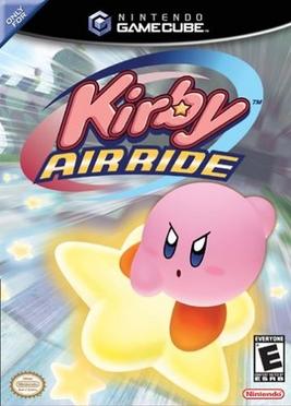

Angry kirby disqualifies this.Japanese Box Art

North American Box Art


.jpg)
Yes, it literally is speculation.
Kevin Eastman said:So when we worked on the animated series, we knew just writing black and white comics for ourselves, we were actually taking the series down to a level that is meant for six and seven year olds. And so things like changing the origin a bit, changing the look of the Turtles a little bit, Pete Laird came up with the idea for the different colored bandanas.
fact
fakt
noun
a thing that is known or proved to be true.
Guys this,
is not this,
It looks like a low budget version of it. It's too flat and has too much white space. Honestly I don't care for either box art but the JP isn't "so much better".Unless this is just an elaborate troll than kudos you got me

American: Has 2 characters. Only 1 of them is playable
Japan/European: Has 7 characters. 6 of them are playable and it's the "standard" for Tales of art-boxes.
Japan/European wins.
Teenage Mutant Ninja Turtles (NES)
I don't even know where they got that JP artwork from. Looks like some crappy fanart.
")
Reading through this thread I now understand why the american covers are like they are, you actually people prefer them! I just don't understand it.
The JPN one kicks both their arsesPS2 Castlevania, always remember the absolutely shocking EU box art in comparison to the amazing US cover.
Worth noting the Japanese cover is a good one too but that US cover just grabs me. Had a fantastic print of it, which I got with the JPN box set.
EU
JPN
US
Yeah, that looks better than the EU cover simply because they didn't stick the RE6 demo information on the cover.
I really like US cover of DD. damn that's such a good cover for such a great game")

Yeah, cover art came directly from the 1984 comic book series. I posted an image to it above. The 1987 cartoon added coloured bandanas to make it easier to market for children.
[MGS2 covers]
JP - US - Euro
Whoever decided to use black font for the logo on the European one blew it, so US wins.