• Hey, guest user. Hope you're enjoying NeoGAF! Have you considered registering for an account? Come join us and add your take to the daily discourse.

Games with an absolutely HORRIBLE UI. Pics!

KingFire

Banned
Man. Those are some terrible menus.
Castlevenia: Lord of Shadows had a bad UI.
castlevania-book-menu.jpg

The writing is so hard to read because they are using some crazy small medieval-looking font. Navigating the menus is also terrible.

I think menus in games should be minimized or integrated into the experience. The best example of that is Dead Space menu:

2241988-676844_40_super.jpg


That is a genius design right there. The HUD stuff is minimal in that game
 

low-G

Member
Man. Those are some terrible menus.
Castlevenia: Lord of Shadows had a bad UI.
castlevania-book-menu.jpg

The writing is so hard to read because they are using some crazy small medieval-looking font. Navigating the menus is also terrible.

But it looks so nice! Also Jean Luc Picard is talkin to me in Castlevania!
 

Riposte

Member
The whole UI variety with RE6 is both silly and novel to me. Thankfully it is only really a problem when you suddenly want to change your setting in the middle of playing. That can be quite disorienting since some of the menus are laid out quite differently (and hopefully you are not fumbling in the middle of combat, online). When it comes to menus that matter in the middle of play, the inventory and weapon systems, it is consistent between all of the campaigns and quite easy to use. I wouldn't encourage a developer do something like that again, but it is quite amusing to me that they did it (I guess on some level I like that each set of characters have their own mobile device, and this is used to contextualize the real-time menus).
 
Worst sin a UI can commit for me is delay from pressing one option until you can press another one (excluding load times). Mass Effect 2 and 3's menus are examples of this. If I want to change the difficulty, when I first press "Gameplay", there's a delay and a pointless little animation of the selection highlighter that I have to sit through first.

CoD games are great in this respect, totally snappy. Absolutely no delay between going from menus to sub menus.
 

The Lamp

Member
PSASBR's UI is terrible, agreed. But Brawl's is pretty bad as well. Sakurai's team/HAL can't ever seem to make a decent looking UI. Brawl's is just as gross as Kirby Air Ride's was. Inconsistent font styles and odd spacing and menu styles...blargh.

But yeah PSASBR's is the worst.
 
I'm at work right now so I can't take pics, but Skyrim's has some issues. My biggest problem with it is what is missing: A summary screen.

The UI is based around the four points of Map, Items, Magic and Skills, but the center of that selection menu should have been "Status", showing our character, everything we have equipped, with their respective bonuses, stats, armor and attack ratings, active effects, ect.

Instead I have to go third person and manipulate the camera to see my character change armor and menu dive to see equipped items, effects and stats. Kind of baffling, IMO.

Absolutely. One of the most frustrating parts of Skyrim's interface is how every time I find myself needing to see plain ol' character status, I have to fumble around the menu looking for it... before I remember it's accessible from the map/journal screen only. Why?!

But Skyrim's PC interface is just a fucking disaster in general. SkyUI fixes a lot of these problems (and looks sexy doing it), but even then you have a nightmare of jank. The number of weird bugs that will apparently never be fixed for no reason is mindblowing. Why do I have to switch to my keyboard after reading a book in my inventory and then backing out, once again, to the "books" menu? Why doesn't the cursor consistently highlight what it's pointing at? Why do I have to put something in my favorites menu before I can bind it to a key?

And maybe the worst of them all (in my experience): why does everything fuck up if I rebind the "F" key? That was the "ready your weapon" key in Oblivion, and I played tons of that, so it was easiest for me to rebind "F" to that action in Skyrim. But when you do that, you can't use your stupid favorites menu anymore unless you reset to default bindings! (And the UI "reminder" at the bottom of the screen won't change to indicate a new binding, either. The default binding is "F", and so it always says "F".)

So every time I find a new weapon to replace another I've been using, I have to switch to default bindings, add that weapon to my favorites menu, then bind it to the right key, then rebind the controls to my custom setup. It's been like this since day one, and no fixes are coming, ever? How difficult would that be to fix? How long would it take? I refuse to believe nobody has noticed this at Bethesda. [/rant]
 

Rubius

Member
Man. Those are some terrible menus.
Castlevenia: Lord of Shadows had a bad UI.
castlevania-book-menu.jpg

The writing is so hard to read because they are using some crazy small medieval-looking font. Navigating the menus is also terrible.

I think menus in games should be minimized or integrated into the experience. The best example of that is Dead Space menu:

2241988-676844_40_super.jpg


That is a genius design right there. The HUD stuff is minimal in that game

I agree. When I first saw Dead Space I was like "Where is the UI" then bam. The life, ammo everything is real for the character. Any other game like that? With no UI outside of the character?
 

Dusk Golem

A 21st Century Rockefeller
Yes

hated it

Go through like, 5 menus to pop a fuckin pill

The UI of Resident Evil 6 (in game, I actually like the main menu) is bad. However, you can just press LB to pop a pill or R+RB to automatically combine all of your herbs into the best possible combination. Was happy as hell you could turn the in-game UI off. >_>
 

Rubius

Member
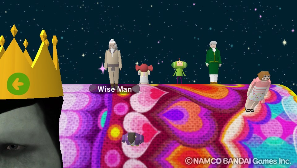
Touch my Katamari on the Vita IS the worst. Selecting a level is an hassel and just trying to see your stats is annoying at the end game because you have to click in a empty space to see them and there is none at this point.
touch_my_katamari_menu.jpg

Trying to find what level next ? Good luck if you didnt remember who was where.
 
I actually don't mind PSBASR or whatever. I only played the beta, and was surprised as hell that those menus weren't placeholder, but still, at least you know exactly what you're getting.

I agree with that poster that said Madden. Holy hell god help you if you haven't been keeping up with the franchise. So much is buried behind obscure menus that they actually have to have news tickers and special news boxes to let people know menu options exist buried down in there somewhere.
 
This one is pretty obscure, but honorable mention for me goes to USA Today Crosswords for Nintendo DS:

ILInP.jpg


It's not a bad game, but look at the tiny pea-sized menu buttons on the bottom screen. Quick, without looking it up, see if you can tell me:

a) What objects are supposed to be represented by all of the those buttons, and
b) What you should expect to happen when you press one of them.

That game has a hideously amateurish (and plain ugly) UI. Good choice.

So are me and Kanye West the only ones who get emotional about fonts

Because seriously, fuck a good 2/3rds of font choices in games. It's at its worst in scifi and fantasy games, but it's a plague everywhere. Modern Warfare 2's multiple fonts on screen at once were barfy.

No, I totally agree. The wrong font can ruin the look of a game. (See above.)

I don't know what it is, but Natsume has a really bad habit of using fucking Comic Sans in their localizations, or at least they used to. See: Harvest Moon: A Wonderful Life and Chulip.
 

Boss Doggie

all my loli wolf companions are so moe
From Smash Brothers you're missing:
You can change the number of minutes without leaving the screen.
You can change the type of match by clicking on the "KO fest" area.
You can see all the characters names above their portraits.
You can see who picked whom by looking at the portraits.
There is a random slot.
You also see what color your character will be if alternates are selected on this menu (not sure is PSABR does this)

PSA has a random box however it suffers from "clicking on random reveals the character immediately and when you de-select it brings you to said character rather than the random slot". And in PSA you can see the color palette, but it will not change the portrait's color unlike in Smash which immediately changes the color.
 

KevinCow

Banned
It's been a while since I touched the game, but I'm pretty sure you could reduce the Wii Remote info down to the basic controls that's been displayed in every 3D Zelda, and turn off the map display completely.

You could reduce the HUD in Skyward Sword, but not Twilight Princess.

And you could make the map go away, but there would still be a big (2) over there to let you know that you could pull the map back up with the 2 button, plus the map would come back every time you transitioned areas so you had to press 2 upon entering every new area to hide it.

The screenshot you posted doesn't even show the Wii Remote outline like you're talking about. Unless you're complaining about how much button info they show, which they kind of have to for everything but A because you can reconfigure all four item slots.

The point is, they probably could've come up with a better way to convey all that information than taking up the entire right side of the screen with it.

For example, look at Batman. You use the d-pad to swap items, similar to Zelda. But the d-pad isn't constantly on-screen. It appears when you press the d-pad, then disappears after a second.

Also, there isn't a constant A button prompt. They assume you know the general actions your character can do, so there's no reason to have (A) SPRINT on screen 90% of the time. They only pop up button prompts when you walk up to something you can interact with.


Oh, and I forgot to mention that your cursor is a fairy that's on screen at all time even when you don't need to point at anything, and makes a sparkling noise every time you move the pointer.
 

Skyzard

Banned
Touch my Katamari on the Vita IS the worst. Selecting a level is an hassel and just trying to see your stats is annoying at the end game because you have to click in a empty space to see them and there is none at this point.

Trying to find what level next ? Good luck if you didnt remember who was where.

I had this same issue! There is another option - I think it is clicking on the green guy or the king brings up the stats as well. Doesn't tell you! Quite a fun UI at least - it's a pretty bizarre game anyway you know, got to give it some artistic license..
 

djtiesto

is beloved, despite what anyone might say
Fable 2 had an extremely sluggish menu system that made doing any type of inventory management a frustrating chore. How could you be such a shitty UI programmer that rendering a bunch of text boxes chugs the game?

Vagrant Story. The menus feel very slow and sluggish (taking a second or two to load), use the Japanese O "confirm" / X "cancel" even in the US version (which makes things even more frustrating to play if you are used to modern-day games).

They tried to mitigate this by having "quick access" hotkeys to instantly call up the menu, but they forgot to make a quick access to the weapons menu, which you will undoubtedly spend the most time in, due to the importance of weapon types on the gameplay.
 
I agree. When I first saw Dead Space I was like "Where is the UI" then bam. The life, ammo everything is real for the character. Any other game like that? With no UI outside of the character?
Ghostbusters the game, i believe. info was on the proton pack.
 
Top Bottom