pillowtalk
Member
I feel that the FF characters' redesigns looked really good if not better in the kingdom hearts games.
Twilight Princess Link, specially coming from WW, which some people disliked.
To this:
I feel that the FF characters' redesigns looked really good if not better in the kingdom hearts games.
Pretty much the poster boy for great redesigns

<3 3rd Strike art and Shinkiro
oh nvm this wins by far

to


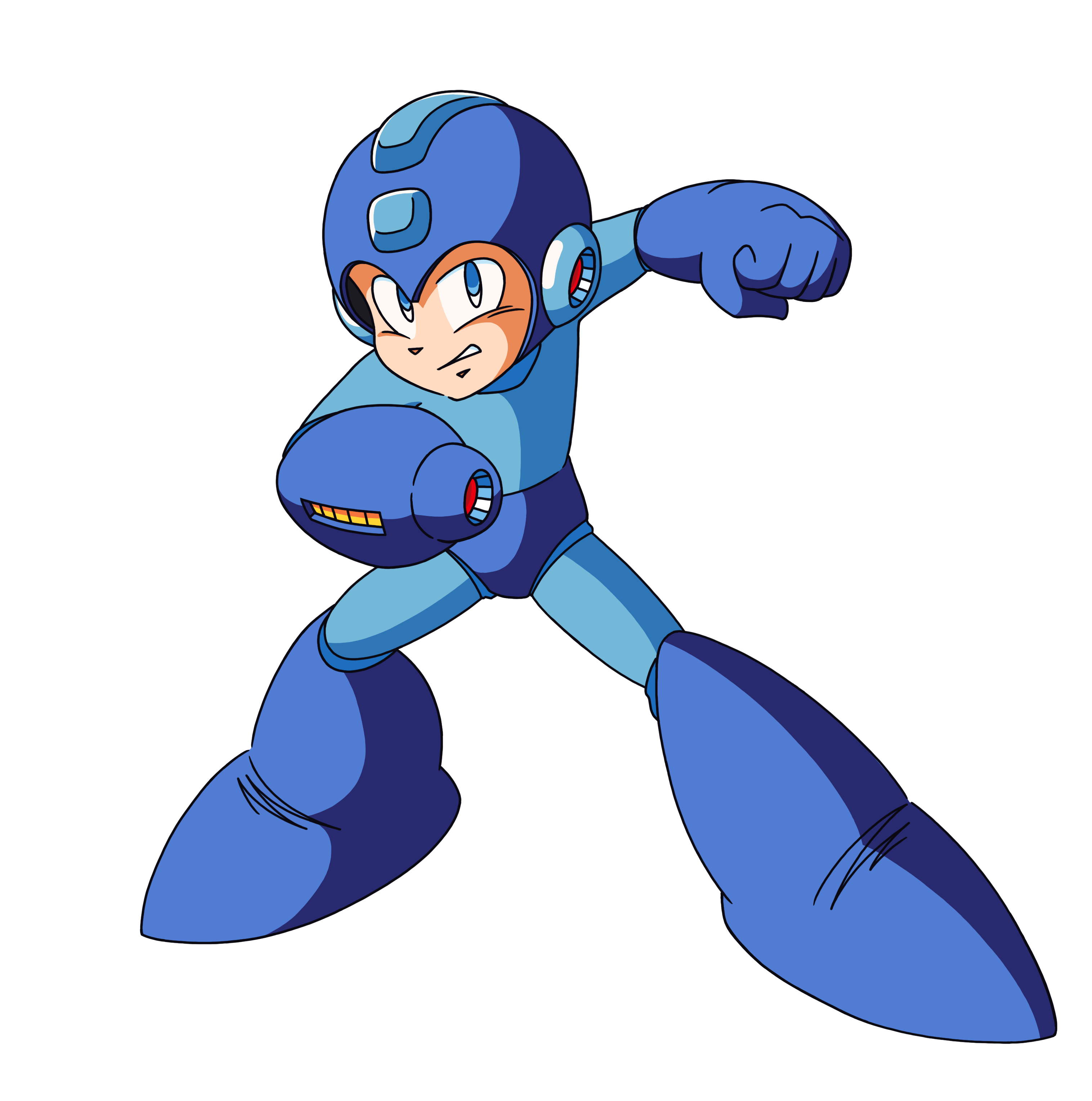
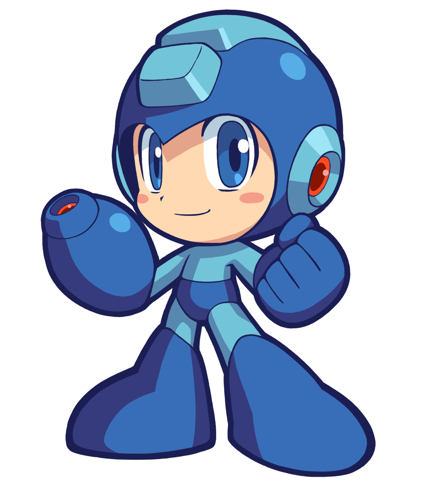
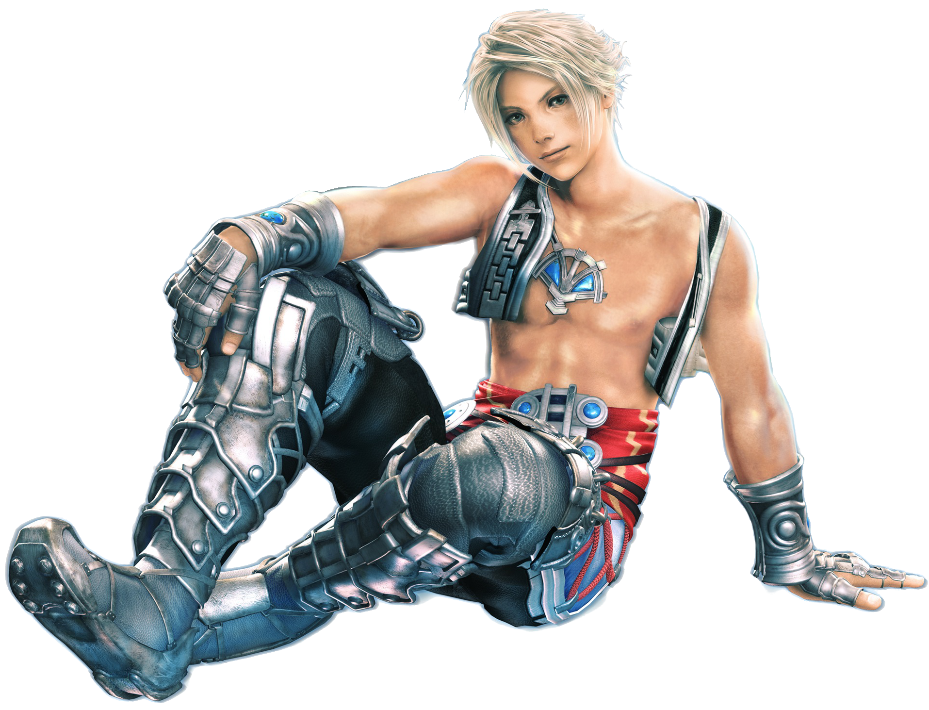
I think Kingdom Hearts 2 has the best overall character designs from the PS2 era......individual characters like Wander maybe be better, but the complete cast of KH2 sure is a site seeI know I'm not supposed to like that mess of belts and zippers, but I do. I like a lot of Kingdom Hearts designs, actually.
I much prefer Sonic's modern design over his original one. Generations cemented that. A character so fast should be slimmer and have longer limbs.


TP Link is the best Link design in all the games period, adult, toon, or kid.
The modifications to him in Brawl, Smash 4, and the Wii U tech demo are even better.
I much prefer Sonic's modern design over his original one. Generations cemented that. A character so fast should be slimmer and have longer limbs.


oh nvm this wins by far
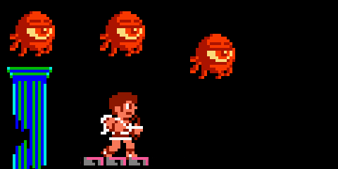
timesplitters shots
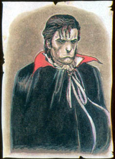
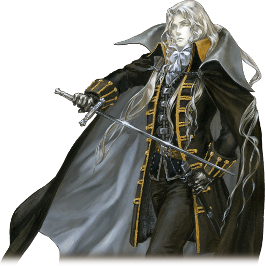
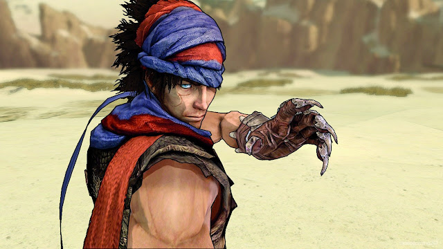
You can't call him TP link. He has a completely different face. That's some new shit altogether.

But how is that a redesign?This is perfect.


I liked the re-imagining of existing characters in the style of the Kingdom Hearts universe. It's just a cool, consistent style. I didn't really like Riku's look at the end of Kingdom Hearts II, but his Dream Drop Distance design was pretty cool. I'm excited to see new designs in Kingdom Hearts III, but I'm sure it'll be too long of a wait.I think Kingdom Hearts 2 has the best overall character designs from the PS2 era......individual characters like Wander maybe be better, but the complete cast of KH2 sure is a site see
But how is that a redesign?
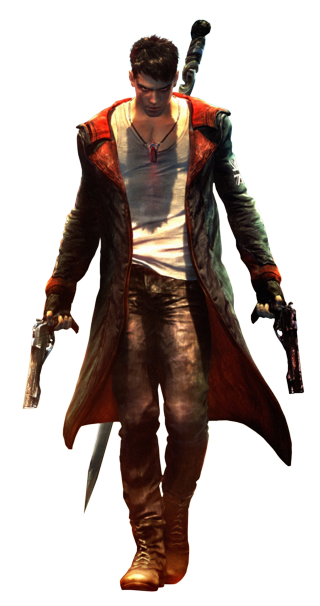
Not Dante.
Nope. Massive downgrade.
But how is that a redesign?
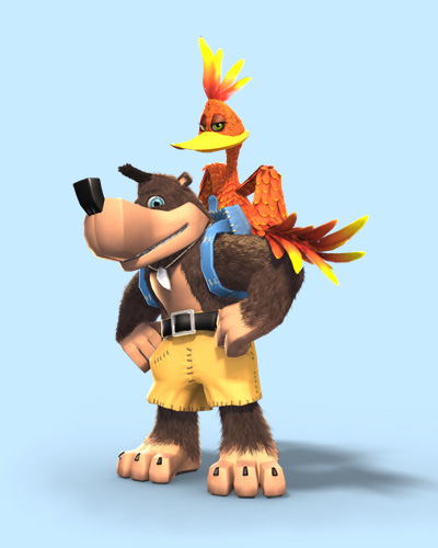
I like new Banjo-Kazooie more than old Banjo-Kazooie. I like the move to more square features on Banjo (look how awkward Banjo's hands look in the old versions) and the clear seperation of feathers on Kazooie looks great. In-game the N64 models looked fine though, it is just the CG artwork that looks bad.
I don't hate the redesign but I feel like the original looks more like a Saturday morning cartoon and the best part about the game was how raunchy, gross, and gory it deviated from that facade.I personally like Conker's redesign for Live & Reloaded. Not a huge overhaul of his design but they added green shorts and a darker blue jacket with strings.

I like new Banjo-Kazooie more than old Banjo-Kazooie. I like the move to more square features on Banjo (look how awkward Banjo's hands look in the old versions) and the clear seperation of feathers on Kazooie looks great. In-game the N64 models looked fine though, it is just the CG artwork that looks bad.
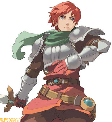
Ys Seven Adol.
They very clearly take from Twilight Princess's artwork, if not necessarily his in-game model. I don't see how you can claim otherwise.
Dante from DMC1 to 2
I think this is the only re-design per se posted ITT.


_box-art.jpg)