-
Hey Guest. Check out your NeoGAF Wrapped 2025 results here!
You are using an out of date browser. It may not display this or other websites correctly.
You should upgrade or use an alternative browser.
You should upgrade or use an alternative browser.
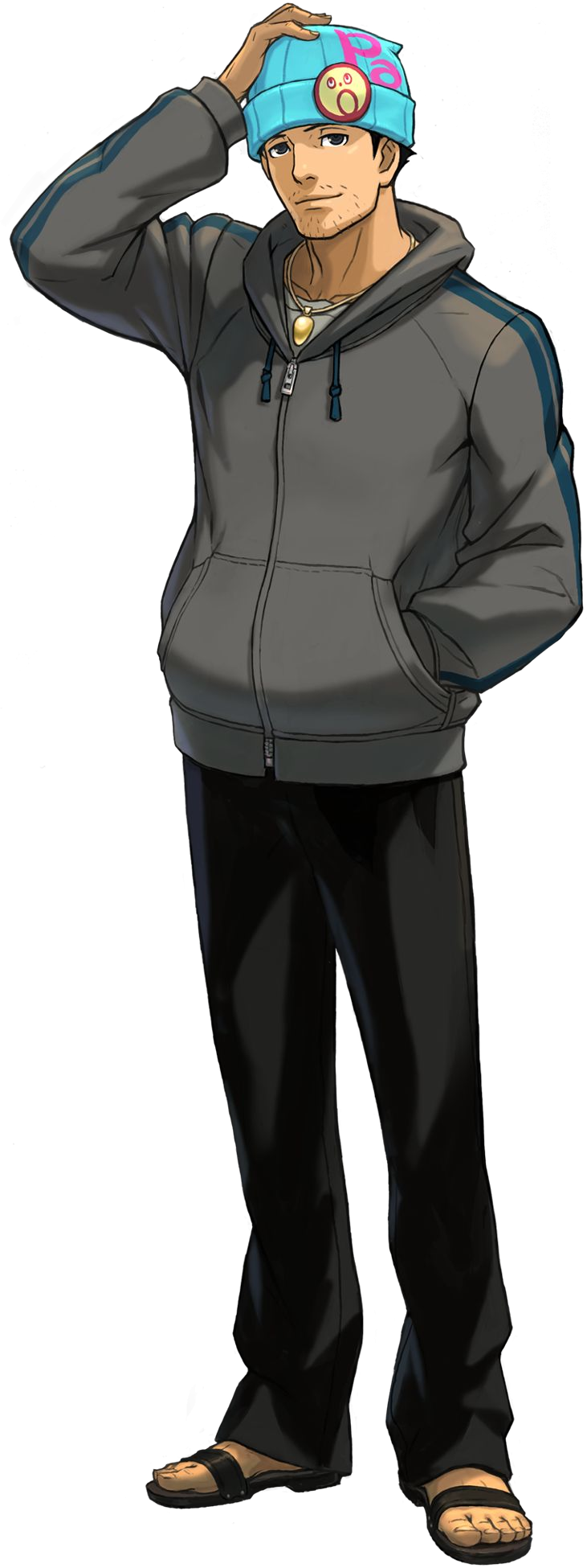
Great character redesigns
- Thread starter sn00zer
- Start date
Heart of Black
Member
I like how they smoothened out Snake's face in MGS3 and made his eyes less angry looking.

That's also 2 different characters
")
This one pains me perhaps the most. When i first saw the previews for Advent Children and saw how pale, effeminate, and emaciated Cloud and Sephiroth looked, I nearly shat. It single handedly made me not care if we ever got a FFVII remake. It's a shame too because if you look at Kingdom Hearts or Dissidea, the models are great.
What the shit?
does a re-re-design counts?
Phoenix Wright:
from this:
to this:
Phoenix Wright:
from this:

to this:
and a full 180 back to this:


To

Really gave him a grounded, father look to him - was impressed.
Duane Cunningham
Member
Not so much a great character redesign but interesting all the same -

I do like how reboot Lara did in the end wind up getting a facial design that could be young Lara.
Complistic
Member
thread needs more triss merigold


I like new Banjo-Kazooie more than old Banjo-Kazooie. I like the move to more square features on Banjo (look how awkward Banjo's hands look in the old versions) and the clear seperation of feathers on Kazooie looks great. In-game the N64 models looked fine though, it is just the CG artwork that looks bad.
This is how I always felt about the character designs, a lot of people like to bring up the pre-rendered artwork from a lot of Rare characters as a crime against humanity but ingame I always liked the way Banjo and Kazooie looked. Personally I prefer the original look in the N64 games much much more than their look in Nuts and Bolts, but just like the old games Banjo and Kazooie look miles better in game in Nuts and Bolts than they do on the artwork. (I actually think Banjo and Kazooie's artwork in Nuts and Bolts looks worse than the look they had on the pre-rendered artwork from the original games)
WrenchNinja
Member
I think Zero's design has gotten progressively better:
Here he is in Mega Man X5. He looks a lot more human like proportion wise. More serious to match the tone of the series.
Here he is in the Mega Man Zero series. The Mega Man series have always had an anime aesthetic, here his design his simpler and sleeker. It really helps show off the speed of the character, he's dropped anything excess and it's mostly a body suit. It's sort of more child like, but it matches the fairy tale tone the Zero series has with an ancient awakened warrior helping a resistance against the tyranny of an empire.
Here he is in Mega Man X. It's still bit more child like pudgy, like the NES Mega Man character designs.


Here he is in Mega Man X5. He looks a lot more human like proportion wise. More serious to match the tone of the series.

Here he is in the Mega Man Zero series. The Mega Man series have always had an anime aesthetic, here his design his simpler and sleeker. It really helps show off the speed of the character, he's dropped anything excess and it's mostly a body suit. It's sort of more child like, but it matches the fairy tale tone the Zero series has with an ancient awakened warrior helping a resistance against the tyranny of an empire.


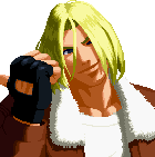
Terry Bogard, Real Bout Fatal Fury Special on the top and Garou: Mark of the Wolves on the bottom.


Arc Christelle
Member
He's taller. The best way to improve a character is to make that character taller. Anyone telling you anything to the contrary is wrong and clearly has terrible taste in character redesigns.
Just look at Mario; make him a few inches taller and paint him green and you have a much better character!
-puts on glasses-
don't worry, half the examples in the thread aren't redesigns.
a lot of these are just the same character wearing different clothes or just another artists interpretation of the character
New artstyles also count as redesigns since they represent the character through a different viewpoint. Which also may have the chance of appealing to a new/different audience. It doesn't always have to be a total change up, it can also be a change of appeal.
Midnight Moon
Banned
Current Leon Kennedy is probably my favorite redesign ever.
Sexyyyy
Also Chris Redfield...MMMMffff
Hoya Destroyer
Member
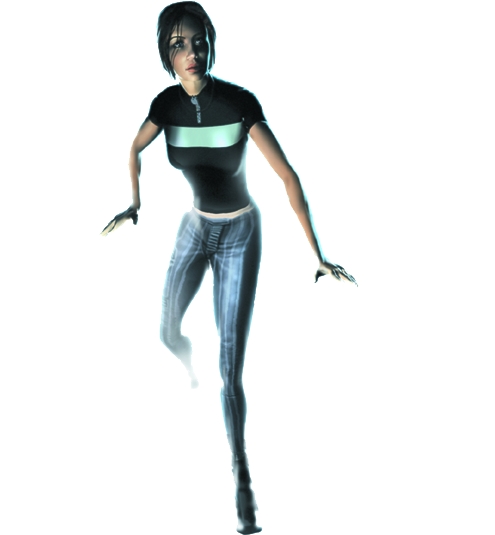
Mass Effects EDI...
ME2

ME3")

ME2
ME3
This is perfect.


man, that trailer is exactly how i want my next gen megaman game to look.

Timeless.
we.are.the.armada
Member
Samus looked better and better from Metroid 3 throughout the Prime trilogy!
AgentLampshade
Member
I generally dislike redesigned characters (and most here aren't posting redesigns at all. Just updated character models that feature the same overall design) but if I were to choose, I'd say Raiden from MGS2 to MGS4. Granted, every single part of that redesign was tailor-made to make people like him but it worked.
His Revengeance appearance though I'm more iffy about. I liked the design (except those stupid shoulder blades and the knife. Why did he have a knife?) but his personality took a turn I wasn't happy about.
His Revengeance appearance though I'm more iffy about. I liked the design (except those stupid shoulder blades and the knife. Why did he have a knife?) but his personality took a turn I wasn't happy about.
Prefered the REmake design or the original concept.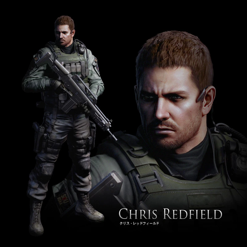
Perhaps the only thing RE6 got right.
Never liked the steroid chris.

ViewtifulJC
Banned
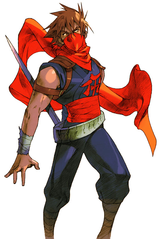
Strider Hiryu might be my favorite. He has a fantastic red/blue color scheme that really pops out, with an asymmetrical balance given to him by his oft-kilter belt. And that glorious scarf that wraps around his mouth gives him a mysterious edge the young ninja warrior version in Strider 1 never had
Four pages and no Cortana?

I can't stand how they cranked up her sex appeal in 4. Sure it might have helped it sell but was it necessary?
You answered your own questionI can't stand how they cranked up her sex appeal in 4. Sure it might have helped it sell but was it necessary?
does a re-re-design counts?
Phoenix Wright:
from this:
to this:
and a full 180 back to this:
I only ever played the first game. What happened? Did he lose his license and go on a bender or something?
SatelliteOfLove
Member
Maki Sonomura from Persona.
Her original and PSP remake designs:
Her appearance a few years later in Persona 2.
Always liked how the P1 guys arrived in IS/EP, her especially. She done seen/done some shit; you can see it in her eyes, despite how relatively normal she recovered.
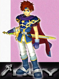
Original Marth to FE11 Marth is the best transition. He looks so much better, even after all the shit that game got, at least they nailed that.
Also, new Dante/Chris Redfield are both godawful. So is new EDI and Cloud.
I do have to say I kind of liked Squall's design in KH1 more than his original design though.
Also, new Dante/Chris Redfield are both godawful. So is new EDI and Cloud.
I do have to say I kind of liked Squall's design in KH1 more than his original design though.
Red Dragon/
from Drakengard 1 -> 2. Looks fierce as hell in 2.
Angelus
Drakengard 1 said:

Drakengard 2 said:

Pretty much the poster boy for great redesigns
Really? This comes off as the least impressive 'redesign' I've seen in this thread, don't even consider this a redesign. Maybe that's what you're trying to say, it's great because it's practically the same?

Hoya Destroyer
Member
Four pages and no Cortana?
I was never a Halo player because I like my shooter to be a little more gritty, but they did a great job on Cortana IMO.
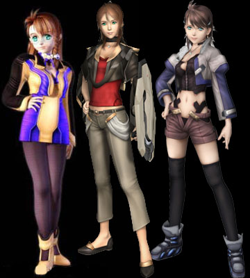
Shion Uzuki From the left to right: Xenosaga 1 \ Xenosaga 2 \ Xenosaga 3
Her original concept design from Xenogears Episode I is still the best.

Blackthorn
"hello?" "this is vagina"
Lol it's Fuse in reverse.oh nvm this wins by far

Terry Bogard, Real Bout Fatal Fury Special on the top and Garou: Mark of the Wolves on the bottom.
Damn You beat me with that one, but pictures doesn't show so


This redisign is awesome not only because it still looks cool (I had no preference over young and old terry) but because this design is able to tell a story, that terry is now more mature and has other things to do, yet he still is a lonely wolf who goes from town to town fighting
SlowRevolution
Member

what about spyro
So whenever an inevitable sequel comes out or switch to another generation older IPs need to change their title characters in some way shape or form....sometimes this can be hilariously bad (Bomberman), but sometimes it can turn out pretty damn great...so what character redesigns werent too shabby?
Subtle proportional changes, but PS3 Ratchet is a much sleeker design that looks much better in motion than the original PS2 models. Not sure how I feel about the latest Full Frontal model, but it is certainly still Ratchet albeit a bit younger and cartoonier looking.
http://www.youtube.com/watch?feature=player_detailpage&v=UTpHNm-gDSI#t=350s
http://www.youtube.com/watch?feature=player_detailpage&v=1pOdET5PW1I#t=117s
isn't the Full Frontal Assault Ratchet the same as the one they've been using in Japan the entire time?
TheRealTalker
Banned
from

to

to

to finally

to
to
to finally
Broder Salsa
Banned

much cooler now
Synth_floyd
Banned
RE 5/6 Chris Redfield is awful and represents how horrible the series has become.
Slayer-33
Liverpool-2
much cooler now
Isn't that the director/producer of the game? LOL
shinobi602
Member
Four pages and no Cortana?
Yup, best one so far.
I prefer this look. I would love to see a full 3D Cell Shaded Zelda with this art style.
Astral/H3X
Member
Cortana went from having bra physics breasts to having naked physics breasts, which went from implying that she was wearing clothes, in a sense, to just being naked. I personally dont like it....
thesuperfunk
Member
I personally like Conker's redesign for Live & Reloaded. Not a huge overhaul of his design but they added green shorts and a darker blue jacket with strings.
I'm actually surprised that when I came back to this game it was still beautiful to look at.
Conquer's character overhaul between 'Twelve Tales' and 'Bad Fur Day' is also noteworthy!
Slamtastic
Member
As someone who thinks New Dante is a better character than the old one, the one place that isn't true is in the looks department. I bought the DMC3 costume and never looked back.
StalkerUKCG
Banned
what about spyro
That belongs in the worst character redesign thread,