• Hey Guest. Check out your NeoGAF Wrapped 2025 results here!

Hollow Knight - Beautifully animated 2D 'vania - On Kickstarter

Jobbs

Banned
Update: Wii U Goal Reached

ae60791993cc754e7bfe7920a4baab79_large.jpg


2nd playable character stretch goal:

4f577748f31c1ad5d6b99df1230fc832_large.jpg


newest gameplay video:

https://www.youtube.com/watch?v=MqHmosJcY0s

------------------------------------


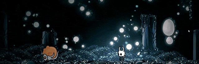
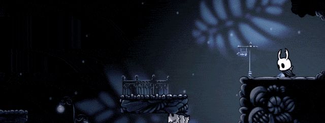
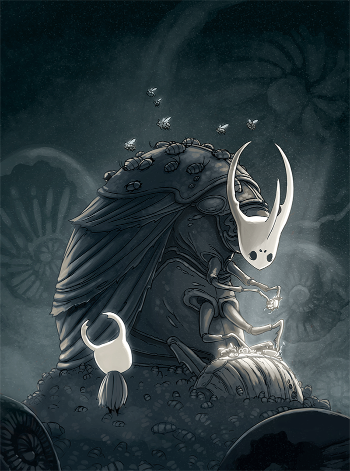
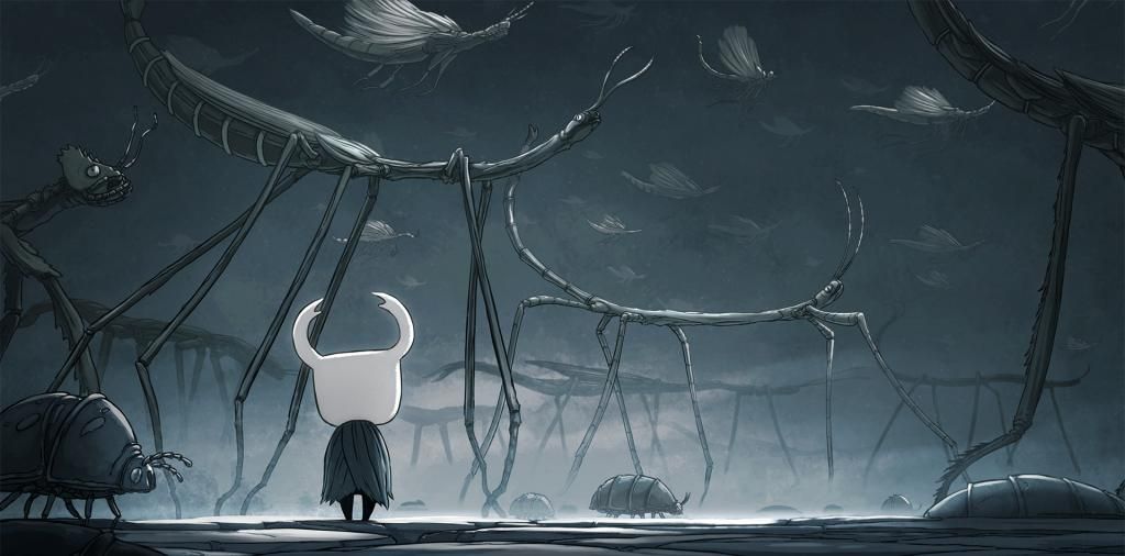
An animator friend has been telling me bits about this project for a while now -- And now it's on Kickstarter, and boy, is it cool looking.

Aside from being beautiful and creative in its visuals, the really interesting thing about it is that it's being made in Stencyl. Stencyl's the game engine I'm using for my own ambitious project, and up until now I really didn't know of anyone else using it for something big and full featured.

Anyway, I'll just let the game speak for itself.
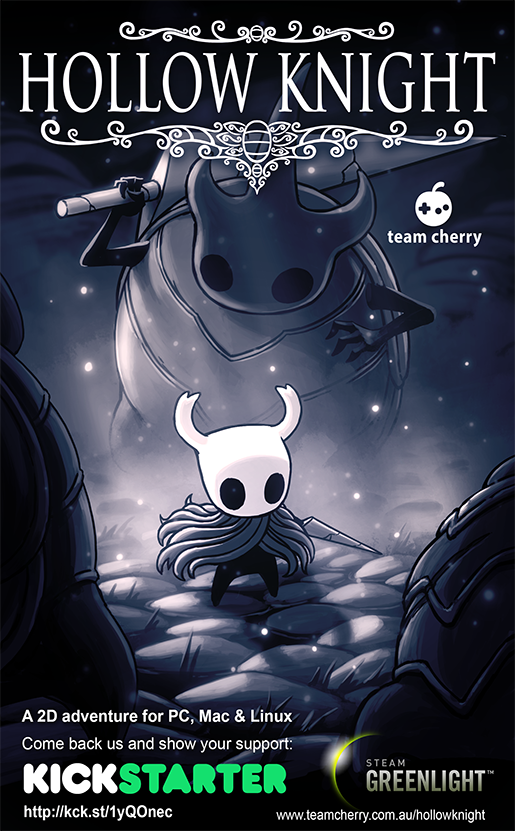
-

KICKSTARTER LINK

-

264017f2451e2b87550208ba974e8aa6_large.gif


52cbb38e0ba55caeab2cfb4cb5192d5d_large.gif


f88fa291a83cacfb78c23f1b69abd74a_large.gif


4c99b024086da19b8df1f42e7dc1f059_large.gif


d2d87a736b077ae2f53de7a6ad5b2a2f_large.gif
 
Damn, amazing animations. I can't blame indies with poor budgets, but I do love seeing proper animations over paper-doll.
 
Wow, that game looks extremely cool from just a visuals stand point. I don't personally back things on Kickstarter, however if this does get released I'll be there day one to purchase it.
 
I don't know why, but having animation that good is actually a pretty big turn-off for me. The "flash game" effect, I guess.
 
Looks cute, but hand-drawn environments like this always look conspicuously stiff when mixed with cutely animated characters like this.
It doesn't look like an environment, but a series of stiff image files.
 
Looks cute, but hand-drawn environments like this always look conspicuously stiff when mixed with cutely animated characters like this.
It doesn't look like an environment, but a series of stiff image files.

Depends how lively they are. Insanely Twisted Shadow Planet has very lively backgrounds that feel perfectly in-place and are frequently animated
 
Looks nice, but why do I have to pay an extra $5 for the instruction manual?
 
Looks nice, but why do I have to pay an extra $5 for the instruction manual?

these days an instruction manual is kind of a fun extra -- TEW has one, but it's not necessary, it's more for style. Most games have none.

I agree it's a bit of an odd tier, but yeah, an instruction manual is a definite novelty these days.
 
Geez, that looks great. I really wish I had a home PC suitable for any form of gaming. I may have to look into that this Christmas...
 
Probably in -- need to look a bit more, but seems worthy of support. I'm surprised the backing total is currently so low compared to the goal... but maybe that's just cause it's relatively new?
 
I don't know why, but having animation that good is actually a pretty big turn-off for me. The "flash game" effect, I guess.

For me it's more the black outlines than reminds me of flash games.
Anyway, I can tell already that I don't like the level design, the copy and paste tiles and the blue color scheme.
 
Thanks Jobbs for the thread! Your so active on here. I don't understand how you manage to get so much work done as well! Are you getting enough sleep?

Looks cute, but hand-drawn environments like this always look conspicuously stiff when mixed with cutely animated characters like this.
It doesn't look like an environment, but a series of stiff image files.

Heya Dock, I've been creating the background art and animation that your seeing in these gifs, and I agree! We're still at an early stage, but one of the things we'd really love to add is more life. If we're successful with the kickstarter expect lots more interactive stuff, things to break, grass to cut through, fossils to shatter, more atmospheric effects, swarms of creatures passing by, quakes and tremors, strange sites in the distance. All that kinda stuff, and a whole bunch more.

We also want a tonne of unique elements in the environments, so lots more individual sights and set-piece style areas.

That stuff all just takes time, but be assured, if we're successful it'll be a high priority.

For me it's more the black outlines than reminds me of flash games.
Anyway, I can tell already that I don't like the level design, the copy and paste tiles and the blue color scheme.

Gah! That flash game style is a bit of a curse. And you're right KooopaKid, they're pretty synonymous with thick black out-lines. I've played some pretty great flash games though, even in that style! I'm hoping the quantity of animation and the visual treatments we'll be applying might help make Hollow Knight distinct.

There are actually a fair few reasons I chose the thicker line (related to the animation pipeline and the efficiency of production). I'd go into detail but it'd be a looong post.

Some of my early art for the character (pre-game), had a thinner line style like this:

hungry_knight_concept_zps78a27dc4.jpg
 
Depends how lively they are. Insanely Twisted Shadow Planet has very lively backgrounds that feel perfectly in-place and are frequently animated
This avoids the problem entirely by having the much overused black silhouette style. (I can't bear games with this style, it was massively overused).
 
Gah! That flash game style is a bit of a curse. And you're right KooopaKid, they're pretty synonymous with thick black out-lines. I've played some pretty great flash games though, even in that style! I'm hoping the quantity of animation and the visual treatments we'll be applying might help make Hollow Knight distinct.

Don't mind me. At least you're doing something :).
You can't please everyone and can't change my aesthetic preferences. Just be careful about the level design and avoid this :

blob_004.jpg
 
Video makes the game look amazing. Wish it had more color though, to differentiate different parts of the world and such (like Metroid).
 
Looks really good. Don't have the money to spare right now, though. And I rarely back stuff anyway, but I hope they make it.
 
Don't mind me. At least you're doing something :).
You can't please everyone and can't change my aesthetic preferences. Just be careful about the level design and avoid this :

blob_004.jpg

Oh geebs! I know exactly what you mean. We really want to avoid too much abstraction with the world and instead design the spaces so you could believe creatures actually lived there. We also want the player to be able to move pretty swiftly throughout the main roads of world, so we would't be slowing your exploration with contrived puzzles.

I still liked that game though. That blob was cute!

Video makes the game look amazing. Wish it had more color though, to differentiate different parts of the world and such (like Metroid).

Hey GWX. Agreed there is a bit of a consistent palette going on so far. Don't worry though! These are mostly early areas on display, so we are aiming for more colour variety throughout the world than what's currently being shown. Probably not quite to the extent of Metroid but more than just blue and bluey-green.
 
Backing this right now. Looks amazing AriEX2, some incredible work there.

Thanks so much! Its been a blast to work on so far. Its a tough time of year for it, but I'm really hoping the Kickstarter is successful!

Here's another strange early concept I dug up:

image_03_v02_zps0fa10d1b.png


I think the final look is a bit more stylised than this. This is kinda, ugh.. creepy.
 
This looks amazing. I really like the artworks. I wish best of luck for AriEX2 and the others involved in the development of Hollow Knight!
 
Thanks so much! Its been a blast to work on so far. Its a tough time of year for it, but I'm really hoping the Kickstarter is successful!

Here's another strange early concept I dug up:

image_03_v02_zps0fa10d1b.png


I think the final look is a bit more stylised than this. This is kinda, ugh.. creepy.

Oooooh, can't you obtain this look in-game? See the black outlines are not as thick here. And the main character doesn't look as flat. He has a light shadow on him. What's missing in these gifs is a lighting model on the characters.
 
Top Bottom