-
Hey Guest. Check out your NeoGAF Wrapped 2025 results here!
You are using an out of date browser. It may not display this or other websites correctly.
You should upgrade or use an alternative browser.
You should upgrade or use an alternative browser.
Illegible or ugly fonts
- Thread starter Phediuk
- Start date
All modern games.
Please, developers. Give us option to change subtitle size. We all don't have 1000000 inch Mega super duber TV.
Pretty much this alot of subtitles are just too small if your couch is 4-7 or more meters away.
Sure i have a game desk upstairs but when i game downstairs how is it possible to read them without a telescope or magnifying glass lol.
Stallion Dan
Member
GTA4 on SD TV.
Cannot read shit on the phone menu.
Cannot read shit on the phone menu.
Spukc
always chasing the next thrill
Took me less then 1 second.
Someone here had to tell me what this said. I wasn't even sure it was in English.
Must be your brain
I'd argue that if it's not readable on a non-HD set, it's still far too small on an HD one.But are most people still using Non-HD screens? This was a problem when Dead Rising launched as most people didn't have HD sets yet.
The main issue is that developpers work on PC monitors, and have a far different experience, related to readability, to people on their couch in their living room.
Makoto-Yuki
Banned
Witcher 3
Code:[IMG]https://i.ytimg.com/vi/HiApH-znl74/maxresdefault.jpg[/IMG]
What the fuck are you doing CDPR. Subtitles in general are absolutely dreadful in video games, to be honest. They're tiny and don't have proper, thoughtful line breaking. So you end up with this kind of garbage which is pretty much unusable at an average viewing distance.
So many devs/pubs just don't give a fuck about allocating the necessary resources for something that I honestly consider to be very important in text/dialogue heavy games.
i never had a problem with the subtitles in Witcher 3 on either PS4 or PC. my 42" 1080p tv is about 15 feet away from where i sit. my pc monitor is 24" and right in front of me. i'm so short sighted i need glasses for reading my monitor.
Witcher 3
Code:[IMG]https://i.ytimg.com/vi/HiApH-znl74/maxresdefault.jpg[/IMG]
What the fuck are you doing CDPR. Subtitles in general are absolutely dreadful in video games, to be honest. They're tiny and don't have proper, thoughtful line breaking. So you end up with this kind of garbage which is pretty much unusable at an average viewing distance.
So many devs/pubs just don't give a fuck about allocating the necessary resources for something that I honestly consider to be very important in text/dialogue heavy games.
One of the many things the Witcher 3 does wrong. It's exhausting sitting 5 feet away from the TV and still having to squint my eyes to make out the subtitles.
Do these people not play their own games?
RoadHazard
Gold Member
Pool of Radiance is pretty dreadful too, though slightly more readable than Ultima 7.

No, that's worse. All-caps fonts suck.
Sgt.Pepper
Banned
Monster Hunter in 3DS has this problem of being too damn small. I got used to it after a while, but at the beginning was rough.
AtomicShroom
Member
One of the many things the Witcher 3 does wrong. It's exhausting sitting 5 feet away from the TV and still having to squint my eyes to make out the subtitles.
Do these people not play their own games?
They do: Sitting at their desks, just 30cm away from their 32" pro-grade PC monitors. Don't wonder why UIs in most games are so painfully tiny.
LegitMcfalls
Member
I think some people need their eyes checked...I Set the hud size to the lowest setting, sit about 6-8 feet away from my 43 inch tv and have no problem seeing the text. I dont want half the screen taken up by text when im trying to actually watching what is going on in the scene rather then reading who is saying what.One of the many things the Witcher 3 does wrong. It's exhausting sitting 5 feet away from the TV and still having to squint my eyes to make out the subtitles.
Do these people not play their own games?
The old Final Fantasy logos:


I read Dandy Santas 9.
McMoneyman
Member
The Steam ports of FF7, FF8, FF9 had soem ugly fonts imo.
When you're playing a game where characters are talking non stop, the main protagonist sounds like old snake and there's so many tiny elements on the menus it's kind of important to have a legible font.I think some people need their eyes checked...I Set the hud size to the lowest setting, sit about 6-8 feet away from my 43 inch tv and have no problem seeing the text. I dont want half the screen taken up by text when im trying to actually watching what is going on in the scene rather then reading who is saying what.
I know the excuse most of the time is 'but it makes it less cinematic and I feel like I'm playing a game instead of watching a movie' but Witcher 3 doesn't look anywhere close to photorealism, so bigger subtitles and menus are not going to hurt anyone.
Besides, just gives us the option, you can keep your tiny letters if you want, but at least give others the chance to not suffer retina detachment.
Did someone say fonts? 'cause I've got a thing or two to say about horrible typefaces.
In fact I even started a thread talking about why I hated the typeface in the Crash N. Sane Trilogy:
Can we please talk about that horrid font used in the Crash Bandicoot N.Sane Trilogy?
(Sorry for being a shameless self-promoter)
In fact I even started a thread talking about why I hated the typeface in the Crash N. Sane Trilogy:
Can we please talk about that horrid font used in the Crash Bandicoot N.Sane Trilogy?
(Sorry for being a shameless self-promoter)
LegitMcfalls
Member
It does give the option though. You can have it large which during the game is big enough (unless you have some sort of condition), small which is fine for people like me who only want it there when the accents get too deep or want to re-read dialogue before a major choice or not on at all for people who want a cinematic experience (doesnt need to look photo-realistic to be cinematic).When you're playing a game where characters are talking non stop, the main protagonist sounds like old snake and there's so many tiny elements on the menus it's kind of important to have a legible font.
I know the excuse most of the time is 'but it makes it less cinematic and I feel like I'm playing a game instead of watching a movie' but Witcher 3 doesn't look anywhere close to photorealism, so bigger subtitles and menus are not going to hurt anyone.
Besides, just gives us the option, you can keep your tiny letters if you want, but at least give others the chance to not suffer retina detachment.
The menu ui is a different beast though. The small font on potions and items isnt changeable and it all looks crammed in because its got so much going on. But the font is still hardly inlegible or ugly
i never had a problem with the subtitles in Witcher 3 on either PS4 or PC. my 42" 1080p tv is about 15 feet away from where i sit. my pc monitor is 24" and right in front of me. i'm so short sighted i need glasses for reading my monitor.

I just can't believe anyone that tells me TW3's subtitles are fine.
I think some people need their eyes checked...I Set the hud size to the lowest setting, sit about 6-8 feet away from my 43 inch tv and have no problem seeing the text. I dont want half the screen taken up by text when im trying to actually watching what is going on in the scene rather then reading who is saying what.
So what you're saying is you don't use subtitles?
What are you saying?
It's in fact when subtitles are SMALL that's impossible to focus on both the picture and the text. When they're appropriatedly sized, SPACED, and LINE BROKEN (plopping down an entire muthaeffing paragraph in a single subtitle is THE WORST, in case you didn't know), subtitles are perfectly fine. They don't distract. When done properly they give you enough time and space to read them and to look at the action. I speak as someone that has watched every movie and game with subtitles on for 30 years. English isn't my first language and I'm a bit hard of hearing. Subtitles are meant to be READABLE, and COMFORTABLY SO.
This is a rough approximation of how that Witcher 3 picture should look like

This x 1000000.All modern games.
Please, developers. Give us option to change subtitle size. We all don't have 1000000 inch Mega super duber TV.
Witcher did it right.
Spukc
always chasing the next thrill
Did someone say fonts? 'cause I've got a thing or two to say about horrible typefaces.
In fact I even started a thread talking about why I hated the typeface in the Crash N. Sane Trilogy:
Can we please talk about that horrid font used in the Crash Bandicoot N.Sane Trilogy?
(Sorry for being a shameless self-promoter)
You are overreacting the new font is worse.
But it still fits the game overall.
Def not a horrible font at all.
In Diablo II, it's almost impossible to read a 5 as a 5 unless you see a 6 next to it.
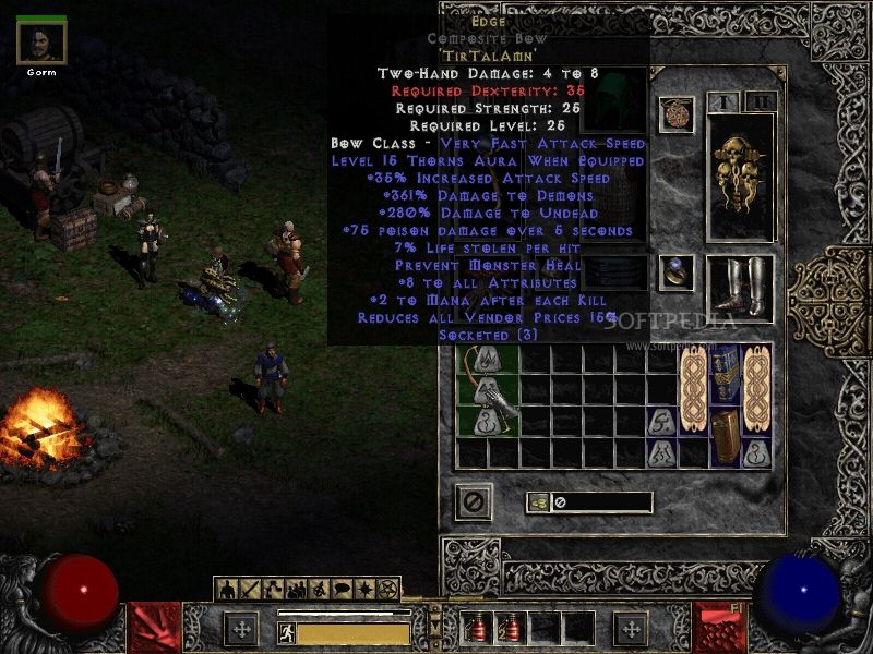
? The 6 slopes straight downwards, but the 5 has the top that hits an edge and comes down. Never had this problem.
Font in Wonderful 101
I don't see what's wrong with it? The serifs are a teeny bit soft but otherwise it's playful and legible.
The old Final Fantasy logos:
Danaly Lantasy
LegitMcfalls
Member
You picked an 11 word frame and bumped up the font size. What about a frame that has 30 to 40 words? God forbid when you start translating it. The font has to fit the frame regardless of how many words is in it. By making that font twice the size you have doubled the work load for the devs and localization teams.
I just can't believe anyone that tells me TW3's subtitles are fine.
So what you're saying is you don't use subtitles?
The fuck are you saying?
It's in fact when subtitles are SMALL that's impossible to focus on both the picture and the text. When they're appropriatedly sized, SPACED, and LINE BROKEN (plopping down an entire muthaeffing paragraph in a single subtitle is THE WORST, in case you didn't know), subtitles are perfectly fine. They don't distract. When done properly they give you enough time and space to read them and to look at the action. I speak as someone that has watched every movie and game with subtitles on for 30 years. English isn't my first language and I'm a bit hard of hearing. Subtitles are meant to be READABLE, and COMFORTABLY SO.
This is how that Witcher 3 picture should look like

thechristoph
Sir!
You picked an 11 word frame and bumped up the font size. What about a frame that has 30 to 40 words? God forbid when you start translating it. The font has to fit the frame regardless of how many words is in it. By making that font twice the size you have doubled the work load for the devs and localization teams.
That's gonna be a big old "tough shit", tater.
Subtitles are an accessibility issue, not an aesthetic issue. Effort needs to be put in to make them usable.
You picked an 11 word frame and bumped up the font size. What about a frame that has 30 to 40 words? God forbid when you start translating it. The font has to fit the frame regardless of how many words is in it. By making that font twice the size you have doubled the work load for the devs and localization teams.
...that's how professional subtitling work is done. I've actually done this kind of work before. Yes, it's more work and requires more time, but it should be done, and the people involved paid accordingly.
SomedayTheFire
Member
OK? Games should be accessible to all.You picked an 11 word frame and bumped up the font size. What about a frame that has 30 to 40 words? God forbid when you start translating it. The font has to fit the frame regardless of how many words is in it. By making that font twice the size you have doubled the work load for the devs and localization teams.
I don't have a screenshot but I remember some games had horrible fonts during the early Xbox 360 era if you were still playing on a SD TV.
I"ll also throw in Lunar: Dragon Song


I don't think it's particularly offensive but it feels very place-holder...much like the rest of the game.
I"ll also throw in Lunar: Dragon Song
I don't think it's particularly offensive but it feels very place-holder...much like the rest of the game.
Then you break it into chunks. I'd say that paragraph should be broken down something like this:You picked an 11 word frame and bumped up the font size. What about a frame that has 30 to 40 words? God forbid when you start translating it. The font has to fit the frame regardless of how many words is in it. By making that font twice the size you have doubled the work load for the devs and localization teams.
But I sees he ain't listnin'
---
Just starin' at me pan
like a magpie at a copper!
---
"Lend it to me gran, I'll
give it back come morn."
---
Was right baffled, for what's
he doin' fryin' in the dark?
---
But I've got a soft 'eart
so I gave it to 'im.
---
Just starin' at me pan
like a magpie at a copper!
---
"Lend it to me gran, I'll
give it back come morn."
---
Was right baffled, for what's
he doin' fryin' in the dark?
---
But I've got a soft 'eart
so I gave it to 'im.
The default subtitles there have five times too many words. You can't just copy in the script, you need to pace the subtitles to match what's being said while keeping them at a good readable size.
Subtitles are hard to do well. I'll point to Kingdom Hearts as a series that does it well. For all the nonsense the characters are saying in that, the subtitles are on point, ensuring that we at least get the right nonsense on time. But you know, it's Disney. Disney has localizations down to an art at this point.
I don't have a screenshot but I remember some games had horrible fonts during the early Xbox 360 era if you were still playing on a SD TV.
I"ll also throw in Lunar: Dragon Song
I don't think it's particularly offensive but it feels very place-holder...much like the rest of the game.
I was so painfully disappointed with that game I ended up returning it after probably an hour of play. After the amazing Lunar 2 on PS1 it was just a straight let down on all fronts.

Witcher 3
Code:[IMG]https://i.ytimg.com/vi/HiApH-znl74/maxresdefault.jpg[/IMG]
What the fuck are you doing CDPR. Subtitles in general are absolutely dreadful in video games, to be honest. They're tiny and don't have proper, thoughtful line breaking. So you end up with this kind of garbage which is pretty much unusable at an average viewing distance.
So many devs/pubs just don't give a fuck about allocating the necessary resources for something that I honestly consider to be very important in text/dialogue heavy games.
Great shout.
I played the game/expansions without subtitles but when I tried them out I thought is this shit written for ants?
Bizarre font decision by CDPR from a game that's incredibly high quality.
DryvBy
Member
In Diablo II, it's almost impossible to read a 5 as a 5 unless you see a 6 next to it.
Ha, I love the font but I totally agree with this. I could never tell the difference.
uncredited male
Member
A lot of PC games used to (still) use fixed pixel dimensions for fonts. You would load up higher resolutions and feel like a stamp collector.
adamsapple
Or is it just one of Phil's balls in my throat?
I remember making this complaint way back when on GAF as well .. but the font on the PSP version of FF Tactics War of the Lions was so tiny it made my head start hurting because I had to constantly force-focus on the screen.
Also .. Dead Rising 1 on an SD TV was notorious for it's time.
Also .. Dead Rising 1 on an SD TV was notorious for it's time.
LegitMcfalls
Member
The Witcher 3s font size is standard font size in regards to other open world games.

Mass Effect Andromeda
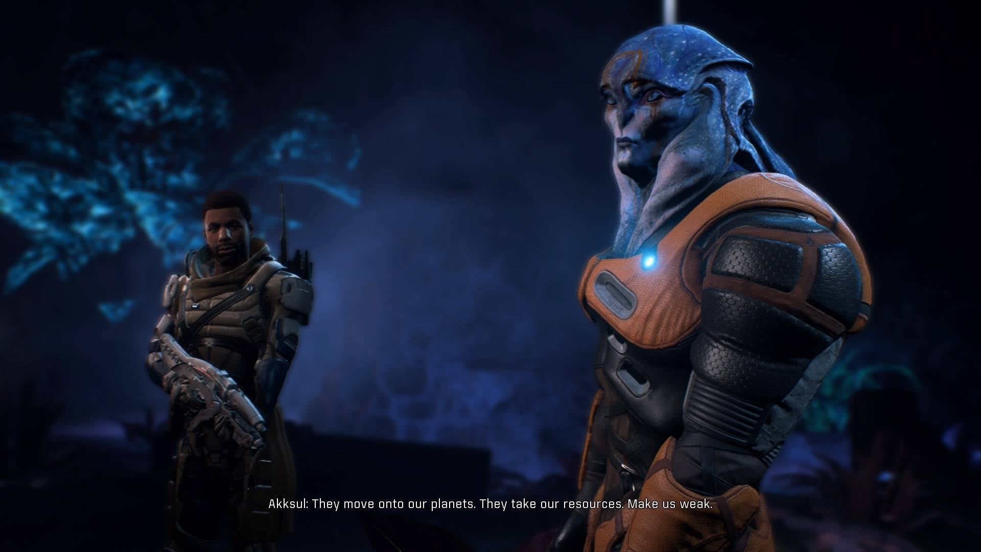
Watch Dogs 2

Destiny

Mass Effect Andromeda
Watch Dogs 2
Destiny
Yeah and all of those are bad subtitles.The Witcher 3s font size is standard font size in regards to other open world games.
Mass Effect Andromeda
Watch Dogs 2
Destiny
The Witcher 3s font size is standard font size in regards to other open world games.
Mass Effect Andromeda
Watch Dogs 2
Destiny
Allow me to quote myself
Subtitles in general are absolutely dreadful in video games, to be honest.
I was so painfully disappointed with that game I ended up returning it after probably an hour of play. After the amazing Lunar 2 on PS1 it was just a straight let down on all fronts.
lol, not to go off-topic but I remember how blown away I was that we were getting a new Lunar game after so many years of holding onto hope. A hope that was basically running on the fumes of "Hey, wouldn't it be cool if there was another one?". Then we started getting details and screenshots. At this point the most realistic thing we can hope for is a PSN release of Silver Star Story with a re-release of Eternal Blue a distant second...I never even got the chance to play Lunar 2

AtomicShroom
Member
The Witcher 3s font size is standard font size in regards to other open world games.
And that here is exactly what the problem is: Why the fuck is this the standard? Who decided that this was going to be the standard? What kind of sheer carelessness and incompetence populated the Great Consulate of Game UI Designers when they came up with this?
The fact is this: They just don't give a shit. I've worked on AAA productions before and subtitles is something they wish they didn't have to do. It's like the one of the things with the lowest priority, given zero care. The script is just literally copy/pasted as is with minimal effort because they can't be bothered to invest any significant amount of time into something they view as completely superfluous. Combine this with the manic obsession of Art Directors to have the UI be as invisible as possible because it "breaks the immersion", and you get what we see. (Because I guess forcing you to squint to read a 10p font paragraph doesn't break the immersion. Go figure.) If subtitles weren't something that is on some checklist of required things deemed mandatory by most publishers, you can be sure it would be one of the first things to meet the deadline cutting axe.
The early HD days were bad, I couldn't read anything in Strania on an SDTV and I left the font on the later added large size in Nuts & Bolts even after getting an HDTV.
But very very few things beat Hellsinker:

In addition to the bad font it also uses completely weird terminology for everything (e.g. "bootleg ghost" means autobomb if you get hit) and has incomprehensible mechanics.
But very very few things beat Hellsinker:
In addition to the bad font it also uses completely weird terminology for everything (e.g. "bootleg ghost" means autobomb if you get hit) and has incomprehensible mechanics.
Most recent example I can think of is Until Dawn, I can't find a screenshot online and I'm at work so can't take one myself but the problem is they're positioned extremely strangely, almost veering towards the middle of the screen rather than the bottom. Bizarre, not seen anything like it.
That's how subtitles work. Dumping the whole script at the bottom of the screen is something different.You picked an 11 word frame and bumped up the font size. What about a frame that has 30 to 40 words? God forbid when you start translating it. The font has to fit the frame regardless of how many words is in it. By making that font twice the size you have doubled the work load for the devs and localization teams.
In Diablo II, it's almost impossible to read a 5 as a 5 unless you see a 6 next to it.
? The 6 slopes straight downwards, but the 5 has the top that hits an edge and comes down. Never had this problem.
Yeah I never had this problem either. 5's and 6's are very different looking in that font, as evidenced by your picture. Not sure how you could have kept having that problem after the first time seeing a 6. Unless you just have a horrible memory or something.
I love the D2 font in general though.
They're definitely not the worst offenders, but cliche scifi fonts are a pet peeve of mine.
Dead Space is a pretty good example of this. Blocky gimmicky fonts can work in titles and such but they get old fast when they're the basis of the entire UI.
Prey on the other hand does it right. Clean and sleek. Feels modern instead of stuck in the 90s like so many other scifi games.
Dead Space is a pretty good example of this. Blocky gimmicky fonts can work in titles and such but they get old fast when they're the basis of the entire UI.

Prey on the other hand does it right. Clean and sleek. Feels modern instead of stuck in the 90s like so many other scifi games.
themagicalkitsune
Member
Wild Arms 2 is egregiously bad.

They should have made Wild Arms Alter Code F 2 or something, just to have a font that doesn't make your eyes bleed.
They should have made Wild Arms Alter Code F 2 or something, just to have a font that doesn't make your eyes bleed.
