-
Hey Guest. Check out your NeoGAF Wrapped 2025 results here!
You are using an out of date browser. It may not display this or other websites correctly.
You should upgrade or use an alternative browser.
You should upgrade or use an alternative browser.
Indivisible: Valkyrie Profile/Metroid, Indiegogo, PC/Mac/Linux/PS4/XB1 -- funded!
- Thread starter HadesGigas
- Start date
Sure, but my point kinda was that it's all being exaggerated in every case. And if that is focused on a specific little thing the impact may end up being worse than when there's a lot to digest and everybody picks different parts to get all vocal about.I think showing more designs would only make this "problem" 1000X worse.
This whole thing is something changed / what could've been. So if we show all the other designs, the discussion is only going to get more fractious, because they're going to see a lot more "would could've beens."
Alternate solution, just focus on showing locales and environments. :/
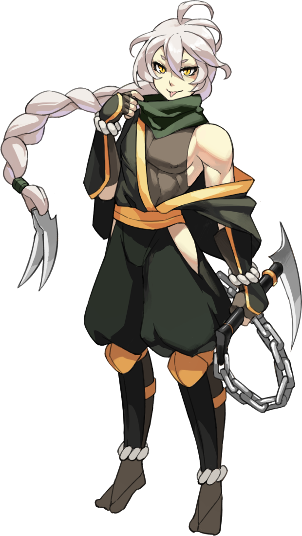
Edit: Oh yeah, what's that funky looking metal plate on his hat? I can't help but see him as a fire fighter due to it.
Yeah. Imagine if the Zelda team showed off biker guitarist Link before the official reveal of BOTW.
Well... some people already said they bowed down to SJWs when they changed some animations in SGs to remove panty shots
...So I guess now we're learning why other companies haven't done this, haha.
The original characters were base concepts made by individuals in a short amount of time, and the new ones are what happened after we actually had time to sit down and iterate on them as a team and more broadly consider gameplay, animation and the cast as a whole.
Yeah. Imagine if the Zelda team showed off biker guitarist Link before the official reveal of BOTW.
LMAO it already happened
Well... some people already said they bowed down to SJWs when they changed some animations in SGs to remove panty shots
Ah I see. I'm not extremely familiar with model sheets but it's a delicate balance no question. On the one hand I'm super glad you all showed so many designs as incentive for supporting but it's hard when changes have to be made for whatever reason, that's for sure.The design is final - shading is just the last step.
I think a lot of people are forgetting that a model sheet is a tool to help artists draw the character, and is purposefully light on everything else, including the characters' personalities.
Some of the analysis we're seeing over Vasco is making me think we need to reconsider how we handle these. I know people are hungry for information, but sometimes a model sheet is just a model sheet.
My personal confusion was going from conceptual (but very detailed pitch designs) to these (more simple by design) model sheets. As a visually oriented person it threw me off a bit. But the details you provided on the reasons behind Vasco's changes were very appreciated and made alot of sense.
Keep up the good work! Looking forward to the backer preview!
Admiral Woofington
Member
Look ultimately we've had so many God damn games with white people cast, and every God damn Hollywood movie is white people central, having a fucking game have a majority minorities isn't going to kill anyone. If they're complaining they weren't planning on getting the game anyways
Gorilla Blade
Member
I actually like the redesign except I dont like the gunblade.
Look ultimately we've had so many God damn games with white people cast, and every God damn Hollywood movie is white people central, having a fucking game have a majority minorities isn't going to kill anyone. If they're complaining they weren't planning on getting the game anyways
No, you misunderstand! These people have to be white because that is what the FREE MARKET and FREEDOM OF SPEECH demand! Including SOCIAL JUSTICE is a plot by the DEGENERATE LIBERALS to undermine WESTERN CIVILIZATION and aid in the rise of the LIZARD PEOPLE that INDOCTRINATE us in the CULT CALLED SCIENCE!
All sarcasm aside...
I like this design, though I need to admit he comes across as having a bit of Antoine's DNA spliced into him, not just from the change of his skin colour, but also his job change from pure gunman to gunblade fencer.
JonnyDBrit
Member
Ah I see. I'm not extremely familiar with model sheets but it's a delicate balance no question. On the one hand I'm super glad you all showed so many designs as incentive for supporting but it's hard when changes have to be made for whatever reason, that's for sure.
My personal confusion was going from conceptual (but very detailed pitch designs) to these (more simple by design) model sheets. As a visually oriented person it threw me off a bit. But the details you provided on the reasons behind Vasco's changes were very appreciated and made alot of sense.
Keep up the good work! Looking forward to the backer preview!
Also worth factoring in the old rule of thumb regarding art versus animation, in that designs for animation tend to be streamlined and simplified for ease of reproduction by animators. This is honestly only bolstered by the fact that Lab Zero's method of applying shading and/or colour maps means that full detail really isn't necessary for the model sheet themselves.
I dig Vasco's new look, though it's definitely more along the line of 'old spanish gentleman', where the old felt overwhelmingly like an American gunslinger. The idea of him being a bit of a fancy swordsman, plus similar 'age of empire' roots, make me wonder if he'd have any kind of association with Antoine.
Correct, it's going to be great to see once all the layers are applied. Im super amazed by what LZ has done with lighting and translucency on their models so far.Also worth factoring in the old rule of thumb regarding art versus animation, in that designs for animation tend to be streamlined and simplified for ease of reproduction by animators. This is honestly only bolstered by the fact that Lab Zero's method of applying shading and/or colour maps means that full detail really isn't necessary for the model sheet themselves.
Raging Spaniard
If they are Dutch, upright and breathing they are more racist than your favorite player
You guys are seeing some of the constant dilemmas studios have when they try to be transparent. How much to show? Too little and fans think youre not working, too much and you spend more time showing things than making things.
Its curious that a very significant art direction change in the environments, which is 95 percent of what you see onscreen at all times, got a minimal response from the fanbase here, and trust me, its a big deal for the game, but a redesign on a very minor part of the game immediately gets 2 pages of discussion.
When big companies do this, btw, companies like Blizzard, Square, etc, you think theyre showing you process stuff and concept art, but they really arent. They're showing you the final, polished designs and illustrations that are really made just for the consumer. This sucks in a way because it teaches you, the consumer, thats what concept art in mid or pre-production actually looks like and it really, really, reeeally does not. So when a company like Lab Zero actually dips their toes in trying to show you what actual process looks like, they get a negative reaction due to people just not knowing the process, which can be discouraging.
Of course, they can educate you on the matter ... but they're a software company, not art college. You gotta draw a line in how much time you spend educating your fanbase on how games are made or else the game wont get made, hell, especially an rpg!
Just trying to give you all a bit more context")
Its curious that a very significant art direction change in the environments, which is 95 percent of what you see onscreen at all times, got a minimal response from the fanbase here, and trust me, its a big deal for the game, but a redesign on a very minor part of the game immediately gets 2 pages of discussion.
When big companies do this, btw, companies like Blizzard, Square, etc, you think theyre showing you process stuff and concept art, but they really arent. They're showing you the final, polished designs and illustrations that are really made just for the consumer. This sucks in a way because it teaches you, the consumer, thats what concept art in mid or pre-production actually looks like and it really, really, reeeally does not. So when a company like Lab Zero actually dips their toes in trying to show you what actual process looks like, they get a negative reaction due to people just not knowing the process, which can be discouraging.
Of course, they can educate you on the matter ... but they're a software company, not art college. You gotta draw a line in how much time you spend educating your fanbase on how games are made or else the game wont get made, hell, especially an rpg!
Just trying to give you all a bit more context

Admiral Woofington
Member
Finally get to see my husbando in action.
JonnyDBrit
Member
I actually saw Dhar's attack animation there being drawn and cleaned up not too long ago. Impressive how quickly it got put to use.
I was unaware that Dhar is apparently an earthbender of some sort. I'm much more excited to have him on the team than I was before.
JonnyDBrit
Member
So Persona did some streaming today: Ren also getting a redesign. Loses the robe, top replaced by two sleeves, got a new belt, and now wears high heels.
Dimitri LH
Member
So Persona did some streaming today: Ren also getting a redesign. Loses the robe, top replaced by two sleeves, got a new belt, and now wears high heels.
.....I need to see. Cause my imagination is wanting to picture the worst, considering the original looked great. Its the high heels part that got me for some reason lol.
JonnyDBrit
Member
.....I need to see. Cause my imagination is wanting to picture the worst, considering the original looked great. Its the high heels part that got me for some reason lol.
Late reply, but here's the stream: https://www.twitch.tv/labzero
Currently on a looping animation of the redesigned Ren-
Hours Left
Member
Ren's new design is really awesome! I love the sleeves. Definitely my favorite redesign so far.
*continues praying for Kogi and Tatanka*
*continues praying for Kogi and Tatanka*
Dimitri LH
Member
Late reply, but here's the stream: https://www.twitch.tv/labzero
Currently on a looping animation of the redesigned Ren-
Hmm.....I am not digging the heels. I guess I can get used to them, maybe in full motion, still prefer the old design.

DiscoShark
Banned
New Ren looks really fantastic.
Hades Hotgun
Banned
I enjoy the new Yorha Type Ren.
Voice recording today!
https://twitter.com/IndivisibleRPG/status/864902244172484609
I can't tell you how weird it was hearing this voice come out of a person after 120 hours of Persona 5.
https://twitter.com/IndivisibleRPG/status/864902244172484609
I can't tell you how weird it was hearing this voice come out of a person after 120 hours of Persona 5.
Voice recording today!
https://twitter.com/IndivisibleRPG/status/864902244172484609
I can't tell you how weird it was hearing this voice come out of a person after 120 hours of Persona 5.
Wait, you play with dubs?! I thought you were legit nakama...
Wait, you play with dubs?! I thought you were legit nakama...
Persona dubs are actually pretty good, and it's also good research for exactly this.
My replay / Platinum run will be in Japanese.
Voice recording today!
https://twitter.com/IndivisibleRPG/status/864902244172484609
I can't tell you how weird it was hearing this voice come out of a person after 120 hours of Persona 5.
I had no idea who this was and immediately knew it was Morgana.
favorite voice in the game and so excited shes here
Persona dubs are actually pretty good, and it's also good research for exactly this.
My replay / Platinum run will be in Japanese.
Actually playing with dubs myself
Though yeah, it's funny hearing the voice come out of the real person. Why didn't you have her go in a slightly different direction?
Ultimadrago
Member
Voice recording today!
https://twitter.com/IndivisibleRPG/status/864902244172484609
I can't tell you how weird it was hearing this voice come out of a person after 120 hours of Persona 5.
Nice!
I actually played Persona 5 in Japanese dub, so I haven't been hearing much of Cassandra lately. She voiced my favorite Trails of Cold Steel character, Fie Claussell, though so I'm down for more from her!
Voice recording today!
https://twitter.com/IndivisibleRPG/status/864902244172484609
I can't tell you how weird it was hearing this voice come out of a person after 120 hours of Persona 5.
Whoaa looking cool, Joker!
Raging Spaniard
If they are Dutch, upright and breathing they are more racist than your favorite player
Voice recording today!
https://twitter.com/IndivisibleRPG/status/864902244172484609
I can't tell you how weird it was hearing this voice come out of a person after 120 hours of Persona 5.
Its almost scary how good she is!
Its almost scary how good she is!
as;ldkaposdi09aisdl;k
robotzombie
Member
Do you have to go to bed early now Rav?
Voice recording today!
https://twitter.com/IndivisibleRPG/status/864902244172484609
I can't tell you how weird it was hearing this voice come out of a person after 120 hours of Persona 5.
Cool!
EDIT: Wasn't that nice Honey?
SolicitorPirate
Member
Voice recording today!
https://twitter.com/IndivisibleRPG/status/864902244172484609
I can't tell you how weird it was hearing this voice come out of a person after 120 hours of Persona 5.
As expected from Lab Zero
Unreal Champ
Banned
Voice recording today!
https://twitter.com/IndivisibleRPG/status/864902244172484609
I can't tell you how weird it was hearing this voice come out of a person after 120 hours of Persona 5.
Hey what's the link if you still want to pledge? My nephew wants the physical collector's edition but I forgot the link where he can go do that.
Delusibeta
Banned
For new pledges, Indiegogo are still taking new pledges. To upgrade an existing pledge, you'll need the BackerKit link that was sent to the email address you used to pledge with.Hey what's the link if you still want to pledge? My nephew wants the physical collector's edition but I forgot the link where he can go do that.
For new pledges, Indiegogo are still taking new pledges. To upgrade an existing pledge, you'll need the BackerKit link that was sent to the email address you used to pledge with.
This needs to be in the title.
How is the PC physical edition? Is it a non-DRM, non-Steam version of the game, or is a Steam account still needed to install the game? And are the Windows/OSX/Linux versions on the same disc, or is there a need to specify the OS when ordering the physical edition?
Will there be a non-DRM GOG/humble store/etc release?
I'm really interested in the physical edition for computers, but if it just means having an extra Steam key it's not really worth it, compared to the console editions (which also get a digital Steam key)
this tier:
Voice recording today!
https://twitter.com/IndivisibleRPG/status/864902244172484609
I can't tell you how weird it was hearing this voice come out of a person after 120 hours of Persona 5.
Is Unclassifiable a word, especially when it refers to feelings?
Baron von Loathsome
Member
Is Unclassifiable a word, especially when it refers to feelings?
It is. A Google search to make sure showed the word being used on .gov websites.