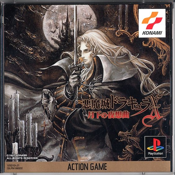
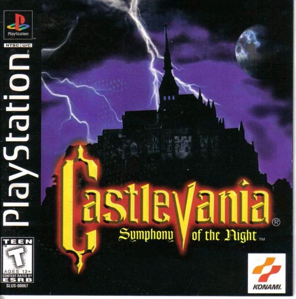
Although American box art has had a reputation for shoddiness, especially back in the day when anime art was systematically replaced by low-rent Boris Vallejo knockoffs, there must also be some cases where box art was changed for the better.
I submit the original Final Fantasy:
The art for the Japanese version looks a bit strange, like it's a colored-in rough sketch, while the American release has a much more polished, classy-yet-minimalist design. It also more clearly indicates an epic quest with a whole world to explore. I found FF's box art to be quite striking back in the day and rented it just because it looked cool.
What are some others?
I submit the original Final Fantasy:


The art for the Japanese version looks a bit strange, like it's a colored-in rough sketch, while the American release has a much more polished, classy-yet-minimalist design. It also more clearly indicates an epic quest with a whole world to explore. I found FF's box art to be quite striking back in the day and rented it just because it looked cool.
What are some others?


-1.jpg)