I wonder why people would choose to write articles about it using this kind of language then.
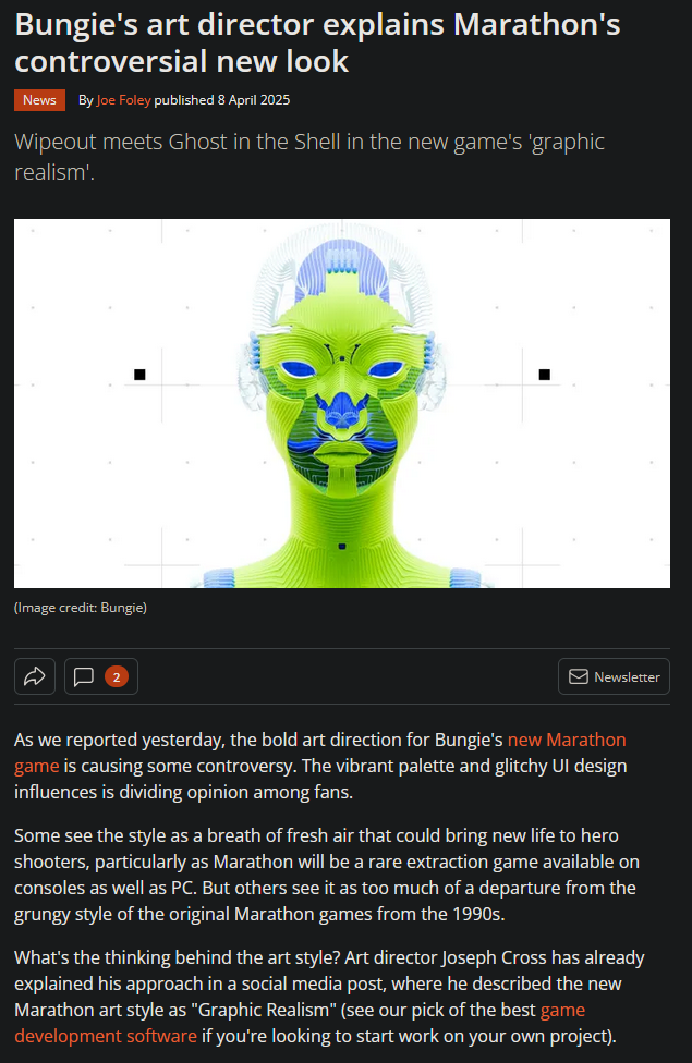
The thing is, pretty much all elements of Marathon's artwork could work, but in the combination of how they've been employed they don't. I'm no art analysis who knows how to structurally breakdown why, I just know that other things that share vague similarities to Marathon look great and Marathon does not. Ghost in the Shell, Mirror's Edge, Wipeout, and the general work done by The Designers Republic.
Marathon is the video game equivalent of the Jaguar rebrand. This is coming from me, someone who's never been into Halo, and probably spent no more than 20 hours in Destiny.
")