-
Hey, guest user. Hope you're enjoying NeoGAF! Have you considered registering for an account? Come join us and add your take to the daily discourse.
You are using an out of date browser. It may not display this or other websites correctly.
You should upgrade or use an alternative browser.
You should upgrade or use an alternative browser.
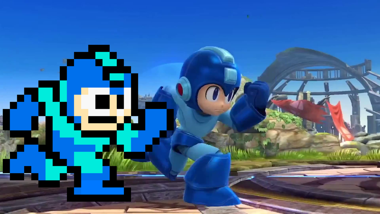
Mega Man design changed for the Mega Man TV Show (2017)
- Thread starter rockman zx
- Start date
The Technomancer
card-carrying scientician
Mega Man is a robot. Or at least a computer program. He's not just a kid. How do you fuck that up
Rentahamster
Rodent Whores

Looks like a Mii.
Version 3.0
Member
Somebody get that kid a sandwich.
Ban Puncher
Member
Should have gone with the Super Smash Bros. Wii U/3DS design...
I mean, you already have a toy on store shelves with the Mega Man Amiibo. You're turning down free and easy marketing.
Soul of the Beast
Member
It's better. Art reminds me of those apps that allow you to dress up your avatar.
"Create your Mega Man!"
It would work perfectly with NetNavis though
ZombiePlatypus
Member
Definite improvement.
Jesus the older one looked like a WikiHow illustration.
Jesus the older one looked like a WikiHow illustration.
TacticalHotdog
Member
Why they can't do one with this design? What are they thinking?
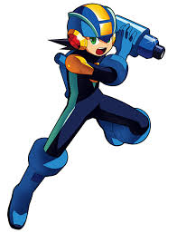
I always liked the Megamix/Gigamix take on the classic design
.jpg/revision/latest?cb=20150325152018)
.jpg/revision/latest?cb=20100210141108)
DangerMouse
Member
A lot better. They seemed to get rid of a lot of the dark blue.
And oh how GAF forgets. Remember how the world rejected this when it was first announced:

And it's the new standard.
Yeah. This show turned out sooo good.
manzoman96
Member
Looks absolutely horrible.
Just Ctrl + C and Ctrl V this:
Thats ma Mega Man!

TRUE ORDER
Member
Looks better than the previous one but still kinda bad.
I always liked the Megamix/Gigamix take on the classic design
This would have been better.
Almost exactly what I said.
Oh god, I still hate it. Every other megaman is fine, why change it to this abomination?
I bet you would say this exact same thing had this been an EXE reveal.
depths20XX
Member
Looks like a dollar store Mega Man.
Harothewanderer
Member
Why is MegaMan so smug now 
Huh? I liked that design when it first came out, that's why I said any other previous design. Classic, Legends, X, EXE are all great, but this is just horrible.I bet you would say this exact same thing had this been an EXE reveal.
Why is MegaMan so smug now
It's the Smash Bros effect.
Springfoot
Member
.
Last edited:
Better design but I have bigger problems like how from the little we have seen it looks to be a boy who turns into megaman when he is not in school or something =P
Why this sounds like an irony ?
The show has its ups and downs, but overall is the best incarnation of tmnt in my opinion.
It is a pure love letter to the history of the franchise.
Yeah. This show turned out sooo good.
Why this sounds like an irony ?
The show has its ups and downs, but overall is the best incarnation of tmnt in my opinion.
It is a pure love letter to the history of the franchise.
SpacePirate Ridley
Member
Better, but still the same badly designed choice.
Looks absolutely horrible.
Just Ctrl + C and Ctrl V this:
This
Bob Coffee
Member
mighty number mega man?
He has always had hair under his helmet. Look at Roll: she has always just looked like a human girl. From what I remember of early story summaries of the new cartoon, the premise isn't that he is a kid, its just that he is a robot who wants to go to school with other kids. This isn't even a new concept: it was the premise of the short-lived Dreamwave Mega Man comic.Mega Man is a robot. Or at least a computer program. He's not just a kid. How do you fuck that up
The idea of Mega Man having a human civilian form and then transforming into his armor to fight was even present in the Mega Man Megamix manga. Mega Man is deeply rooted in Japanese superhero cartoons and TV shows. Both the Star Force and Mega Man ZX series were about ordinary humans transforming into superheroes called "Mega Man", for crying out loud. Mega Man having a transformation sequence to put on his armor is hardly outside the norms of the franchise.
veloxStrix
Banned
A E S T H E T I C
Chaotic-Strike
Banned
It's better than the last one which isn't saying all that much, but I'll still give this show a chance to prove itself.
I just remembered that there was a Mega Man design made for a cheap smartphone game that I really love (the design, not the game):
If the TV show shows off the same artstyle as the OP it isn't so bad, but the old one has a really nasty combination of an overly simple artstyle with an overly complex character design.
Whoa...AMAZING!
To be honest the design itself is okay, it's just that the art-style looks like Subway Surfers and ugh... :/
And there's another reason why I always thought you are a great person!
Icedburden
Member
Pretty much. I wonder how much the people who think this is a good idea get paid?Looks like a Mii.
What The Forest Taught Me
Member
I guess it looks slightly better. Why can we just not get this as the design instead.

Yes! This design right here.
Nintendo nailed the design perfectly...

Why can't Capcom take notes?
Suprised people loved this.
Its such a dorky design.His dead eyes and weird proportions.lol
(The original Mega Man has always looked kinda dorky)Suprised people loved this.
Its such a dorky design.His dead eyes and weird proportions.lol
mortal
Gold Member
I think it's a pretty solid design. It feels very Tezuka-esque. To be honest, Mega Man has always had odd proportions, so the stylization isn't all that extreme.Suprised people loved this.
Its such a dorky design.His dead eyes and weird proportions.lol
Same aesthetic, but definitely improved.
The worst first post.
The design looks awful! The head is way too big, and the eyes are all wrong...jeeze. How can anyone think it looks good?
Iva Demilcol
Member
Suprised people loved this.
Its such a dorky design.His dead eyes and weird proportions.lol
Kind of agree there. It really looks weird but I suppose that in the end "its better than nothing".
Rumor has it that the megaman team (is this a thing still) has been working on a game in-tandem with the show. 2 versions, consoles is MM team and mobile is somebody else
Anyone getting flashbacks to Sonic Boom yet?
Rentahamster
Rodent Whores
Suprised people loved this.
Its such a dorky design.His dead eyes and weird proportions.lol
I thought the proportions were cute. I liked this design.
texhnolyze
Banned
Kain-Nosgoth
Member
Suprised people loved this.
Its such a dorky design.His dead eyes and weird proportions.lol
it's meant to represent the original 8 bit sprites, and they nailed it, even the eyes are like that! I really loved it