• Hey Guest. Check out your NeoGAF Wrapped 2025 results here!

New Sony Santa Monica logo unveiled

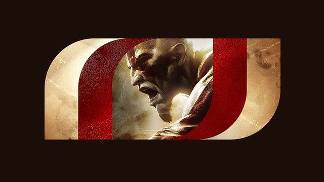
Yeah. Really like the GoW one as well. I wonder what it would look like for the order. Probably use RAD's brushed metal aesthetic with the symbol of the order in the middle? Or may be just the brushed metal and a black center.

readyatdawn-logo01.jpg


I can't see Galahad in the middle, not iconic enough yet.

Not enough stache.
 
While I love there old one (really fit the more violent games they worked on :D), this new one is a better reflection of them as a whole :).

They work on and help out with TONS of different games (helping out the smaller teams within Sony, help make some ports across the PS eco-system, ect), so a new logo that reflects there creative side does fit them better :D.
 
The Hohokum variant sold me on it. Color adaptability to complement the product it's paired with is a good look.
 
Old one reminds me of cheesy 90s comic book aesthetic, new one reminds me of huge 70s tech companies, namely Polaroid.

Personally I'll take the new one any day but I don't think it represents, even remotely, their products.
 
The old one was ugly, but the new one just isn't anything.
Not really sure why 'versatile' is a laudable quality in a game studio logo, it's not like it needs to be anything else. It is true though, it could just as easily easily be the logo of a printing company or a real estate firm.
 
The old one was ugly, but the new one just isn't anything.
Not really sure why 'versatile' is a laudable quality in a game studio logo, it's not like it needs to be anything else. It is true though, it could just as easily easily be the logo of a printing company or a real estate firm.

Sony Santa Monica, the financial consulting company. "Versatility" at its finest. :-P
 
From a graphical design point of view the new logo is 100x better. The old one might have been unique, but, it is hard to recognize and decipher since it's more of a mess drawn with a brush.

Never liked the old one, the new is clean, has it's on identity and with a game image attached in the center is also clear to "read" for people who might not be familiar with the company.

GJ.
 
prefer the new one, old logo looked like some HP laptop decoration or mid 00's MTV identity.

yup

People here said 3D Realms' old logo was good. Not surprised at praise for SSM's old one.

The old one was ugly, but the new one just isn't anything.
Not really sure why 'versatile' is a laudable quality in a game studio logo, it's not like it needs to be anything else. It is true though, it could just as easily easily be the logo of a printing company or a real estate firm.

Nothing says "video game developer" like a messy logo.
 
What does the amorphous blob at the top represent in any capacity? There's no cohesion or unity between the font, studio name and shape of the design.

Bungie got it right with the logo, a shooting star that is a subtle nod to their love of the sci-fi genre.

468px-Bungie_Logo_4C_dark.png
Or, it's just a ball with the swoosh shape that you'd find in pretty much every logo in the 90s.

This would be one weird shooting star:
Nb4zFfM.png
 
This is btw what their old logo looked like for the most part:
20130719184014!SCE_Santa_Monica_Logo.png


It wasn't completely unreadable like the image in OP suggests. I always saw it as a surfer culture graffiti thing, which made sense to me because "Santa Monica".
 
I like the new logo, better then the old one that looked like a bunch of cheesy free fonts thrown together with some clip-art curls.
 
The old one looks like something you would see on an Affliction t-shirt. The new one is much better from a design and usability perspective, but I don't find it particularly creative either, as it doesn't really represent anything in relation to the company name, itself.
 
I can't believe people say they preferred the old one.

I will use this thread as a reminder to myself of the vast ocean of aesthetic preference on GAF.

That's a really nice way of saying a lot of GAF has awful taste.

Seriously, that old logo is really, really bad.

The new is interesting. I wonder how far they'll go with the customized aspects. Reminds me a bit of what DC has done with they're new logo.


I can see the SMS logo easily animating too. The main middle section appears with whatever content and the side pieces slide out or something. Could be neat when starting up a game.


Pretty good job.
 
It's like something from the 1970s color-wise, sort of like that part... the Sony Santa Monica part though could use a different font entirely.
 
This is a really good execution, I'd have maybe chosen different colours. Its really slick. It will age well.

edit:
The Hohokum variant sold me on it. Color adaptability to complement the product it's paired with is a good look.

Bingo! /edit


The old one was creepy and cool too, i like it enough, but I feel they have grown far beyond that mark.

Also, I'm not surprised more like the old one though. hehe
 
That's a really nice way of saying a lot of GAF has awful taste.

Seriously, that old logo is really, really bad.

The new is interesting. I wonder how far they'll go with the customized aspects. Reminds me a bit of what DC has done with they're new logo.


I can see the SMS logo easily animating too. The main middle section appears with whatever content and the side pieces slide out or something. Could be neat when starting up a game.


Pretty good job.

Yeah after I saw the changes with the colours to adapt to different games, it reminded me of the DC logos with all the different characters. I like it now
 
It's like something from the 1970s color-wise, sort of like that part... the Sony Santa Monica part though could use a different font entirely.

It's too obviously retro-inspired, imo. The logo should be forward thinking and original, which this is not.

Not that I could make a decent logo to save my life...
 
lol at people preferring the original logo made by the son of the janitor back in 1994, in his art-class in highschool with his illegal copy of photoshop 2.
 
Top Bottom