Was about to complain, but the added game theme color flexibility sold me. Still like the logo, though.they also change the colour around for different games

-
Hey Guest. Check out your NeoGAF Wrapped 2025 results here!
You are using an out of date browser. It may not display this or other websites correctly.
You should upgrade or use an alternative browser.
You should upgrade or use an alternative browser.
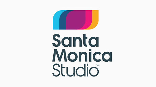
New Sony Santa Monica logo unveiled
- Thread starter JehutyRunner
- Start date
spacemonkeynation
Member
Wtf is wrong with companies? The entire point of identity systems is thrown out the window when you drastically change your logo every couple years!
Triggerhappytel
Member
They should have changed their name aswell. To "God of War Factory". Because that's what they are.
To be fair, they did try something else, but for whatever reason it fell through. I think it's almost certain that Corey has returned to helm a new GoW (hopefully notably different from the others), but hopefully once that's out the door the studio is allowed to try something new again. I have a lot of faith in Corey, but from a creativity point of view I think the staff should be allowed to develop something different.
Always-honest
Banned
Much better
SomedayTheFire
Member
So so so so much better than the old logo. The old one looked like it was stuck in the late 90's early 00's nu metal phase.
It feels way less stylish than the old one.

looks bad, i prefer the old logo

My god, this is awful and hideously dated. New one is an absolutely massive improvement.
Azure Wolf
Banned
The old one looks like something Joe Rogan would have stitched on the back pocket of his dragon jeans.
The new one is clean, corporate and classy.
I like the way the curves of the graphic have elements of the letters M and S too.
The new one is clean, corporate and classy.
I like the way the curves of the graphic have elements of the letters M and S too.
Pristine_Condition
Member
I like it. A lot.
Can't believe people's nostalgia glasses still fool them into thinking that old logo doesn't suck. It does, and to have something that dated in the Year of Our Lord 2014 is almost as embarrassing as the WWE still using the "scratch" logo. (Which they are finally starting to break away from too.)
Can't believe people's nostalgia glasses still fool them into thinking that old logo doesn't suck. It does, and to have something that dated in the Year of Our Lord 2014 is almost as embarrassing as the WWE still using the "scratch" logo. (Which they are finally starting to break away from too.)
Leafhopper
Banned
I like it. A lot.
Can't believe people's nostalgia glasses still fool them into thinking that old logo doesn't suck. It does, and to have something that dated in the Year of Our Lord 2014 is almost as embarrassing as the WWE still using the "scratch" logo. (Which they are finally starting to break away from too.)
The old logo wasn't great but this minimalistic bland, no personality at all, stuff isn't great either.
Captain Pants
Killed by a goddamned Dredgeling
The old one looks like something Joe Rogan would have stitched on the back pocket of his dragon jeans.
The new one is clean, corporate and classy.
I like the way the curves of the graphic have elements of the letters M and S too.
Agreed! I was coming in to say something similar. The old logo is definitely douchebro style.
Gusy
Member
my thoughts exactly.
the new one definitely looks like it belongs on a 70s coffee mug but that's better than the Alice in Chains album cover it used to be
Yup..There´s totally a 70´s vibe in it. Made me think about boogie nights.
Wtf is wrong with companies? The entire point of identity systems is thrown out the window when you drastically change your logo every couple years!
I guess they got sick of identifying as a grimdark nu-metal band.
astroturfing
Member
so apparently every logo needs to be minimalistic and simplified these days?
meh. the old one was distinct, and stuck to my mind. this new one is like a million other oil company logos or whatever. boring, uninspired. just bad.
meh. the old one was distinct, and stuck to my mind. this new one is like a million other oil company logos or whatever. boring, uninspired. just bad.
The old one was way too dirty for a logo, actually changed my impression of the studio. I'm glad marketing cleaned themselves up tbh.
I listen to the Cure, the Smiths, the Pixies and the smashing pumpkins... doesn't change the fact that the old logo was terrible.At this point I'm assuming that everyone who really liked the old logo was one of those edgy kids that never listened to anything but The Cure.
EmeraldSwords
Banned
I really like it.
so apparently every logo needs to be minimalistic and simplified these days?
meh. the old one was distinct, and stuck to my mind. this new one is like a million other oil company logos or whatever. boring, uninspired. just bad.
It stuck to your mind because you've seen it for years now. You're used to it. Just like you'll get used to this one.
At this point I'm assuming that everyone who really liked the old logo was one of those edgy kids that never listened to anything but The Cure.
Let me crash your theory in a brick wall.
I listened to tons of music, even when young. From the likes of Offspring and Bad Religion to Slayer and Megadeth.

The old one was way too dirty for a logo, actually changed my impression of the studio. I'm glad marketing cleaned themselves up tbh.
I listen to the Cure, the Smiths, the Pixies and the smashing pumpkins... doesn't change the fact that the old logo was terrible.
I like those bands too. It just reminds me of people I know that call everything that isn't scrawly or super-edgy "gay". The Cure reference was just a point of reference/bad punchline.
The old logo was great, but really shows its age. Feels late 90s/early 2000s to me.
The new one is nice enough.
Yeah totally agree. The new one is nice and clean, and more modern.
Leafhopper
Banned
It stuck to your mind because you've seen it for years now. You're used to it. Just like you'll get used to this one.
Get used to sure but it doesn't mean they will ever like it.
Lord Error
Insane For Sony
I don't think this new logo can be memorable to be honest. It just has no identity whatsoever, and looks like million other logos that are out there now. It tells nothing about the studio's identity or the games they make, or anything. The fact that the old logo looks dated nowadays, doesn't make this new one good just because it follows the trend million other logos set before it.It stuck to your mind because you've seen it for years now. You're used to it. Just like you'll get used to this one.
Pristine_Condition
Member
The old logo wasn't great but this minimalistic bland, no personality at all, stuff isn't great either.
I disagree. The multicolor thing seems inspired/informed by classic multitone designs from surfing. Which is very much at home in a logo representing a company based in Santa Monica.
I get what you're saying, but I guess the Cure threw me though as I wouldn't associate their mood to that kind of aesthetic. Funnily enough I possibly could with the Pixies though.I like those bands too. It just reminds me of people I know that call everything that isn't scrawly or super-edgy "gay". The Cure reference was just a point of reference/bad punchline.
This kind of thing seems aesthetically similar to me and I totally did associate Santa Monica with that kind of scene, glad they've dropped it.

eso76
Member
The old logo also sucked.
It was an ugly mess of different things, with uninspired fonts, absolutely no balance and it just wasn't working as a logo on any level.
Now, the new one instead...
...looks like every other logo now, like everyone else said already.
They both suck for different reasons.
It was an ugly mess of different things, with uninspired fonts, absolutely no balance and it just wasn't working as a logo on any level.
Now, the new one instead...
...looks like every other logo now, like everyone else said already.
They both suck for different reasons.
The old logo also sucked.
It was an ugly mess of different things, with uninspired fonts, absolutely no balance and it just wasn't working as a logo on any level.
Now, the new one instead...
...looks like every other logo now, like everyone else said already.
They both suck for different reasons.
You must be fun at parties.
loaf of bread
Member
They should have changed their name aswell. To "God of War Factory". Because that's what they are.
Yeah and Bungie should have changed their name to "Halo guys" and Lionhead should be called "Studio that makes Fable" and Polyphony digital should change to "The Gran Turismo studio" and Rare should be called "Kinect industries".
The Hohokum one is what sold me on it. It'll look so much better with different types of games.Not many people seem to even acknowledge that they want the logo to adapt to each game they release. These looks really good imo
Using the one below for Hohokum would have been so incongruent
NeptunePirate
Member
I really like the new look. Simple and clean.
DUFFMCWALIN
Member
Old logo was dogshit from the 90's. I like the new change.
Off-Kilter
Banned
Love it, especially with the Hohokum color scheme.
Dr Campino
Member
I like it, I was never a fan of the old one
Wait, people actually liked the old logo? Are you kidding me?
nerds have the worst taste in things
see: linkin park
sorry guys.
viveks86
Gold Member
The Hohokum one is what sold me on it. It'll look so much better with different types of games.
Yeah. Really like the GoW one as well. I wonder what it would look like for the order. Probably use RAD's brushed metal aesthetic with the symbol of the order in the middle? Or may be just the brushed metal and a black center.
I can't see Galahad in the middle, not iconic enough yet.
BetterThanNothing
Member
Kind of reminds me of...

It's much better than their 'super edgy' logo, which was goddamn all over the place and tried way too hard.
It's much better than their 'super edgy' logo, which was goddamn all over the place and tried way too hard.
I know the old one says Santa Monica, but it just looks like a 5 year old going crazy at a canvas. I'm not the biggest fan of the new one, but I love the idea of them changing the colors for each game. That'll be nice.
EDIT : I have to wonder what the ages ranges are of people who like the old one vs the new one.
EDIT : I have to wonder what the ages ranges are of people who like the old one vs the new one.

The new logo isn't bad; it just feels really familiar. I've been to at least 2 paint stores that use similar graphics and type treatment in their signage.
I liked the old one a lot; it was really distinctive and boutiquey.
When I opened this thread I actually thought they'd changed the name and went for a total rebrand, since I was of the impression they weren't actually located in Santa Monica anymore.
That Naughty Dog logo though - the dog paw makes me think '90s clip-art library.
zackmorris
Member
I like it. What I don't like is this quote "Kinetica, God of War, Journey, Hohokum, and The Order: 1886 these are just a few examples our studios strong internal and external legacy encompassing a broad spectrum of innovative and diverse titles. "
I get that they "helped" work on Journey in some capacity, but I don't think it's really fair for them to claim it here as if it was there game. Same for The Order. I don't want to completely minimize what work they did on those games, but I doubt they would have turned out much different if they weren't working on them. Maybe they would have just taken a bit more time.
I get that they "helped" work on Journey in some capacity, but I don't think it's really fair for them to claim it here as if it was there game. Same for The Order. I don't want to completely minimize what work they did on those games, but I doubt they would have turned out much different if they weren't working on them. Maybe they would have just taken a bit more time.