-
Hey, guest user. Hope you're enjoying NeoGAF! Have you considered registering for an account? Come join us and add your take to the daily discourse.
You are using an out of date browser. It may not display this or other websites correctly.
You should upgrade or use an alternative browser.
You should upgrade or use an alternative browser.
Snake Pass, and how a bad home menu icon drags down my enjoyment of a game
- Thread starter Neiteio
- Start date
- Status
- Not open for further replies.
The à¹ÛBronx
Member
Yes, only when you've selected the game though, which in the capacity of something that should be designed to account for numerous games isn't as helpful as you'd indicate.This is a weird thread. Guys, you do realise it says what the game is in text above it right? Guys?
Any word on what the icon for Pan Pan looks like?
I'm posting them weekly on Nintendo Downloads thread. You have icons of this week here .

Thanks! Just got it. For the record, it doesn't have the white & orange borders.
More akin to this (sloppy crop of my own):

edit:
I'm posting them weekly on Nintendo Downloads thread. You have icons of this week here .
You are the best. Thanks so much.
The à¹ÛBronx
Member
That Pan Pan tile is gorgeous.
Yep. All I've seen of the game is its icon, which tells me 1) it appears to have a lovely Noby Noby Boy-like art style and 2) it's called Pan-Pan. An effective icon that makes me interested.The ๖ۜBronx;249142062 said:That Pan Pan tile is gorgeous.
The à¹ÛBronx
Member
That's it. I mean I don't see their primary purpose as being getting someone to want the game from nothing, but in doing so is an indicator that it's both informative and distinct which are both key for it's purpose as a library tile.Yep. All I've seen of the game is its icon, which tells me 1) it appears to have a lovely Noby Noby Boy-like art style and 2) it's called Pan-Pan. An effective icon that makes me interested.
Whole flock of birds with one stone.
Robin64
Member
Yep. All I've seen of the game is its icon, which tells me 1) it appears to have a lovely Noby Noby Boy-like art style and 2) it's called Pan-Pan. An effective icon that makes me interested.
And you should be interested, the game is excellent and cheap as chips.
You get dumped into this gorgeous simple looking world, and there are no instructions. You can interact with the environment, pick things up but you don't know what they're even for, talk to beings who just gesture and point at things, and it's all so very alien. You begin to experiment with things and learn the rules to progress and it feels great.
D.Lo
Member
No, it isn't. You have to highlight the game for the title to show. The majority of the time the text is not above it.This is a weird thread. Guys, you do realise it says what the game is in text above it right? Guys?
Demoskinos
Member
Good on the devs.
Not liking an icon is one thing. Shaming developers to change back a fucking icon on the dashboard of a game though is IMO kind of disgusting. Like what a petty thing.
Not liking an icon is one thing. Shaming developers to change back a fucking icon on the dashboard of a game though is IMO kind of disgusting. Like what a petty thing.
You know, most of the discussion here from the side of the folks that didn't like the way a certain subset of icons are presented has been relatively civil. It's primarily those that decry this supposed 'faux outrage' that have resorted to pettiness and ad hominems.
If the developer doesn't want to do anything about it; it's up to them, fine. If they care enough about satisfying a fraction of their audience, great! What's it to you?
Is this thread really "shaming?" It's mostly just people complaining about something that annoys them, which I think is totally fine even if you don't agree.Not liking an icon is one thing. Shaming developers to change back a fucking icon on the dashboard of a game though is IMO kind of disgusting. Like what a petty thing.
OrbitalBeard
Member
I personally think all the icons without logos look much, much better than the ones with. They're generally more memorable and look classier.
An icon's function isn't to be memorable or look classy.
TheGreatMightyPoo
Banned
He's right, some people take it to another level.Is this thread really "shaming?" It's mostly just people complaining about something that annoys them, which I think is totally fine even if you don't agree.
D.Lo
Member
Ridiculous language. Asking developers to change something incidental but annoying about a product is not 'shaming' or 'disgusting'. There is nothing personal, just requests for someone selling something to make their product better for people who prefer their icons to follow the official guidelines. It seems the reaction from some devs has been 'oh no worries, will be done in next update' aka they had no serious attachment to the old icon and just slapped a phone type one in there with little thought the first time.Not liking an icon is one thing. Shaming developers to change back a fucking icon on the dashboard of a game though is IMO kind of disgusting. Like what a petty thing.
Ironically you are the one shaming people, for not liking these icons. You have used personal language like 'disgusting' to describe other people's icon preferences and requests to devs.
Not liking an icon is one thing. Shaming developers to change back a fucking icon on the dashboard of a game though is IMO kind of disgusting. Like what a petty thing.
disgusting? shaming? maybe a dictionary is in order here. thats seems pretty harsh. are you shaming op for having an opinion and expressing it? not sure what loose definition of "shaming" youre using so i will just assume im using it right.
The ๖ۜBronx;249141332 said:I broke this down a couple of pages back if you're interested:
That's a great explanation as to why you think that way but again, for me, it's a matter of opinion. You think this element of design has a purpose, and you elucidate that well. I don't need my icons to have that purpose.
An icon's function isn't to be memorable or look classy.
For me that's all it has to do.
Again, I'm not too bothered that people disagree with my interpretation of what icons have to do. You guys put your position across well and I totally see your point.
All I was replying to was the charge that a developer doesn't take pride in their work if they put out an icon without a logo because it implies that only one way of thinking is right.
D.Lo
Member
You can have your opinion on what is better, but it is largely the inconsistency with the majority of games that grinds the gears of those with some OCD. If they were all minimalist, it would also be fine to me, as long as they matched. I think it would lose some function, but then the Switch home screen would look like a mini-art gallery of sorts, instead of a game/movie type library.That's a great explanation as to why you think that way but again, for me, it's a matter of opinion. You think this element of design has a purpose, and you elucidate that well. I don't need my icons to have that purpose.
For me that's all it has to do.
Again, I'm not too bothered that people disagree with my interpretation of what icons have to do. You guys put your position across well and I totally see your point.
All I was replying to was the charge that a developer doesn't take pride in their work if they put out an icon without a logo because it implies that only one way of thinking is right.
I honestly think many of these devs/publishers threw in a mobile-like icon without thinking about it, having worked in that kind of space before, and didn't consider a different environment. In that case it could be seen that they (maybe not the devs, but the publisher who prepares the submission) were not taking pride in the presentation of their game in the environment in which it would launch from. A 'It's ready to go, Oh the upload needs an icon, just grab that asset and put it on a while background yeah that'll do'. scenario is possible.
Some may have chosen a minimalist one thinking it's classy. Which it may be to some in isolation. As a designer, I disagree in many cases, the Semispheres and Lego Worlds ones for example just look like nothing, they're minimalist but not clever in any way, so just look lazy. Snake Pass #2 isn't very minimalist anyway and just looks really bad and cheap. The Sonic Mania one does look classy however, and only has the inconsistent argument against it. But good/bad art examples are not the point, all fail on the consistency issue. Splatoon 2 for example I think has worse icon art than Sonic Mania, but passes the consistency test.
In another case, it seems the Snake Pass devs have decided their consistent branding across platforms is more important than their customers have consistent icons across games. So much so that they went back to a released game and edited it. They seemingly put their needs/desires above their users, and have not offered any explanation despite months of negative feedback now.
PeakPointMatrix
Member
I would love for this thread to explain to me how smartphones, which are almost entirely composed nameless app icons, hasn't fallen into the chaotic hellscape of confusion that the Switch is currently enduring for those unfortunate enough to own Snake's Pass, Kingdom or SemiSpheres.
D.Lo
Member
Seriously?I would love for this thread to explain to me how smartphones, which are almost entirely composed nameless app icons, hasn't fallen into the chaotic hellscape of confusion that the Switch is currently enduring for those unfortunate enough to own Snake's Pass, Kingdom or SemiSpheres.
Look at your phone screen. See how the icons are very small? See how it has an app name under each icon?
PeakPointMatrix
Member
The fact that I had to jump out of Safari, look at my app screen and and verify that there is text beneath each app should tell you how little I actually use the text, relying solely on the textless tile visual. Not to mention that most of my apps are in folders which show no text within the bubble, and myself and I imagine most people are able to glance and select apps this way problem free.Seriously?
Look at your phone screen. See how the icons are very small? See how it has an app name under each icon?
ThanksVision
Member
this thread is one of those reasons i downplay how much i like games in public
OrbitalBeard
Member
this thread is one of those reasons i downplay how much i like games in public
"Hey man, do you like video games?"
"I better not say too much, they might think I'm one of those guys who doesn't like the Snake Pass icon on Switch", ThanksVision mutters to himself.
"Yeah, kind of. I post on a video game forum that required months of wait time in order to be approved for membership, but I'm not that into video games". ThanksVision hopes he hasn't made himself look too nerdy.
RaySpencer
Member
Seriously?
Look at your phone screen. See how the icons are very small? See how it has an app name under each icon?
Im on android, I turned off names below the icons, and I frequently change the icons to whatever I want

But thats on my phone, on my Switch I wish they all had names and a unified design across all the games.
You can have your opinion on what is better, but it is largely the inconsistency with the majority of games that grinds the gears of those with some OCD. If they were all minimalist, it would also be fine to me, as long as they matched. I think it would lose some function, but then the Switch home screen would look like a mini-art gallery of sorts, instead of a game/movie type library.
Sure, I'm not disagreeing with that. I can see how the inconsistency would bother people. I like the chaos personally.
In another case, it seems the Snake Pass devs have decided their consistent branding across platforms is more important than their customers have consistent icons across games. So much so that they went back to a released game and edited it. They seemingly put their needs/desires above their users, and have not offered any explanation despite months of negative feedback now.
I don't think this is fair though. Why should they care to make icons consistent across all games if the platform holder hasn't set strict rules to make it so and other developers are doing the exact same? Maybe they see benefit in this icon, whether it's just to stand out or to, like you said, have consistent branding across platforms - not inherently a bad thing. And reducing a divisive icon decision to 'putting their users needs/desires after theirs' is a bit dramatic I feel, and again not considering those who have no problem with this.
ThanksVision
Member
ya know maybe i'm really not that nerdy cause i don't have the pedantry to type paragraphs about a fucking app icon. with that i'm gonna bounce out of here and hopefully one day this forum
for the record i hope super mario odyssey is incredible... and that its icon is just mario's nips with no text
for the record i hope super mario odyssey is incredible... and that its icon is just mario's nips with no text
RaySpencer
Member
ya know maybe i'm really not that nerdy cause i don't have the pedantry to type paragraphs about a fucking app icon. with that i'm gonna bounce out of here and hopefully one day this forum
for the record i hope super mario odyssey is incredible... and that its icon is just mario's nips with no text
Yet you want to complain about people having a discussion, and belittle their ideas because you dont agree. You even disagree so much, that you hope something that doesnt bother you is designed in a way to specifically annoy others.
That seems very rude, and I think you should rethink how you act.
ScaryShark
Banned
I can't wait until I purchase a 5th game for the Switch so I can push Sonic Mania's ugly icon off the first screen.
ScientificPizza
Banned
I don't know if it has been patched in yet, but they have confirmed that they areIs it true that Kingdom: New Lands fixed its icon? I was watching a longplay, and the visuals look excellent in motion. The changing weather and time of day coupled with the reflective water looks gorgeous. I might take a gamble on it if it's true the icon is fixed now.
Nice! Glad to see more devs fixing their icons in response to feedback.I don't know if it has been patched in yet, but they have confirmed that they are
AlexFlame116
Member
You know, I definitely don't agree with the idea of there being a "problem" with the Snake Pass/Sonic Mania/etc. at all, in fact I'm still baffled that this thread even exists in the first place, but I do hope that things get fixed so that those who are having issues become satisfied. At the very least it shows that developers are listening to discussion of every kind.
Phife Dawg
Member
Not changed yet (and it is troll level bad), but the game is cool, dunno about content, not too far in.Is it true that Kingdom: New Lands fixed its icon? I was watching a longplay, and the visuals look excellent in motion. The changing weather and time of day coupled with the reflective water looks gorgeous. I might take a gamble on it if it's true the icon is fixed now.
You guys are lovely, a lot of those who find this thread ridiculous made some drive by post where they say they hope we don't get what we want. Pure ill will and pettiness. Meanwhile we're here being civil.ya know maybe i'm really not that nerdy cause i don't have the pedantry to type paragraphs about a fucking app icon. with that i'm gonna bounce out of here and hopefully one day this forum
for the record i hope super mario odyssey is incredible... and that its icon is just mario's nips with no text
D.Lo
Member
Must be the title.This thread is a surprisingly strong beacon for posters that feel the need to demean others, just for having a different belief on icon design then they do. Is it the title?
They never catch the irony that they are complaining about something petty when complaining about complaining about something petty.
The à¹ÛBronx
Member
That's a great explanation as to why you think that way but again, for me, it's a matter of opinion. You think this element of design has a purpose, and you elucidate that well. I don't need my icons to have that purpose.
I don't think they have that purpose, they do have that purpose from a design standpoint. If you don't need/want them to have a title, that's absolutely fine but design – especially in that space – shouldn't cater to the singular. It isn't a matter of opinion – I'm not saying I don't like them just for the look of them, I'm discussing design surrounding library tiles, for which there are objective measures against that purpose that should be considered. I might like a blue button over a green button personally but objectively one will perform better within a space.
Again, I don't mind if anyone thinks the icon looks good. I'm not saying that Sonic Mania's tile doesn't look nice – it does, I'm saying it's a poor library tile.
No, it just reaffirms how good design goes unnoticed. Your brain scans words without you needing to physically read them and glancing at an icon you can get enough to confirm from that without needing to actually focus and read the text itself. It's a support, it helps. Whether you notice that help is irrelevant. People fast read books by looking at the left of the line, middle of the line, and end of the line, your brain is remarkably efficient at being able to pick up and process things regardless of your intent or focus.The fact that I had to jump out of Safari, look at my app screen and and verify that there is text beneath each app should tell you how little I actually use the text, relying solely on the textless tile visual. Not to mention that most of my apps are in folders which show no text within the bubble, and myself and I imagine most people are able to glance and select apps this way problem free.
BanjoLayleeYookaKazooie
Banned
The amount of people just posting in here wanting to show how not petty they are by thinking that criticising startup icons on a dashboard of a console is the height of pettiness, only to end up throwing shade at the OP and others who share their opinion is just too damn good. Are they even aware of their own hypocrisy and pettiness?
"Oh I'm such a real, mature and civil Gamer (capital letter is important) that I go on one of the most renowned gaming message boards in the word and why yes I complain about a great many things there. Game icons? Heavens no! That's for petty and immature forum dwellers!"
Like oh my god it just gets even stupider when you think about it for a bit.
I don't have a strong opinion on the topic of this thread but I hope you get the change you want OP! And don't let the whinging get to you!
Must be the title.
They never catch the irony that they are complaining about something petty when complaining about complaining about something petty.
Yeah thread title definitely sends out the wrong message to the tone of this thread, people clearly come in here and post judged off the OP
The ๖ۜBronx;249201548 said:I don't think they have that purpose, they do have that purpose from a design standpoint. If you don't need/want them to have a title, that's absolutely fine but design especially in that space shouldn't cater to the singular. It isn't a matter of opinion I'm not saying I don't like them just for the look of them, I'm discussing design surrounding library tiles, for which there are objective measures against that purpose that should be considered.
Who decides what these objective measures are? If people want different things out of library tiles then there can be no objective measures as to what a successful library tile is.
Night.Ninja
Banned
21 pages about a icon
I thought this was a top tier gaming forum 🤔
I thought this was a top tier gaming forum 🤔
beelzebozo
Jealous Bastard
21 pages about a icon
I thought this was a top tier gaming forum 🤔
ostensibly, "top tier gaming forum" is the place where specialty minutiae like subpar icons would be discussed. "bottom tier gaming forums" would only be discussing xbox v gamecube ad nauseum. the forum's ability to go knee-deep into the tiniest details of a game or game design or presentation is what makes it a good place for people passionate about gaming and art.
The à¹ÛBronx
Member
I'm not really sure you're looking at this from the right perspective. The function of the item is to be a tile in a library of games. That is its function. As detailed that function has design goals attributed to it by the nature of what it is intended to do – represent a game in an expandable library of games. That can be measured and considered, and critiqued against. The same for every single other element of the UI, from the font to the icons used.Who decides what these objective measures are?
The following are grounded in fact:
- The Switch UI should be accessible to as wide a range as people as possible.
- The library should aim to provide an easy and accessible means to find the game you're looking for.
People want different things out of every single thing in life, that doesn't mean that design isn't objective because design isn't about catering to what people want it's about catering to what's required of that element in the space it's in, and what's needed to fulfil that role. I might visually prefer one element to another but that's not relevant when one will perform better.If people want different things out of library tiles then there can be no objective measures as to what a successful library tile is.
21 pages about a icon
I thought this was a top tier gaming forum 🤔
Same. Which is why I'm surprised by the amount of people coming in here who apparently hate discussion.
https://twitter.com/nintendolife/status/909812365566398464
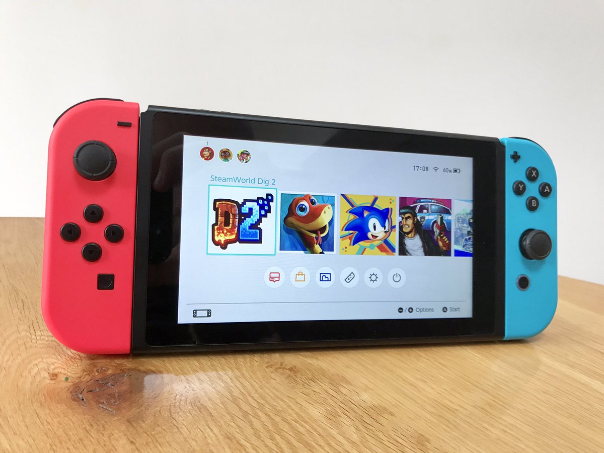
Steamworld Dig 2's icon is also pretty shitty.
Steamworld Dig 2's icon is also pretty shitty.
OrbitalBeard
Member
C'mon Image & Form, you're one of the good guys!!
lol I just realized that image is a cleverly disguised troll. Every single icon on the home screen lacks a logo, save for Mighty Gunvolt, which is only partially shown.
lol I just realized that image is a cleverly disguised troll. Every single icon on the home screen lacks a logo, save for Mighty Gunvolt, which is only partially shown.
- Status
- Not open for further replies.