Call me cynical, but I think so too.I'm starting to wonder if this is just a weird way to generate some additional buzz post launch.
-
Hey, guest user. Hope you're enjoying NeoGAF! Have you considered registering for an account? Come join us and add your take to the daily discourse.
You are using an out of date browser. It may not display this or other websites correctly.
You should upgrade or use an alternative browser.
You should upgrade or use an alternative browser.
Snake Pass, and how a bad home menu icon drags down my enjoyment of a game
- Thread starter Neiteio
- Start date
- Status
- Not open for further replies.
The à¹ÛBronx
Member
.

I'm starting to wonder if this is just a weird way to generate some additional buzz post launch.
That's exactly what it is in Dig's case, IMO. No way would they willingly create such a WTF icon.
This way they get to be the good guys by listening to the community and putting out the icon they'd always planned to, a day or so after release.
Maintenance
Member
Not liking an icon is one thing. Shaming developers to change back a fucking icon on the dashboard of a game though is IMO kind of disgusting. Like what a petty thing.
Yep.
It's funny how GAF is happy to critique the world of gaming development for all sorts of thing, but apparently critiquing an icon is one step too far.
More like it's funny that people complain that others complain about shit that really matters, you know, like bad localization, terrible dubs, actual bugs, but an icon? Dear lord change that right now.
I somehow suspect Maintenance didn't read the entire thread in the two minutes since I directed him here from another thread where he expressed an (allegedly good-faith) interest to understand another viewpoint.
At any rate, here's the short version:
- An icon is something you have to look at every time you boot up (or power down) any game, as well as every time you hit the home button to check screenshots you just took, or to check your friends list, or to change controllers, or to check battery life, or to check the time, or to adjust settings, etc. For someone like me who has 4,000+ screenshots of Zelda alone, I'm visiting the home menu dozens of times per play session. I'd rather not look at any ugly cover every time I hit the home button.
- Providing feedback that a lazy icon makes it look like the dev doesn't care is providing feedback on a product I bought and that I appreciate but want to be better. It's not a personal attack on anyone or their family.
- In the case of Snake Pass, their original icon was great, but then they inexplicably updated it to its current worse state. Unnecessary, and thus frustrating.
- Nintendo themselves specifically recommends that developers include a key visual on the icon along with the title. See earlier pages for the excerpt from the design doc.
- Icons with titles are helpful since the alternative is to highlight each icon to see the title. If you have multiple Sonic games and they all feature Sonic's head, it's going to be hard to tell them apart after awhile. And if you have a guest using the system, having the title on the icon will help them find what they want to play without having to highlight each icon.
And at the end of the day:
If you don't care, it's no skin off your back. The rest of us will hold a civil discussion about the value of aesthetics and good front-end presentation, and politely request that icons follow Nintendo's recommended format.
So far, it's working. A number of devs have already updated their icons and others have said they will update them in the near future.
BurritoBushido
Member
It's maddening how this thread thrives. A bunch of uppity armchair designers over here bullying devs over something that should have no bearing on the enjoyment of the game. If you guys knew what a miracle it was to ship a game and how the menu icon might be the last thing on their minds when making their final push to ship, you probably wouldn't be so precious about something so exceedingly inconsequential.
Not to get all old man on you guys, but do you think people really enjoyed games any less when we got shit Mega Man box art, or the horrendous off-brand DND garbage for Suikoden? It's insane to me that anyone could say they enjoy a game less, or feel so entitled over a stupid home icon they see for less than 1% of the time they'd actually spend playing the game.
Not to get all old man on you guys, but do you think people really enjoyed games any less when we got shit Mega Man box art, or the horrendous off-brand DND garbage for Suikoden? It's insane to me that anyone could say they enjoy a game less, or feel so entitled over a stupid home icon they see for less than 1% of the time they'd actually spend playing the game.
1) If providing feedback on elements of a game is "uppity," we might as well pack up Gaming Discussion and just accept whatever devs give us. No hard work should be criticized!It's maddening how this thread thrives. A bunch of uppity armchair designers over here bullying devs over something that should have no bearing on the enjoyment of the game. If you guys knew what a miracle it was to ship a game and how the menu icon might be the last thing on their minds when making their final push to ship, you probably wouldn't be so precious about something so exceedingly inconsequential.
Not to get all old man on you guys, but do you think people really enjoyed games any less when we got shit Mega Man box art, or the horrendous off-brand DND garbage for Suikoden? It's insane to me that anyone could say they enjoy a game less, or feel so entitled over a stupid home icon they see for less than 1% of the time they'd actually spend playing the game.
2) I see the icon dozens of times every time I play. I see it on boot up, power down, while checking screenshots, changing controllers, checking battery, going to my friends list, etc.
3) The Snake Pass icon used to be fine. Then they changed it to make it worse. They changed it after it had shipped.
4) Other devs, however, have listened to their fans and fixed their icons. And others have said they will fix theirs.
I ultimately don't mind the people who complain about our concerns, though. Makes for good discussion, and has led to a number of icons being fixed.
TheGreatMightyPoo
Banned
You werent so polite with one of your statements to be fair.1) If providing feedback on elements of a game is "uppity," we might as well pack up Gaming Discussion and just accept whatever devs give us. No hard work should be criticized!
2) I see the icon dozens of times every time I play. I see it on boot up, power down, on checking each screenshot I took, on changing controllers, on checking battery, on going to my friends list, etc. It adds up.
3) The Snake Pass icon used to be fine. Then they changed it to make it worse.
4) Other devs, however, have listened to their fans and fixed their icons.
I ultimately don't mind the people who complain about our concerns, though. Makes for good discussion, and has led to a number of icons being fixed.
Cant remember it but it came across as whining that they dont care about their game.
Plus, you and others went from its ugly to some formal document from Nintendo that recommended it be done a certain way as if this was about rules instead of just hating how it looked.
Should some icons be updated???
Sure but its not the end of the world and no one is airing their grievances for the sake of the developer.
This thread being THIS long over THIS issue is really bizarre.
OmegaDL50
Member
Yep.
More like it's funny that people complain that others complain about shit that really matters, you know, like bad localization, terrible dubs, actual bugs, but an icon? Dear lord change that right now.
It's as petty as refusing to buy a known to be quality game on the basis of simply not liking it's boxart.
It's maddening how this thread thrives. A bunch of uppity armchair designers over here bullying devs over something that should have no bearing on the enjoyment of the game. If you guys knew what a miracle it was to ship a game and how the menu icon might be the last thing on their minds when making their final push to ship, you probably wouldn't be so precious about something so exceedingly inconsequential.
Not to get all old man on you guys, but do you think people really enjoyed games any less when we got shit Mega Man box art, or the horrendous off-brand DND garbage for Suikoden? It's insane to me that anyone could say they enjoy a game less, or feel so entitled over a stupid home icon they see for less than 1% of the time they'd actually spend playing the game.
Devs arent entitled to my $$$. If they dont want to put the effort in to have a good presentation Ill put my money elsewhere.
Its not about box art. The icon is how people perceive the game when theyre not playing it. Looking at Breath of the Wilds icon makes me want to play it. Looking at Snake Passs icon makes me want to delete the app.
TheGreatMightyPoo
Banned
Seems outlandishly superficial to me unless the game icon magically appeared on your screen and you never head of it before.Devs arent entitled to my $$$. If they dont want to put the effort in to have a good presentation Ill put my money elsewhere.
Its not about box art. The icon is how people perceive the game when theyre not playing it. Looking at Breath of the Wilds icon makes me want to play it. Looking at Snake Passs icon makes me want to delete the app.
Youre right to think that though.
The thread is this long because a handful of people keep complaining about other people wanting nice-looking icons. But like I said, it's quite OK, because it increased the visibility of this thread and this concern. It's well-known concern now, and devs are starting to fix their stuff.You weren't so polite with one of your statements to be fair.
Can't remember it but it came across as whining that they don't care about their game.
Plus, you and others went from ”it's ugly" to some formal document from Nintendo that ”recommended" it be done a certain way as if this was about rules instead of just hating how it looked.
Should some icons be updated???
Sure but it's not the end of the world and no one is airing their grievances for the sake of the developer.
This thread being THIS long over THIS issue is really bizarre.
Also, I didn't say anything personal. I said how it looks to me: That devs aren't taking pride in presentation when the icon is slapdash, or lazy. That's my feedback on a product I bought or may buy (depending on which game we're talking about).
Finally, saying it looks ugly and noting Nintendo's guidelines are two separate things. Not sure what you're saying there. They're two separate reasons to update the icons.
Nights Owl
Member
The biggest complaints people seem to have is as if a lot of people are "bullying the devs".
Are you kidding me? Saying an icon is ugly is just saying it's ugly. People acting like uploading a different PNG or JPG takes an unholy amount of work that they need to break their backs over it is confusing.
If I were a dev I'd want my game to look premium in every sense of the word. From icon to boxart if possible. And uh hate to break it to the "boxart" argument, but bad-boxart has died off since the NES/SNES days for a reason. It was usually inferior and ugly.
Also, I didn't say anything personal. I said how it looks to me: That devs aren't taking pride in presentation when the icon is slapdash, or lazy. That's my feedback on a product I bought or may buy (depending on which game we're talking about).
Not liking an icon does not make it slapdash or lazy, nor does it mean the developers aren't taking pride in presenting their game.
Nope. Where'd you get that idea?Did anyone here actually threaten a dev or their relative? Sorry, can't catch up with the thread.
The à¹ÛBronx
Member
Huh, didn't realise the salt truck crashed overnight.
Few people have said it affects their enjoyment of the game. The fact you call others 'armchair designers' before letting the purpose of design fly over your head is somewhat laughable. Not sure where 'entitled' comes into it.
We're discussing a designed element in a space, why is that suddenly the line that we can't go past when evaluating games. I don't think anyone's been aggressive, threatening or abusive over it aside from the people who seem to have an issue with the discussion. We're fans of video games that appreciate good design. Currently the Switch has a case of poor library tiles within that function. I've played Sonic Mania, I've enjoyed it. I think the library tile is poorly designed, and like discussing that in this thread. Why is this so offensive to you?
The fact you felt a compulsion to come and insult other people over a discussion is infinitely more pathetic than discussing the design merits of designed elements. We're having a mature discussion about something that we wish was improved, you're getting mad (by your own words) that people are having a discussion for which there's no obligation to read or contribute to.
Perhaps it's time to step away from the keyboard if you can't handle people discussing something about a game, on a discussion site for games. Feel free to take part in the discussion but moaning about the discussion at hand or insulting people within it is unnecessary for the sake of just not posting.
Nice. Come into the thread and insult people just because you disagree with their discussion about something you claim to be minor. Why is this such an issue for you to which you're incapable of ignoring it and instead choose to belittle others?It's maddening how this thread thrives. A bunch of uppity armchair designers over here bullying devs over something that should have no bearing on the enjoyment of the game.
Not to get all old man on you guys, but do you think people really enjoyed games any less when we got shit Mega Man box art, or the horrendous off-brand DND garbage for Suikoden? It's insane to me that anyone could say they enjoy a game less, or feel so entitled over a stupid home icon they see for less than 1% of the time they'd actually spend playing the game.
Few people have said it affects their enjoyment of the game. The fact you call others 'armchair designers' before letting the purpose of design fly over your head is somewhat laughable. Not sure where 'entitled' comes into it.
We're discussing a designed element in a space, why is that suddenly the line that we can't go past when evaluating games. I don't think anyone's been aggressive, threatening or abusive over it aside from the people who seem to have an issue with the discussion. We're fans of video games that appreciate good design. Currently the Switch has a case of poor library tiles within that function. I've played Sonic Mania, I've enjoyed it. I think the library tile is poorly designed, and like discussing that in this thread. Why is this so offensive to you?
The fact you felt a compulsion to come and insult other people over a discussion is infinitely more pathetic than discussing the design merits of designed elements. We're having a mature discussion about something that we wish was improved, you're getting mad (by your own words) that people are having a discussion for which there's no obligation to read or contribute to.
Perhaps it's time to step away from the keyboard if you can't handle people discussing something about a game, on a discussion site for games. Feel free to take part in the discussion but moaning about the discussion at hand or insulting people within it is unnecessary for the sake of just not posting.
It's not the end of the world, which is why we're all discussing it in a thread on the internet. It's literally the most vanilla thing you can do over an issue. If this thread is bugging you too much, then leave. It's not bizarre at all. Read all the responses and tell me where it's bizarre or where people haven't been casually engaging in a normal discussion about it.Sure but it's not the end of the world and no one is airing their grievances for the sake of the developer.
This thread being THIS long over THIS issue is really bizarre.
I've always been discussing the tiles based on their design function, and it's never been about whether I simply like the look of them or not. I feel I've stated and gone into that enough times for it to be obvious. For me it's definitely about rules and function over a simple "I don't like the look of it".Plus, you and others went from ”it's ugly" to some formal document from Nintendo that ”recommended" it be done a certain way as if this was about rules instead of just hating how it looked.
Nope. Where'd you get that idea?
Sorry, it's a sarcastic remark about the "Bullying" part. I also don't get how people are bullying the devs.
This thread being THIS long over THIS issue is really bizarre.
Pro Tip to everyone new to this thread: every time you pop in just to post that you're surprised this thread is long, you're making in longer.
The Hermit
Member
Did anyone here actually threaten a dev or their relative? Sorry, can't catch up with the thread.
No, but Neiteio is holding his sale as a hostage lol
No, but Neiteio is holding his sale as a hostage lol
He already bought the game...
The Switch icons aren't that bad, at least they look tidy.
At least it's the same size, we're living in 2017 and we still have to force our icons to be default sized because PC Devs can't work out a resolution standard and we're still stuck with something like this we we want bigger icons.

At least it's the same size, we're living in 2017 and we still have to force our icons to be default sized because PC Devs can't work out a resolution standard and we're still stuck with something like this we we want bigger icons.
Most of us aren't even criticising the art, we're just saying its not what we want. I want the icon to be the de factor boxart because I'm all digital. Other people have other reasons for wanting proper art rather than an icon.
The main reason for wanting the change is that keyart these days looks sooooo gooooddd. Icons are fine, but they can't compete.
Anyway i'm glad that this thread is having a genuine impact! I just hope Sonic Mania changes its icon. Its icon is pretty cool to be fair, so if it doesn't change its not the end of the world, but it would definitely be better with the key art rather than Sonic's head.
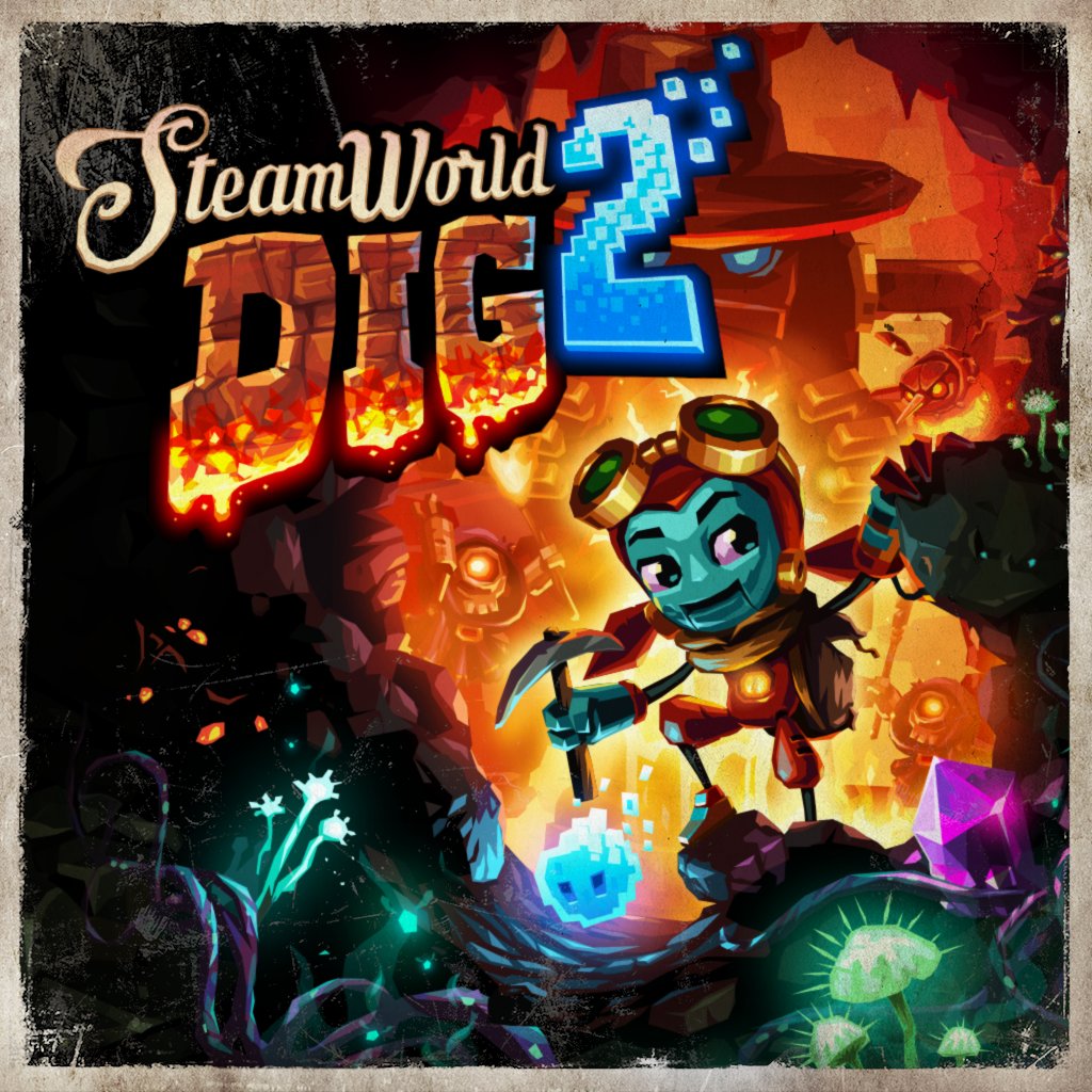
He might be talking about SteamWorld Dig 2. I'm holding off on that game until they update the icon. But that's more because I'm still busy with Rabbids and Pokken DX (and Metroid on 3DS), so I figure if I'm not going to get around to playing it right away, might as well not make the home menu look worse in the meanwhile.He already bought the game...
RaySpencer
Member
He might be talking about SteamWorld Dig 2. I'm holding off on that game until they update the icon. But that's more because I'm still busy with Rabbids and Pokken DX (and Metroid on 3DS), so I figure if I'm not going to get around to playing it right away, might as well not make the home menu look worse in the meanwhile.
You're crazy.
I want new icons, I think some are bad and they should change them, BUT I'm certainly not avoiding buying games because of the icons.
I really hope your alone in that too. Haha.
The à¹ÛBronx
Member
I want new icons, I think some are bad and they should change them, BUT I'm certainly not avoiding buying games because of the icons.
Eh. They're not not buying it outright just because of an icon. They're not buying it because they won't have time to play it currently and don't want the icon sat on the screen. Don't see the issue there personally, but if you do then you can +1 to the list. If I'm thinking about buying a game I won't be able to play for awhile then I can understand how having a nice tile would prompt me to buy it earlier, but if it had a poor tile I'd wait.
At that point all the game is is the tile since you're not going to be playing it, so if you find that tile dislikeable it makes sense to not want it there in the interim.
Retro Edge
Member
Proposed new icon for Steamworld Dig 2(from I&F twitter):
This tweet....
We hear theres a lot of views on our current Switch icon! 😊 Although many like it, were thinking of changing it. What do you think? #SWD2
Said no one ever. What a shameless lie. 🤣
The à¹ÛBronx
Member
Get ready for the next battle.

I hate to illustrate the point, but which games are these?
Jo Shishido's Cheeks
Member
Im gonna end up purely buying Nintendo titles at this rate...
Wowfunhappy
Member
Y'know, this kind of problem happens to me with iOS apps all the time.
"That app looks great, but ew what an awful icon." *Delete*
"This is a nice game andoh wtf why did the have to write the title in all caps. Screw this." *Delete*
(I really need my Jailbreak back so I can edit titles...)
"That app looks great, but ew what an awful icon." *Delete*
"This is a nice game andoh wtf why did the have to write the title in all caps. Screw this." *Delete*
(I really need my Jailbreak back so I can edit titles...)
The ๖ۜBronx;249975117 said:I hate to illustrate the point, but which games are these?
Brave Dungeon + Dark Witchs Story: Combat and Conga Master Party!
Bronx gets me. <3The ๖ۜBronx;249973890 said:Eh. They're not not buying it outright just because of an icon. They're not buying it because they won't have time to play it currently and don't want the icon sat on the screen. Don't see the issue there personally, but if you do then you can +1 to the list. If I'm thinking about buying a game I won't be able to play for awhile then I can understand how having a nice tile would prompt me to buy it earlier, but if it had a poor tile I'd wait.
At that point all the game is is the tile since you're not going to be playing it, so if you find that tile dislikeable it makes sense to not want it there in the interim.
Get ready for the next battle.
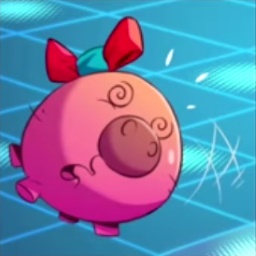
One appears to be about a pink ball with one stray hair, and the other appears to be about a booby blue-haired animu chick. Not sure if want.The ๖ۜBronx;249975117 said:I hate to illustrate the point, but which games are these?
Robin64
Member

ScientificPizza
Banned
Those two lego icons side by side hahahaWell look what's now live.
CharminUltra
Member

Two Tribes is looking for input on Rive's icon btw.
https://mobile.twitter.com/twotribesgames?lang=en
https://mobile.twitter.com/twotribesgames?lang=en
TheGreatMightyPoo
Banned
lolWell look what's now live.
Pretty sure it's the same icon used on PC, where it's just never been much of a priority (I've all but stopped putting most game icons on my desktop and just launch 'em from within Steam).it's weird that they would launch with a seemingly placeholder icon
That being said, the proposed new one for Switch is terrific!
I'm not sure what that first Lego game is, but that icon would be really nice if just had the title in the corner.Well look what's now live.
As for the other Lego game, Lego Worlds, the new icon looks fantastic!
pretty done
Member
I'm holding off on that game until they update the icon.
Jesus christ
Jesus christ
You realise there's more text after that right?
He might be talking about SteamWorld Dig 2. I'm holding off on that game until they update the icon. But that's more because I'm still busy with Rabbids and Pokken DX (and Metroid on 3DS), so I figure if I'm not going to get around to playing it right away, might as well not make the home menu look worse in the meanwhile.
I'm sure your valiant abstinence will speak volumes to the devs. You seem like you're a person who cares a great deal about their home menu, and that's just a matter of opinion.
This thread is funny, and as someone who gets anal about design decisions, I'm not opposed to it.
They've already confirmed they're fixing the icon, in response to the feedback.I'm sure your valiant abstinence will speak volumes to the devs. You seem like you're a person who cares a great deal about their home menu, and that's just a matter of opinion.
This thread is funny, and as someone who gets anal about design decisions, I'm not opposed to it.
Here's the gorgeous new icon that they posted on their Twitter:
So I'll buy it. I'm just waiting until the update is live.
- Status
- Not open for further replies.