• Hey, guest user. Hope you're enjoying NeoGAF! Have you considered registering for an account? Come join us and add your take to the daily discourse.

The current Mario Kart logo is so boring

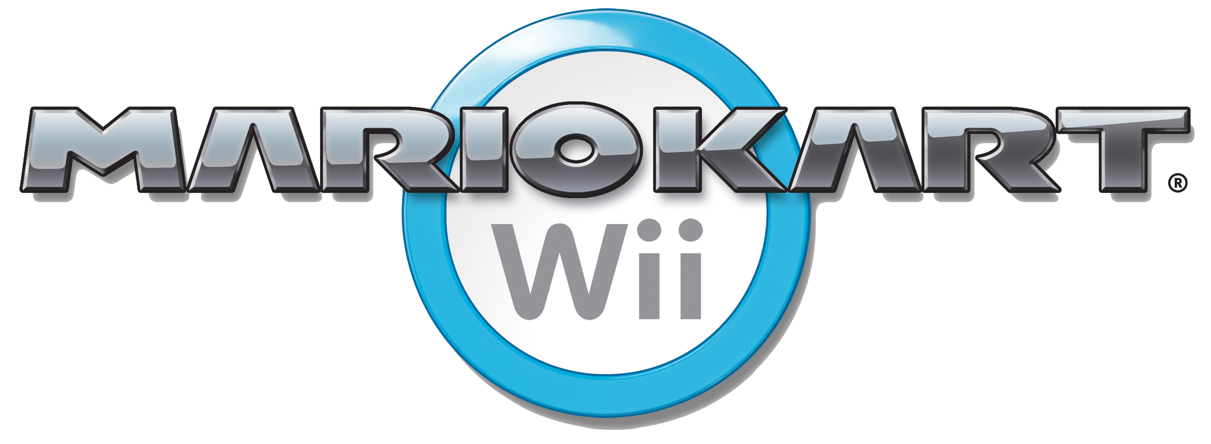
Mario-Kart-Wii-Logo.png

Nothing says fun family racing like a grey logo with a slight gradient. What happened? Previous games up until Double Dash burst off the box with their vibrant colours but the last 4 Mario Kart games look far too serious.


This may be the biggest non issue I've ever made a thread about but it bothers me when Nintendo have such high quality designs and box-arts yet one of their flagship titles has the most boring logo out there.
I love the design of the 8 but the font and colour scheme really isn't very exciting.
 
The more metallic look of Wii's and 8's logos make them looks more like racing game logos so maybe that is what they were going for. I personally prefer them to stuff like Double Dash's logo. Even Super Mario Kart's logo was metallic looking and that is where it all started.
 

Daouzin

Member
I think Double Dash is the best Mario Kart, but I really love the Mario Kart 8 logo. The rest of the logos are too loud..
 
I HATED the Mario Kart Double Dash logo. So obnoxious and unkempt.
LOVED the Mario Kart Wii logo.

Very representative of the quality of their games now that I think about it.
 

Chase17

Member
I prefer the Mario Kart 8 logo to the double dash one.

Even if the game is "double" two exclamation points are unacceptable.
 
I HATED the Mario Kart Double Dash logo. So obnoxious and unkempt.
LOVED the Mario Kart Wii logo.

Very representative of the quality of their games now that I think about it.
I do like how classy the Mario Kart 8 logo looks bit I think that's primarily because of the 8, I much prefer the more vibrant logos of 64, Super Circuit and Double Dash
 
PS_WiiVC_MarioKart64.png


64 also had that east infectionist baby diaper poo gradient mesh.

The 64 is classic early 3d geometry. Suited the tech in time in 1996-1997.
 

Stopdoor

Member
The logo change with MKDS seems to correlate to when Mario Kart became mega-successful and 'its own thing' rather than 'some other Mario spinoff' like Mario Party. The logo has identity, and 'coolness', somehow, unlike the Double Dash logo. Mario Kart 8 oozes quality and while a 'fun' logo could work, the one it has now really makes it stand out from other Mario games.
 

Shig

Strap on your hooker ...
It worked with DS's cover, whose 'serious-faced Mario hopping into a sleek concept car on a white cover under a minimalist logo' was clearly meant to be a parody of more serious racers.

But then they kept the logo after dropping the parody it was meant to be part of. I agree, it's strange. Lazy, dare I say.
 
The logo change with MKDS seems to correlate to when Mario Kart became mega-successful and 'its own thing' rather than 'some other Mario spinoff' like Mario Party. The logo has identity, and 'coolness', somehow, unlike the Double Dash logo. Mario Kart 8 oozes quality and while a 'fun' logo could work, the one it has now really makes it stand out from other Mario games.
That's probably exactly it. My main issue is I look at it and don't related it with the Mario brand, I suppose it really just is it's own thing which became hella classy with Mario Kart 8.
 
Nothing says fun family racing like a grey logo with a slight gradient. What happened? Previous games up until Double Dash burst off the box with their vibrant colours but the last 4 Mario Kart games look far too serious.


This may be the biggest non issue I've ever made a thread about but it bothers me when Nintendo have such high quality designs and box-arts yet one of their flagship titles has the most boring logo out there.

I love the design of the 8 but the font and colour scheme really isn't very exciting.
I'm sorry OP but MK Double Dash has the worst logo in the franchise.

MK8 is GOAT but I agree MKWii was boring and uninspired, not only the logo but the name too.
 
Some older logos:

tumblr_o2tg01AmEA1tu022ro1_500.png

tumblr_o2tfuh6DQw1tu022ro1_500.png

tumblr_np0azulR0Z1tu022ro1_500.png

tumblr_np0axgXIUO1tu022ro1_r1_500.png


Also, Mario Kart DS was going to have the goofy font, but changed by the end.

tumblr_n38vfo6qZ51tu022ro1_500.jpg

tumblr_n38vfo6qZ51tu022ro2_500.png
Super Mario Kart is an interesting mix of the two, staring more at the older logos I am starting to think they look a little cheap but I also think the modern one looks far too serious for a Kart racer, and what's up with the A's?
 

Stopdoor

Member
It worked with DS's cover, whose 'serious-faced Mario hopping into a sleek concept car on a white cover under a minimalist logo' was clearly meant to be a parody of more serious racers.

But then they kept the logo after dropping the parody it was meant to be part of. I agree, it's strange. Lazy, dare I say.

I dunno, I have my doubts they really intended it to be a parody - see Mario and Kirby looking angry on boxarts, there's a point to making kids games at least look sort of cool instead of cute.

If they're ever going to change it, now is the time.

What, right after their most well-regarded game?
 

Chase17

Member
I'm sorry OP but MK Double Dash has the worst logo in the franchise.

MK8 is GOAT but I agree MKWii was boring and uninspired, not only the logo but the name too.

I may be misunderstanding, how is the name any less inspired than most of the other games in the series?
 
I may be misunderstanding, how is the name any less inspired than most of the other games in the series?
Because they just grabbed the name of the console and pasted it in the name.

I realize Mario kart 64 and DS did it too but at least those logos didn't use boring fonts with grey gradings.
 
Super Mario Kart is an interesting mix of the two, staring more at the older logos I am starting to think they look a little cheap but I also think the modern one looks far too serious for a Kart racer, and what's up with the A's?

The A's are supposed to look like tire tracks zooming off into the distance.
 
Because they just grabbed the name of the console and pasted it in the name.

I realize Mario kart 64 and DS did it too but at least those logos didn't use boring fonts with grey gradings.

DS's logo is just as "lazy" as Wii's if this is your criteria. It uses a gray gradient just like Wii's.

The A's are supposed to look like tire tracks zooming off into the distance.

How did I never notice this before?
 
I dunno, I have my doubts they really intended it to be a parody - see Mario and Kirby looking angry on boxarts, there's a point to making kids games at least look sort of cool instead of cute.


What, right after their most well-regarded game?

Maybe well regarded but not that many people bought it
Polygonpiechart.png

I mean to herald in the NX era, whatever that may be.
 
What, right after their most well-regarded game?

Mario Kart 8 is far from the most well-regarded installment. It might be agreed to be the best one by many of the people who have played it, but the number of people who have played it pales in comparison to Super Mario Kart and Mario Kart 64. When you say "Mario Kart" to most people, one or both of those will be what they immediately think of.
 
What do you think about Smash Bros logos OP? They also went to a "clean" look after Smash 64.
I think they gradually got much better as a result of the cleaner design. I like the original logo but it's very much of its time. The logo hasn't changed too much since Melee but even the word "Melee" looks a little cheap. I love the end result and can't see how any future iterations can improve upon it.

This thread has actually made me appreciate the older logos for Mario Kart less but I don't think the modern ones are iconic by any means. If you showed someone a small snippet of it they probably wouldn't be able to guess what game it's from in the same way as if you showed them the Super Mario 64 logo.
 

Ivan 3414

Member
I think the font came as a reflection of Nintendo positioning Mario as a dude who will shut your shit down when he doesn't have time to play.

Look at the box art for MKDS:

As serious as they could make Mario without going totally against his happy-go-lucky personality.

I think the first sign of Nintendo's new direction for Mario is Sunshine. Prior to this, I don't think he ever had a serious demeanor on any box art, let alone in a game.


Just look at Smash Bros Melee compared to Smash Bros Brawl; he's full of woohoos and smiles in Melee, whereas in Brawl, almost all his joyous sounds are replaced with angry grunts and his brow is firmly in a fixed determined position, except when being hit. He pretty much never smiles in Brawl and Smash 4.
 

Chase17

Member
I think they gradually got much better as a result of the cleaner design. I like the original logo but it's very much of its time. The logo hasn't changed too much since Melee but even the word "Melee" looks a little cheap. I love the end result and can't see how any future iterations can improve upon it.

If you showed someone a small snippet of it they probably wouldn't be able to guess what game it's from in the same way as if you showed them the Super Mario 64 logo.
Agreed.

I think the 3d World logo is excellent as it combines a modern look with colors/details that make the logo stand out as its own. Wouldn't mind seeing more logos like it.
 

Stopdoor

Member
Mario Kart 8 is far from the most well-regarded installment. It might be agreed to be the best one by many of the people who have played it, but the number of people who have played it pales in comparison to Super Mario Kart and Mario Kart 64. When you say "Mario Kart" to most people, one or both of those will be what they immediately think of.

Uh, I would disagree, I would think most people would be thinking of Mario Kart Wii, the game that sold 30 Million+ copies on a system that reached one of Nintendo's widest audiences of all time.

And many of that audience only barely remembers SMK or MK64. So maybe MK8 hasn't reached as far, but it's an echo of Wii's popularity.
 

Htown

STOP SHITTING ON MY MOTHER'S HEADSTONE
Mario Kart 8 is far from the most well-regarded installment. It might be agreed to be the best one by many of the people who have played it, but the number of people who have played it pales in comparison to Super Mario Kart and Mario Kart 64. When you say "Mario Kart" to most people, one or both of those will be what they immediately think of.

Actually, by those criteria the one they'll probably think of the Wii version, since it sold something like 35 million copies.
 

Lucumo

Member
That's an "8"? I thought it's a tilted infinity symbol.

infinity.jpg


/edit: I'm not being serious, just some little mockery.
 

correojon

Member
After the DLC added 200cc MK8 has become a really serious game not fit for those faint of heart. MK9 logo will be the Luigi Death Stare warning kids and casuals to stay away form it. Some years from there, everyone will think the "M" rating will be because of Mario Kart and even mistake MK for the more lighthearted game, Mortal Kombat.

^^it´s an escherian infinity symbol which also acts as an 8, to somehow symbolize MK8´s gravity mechanic.
 
That's an "8"? I thought it's a tilted infinity symbol.

infinity.jpg

I think it is meant to be an 8 and a mobius strip instead of an infinity symbol because of the whole anti gravity mechanic they added in.

After the DLC added 200cc MK8 has become a really serious game not fit for those faint of heart. MK9 logo will be the Luigi Death Stare warning kids and casuals to stay away form it. Some years from there, everyone will think the "M" rating will be because of Mario Kart and even mistake MK for the more lighthearted game, Mortal Kombat.

I want this.
 
Honestly, I think every Mario Kart logo has been bland and boring. I've said before I'll always choose the Super Mario World font over the generic and devoid of personality fonts they've been using in recent years.
 
Top Bottom