I think we can actually take that argument a step further into the game's general design astethic and menus after they changed to logo.
Mario Kart Wii presented you the colorful wonders of Mushroom Kingdom with this corporate business presentation:
And, boy oh boy, get ready to choose your cart with all the style of a random south korean free2play Mario Kart copy! Look at that Font! Look at those piss-yellow bars! Look at the background that manages to be both incredibly ugly
and devoid of any and all character. Seriously. Just imagine Mario wouldn't sit in that car - this could be the menu of every Wii shovelware game ever.
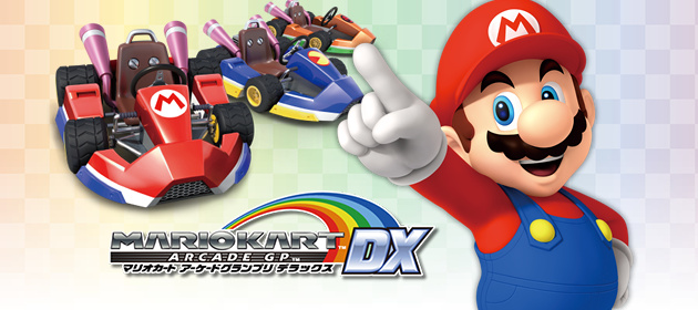
It got better with Mario Kart 8 but it still seemed so
serious at times. Look at that Mario. He will fuck your shit up. Do you think this is a game? This is a real racing game with real consequences you scrub. Let's go with white and light blue. Clinical. But still
kiiiinda fun! But not really. This is serious. Mario
will destroy you.
Now, this is real important! You guys know we wanna start big in the mobile sector in the next few years, yeah? Ever heard of Crash of Clans or something like that? My kids love that stuff!
Do you know how all their game icons look in the app store? Like, every single game these days? Make it like that. Just, no movement please! And only heads! Again, this is serious! We don't want too much joy in these menus!
Perfect. Ok, i dunno, just but some flaggs or signs and light blue in the background, it's probably fine, nobody cares.


")