• Hey, guest user. Hope you're enjoying NeoGAF! Have you considered registering for an account? Come join us and add your take to the daily discourse.

The latest Doom is great, but some of it's designs are plain bad.

nkarafo

Member
Before i go on with my rant, i want to say that i reached mission 10 and i'm having a blast with the game. The level design is amazingly done and rewards exploration just like classic DOOM.

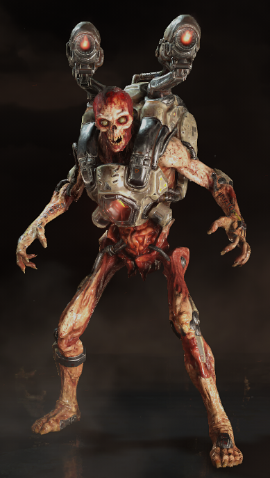
The visuals, however, are a mixed bag. The environments look great. But the monsters... not so much. I feel like they are over-designed, does that make sense? It feels like they have too much detail for the sake of looking detailed. As a result they look less scary or intimidating and more like a children's cartoon monsters. Look at the "lost soul" enemy for instance:

latest

This looks like a deviant art tattoo scull project with as much detail and features as possible to make it look impressive. It's not scary or intimidating. A regular flying scull (like in the original Doom) would be more creepy.


Doom 3's lost souls were also creeper:


It doesn't have too many features and it looks legitimate scary.


There's also the "pinky demon". Compare this Saturday cartoon monster:

To this amazing design:

Seriously, Doom 3's pinky demon is nightmare fuel. 2016 pinky Demon is laughable in comparison.


The worst offender is CyberDemon. Now, both Doom 3 and the 2016 version messed up the character IMO. In the original Doom, the Cyberdemon is probably my favorite monster design in all videogames.

Again, not over-designed, just the essential features, cables, some metallic parts, the horns and the rocketlauncher. I LOVE how his cyber parts look rough and low-tech and not like some fancy, high tech gadgets. I also like his "attitude". He doesn't go "booooo, look how scary i am" and doesn't do cool poses. He just walks towards you and shoots you. No emotions, no expressions. That's the beauty, he is almost like that chainsaw massacre guy.


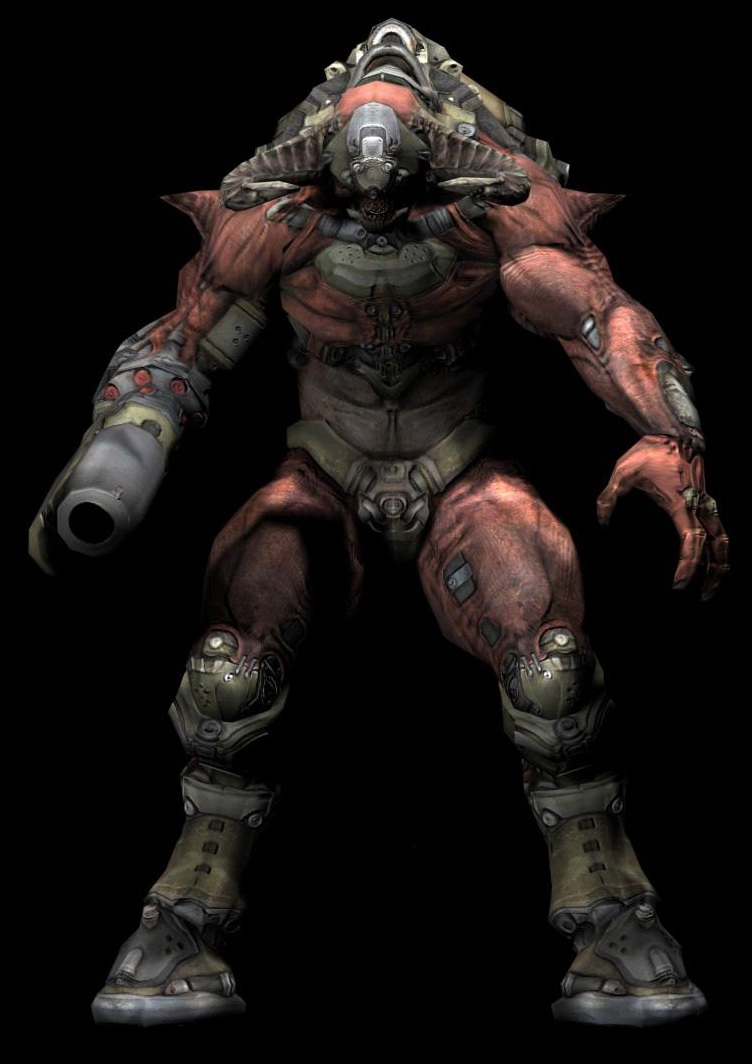
In Doom 3 he looks like this:

It's just a generic design IMO. I hate how both of his legs are robotic. He is also using more fancy and "pleasing to look at" high tech parts. So he looks more "cool" than scary or intimidating like the original. The fight was also lame so that added to the overall disappointment.


And then, you have this stupidity in the 2016 version:

LOL, what am i even looking at? This looks more chunky than those Gears of War protagonists. And look at those fat elephant legs. Ant the tiny head. This thing should not be able to move the way it moves in the game. Of course one antler is broken because "features". Also, there is nothing "cyber" about him apart from the weapon hand. Terrible, ugly design that doesn't even pass for an amateur deviant art project.

And making matters even worse.... he even does that dreaded "intimidation roar" at me, to convince me he is scary, with the camera even zooming to his face, hands back pose and goes "ROOOOAAAAAAAAARRRRRR, look how scary i am, i'm going to eat you, baaaaaaaah"

I swear, every time i see this cliche that all monsters do i cringe so much that my face hurts. It's stupid, it's overused, it's immature and scares nobody except maybe little children at 6.


So yeah, great game. The monsters not so much (except a few exceptions like the Revenant) but that cyberdemon was so bad that i couldn't resist ranting about it's monster designs.

Anyone agrees or want to add something?
 

Zombine

Banned
Every example against the game you posted I said to myself

"Wow, that design was badass."

I loved Doom 2016.
 

Sesuadra

Unconfirmed Member
Sorry I disagree too. The design is awesome..I just loeve the enemies in DOOM.

But I'll be honet I never liked doom 3 and its enemy design.
 
The monster designs are basically updated versions of the classic ones.

I love them all, hell with a few tweaks even the Cyberdemon could be even better.

DOOM3 really diverged from the Design of the first two games in more than one way.
 

Brockxz

Member
Doom isn't a game to scare you (well they tried Doom 3 to be that a little bit but failed). I think monster design is good but I agree, I prefer Doom 3 pinky demon design better too.
 
I don't agree at all. I think the enemy design in Doom 3 on the other hand is terrible. That lost soul for example is laughable.
 

nkarafo

Member
What is there to like about the new Cyberdemon you guys? Pleas tell me what i'm missing, maybe i will get it and hate him less?

If the new Doom goes for silliness then i suppose it makes sense. That's a reasonable answer.


Lol at the cyberdemon. Looks nothing like the original at all. Same with some of the other monsters. Only the Imp and the Revenant look like the original.
 
I somewhat agree with the overly detailed design of the enemies. When I first saw the new Pinky, I was disappointed that they covered it with armour when the naked look of the original looked way better. But I disagree when you say they should be more creepy and scary because that's not the tone the game is going for. I also thing the Cyberdemon looks way cooler.
 
I can see where you're coming from, as much as it pains me to say anything negative about this fantastic game. I don't necessarily agree about the Cyberdemon and Pinky, but I'm totally with you on the lost soul.
 

Dahaka

Member
I dislike the predictability of the "set pieces" and the mediocre sound mixing and effects. Still a great game of course.
 
What is there to like about the new Cyberdemon you guys? Pleas tell me what i'm missing, maybe i will get it and hate him less?

If the new Doom goes for silliness then i suppose it makes sense. That's a reasonable answer.


Lol at the cyberdemon. Looks nothing like the original at all. Same with some of the other monsters. Only the Imp and the Revenant look like the original.

Huh? Most of the monsters look like the original ones. Especially Revenant, Pinky and Spider Mastermind. The Hell Knight is the only one that's vastly different, but that's because the original was just a color swap. It needed a redesign.
 

dmr87

Member
I agree that some monster designs, especially the Cyberdemon, were bad. But in the end I didn't have less fun playing the game.
 

Funky Papa

FUNK-Y-PPA-4
The Cyberdaemon is stupid as hell and looks like something out of a MMORPG instead of Doom.

Everything else is fine. I actually love the pinky, even if it no longer looks porcine.
 

Bedlam

Member
I disagree completely with the OP.

The Doom 2016 designs perfectly capture the partial goofiness of the monster design in the original Doom(s). Especially with regards to Pinky!

I also like the Cyberdemon with the antlers. >:D So much better than his generic Doom 3 design.
 

Mechazawa

Member
To be fair, the Doom 1/2 pinky demon design is pretty stupid too. They chose to stick with similar proportions as a callback, and there's only so much you can do with that.
 

Kinyou

Member
Huh? Most of the monsters look like the original ones. Especially Revenant, Pinky and Spider Mastermind. The Hell Knight is the only one that's vastly different, but that's because the original was just a color swap. It needed a redesign.
Not to forget the Cacodemon.


With most designs they were definitely trying to make something that resembles the original sprites.
 
I liked the cyber demon :( his intro was cool as hell too. At least it's easier to recognize than whatever they did with him in Doom 3.

The only design in 3 that I really liked was the Hell Knight. 2016 stacks up quite favorably compared to that.

Also it's easy to just criticize the designs but a major part of the demons are their animations, which DOOM absolutely knpcked out of the park. I got serious DOOM 1 flashbacks at the first Baron of Hell fight because of the way they walk and launch projectiles.
 

bigmac996

Member
I do actually agree with OP somewhat on a more closeup detail level. I feel the designs lack something unique and feel sort of "samey" when put alongside other creature concept art.

The best thing about the designs as-is, is that the creatures have distinct and recognizeable silhouettes from a distance. This makes it easy to always distinguish which is which while running and gunning.
 

Floex

Member
Personally think they are a great reimagining of the original.

Goes with the 'sillier' nature of the game
 
I don't really agree OP I am afraid. Doom for me has always had a sense of dark flamboyance and over the top demon nature (often referred to as 'metal album cover' type of deal) that I find is better captured in the more modern designs of the Doom monsters.
 
While Doom 3 was an ok shooter back then, it wasn't really Doom and it had pretty poor demon designs. Doom 2016 destroys it in every single way (gameplay, level and demon designs) and is a great nod to the original games.
 

eso76

Member
Let's be honest: the original designs are only iconic because the game was and because back then not everyone was a graphic designer.
The original cyber demon is not less silly or more inspired than the updated version.

Pinky though, yeah i like the doom 3 version better
 
I do agree with the Lost Souls, but the sound they make more than makes up for how they look.

I love the designs for these three though and think they look the best out all versions:

033d8f637bb44dc65bc63a6fcf3af40a.jpg


doom-review-baron-hell-model-1024x576.jpg


doom_20160519033453a6bsh.png


latest
 

Nev

Banned
I haven't played the game but to me the DOOM designs are way better than the other generic, "scary", metal, edgy, tryhard crap designs.

Looks to me like these are self-aware and made by some talented artists who know exactly how to create a unified, stylized and fitting artstyle and the other are what a 16 years old "anything that isn't metal music is trash" kid wearing all black would sketch in his notebook/deviantart while the rest of the class has fun and enjoy the colorful life he claims to be bad only because he's a self-proclaimed outcast and his crush doesn't even know he exists. I.e.: garbage.
 

nkarafo

Member
I liked the cyber demon :( his intro was cool as hell too..
Ok i have to ask.

His intro is a camera zoom to his face and then the cliche roar thing. He even rotates his head to make it even more pronounced i guess?

This is just a trope we see in most movies or games with monsters. How is it still cool as hell? Aren't people tired of this already?

For me, it eliminates any threat any monster could initially pose.


I do agree with the Lost Souls, but the sound they make more than makes up for how they look.

I love the designs for these three though and think they look the best out all versions:

033d8f637bb44dc65bc63a6fcf3af40a.jpg


doom-review-baron-hell-model-1024x576.jpg


doom_20160519033453a6bsh.png


latest
I agree that these designs are great.

Thankfully, not all designs got the CyberDemon/Pinky treatment.
 
Ok i have to ask.

His intro is a camera zoom to his face and doing the cliche roar thing. He even rotates his head to make it even more pronounced i guess?

This is just a trope we see in most movies or games with monsters. How is it still cool as hell? Aren't people tired of this already?

For me, it eliminates any threat any monster could initially pose.

I think you're trying to take the DOOM universe more seriously than it actually is
 

SigSig

Member
Yeah a few designs are pretty bad, especially the Cyberdemon looks like ass.
I like most of them, though. Especially the Cacodemon and DOOT
 
Ok i have to ask.

His intro is a camera zoom to his face and doing the cliche roar thing. He even rotates his head to make it even more pronounced i guess?

This is just a trope we see in most movies or games with monsters. How is it still cool as hell? Aren't people tired of this already?

For me, it eliminates any threat any monster could initially pose.
The part where he breaks open the door and throws you across the room. It's incredibly well directed. I don't care about the roar.
 
My multiplayer experience on the Xbox one is bad, struggle to find any games, created support requests, bombard them on Twitter and no response :(
 
Top Bottom